Looking closer
Reading Light, Uniform and Sash in Portrait in Navy and Gold
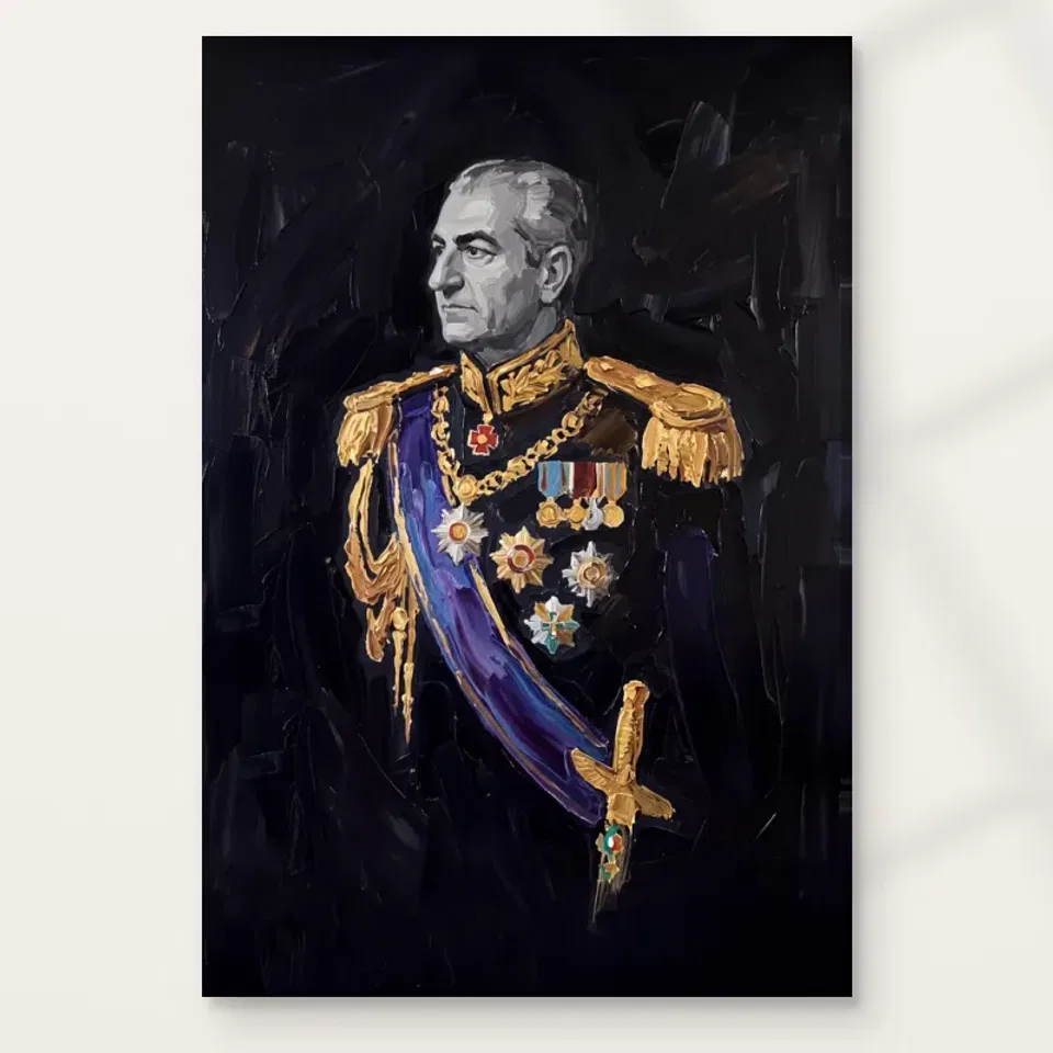
Explore the face, dark uniform, gold-coloured details and blue-purple diagonal in Portrait in Navy and Gold, without assigning an unverified name, rank or historical identity to its sitter.
The face emerges before the uniform is fully explained
Portrait in Navy and Gold presents a grey-haired man in a dark ceremonial-looking uniform against a near-black field. The public description makes the contrast around the face a central feature. Begin there rather than trying to identify the sitter. Notice how much of the figure is immediately available and how much is described through smaller highlights. The portrait can remain readable even when its darkest areas are not separated by sharp boundaries. That economy of information is part of the encounter: light gives the viewer a route into a person whose surrounding attire and setting do not reveal themselves all at once.
The head turns slightly to one side, creating an indirect relationship rather than a fully frontal exchange. Look at how that turn works with the facial light. You may experience the figure as composed or reflective, but those are responses to the arrangement, not verified knowledge of the man's thoughts. The image does not require a biography to hold attention. A human presence can be studied through pose, contrast and the distribution of detail. If you find yourself searching for a name immediately, pause and ask what the portrait offers before any identification has been made.
This is a useful beginning for selection because it separates the actual image from the associations formal uniform can prompt. A viewer might think of ceremony, authority or historical portraiture. Those associations can be acknowledged without becoming facts about a named person. The observable arrangement is more precise: a turned head, grey hair, dark attire, concentrated warm and cooler details, and a loosely described near-black setting. If that arrangement interests you, the portrait can have a grounded place in your collection even when the sitter's identity is neither supplied nor necessary to your enjoyment.
How do the gold-coloured details lead the eye?
The public copy identifies gold-coloured epaulettes, embroidered-looking detail and groups of medals. Study them as a distribution of brighter marks before treating them as objects to catalogue. They can connect different areas of the torso and shoulders, giving the eye routes across a largely dark figure. A small highlight may have more force because so much around it is restrained. This makes the portrait's detail economical rather than uniformly busy. Ask where attention goes after the face: towards a shoulder, across the chest or along the sash. The answer can reveal how the image links its human and ceremonial elements.
The decoration should not be used to infer an exact military rank, honour, institution or career. The visible forms are not independent documentation of service or status, and the product information does not establish those claims. You can describe a ceremonial-looking uniform and medal-like details without identifying what each represents. This restraint is particularly important in a formal portrait, where familiar motifs can tempt the viewer to treat recognition as evidence. The visual question remains available: how do concentrated bright accents make an otherwise dark costume readable, and how do they support rather than replace the face as a point of attention?
Gold is also an appearance here, not proof of real metal, gold leaf or metallic printing. A depicted highlight can seem luminous because of the darker area beside it. That effect belongs to the image's relationships. If you like the richness of the details, enjoy it through those relationships rather than expecting the physical print to behave like an object with metal decorations attached. The distinction makes comparison more useful. Another portrait may contain equally bright ornament yet organise it differently, and it is that organisation, not an imagined quantity of precious material, that should guide the choice.
The sash introduces a diagonal into a formal pose
The blue-purple sash crosses the figure diagonally according to the current public description. That direction matters. A uniformed portrait can contain many upright or relatively stable forms, while a diagonal creates another route across them. Follow the sash as a broad visual connection rather than as a clue to an order or institution. Notice how it relates to the smaller warm highlights and the dark clothing. The image's colour is restrained overall, so this cooler band can have substantial importance without occupying most of the surface or becoming the only feature the viewer remembers.
Compare the sash's broad movement with the smaller groups of detail. One offers a continuous-looking direction; the others may provide points at which the eye pauses or changes route. Their combination helps keep the torso active while the pose remains formal. This is a more useful observation than assuming a ceremonial subject must be visually static. The figure can look composed while the arrangement of accents supplies motion for the viewer. If you are attracted to that balance, make it part of your selection reason: the work joins a stable human presence to a measured but active network of colour and light.
What does the near-black field leave available?
A dark setting does not automatically mean an empty one. The public copy describes loose, visible handling in the background. Look at how that handling allows the figure to emerge without supplying a detailed room or landscape. The reduced setting limits narrative clues and keeps attention on the person and attire. It can also make transitions between figure and field more important. Where a boundary is clear, recognition strengthens; where it softens, the portrait can feel less like a cut-out object and more integrated with the surrounding atmosphere. These are visual relationships, not evidence of an actual location.
The field's restraint can make the face and bright details seem more concentrated. Ask whether that hierarchy is what you value. If you prefer portraits that reveal a setting, this work may offer less contextual information than you want. If you enjoy a person emerging from a quieter field, the limitation may be an advantage. Neither preference requires a universal rule about dark portraits. The relevant question is whether the available information feels sufficient and engaging to you, especially after the first impression of navy and gold has become familiar and you are looking for subtler reasons to return.
Examine the edge of the figure in the cover and then compare a smaller view. Some transitions may become less distinct at distance, leaving a compact arrangement of face and accents. This can be effective if the broad hierarchy remains compelling. It may be less satisfying if your interest depends on delicate differences within the darker areas that will rarely be visible from your intended position. Recognise that difference before choosing size. A work does not need to reveal every part equally, but the elements you most value should have a realistic opportunity to be seen in its eventual setting.
Formal imagery can remain open about the person
The current public description explicitly allows the portrait to be read without assigning a name or historical identity. Take that as a useful boundary, not a missing puzzle piece that must be supplied through resemblance. A grey-haired man in ceremonial-looking attire may evoke familiar people, but resemblance alone does not verify a sitter. The image can be appreciated through light, posture and detail without claiming endorsement, political affiliation or documented provenance. This is particularly valuable if the work will be discussed or displayed publicly, where an unsupported name can quickly become repeated as though it were part of the product's verified information.
You can still respond to the portrait's formal language. It may feel dignified, theatrical, restrained or distant to you. Keep those words attached to your experience rather than presenting them as facts about the person's character. The difference between a composed-looking pose and a composed individual is small in wording but large in evidence. Careful looking preserves that distinction while leaving emotional response available. If you choose the work chiefly for its formal presence, say so. If a specific named subject is essential, seek documented identification rather than relying on the uniform's appearance or an online image comparison.
This openness can also make the image more flexible within a collection. It can sit among portraits that are explored for their visual organisation rather than as a gallery of identified personalities. A neighbour might offer a direct gaze, a brighter field or a less formal pose, allowing the differences to become the relationship. There is no need to construct a shared biography across unrelated works. The present portrait contributes a particular visual pace: a face emerging from darkness, a stable pose and a few carefully concentrated directions of light and colour across the uniform.
From broad hierarchy to close detail
The image has a clear reason to be viewed at more than one distance. Across a room, the face, sash and bright accents may establish its main structure. Closer attention can reveal changes in represented handling and the arrangement of smaller details. Decide which experience is central for you. A larger print can make those details more available, but only if the room also offers enough distance to see the complete figure comfortably. A smaller version near a seat may provide a more deliberate close encounter. Size should support the intended pace of looking rather than function as a simple measure of importance.
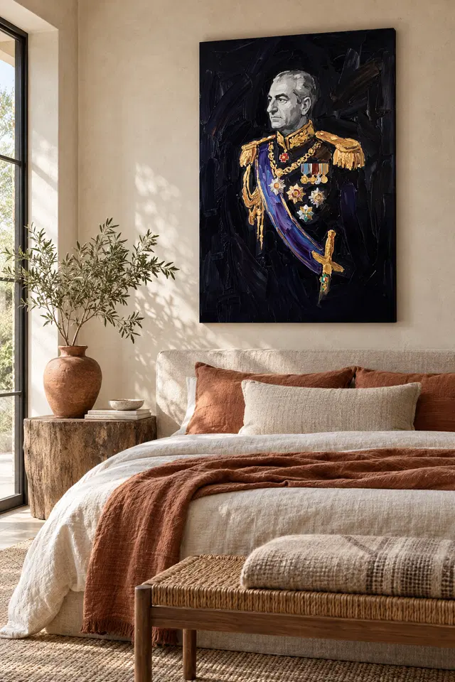
Use the current existing room visualisations to consider the portrait as one element within a wider field. They are illustrative settings, not exact scale demonstrations or proof of customer installations. Return to the cover for detail and to the configurator for actual dimensions. If a frame or mount is planned later, include that outer boundary in measurements. The selected print size does not document the physical size of a source painting. These distinctions help preserve the relationship you want to see instead of allowing the apparent proportions of a staged scene to become an unexamined assumption about your own wall.
A simple test is to name the main relationship after a quick view and again after a longer one. The first description may focus on navy and gold; the second may include the diagonal sash or the softer figure-ground boundary. If both remain interesting, the picture can support immediate recognition and slower attention. If only the colour pairing matters, consider whether another image offers that with a subject you prefer. A formal portrait should not be selected solely because its palette matches a room when its central human presence is something you are unsure you want to encounter repeatedly.
The support is not the represented uniform's material
A print can depict embroidered-looking details and rich dark fabric without containing those physical materials. The same applies to visible brushwork: apparent texture does not establish raised paint on an ordinary reproduction. Choose the image for its visual relationships, then choose the actual support through current product information. Neptune Natural Matt Canvas 400 is the stated canvas option, with a cotton support and matt textured character. Compatible photographic papers offer a different presentation. These materials describe the object supplied, while navy, gold and blue-purple describe the image. Keeping those roles distinct avoids turning a richly described subject into an unsupported construction claim.
Optional light selective hand-finishing, where offered and selected, is another separate choice. Review the actual configurator rather than assuming it from the portrait's painted appearance. A framed paper presentation may give the figure a contained interval before it meets the wall; canvas can provide another kind of boundary. Neither choice establishes a more authentic identity for the sitter or a verified history for the image. Manufacturer information is useful further reading about the support, not a substitute for provenance. A well-understood reproduction can be chosen confidently without needing to be described as a historical original or a materially embellished uniformed portrait.
A precise reason for a restrained portrait
After looking at alternatives, return to the complete work and identify what remains specific. It may be the face's contrast with the near-black field, the diagonal cooler sash or the way small warm details connect an otherwise restrained uniform. Those are observable reasons to prefer this portrait. They are stronger than a general desire for something regal or important-looking, which can encourage unsupported identity and status claims. The picture's value to your collection can lie in its balance of formal pose and expressive appearance, without requiring a named sitter to explain why its arrangement continues to hold attention.
If selecting it for another person, consider their comfort with formal figurative imagery as well as the palette. A liking for navy decor does not automatically imply a wish for a uniformed portrait. Similarly, an association with a familiar public figure should not be presented as verified product information. You can offer the work honestly as a dark figurative portrait with concentrated gold and cooler accents. That leaves the recipient free to respond through composition, atmosphere or personal association rather than being asked to accept a documented identity the available description does not establish.
Complete the decision by checking medium, size, presentation and any optional finish independently. The existing room images remain visualisations, and the material page remains support information. With those boundaries clear, Portrait in Navy and Gold can be enjoyed for an exact visual relationship: a human face emerges from a restrained field while small decorations and a broad diagonal keep the clothing active. If that balance interests you beyond the first impression, the work offers a grounded reason to return. Its formal language is visible; the sitter's unverified name does not need to be invented to make the looking complete.
Continue with this artwork
Find your next artwork
Three ways to read the dark formal portrait
Read more: Three ways to read the dark formal portraitRead less: Three ways to read the dark formal portrait
This navy and gold portrait study starts with a face that looks away. Grey strokes mark the forehead and cheek while much of the body merges with the dark ground. A blue sash then cuts across the middle. In addition, a group of bright shapes gathers around and above it, giving you several ways into the picture.
Try three routes: follow the grey tones, read the sash and compare the gold-toned details. None requires a name for the sitter. Instead, the approaches help you judge which visible choices make the artwork feel formal and which still read when you step back.
Navy and gold portrait study route one: find the face without the uniform
Look above the decorated shoulders and locate the warm grey alongside the lighter forehead. Then follow the darker brow towards the far edge of the nose. A few changes in tone let you read the turn without needing a bright outline around the entire head. The hair meets the background less sharply in some places.
The National Gallery's glossary on chiaroscuro explains the broader relationship between light and shade. Here, notice where a small pale area does more than a larger near-black field. However, there is no need to conclude that a particular room, camera or source of light produced the result.
On a second look, compare the visible cheek with the far side of the head. Do they give you the same sense of depth? The thin boundary by the nose may catch your eye first. Meanwhile, quieter changes in the hair give you time to notice the shape of the face as a whole.
Look at the collar just below the chin. The warm line there gives you a second boundary to compare with the cooler edge of the cheek. However, it repeats neither the shape nor the lightness of the face. That small gap is useful when you look at the whole picture. It keeps two bright passages close together without turning them into a single pale block.
Give the background a role in the navy and gold portrait study
The area beside the head is not a uniform black rectangle. For example, wider dark strokes appear behind the figure's right side from the viewer's perspective. Try looking at that space directly. Then return to the face. The background gives the pale region a strongly different neighbour without surrounding it with identical marks.
Compare what happens at the head with what happens at the lower jacket. Up high, parts of the silhouette remain easy to pick out. Lower down, some edges draw much less attention. As a result, the image does not give the body an even outline, and the clothing can feel more recessed than the face.
If the darks disappear in your preview, use the guide to print appearance and screen colour. A larger or brighter view can help you find a boundary. It does not guarantee the same distinction at your usual viewing distance. Note what you notice without treating one screen as a physical sample.
Navy and gold portrait study route two: trace the sash in sections
Start at the shoulder on the viewer's left. Follow the blue and violet downwards to the hilt-like form on the lower right. The sash does not run as a flat stripe. It changes width and tone. Because the dark fabric behind it is less distinct, those changes carry much of the motion in the lower half.
Look back along one narrow lighter border rather than trying to see the whole band at once. The lighter line helps the deeper blue retain a clear direction. But a glance may emphasise the nearby chain or decorations over the border. See which pathway you find again after looking away.
The National Gallery's explanation of composition offers a useful way to think about how those elements sit together. Try following the blue up and the chain down. They take different routes through the jacket. In particular, the shorter curve returns you to a busier area than the sash does.
Compare a navy and gold portrait study with other figurative work
Our figurative wall art collection offers different kinds of faces and poses. Look for an artwork where a hand or another strong slant, rather than clothing, helps the figure occupy the page. Then come back to the sash and ask what you would miss without it. The comparison can help you buy wall art with a clearer preference.
If the colour draws you in but you find the figure distant, that reaction is also useful. For example, you may prefer a picture that gives you a stronger sense of direct contact. A striking diagonal need not outweigh the effect of a gaze. Likewise, a quieter composition might suit your wall better than an exact colour match.
Navy and gold portrait study route three: read gold as a pattern
Compare the warm patches at the shoulders with the smaller shapes across the chest. The shoulders carry the colour in two broader blocks. In contrast, tiny circles, points and ribbons interrupt it below. Because the density changes, the trim does not simply make one continuous frame around the face.
Follow the sequence from the chain to one of the pale stars or rosettes. Several small dark passages divide the group. Also, a cool green accent appears among warmer areas. See whether that accent helps you relocate a particular part of the picture after stepping back. There is no need to attach a name to any insignia.
Try covering first one shoulder and then the other in a temporary screen crop. The centre does not lose the same amount of interest on both sides. It still contains the chain, sash and row of details. However, the gold at the top makes the figure wider visually than the decorated centre does by itself.
Check what belongs to this navy and gold portrait study
The study of marks and apparent relief explains why a detail can seem raised without telling you about the physical object supplied. Similarly, gold-coloured shapes in a preview do not establish the presence of metal or foil. If hand made wall art matters to your decision, look for an actual account of the order's production and finish.
Compare the full image with the styled bedroom view. The room softens its setting with pale bedding and warmer accents. However, those details do not belong to the picture and do not identify the sitter. Our companion guide on displaying this dark formal portrait separates the placement question from the visual reading.
Match the navy and gold portrait study to an order you can verify
Visit the Portrait in Navy and Gold product listing for the actual format, dimensions and presentation options. If you want to buy artwork for a particular room, check the option rather than trying to infer its size from the room example. The example serves as an arrangement idea, not a scale reference.
You might care most about the controlled contrast of the grey face, or the way the sash crosses that darker field. Decide which feature you want to retain at ordinary distance. Then check whether the placement and size you can use let you enjoy that aspect of the wall art. There is no obligation to choose matching furnishings.
Frequently asked questions
Where should I begin a navy and gold portrait study?
Try the pale face first, then look at the gold-toned shoulders. The two areas attract attention for different reasons. Therefore, notice what you return to without looking for it deliberately. That instinct can help you decide which feature matters from across a room.
Does the background contain any colour or movement?
Look at the areas beside the head and behind the shoulders. You can find darker strokes rather than a perfectly even field. Meanwhile, the surroundings stay much quieter than the face. Try checking the two areas at the same brightness on your display.
How do I trace the sash in this navy and gold portrait study?
Pick its lighter edge near one shoulder and follow it across the jacket. Then move back to the larger blue section. In particular, compare its changing width with the smaller chain above. That helps you see two distinct routes through the clothing.
Can I identify the sitter from the uniform?
This article does not authenticate the person or uniform. You can notice a pose, braid and medal-like forms without assigning them a rank or origin. If identity is essential to your decision, rely on independently verified documentation rather than the image's appearance.
Does every warm accent belong to the same pattern?
Not visually. The shoulder shapes, chain links and small coloured details vary in rhythm and scale. For example, a broad patch holds the eye differently from a row of small circles. Follow the pattern in one region before looking for a match elsewhere.
Is there gold leaf on the artwork I would receive?
The warm tones in the photo do not establish the use of gold leaf. Therefore, only treat metallic material as part of the order if the selected option actually states it. The same distinction applies to the brightness or texture you see in the image.
What happens if I start a navy and gold portrait study at the bottom?
The lower shapes can take you up the sash instead of down from the face. You may notice where the bright details first crowd together in the chest. Then look at how far your eye travels into the darker jacket before the path becomes less clear.
Will a small preview tell me which details I can see on the wall?
It can help you decide which larger forms stand out at a glance. However, it cannot tell you exactly what you will notice at home. Distance, room light and the selected size come into play. Check those separately before fixing the position.
Why does the portrait feel formal even though the face turns aside?
The upright position and decorative clothing contribute to that impression. Meanwhile, the look away can make the figure feel reserved rather than directly engaged with you. That response comes from visible features, not from known facts about the sitter's motives or character.
How could I compare it with a less formal portrait?
Pick one work with another kind of pose or clothing. Notice whether its main path starts at the eyes, a gesture or a brighter background. Then compare how your attention returns to the navy sash. That difference can be more helpful than judging their colours alone.
What can the bedroom visualisation tell me?
It shows one possible way to give a dark vertical picture space beside a window and above bedding. However, the room's dimensions and view are not specifications. First decide whether you like the picture itself. Then measure a space you actually use.
What should I confirm before adding the print to my shortlist?
Make sure the physical options on the listing match what you want to display. For instance, check how the dimensions and presentation work together. If you also want a particular finish, read its description rather than assuming the preview establishes it.
End the navy and gold portrait study at the detail you remember
Return to the isolated portrait without the room setting. Think back to the grey face, the diagonal and the small warm interruptions. If one relationship stays with you, you have a good reason to choose the image. Moreover, you can compare it with other work without relying on a biography the picture cannot establish.
If you would like to see that effect in your space, choose a verified size and presentation from the current listing. Give the portrait's darkest areas a chance to read at the distance that matters. The goal is to enjoy the image, not reproduce the room shown in a styled view.