Living with art
Give the Reaching Figure Room: Red, Black and a Clear Sightline
Plan Graceful Figure through open wall space, restrained red accents and practical furniture relationships, preserving the reach and bird detail without turning the room into a performance set.
Where can the reaching gesture be seen as a whole?
Graceful Figure in Red and Black depends on more than a face or a bright dress detail. The reaching body, flowing garments and small bird-like form work together, so begin with a wall where the complete composition can be seen. Look from the normal seats as well as the doorway. A tall lamp or plant may overlap part of the image from one angle, changing the relationship even when there is a physical gap. Choose a position that preserves the gesture rather than merely fitting the rectangle between objects. The practical goal is a coherent view of the figure and its smaller point of interest.
A living-room wall can support longer looking, while a home-office side wall may offer an intentional pause away from a screen. Decide which encounter you want before choosing dimensions. The most prominent wall is not automatically best if it is seen only obliquely or regularly obscured by furniture. Walk through the room in its normal state and identify where attention naturally slows. An open gesture within the picture does not require the room itself to become theatrical or unusually empty. It needs a clear local setting that fits daily use, leaving the rest of the space available for conversation, work and ordinary household movement.
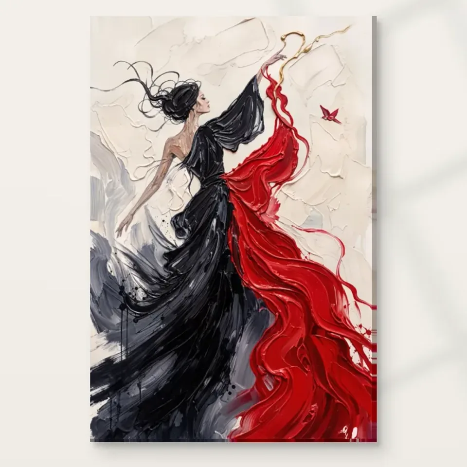
Should the room repeat the red bird or the broad dark forms?
The print offers two very different connecting routes. A modest red echo can relate to the garments and bird, while a broad dark piece of furniture can support the black areas. You do not need to pursue both equally. Start with what is already present. A dark chair or cabinet may establish enough continuity, leaving the artwork as the main red event. If you add a red object, keep it small enough that it does not compete with the bird's concentrated role. Exact matching is unnecessary and difficult from a screen. A related warmth or intensity can create a useful connection without making the room look like a coordinated set.
If red is already extensive in the room, try removing one nearby accent during the trial. The print may bring enough additional colour that the arrangement becomes crowded. Conversely, in a largely neutral space, it may need no echo at all. Position, scale and a clear wall can make a single colour event intentional. Judge the complete view from the main seat rather than a close-up of accessories. The picture's cream field is also important, so do not plan only from red and black fragments. The aim is to support a whole composition whose openness and movement may be more distinctive than the palette itself.
Let the pale field meet the wall without disappearing
The cream background can relate gently to a light wall, but the two do not need to be identical. Small differences in warmth and lightness can preserve the artwork's boundary. Consider how the selected presentation will sit against the actual wall under normal lamps and daylight. A digital preview cannot provide an exact match. If the image seems visually absorbed, a clearer furniture base or more open space beside it may help before you consider repainting. A darker wall is another possible contrast, but it should be tested with the full composition, including the substantial black areas, not chosen solely to make the cream look brighter.
Nearby materials can provide warmth without repeating colour literally. Timber, an even textile or a softly toned surface may support the pale field while leaving the red-and-black movement distinct. Avoid assuming that every cream accessory belongs. A collection of small pale objects can be visually busy if their shapes and highlights compete. Broad calm forms usually make a more useful starting point around an active image. The room can remain layered, but give this sightline a hierarchy. Let the picture carry the most intricate movement in its immediate area, with the surroundings offering steadiness rather than another equally restless pattern.
Keep real movement and painted movement separate
A figure that appears to reach or move does not require a placement beside a busy doorway. In fact, a calm viewing point may make its motion easier to appreciate. Check circulation before installation. Will a chair back, door handle or passing bag approach the surface? Can someone pause without blocking the room's route? A dramatic wall position is not worthwhile if it repeatedly conflicts with ordinary use. The work's movement belongs inside the image; the household should be able to move comfortably around the object. A less conspicuous wall can be the stronger choice if it provides a complete view and safer clearance.
This is useful in a creative workspace too. The image may be enjoyed as a visual companion, but it should not be expected to produce inspiration or improve productivity. Place it where looking is a choice, perhaps visible when turning away from a task. Avoid hiding it behind a monitor or making it compete with every practical item on a desk. A clear side wall can give the figure room while leaving the workspace functional. If the room changes use, test those conditions as well. A guest bed, folding table or moved chair should not immediately make the print's location impractical.
Measure the gesture through the completed presentation
Mark an available size on the wall with a surface-safe method and check the outline from seated and standing positions. Imagine the whole composition within it, including the small bird-like form and the space around the reach. A size that fits physically may still feel squeezed by a shelf or door frame. A larger option may not improve an awkward viewing angle. The useful scale is the one that makes the complete image comfortable at the distance you use. There is no universal ratio that resolves every room, and a strong red-and-black figure can have considerable presence without occupying the largest possible area.
Read the current product's presentation measurements carefully. Rolled canvas distinguishes artwork size, printed allowance and supplied flat dimensions. Stretched canvas states the selected front face and wrap separately. A paper print gains outer dimensions when framed. Establish the likely completed size before ordering for a tight wall, especially if you plan to use a professional framer. Do not rely on a remembered margin or estimate from the existing room gallery. Those scenes are visualisations rather than measured installations. Use them to notice relationships, then return to your own wall, furniture and actual selected format for the final plan.
Check Graceful Figure's current dimensions and formats

Let lighting show the figure rather than stage it
The image already contains contrast and apparent movement, so begin with even domestic light. Check whether the pale field, dark garments and small red form remain readable together during the hours you use the room. A harsh beam may make one area too prominent or create a reflection on framed paper. Moving a lamp can be more useful than adding a spotlight. Judge from the actual seats and approach route, not only while standing beside the wall. The goal is a comfortable view of the complete image rather than a performance-like display that looks dramatic in a photograph but is difficult to live with.
Avoid unnecessary direct sunlight, persistent damp and strong heat sources as general care considerations. Seasonal light and normal heating use may change the conditions, so consider more than installation day. The Canadian Conservation Institute's art-on-paper guidance is useful further reading if you choose a paper route, but it does not certify this print or guarantee longevity. Follow the supplier's instructions for the actual material and presentation, and ask a competent framer about unusual conditions. The print should not be treated as waterproof because it has a finish or as physically rugged because the source image looks textured. Sensible placement supports both visibility and care without adding unsupported claims.
Choose the format before the final wall arrangement
Neptune Natural Matt Canvas 400 is a specified 100 percent cotton, 400 gsm support with a natural warm base and irregular weave. Compatible photographic poster papers include Oyster 271 and Photo Lustre 310. Decide through the current product controls which format and presentation fit your plan. A rolled print needs an appropriate next step after delivery, while stretched canvas is offered ready to hang. Optional light, selective hand-finishing is distinct from an ordinary print and should not be assumed for every variant. It does not mean every depicted brushstroke becomes raised paint or that the object is an original impasto painting.
If using a framer, discuss the selected support, completed outer size and proposed wall before ordering for a constrained space. If choosing stretched canvas, plan fixings suitable for the actual object and wall construction. Arrange a safe unpacking area and avoid leaving the work in a busy passage while deciding what to do. Clear practical steps let the image remain open in meaning without making the supplied object uncertain. Quality is partly a matter of accurate specification and suitable handling, not simply an elaborate finish. The figure, garments and bird should already be the reason you want the image; the support serves the presentation you intend.
Read material and optional finishing choices before installation
Try two realistic room plans before making permanent changes
Imagine a lounge with a pale sofa, a dark side table and several red cushions already in use. One plan would place the print directly above the sofa and add more red accessories below it. A more useful first trial may be simpler: keep the artwork as the main red event, remove one cushion temporarily and check whether the side table already provides enough dark continuity. This is a hypothetical example, not a description of a supplied room scene. Its point is that the print can change the balance of existing objects without requiring a new set. Look from the sofa's normal opposite view and from the doorway. If the figure's reach remains clear and the bird has room to register, the arrangement may need no further decoration. If the wall feels crowded, test object placement before assuming a different size or more accessories are necessary.
Now imagine a room shared between work and occasional guests. A clear side wall is visible from the desk, but the first proposed location sits behind a chair that moves back during use. A second position is less prominent from the doorway yet offers safer clearance and a comfortable view when turning away from work. The latter may be the better plan even if it looks less dramatic in a photograph. Test the guest arrangement as well, including any opened bed or moved table. The print should remain available without making practical furniture use awkward. Again, the example is a planning method, not a claim that the artwork guarantees concentration or comfort. It asks which location survives ordinary changes. The reaching gesture can be enjoyed deliberately from the desk, while the rest of the room remains functional. A small existing warm textile may connect the palette, but there is no obligation to create an office-wide red theme. Comparing two plausible plans in this way helps separate a decorative first idea from a setting that actually fits daily life. It also makes any shared-room discussion concrete: people can compare views and clearance rather than debate whether a flowing figure is supposed to feel inspiring.

Keep the home personal around the open gesture
Check the arrangement with people present as well as furniture in place. A seated person may block a lower view from the doorway, while another chair may bring someone closer to the print than expected. This does not mean every possible view must be perfect. It means the main intended encounter should work when the room is occupied, not only when it is prepared for a photograph. Leave enough practical clearance that the print does not become a reason to restrict normal movement. The image's open gesture can remain available while the people using the room have their own space to sit, stand and change activity.
The room does not need bird ornaments, performance references or a complete red-and-black scheme to explain the print. One clear place and a few restrained relationships can be enough. Use the space normally before adding more decoration. If the wall feels crowded, remove one nearby object or pattern. If it feels disconnected, test a modest tonal link already present in your belongings. A layered room can work when each sightline has a main event. The artwork may carry the movement while furniture and ordinary possessions provide steadiness, warmth and evidence of the people using the space.
Recheck the complete view, shared seating positions and actual selected dimensions before ordering. Then leave room for small changes after installation. A new textile or moved lamp should not force a complete redesign if the print's role depends on scale and sightline as well as colour. Graceful Figure can remain an outward-reaching, partly unresolved image in an otherwise straightforward room. You do not have to decide what the bird symbolises or which action the woman performs. A comfortable view, sensible conditions and a clearly chosen presentation provide the useful foundation, allowing the relationship between large gesture and small form to remain a personal invitation to look.