Looking closer
A Reaching Figure and a Small Red Bird: Looking at Graceful Flow
Explore the reaching woman, flowing black-and-red garments and origami-like bird of Graceful Figure, considering gesture and scale without inventing a performance or fixed symbolic story.
What connects the reaching figure to the small bird?
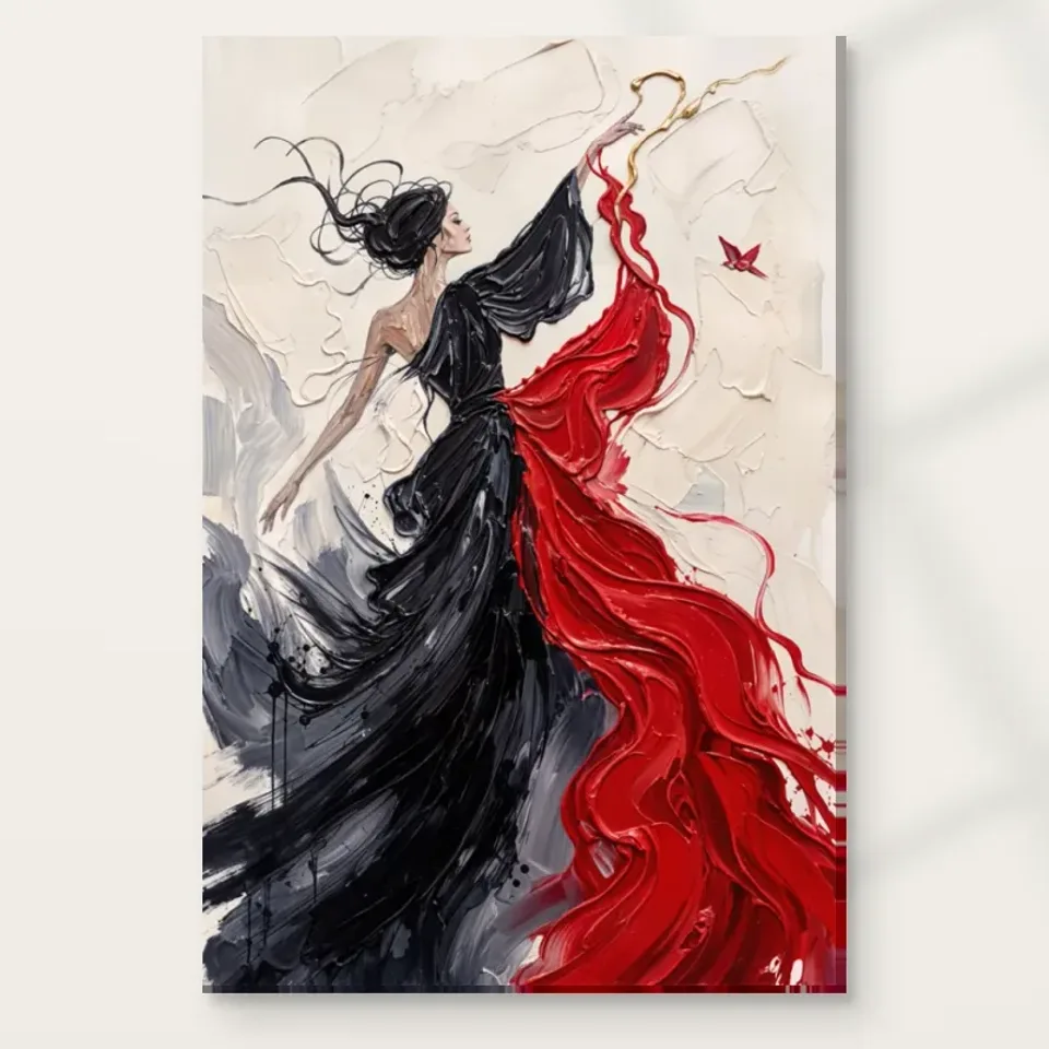
Graceful Figure in Red and Black Expressionist brings a woman in flowing garments into relation with a small red, origami-like bird. The difference in scale is a useful place to begin. A large human gesture and a much smaller form can create a strong visual exchange without a detailed narrative. Look at how your attention moves between them. Does the reaching action make the bird more noticeable, or does the bird help you understand the reach? You do not need to decide whether the woman is releasing, greeting or following it. The verified description establishes the gesture and the bird-like form, not a documented action sequence. Their relationship can remain suggestive while still giving the composition a clear point of interest.
For selection, ask whether this small interaction matters to you as much as the flowing dress. The garments may create the strongest first impression, but the bird can change the image from a general figure study into a more particular encounter. If you enjoy that difference, it is a specific reason to choose this work rather than another red-and-black portrait. If you prefer the figure without a narrative cue, the bird may feel too explanatory or whimsical. Neither response is wrong. The useful decision concerns the complete composition, including the modest element that may become more important after repeated looking. Avoid selecting only from an enlarged crop of fabric or face that removes the very relationship making this image distinctive.
Flowing garments make a body visible through direction
The black-and-red garments do more than identify clothing. Their flow can extend the body's movement into a wider arrangement of colour and marks. Follow the broad directions before naming a pose. Notice where a form seems attached to the woman and where it becomes a more independent sweep across the field. That transition can make the work feel both figurative and abstract. The body is present, but the surrounding treatment refuses to settle into a neat outline. If you enjoy images in which movement belongs to the handling as well as the subject, this relationship may offer more sustained interest than a precisely described costume would.
There is no need to identify a dance, performance or cultural dress tradition that the source information has not established. A reaching woman in flowing garments is enough to describe the visible subject. You may associate the movement with dance privately, but it remains an interpretation. This restraint keeps the image open and avoids borrowing significance from a named activity or biography. Compare the work with a more static figure. Do you prefer the clearer pose, or the way this image lets the garments carry movement beyond the body? That comparison can reveal your taste more accurately than a broad claim that the work is energetic. The particular route from body to flowing shape is what you are choosing to revisit.
Does the cream field matter as much as red and black?
The textured cream background gives the stronger colours a setting and should not be treated as leftover space. Look at how the pale field allows the black and red to register. It may provide separation, a visual pause or room for the gesture to extend. Those functions are part of the composition. A similar figure against a dark field would feel different even if the garments were unchanged. This is why judging only from a red swatch or a dark fragment is incomplete. The pale environment participates in the image's fluidity and can be a major reason the active forms remain readable rather than becoming a dense mass.
View the cover at a reduced size and notice the balance of pale and dark areas. Then return closer to examine how the cream's textured appearance complicates the apparent emptiness. Ask whether you enjoy both the broad openness and the local activity. If the work appeals mainly because its red matches a room object, make sure you also want the substantial pale field and recognisable figure. A complete image is not a colour sample. The background may be exactly what distinguishes this work from other red-and-black images in your collection, giving the gesture space rather than concentrating all attention into a tightly packed face or dark field. Naming that difference helps you choose deliberately.
An origami-like bird need not carry one fixed meaning
The description calls the small red form origami-like, which is a visual comparison rather than proof of a particular paper object, tradition or symbolic programme. You can notice its folded-looking character and contrast with the flowing garments without claiming an origin. The angular suggestion of a bird may provide a useful counterpoint to looser marks. A small, distinct form can give the eye a destination after following a broad sweep. Consider whether that contrast is important to your response. It may make the image feel playful, delicate or unresolved, but those remain personal readings rather than a universal message everyone is required to recognise.
Avoid turning the bird into a guaranteed emblem of freedom, hope or transformation. Such associations can be meaningful for you, but the verified product copy does not establish a single intended meaning. A more grounded question is what changes if you imagine the bird absent. Does the figure become less directed? Does the composition lose a small red point that connects separate areas? These visual changes are enough to explain why the detail matters. If you are buying for someone else, consider whether they enjoy this kind of open suggestion rather than assuming the bird will communicate the same idea to them. The most thoughtful selection respects the image's specific forms and the viewer's freedom to read them differently.
Texture should support the gesture rather than substitute for it
The image has a brush-like, textured treatment across figure and field. Examine how that treatment contributes to movement. Changes in mark direction may help the garments flow, while denser passages may give the body weight. The useful question is not simply whether the surface looks richly painted. It is whether the marks help the reaching action and small bird belong to one arrangement. A close crop can make texture appear to be the entire subject, so return to the complete cover regularly. You are selecting the relationship between a figure, a pale field and a modest bird-like form, not only an attractive patch of simulated brushwork.
Represented texture does not automatically become raised paint on the print. The current order may offer optional light, selective hand-finishing separately from the ordinary image, but that should not be described as a complete reconstruction of every stroke. No claim of an original impasto painting, waterproof surface or guaranteed lifespan follows from the appearance. These limits leave plenty to appreciate visually. The work can suggest depth and material activity while being supplied on a clearly described support. Quality questions should therefore concern both image and object: whether the composition rewards looking, and whether the selected material, dimensions and finish fit your practical plan. Keeping those questions distinct makes the purchase clearer without reducing its expressive interest.
Compare its open gesture with other red-and-black works
A restricted palette does not make works interchangeable. Compare Graceful Figure with a closer portrait or a denser abstract image in similar colours. The reaching body, pale field and small bird may give this one a more outward-directed experience. Another image may concentrate attention inward or occupy more of the frame with dark marks. Decide which relationship you want. If your collection already contains several close faces, this figure may add a broader bodily gesture. If it already contains many flowing forms, it may continue an interest rather than introduce contrast. Both can be worthwhile, provided you recognise the role rather than buying only because the palette is familiar.
The abstract and expressionist categories can help find alternatives, but compare actual amounts of space, clarity of action and scale of the human presence. These are more precise than asking which work looks more dramatic. Return to the cover without reading the title and see whether the reach still organises your attention. Then look again with the bird in mind. If the composition offers more than one rewarding route, it may sustain interest after the first impression. If you find yourself trying to invent a story to make it work, consider whether a more explicit narrative image would suit you better. There is no obligation to choose ambiguity when you prefer a clearly documented subject.
Choose a material that serves your intended presentation
The specified canvas is Neptune Natural Matt Canvas 400, a 100 percent cotton, 400 gsm support with a natural warm base and irregular weave. Compatible poster papers include Oyster 271 pearl or satin photographic paper and Photo Lustre 310 photographic paper. These facts help clarify what can carry the image, but they do not establish a universal best format for flowing figures. A paper route can suit separate framing; rolled and stretched canvas have different practical next steps. Read the actual available combinations and dimensions in the current product controls rather than inferring them from a styled gallery scene.
Optional light, selective hand-finishing is separate from an ordinary print and should not be assumed for every configuration. Supplier further reading can explain a support's stated surface character, not certify the source artwork's identity or promise an exact screen match under all light. The cream field may be particularly worth considering alongside the support description, but avoid imagining that one material will guarantee a certain mood. Your attraction to the image should already rest on its gesture, colour and bird detail. The material then serves that choice. Review the complete cover after looking at room visualisations, which remain illustrative rather than proof of real installations, selected scale or included furnishings.
Read the actual paper, canvas and finishing specifications

Test three routes through the same complete image
First, look only for the broad black-and-red flow, letting it register before you identify the woman. Notice whether it makes a satisfying arrangement on its own. Second, attend to the reaching body and ask how much of its action you understand without a story. Third, find the small bird-like form and follow the relationship back towards the figure. These are not tests of print sharpness or symbolic knowledge. They are different ways to discover what the composition offers. If each route leads into another, the image may have a useful depth of attention: colour leads to body, body leads to a small destination, and that destination returns you to the larger field. If one route repeatedly stops your interest, that response is worth considering rather than explaining away.
The exercise also helps when viewing on a small screen. A thumbnail may make the red-and-black sweep dominant while the bird is easy to overlook. A very close view may reverse that emphasis and make the small form seem like the whole subject. Neither is the complete experience. Return to a whole-cover view that lets you see all the major elements together, and judge their relative importance there. Do not assume a chosen print size will reproduce a screen's apparent scale exactly. The useful insight concerns your attention, not a measurement. If you find that the smaller form is essential to your interest, choose a future viewing arrangement that allows it to register without sacrificing the full gesture. If the broader flow is what matters, recognise that preference while still accepting the bird and human presence as part of the image. This keeps the selection honest about all its elements instead of mentally cropping away anything that does not fit an initial colour-based attraction.
Choose the open relationship you want to return to
Let the smallest element remain small in your judgment too: it can be important without being asked to explain every mark, colour and gesture elsewhere in the composition.
A specific final reason might be that you like the way a small bird-like form gives direction to a much larger human gesture, or the way black and red move through a pale field without becoming wholly descriptive. Those reasons are grounded in the image. They do not require a named performer, a claimed cultural origin or a fixed symbolic lesson. Ask whether the complete arrangement remains interesting after the novelty of the bird has faded. A work can be graceful in appearance and still visually forceful, so consider the whole experience rather than relying on one adjective in the title. The choice should fit the kind of attention you actually want to give.
Review the current format, size and finish alongside the cover before ordering. Make sure you want the reaching woman, flowing garments, cream environment and small red form together. If only one element appeals, compare an alternative that focuses more directly on it. A considered selection includes the possibility of preferring something quieter or more literal. If this combination continues to draw you back, it has a clear basis for entering your collection. You can leave its story open while being precise about the print you choose, allowing the relationship between gesture and bird to remain an invitation to look rather than a claim that needs unsupported explanation.