Living with art
Make Room for Golden Glow Without Building a Cafe Set
Place Golden Glow Cafe Interior in a dining area, breakfast corner or quieter room with a practical plan for warmth, lighting, kitchen clearance and the print's chosen presentation.
Where can the cafe image belong without becoming a theme?
Golden Glow Cafe Interior can connect naturally with a dining area or breakfast corner, but it does not need a wall of coffee accessories to explain its presence. Begin with a real use: where do you sit for a short pause, talk over a meal or read at a table? A picture of a warmly lit interior may complement that activity because it offers another inviting space to look into. The useful relationship is between two kinds of attention, not between matching props. A work that you enjoy at an ordinary table can remain meaningful even if the coffee machine moves or the room's function changes. This makes placement more adaptable than a narrowly themed display.
Look for a wall that is visible while seated as well as when entering. A breakfast corner may have limited wall area, so consider door swings, cupboards and the position of a pendant light. If the only available spot is repeatedly obscured by practical equipment, another room may serve the print better. The subject does not obligate you to place it beside food preparation. A hallway, home office or bedroom can also accommodate a warm interior image if you like its atmosphere there. Start with the best viewing conditions in your home, then decide whether the subject connection adds something. Reversing that order can leave an attractive print in an awkward location simply because the word cafe seemed to dictate the room.
Let one warm material do much of the connecting work
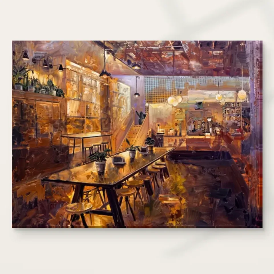
Timber can provide a straightforward bridge to the image's rustic furnishings and earthy palette. This does not require a particular species, finish or matching table set. An existing wooden table, cabinet or chair may already supply enough warmth. Place the picture in relation to that broad material before adding accessories. A large stable surface often does more to make the arrangement coherent than several small brown or amber objects. If your room is mostly painted furniture and pale walls, a single warm textile or ceramic piece can serve a similar purpose. Choose a relationship that feels natural among your possessions rather than trying to recreate the furnishings inside the print.
Be attentive to differences between warm materials. Highly orange timber, dark red leather and yellow lighting can accumulate quickly, making the room feel more heavily coloured than intended. A quieter neutral nearby may help the image's own warmth remain distinct. Conversely, a cool grey room may welcome the contrast without needing any new warm objects at all. Evaluate the whole field from the main seat. The artwork should not disappear into a collection of similarly toned pieces, nor should it look stranded above unrelated furniture. One broad connection and a little contrast are usually a useful starting point. You can adjust later, but begin with fewer elements so you can see what each one contributes to the room's balance.
Keep the real kitchen conditions separate from the pictured cafe
A kitchen tag describes a possible editorial setting, not permission to expose the print to every condition found in a kitchen. Before selecting a wall, consider steam, splashes, grease, heat and cleaning routines. The safest-looking empty patch may be near a hob, kettle or sink, where it is not a sensible display location. Look instead for a more protected dining end, adjacent wall or breakfast area with enough distance from preparation. The image depicts an inviting interior, but no offered surface should be assumed waterproof or immune to household residues. Its practical needs should be assessed through the actual material and presentation, not through the cafe subject.
Watch how the room is used for a few ordinary days. Where do people carry hot dishes? Which cupboards open towards the wall? Does a chair back strike the surface when someone stands? These small observations are more useful than a rule based only on room name. If the conditions remain unsuitable, place the work elsewhere and create the connection through a sightline from the kitchen rather than direct proximity. You can enjoy the print while sitting at a nearby table without hanging it in the busiest work zone. That choice preserves both the image's visibility and a practical route for care. It also avoids depending on an optional finish to solve an environmental problem the product has never promised to withstand.
How should warm room lighting relate to the painted glow?
The print already contains warm illumination. Your room lighting should make it visible rather than attempt to intensify that glow with an excessively amber or tightly focused beam. Begin with the lights you normally use during meals or evening reading. From the intended viewing position, check whether darker interior details remain legible and whether any reflection interferes with the image. A framed paper presentation may respond differently from a matt canvas, so consider the actual chosen format. Moving a lamp or changing its angle can be more effective than adding a dedicated picture light. The aim is an even, comfortable view, not the appearance of a spotlighted display in a commercial venue.
Daylight can change the relationship substantially. A pale wall may make the image feel warmer by contrast, while late sunlight can make the whole room more golden. Observe these changes before painting a wall or replacing lamps to match a screen preview. Avoid unnecessary direct sunlight and strong heat sources as a matter of general care. That caution does not mean the room must be dark; it means that display conditions deserve attention alongside aesthetics. If you need detailed advice for a framed paper option, discuss the location with a competent framer. The image's atmosphere should remain its own visual property, supported by the room's light but not dependent on an arrangement that is uncomfortable, impractical or needlessly stressful for the print.
Measure from seated eye lines as well as standing views
Dining and breakfast areas are often judged from a doorway, yet the artwork may be viewed mostly while seated. Mark a proposed size with a wall-safe outline and sit at each relevant chair. A pendant shade, tall vase or person seated opposite can interrupt the view in ways that are invisible from the entrance. Check the complete rectangle rather than focusing only on its centre. The cafe's many details may be more rewarding when the image is comfortably visible as a whole. If one seat is too close or too oblique, consider a different wall before assuming a larger size will solve the issue. Increased dimensions do not automatically correct an awkward angle.
Use the current product's selected dimensions and account for the final presentation. A frame around a poster adds to the outer size. Rolled canvas includes a printed allowance and a supplied flat measurement that differ from the intended image area. Stretched canvas states its front-face dimensions and wrap separately. Do not substitute an old margin rule or estimate from the room gallery. If a cabinet or shelf sits below the work, allow for the objects it normally carries rather than the temporarily cleared surface. Accurate planning protects the picture's depth and prevents its lower areas from becoming hidden behind everyday things. It also keeps practical furniture movement from becoming a recurring risk to the print after installation.
Check Golden Glow's current size and presentation choices
Avoid multiplying small details around a detailed interior
Golden Glow contains many visual destinations. A surrounding arrangement of tiny frames, mugs on hooks, patterned wallpaper and numerous ornaments may ask the eye to process too much at the same scale. You do not need to empty the room, but try giving the print one simpler neighbour. A plain wall area, a broad cabinet front or a clear tabletop can provide a useful contrast. This is especially important in a small kitchen or dining corner, where practical objects already create variety. Let the artwork carry some of the decorative detail instead of adding a second complete layer around it. The room can feel richer through hierarchy rather than through quantity.
If you already have a gallery wall, assess whether this image adds a distinct role. It may work as the warm, spatial anchor among smaller, quieter pieces, but not if every neighbouring frame contains equally dense interiors. Separate the frames enough that each has a readable boundary and consider removing one piece during the trial. The arrangement should be judged from where you use it, not solely from a straight-on photograph. A wall can look balanced in a camera frame while feeling crowded from the table beside it. Keep the cafe image legible as its own place. That preserves the pleasure of entering its painted interior without requiring the surrounding wall to imitate its abundance of objects.
A quieter room can reveal a different use for the image
In a home office, the cafe may offer a visual change from work equipment without turning the room into a themed workspace. Place it where you can choose to look away from the screen, perhaps near a reading chair or on a side wall. Its familiar interior can provide a separate destination for attention, but it should not be promised to improve focus or productivity. In a bedroom, consider whether the warm detail feels welcoming or too active. A side wall may suit the work better than a position directly above the bed. The important question is how the image participates in the room's real activities, not whether a supplied visualisation has shown that category of space.
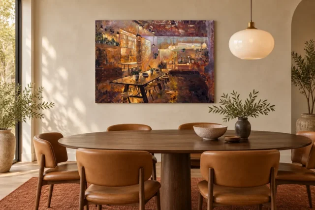
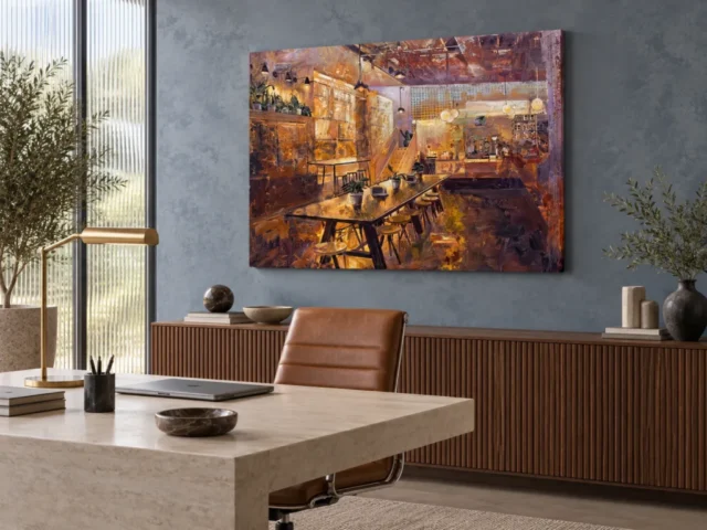
The existing room gallery can help you notice possible relationships between the print and furniture, but its scenes are visualisations rather than proof of an installation or precise scale. Translate a useful principle instead of copying the entire arrangement. If you like a warm image against a restrained wall, try that with your own belongings. If you like the space left beside the picture, preserve that breathing room without seeking identical furnishings. This approach keeps the result personal and reduces unnecessary purchases. It also lets the print travel with you if the room changes function. A cafe interior selected for light and atmosphere can remain useful beyond a single coffee corner, provided the placement continues to give it a clear and comfortable view.
Choose the presentation before planning the final fixing
Decide whether you want stretched canvas, rolled canvas or an unframed rolled poster through the current options, then plan the practical next step. Neptune Natural Matt Canvas 400 is a 400 gsm, 100 percent cotton canvas. Compatible poster papers include Oyster 271 and Photo Lustre 310. Optional light, selective hand-finishing is a separate choice, not an automatic consequence of the image's expressive appearance. A rolled format will need a suitable presentation plan, while a stretched option is offered as ready to hang. Read the selected configuration rather than treating the different routes as interchangeable rectangles. Their outer dimensions, handling and installation needs may differ.
For a paper print, suitable mounting and framing can be discussed before arrival, including the planned wall and its light. For a stretched object, use fixings appropriate to the wall construction and the actual supplied piece. Keep the object away from food preparation while unpacking and arranging it. General art-on-paper care information from the Canadian Conservation Institute is useful further reading if you are choosing that route, but it is not a product-specific certification or a guarantee of longevity. The print should be handled according to the supplier's instructions and any professional framing advice relevant to its presentation. A clear installation plan allows the warm scene to be enjoyed without relying on improvised handling or unsupported assumptions about resistance to moisture and heat.
Complete the corner with an ordinary-use check
Before finalising the arrangement, use the space normally. Sit with a plate, open the cupboard, move the chair and switch on the evening lights. Notice whether the picture remains visible and whether anything repeatedly approaches its surface. This small rehearsal can reveal more than an elaborate mood board. If the scene feels crowded, remove one nearby accessory before changing the artwork plan. If it feels disconnected, try one modest material or colour link already available in the room. Do not assume that the solution is another cafe-related object. The image already supplies the subject; the surrounding space can supply comfort, practicality and a little visual steadiness.
A successful setting for Golden Glow does not need to look like a business interior or a carefully staged breakfast advertisement. It can be a lived-in dining area with useful furniture and a clear wall. Keep the print away from avoidable kitchen risks, allow a seated view and choose a presentation whose dimensions you understand. Then let the painted cafe remain a place within the picture rather than a script for the whole home. Its warmth can relate to your room without dictating every object in it. That balance gives the work room to retain its detail and atmosphere while leaving daily life uncomplicated, which is a more durable outcome than building a complete decorative theme around one image. Leave useful surfaces useful, too: the print can provide a decorative focus without taking over the places where you prepare, eat or work.
Continue with this artwork
Find your next artwork
Four checks for a dining room or study
Read more: Four checks for a dining room or studyRead less: Four checks for a dining room or study
A Golden Glow Café wall display does not need café furniture. What matters is whether the warm highlights, long table and darker floor remain clear from your own seat. A large pendant or a tall object can distract from one of those parts. Try the ordinary view before setting the height or width.
The design appears against a warm dining-room wall in one illustration and a cooler study wall in another. Those settings let you compare how an amber picture reads among different furnishings. They offer ways to test your room. Neither is a size guide or a list of fixtures you need.
Golden Glow Café wall display check one: look from the view you want
Choose the place from which you are most likely to see the image. For a dining room, it might be one side rather than the end of the table. In a study, it might be the doorway or a view beyond a second screen. Then compare the same wall from another useful position.
Put a mark near the lower left of the intended footprint for the dark table edge. Put a second mark nearer the right for the pale lamps. If those points both remain visible with chairs in use, you can consider the width as a whole. If one disappears, try another position before changing the size.
Give the picture one main role in your room. In the dining illustration, it shares a wall with a hanging lamp in the viewer's field. In the office view, the chair and desktop have their own strong shapes. Decide whether the image should be the first thing you notice or something you return to after sitting down.
Look for the longest clear view of a Golden Glow Café wall display
Check where the table and chairs sit on a normal day. Do not move them just to make one test look tidier. Then compare the arrival view with the seated view. A difference is useful: you can choose which one deserves priority instead of assuming a single position gives the same result to everyone.
For another way to practise, read our guide to positioning art around a home workspace. Try being deliberate about what you see away from your screen. The picture need not appear in a call background to have a useful position in the room.
Golden Glow Café wall display check two: set an edge around the warm colours
Look at the boundary where the picture would meet the wall. A cooler wall can set the warmer marks apart. A pale cream wall may leave the warmer tones closer to their surround. Neither is automatically better. Compare which edge becomes noticeable in each case before matching furniture to the image.
In the dining picture, the real-looking globe sits to the right of the artwork. It need not repeat the smaller lights inside the design. Try moving a portable object near your own outline and comparing the view without it. What matters is whether its presence makes it easier or harder to read the design.
Keep your furniture useful around the Golden Glow Café wall display
Our wall art selection for shared living spaces offers other ways to compare wide designs. Check whether you prefer a piece with a clearer margin rather than removing a lamp that works well for the room. A useful positioning change should leave seating and access intact.
The study has a long low cabinet behind its table. In your room, check whether the picture's lower edge seems to meet that horizontal line too closely. Separating the two can give the darker floor inside the image more space to read. Use a temporary outline to compare before committing to a height.
If the furniture is much darker than the wall, stand where you can see both outlines clearly. A wide shadow from the furniture may appear to extend the dark floor within the image. Try increasing the space between them. If the lower edge becomes more distinct, the gap may matter more than the furniture colour.
Golden Glow Café wall display check three: use the light at ordinary times
Compare the intended wall while people usually use the room. The warm subject may remain readable in different light, but the small pale marks may change most. Make a daytime and evening observation from the same position. Keep the usual lamp available instead of buying one that resembles a lamp in the image.
The Canadian Conservation Institute's guidance on light exposure is useful for separating visibility from care. A spot can make a picture stand out and still need a check against the material's care guidance. Do not adopt the conditions of a staged room as instructions for your chosen item.
Compare a bright patch with an actual mark in the design
The close-reading guide to Golden Glow Café identifies the table edge, round lights and darker floor. Use one of those features as a fixed reference. If a bright patch seems to travel across it when you change position, compare the reflection separately from the marks in the design.
Test the view after you have moved back to your ordinary seat. Leaving a light on a little longer can change your impression of a dark wall, but it is not a reason to ignore reflections. Choose the arrangement that works most of the time without making the room harder to use.
If the room already includes a pendant over the table, check where it sits in your view rather than measuring only its drop. It might cover part of the picture from one end and leave it clear from the other. Decide which place usually matters before changing the intended position of either object.
Golden Glow Café wall display check four: measure the exact selection
Open the Golden Glow Café Interior product listing and note the width and height of the format you are considering. Do not calculate them from the dining table in the illustration. If the selected item includes an outer frame, use the appropriate outside measurements where available.
The National Gallery's frame glossary discusses how a frame can change a picture's appearance. Make that a separate choice from the placement of the image. A temporary margin can show the difference in your view. The actual offer remains the source for what is included.
If you want to buy artwork in a specific presentation, note what would have to happen before hanging it. When you find a piece through hand made wall art, check the actual finish rather than reading the production process from the surface in the photograph. The product option is where to look for the supplied materials.
People who buy wall art can use the ready-to-hang comparison guide to make those choices separately. The image and the preparation can both affect the decision. Keep your measurement in view when you compare possible sizes. Do not let the catalogue mock-up become the only reference.
Repeat the trial with lamps and chairs in their usual places
If you have two outlines, label each clearly. Compare them from the same doorway and then the same seat. Ask which leaves enough space near a pendant, a cabinet or the top of a chair. A larger footprint may give the details room but take up a different part of the usable wall.
Check the relationship between your tabletop and the painted table from a second position. You need not line them up. A quieter interval can make each one easier to notice. If you prefer the image on a wall without a table in front, the room does not need to adopt its subject.
As a last check, clear away temporary paper and put one ordinary item back on the table or desk. Then repeat the view. You might find that an object you use daily draws attention towards the lower corner. Keep that fact with your measurements rather than trying to reproduce the empty table in the demonstration.
Record which position keeps the painted lamps visible while the real lamp stays where you need it. That gives you a more useful reference than marking the centre of the wall without a viewpoint.
Frequently asked questions
Where should I start a Golden Glow Café wall display test?
Choose the viewpoint you want most. Mark the whole width, then identify the lower table edge and pale lights in the mock-up. Check both from your ordinary seat before using the doorway as a second viewpoint.
Can the picture work in a room without dining furniture?
Yes. The design shows an interior, but the room it hangs in need not copy it. Use the warm areas and dark outline as the starting points. Then choose a place where those features remain visible.
Does a Golden Glow Café wall display need a warm-coloured wall?
No. A cooler surround can help warm marks appear more distinct. A pale surround can give the wide image a quieter edge. Compare both kinds of relationship under your normal light rather than matching by a colour name.
Is the dining room image a reliable size reference?
It illustrates a relationship, not a measurement. The dimensions of your wall and furniture may differ. Check the listed width and height of the chosen option and put a temporary outline on the intended wall.
What should I check beside a lamp?
Check whether the lamp covers one side of the image from your usual position. Then compare its light across the area. Keep the lamp where it works well for the room. You can try shifting the footprint before moving important equipment.
Can I see the smaller lights from a distant chair?
You may see the general brightness before noticing individual circles. Compare a reduced cover with the closer view. Decide whether you want to recognise particular lamps or simply read the shift between the warm walls and the darker floor.
What if the framed edge looks close to a window?
Use the exact outside dimensions when you have them. Then compare the view from the doorway and the normal seat. Keep access to the window and the amount of light reaching that section of wall in mind.
Does a Golden Glow Café wall display need an extra light fixture?
Not necessarily. Check the image where you intend to see it under the lighting you already use. Try a second position if the view changes greatly after dark. A new fixture is not the only way to alter a viewing angle.
Should I use the colours in the artwork to choose every accessory?
No. You might choose one nearby object as a comparison or leave the existing arrangement in place. Look at the design again after removing the sample. That can tell you whether it needed a match or simply more room.
Can I infer the delivered surface from a room mock-up?
No. The image shows a possible display and the appearance of marks. It does not establish the condition, physical relief or finish of the item. Read the exact selection for those details.
Is a large version always better for the sense of depth?
No. The diagonal table and dark floor can remain clear in a smaller view. Compare both positions and dimensions. If the important features already read from a useful seat, a wider choice is not required.
When should I delay the choice?
Wait when the outer size, finish or required mounting is unclear. Keep the best wall position and check the actual product details. A photo that suits your room can be a reason to investigate, not a reason to rush.
Conclusion: leave space for the lights and the darker edge
Choose the view where the warm interior and lower table still read, with your actual furniture and light in place. Compare the measured outline with the selected option. Then choose whether the current wall offers the experience you want.