Looking closer
Inside the Golden Glow: Choosing a Cafe Interior for Its Light
Explore how warm illumination, rustic furnishings and accumulated detail shape Golden Glow Cafe Interior, and decide whether you want its inviting atmosphere rather than a literal cafe theme.
What makes this a picture of light as well as a cafe?
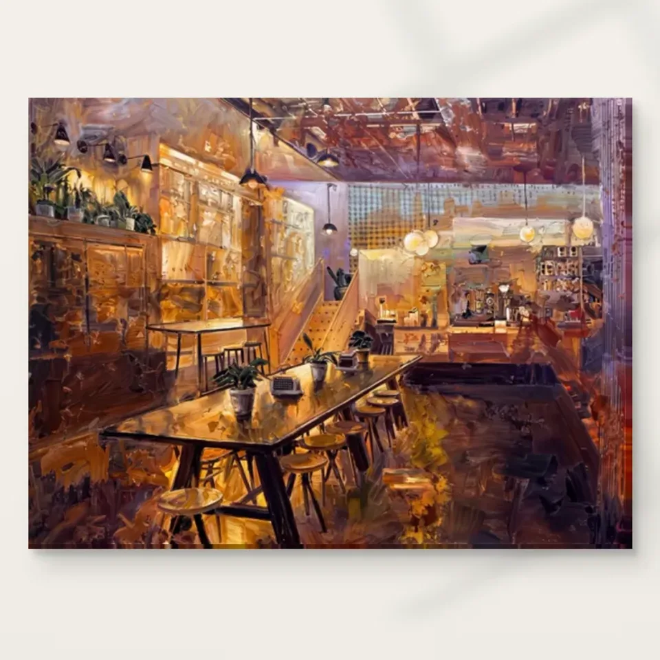
Golden Glow Cafe Interior Impressionist presents a cafe through warm illumination, rustic furnishings and a wealth of small details. The subject is recognisable, but the light is what makes the setting cohere. Begin by looking for the broad warm areas rather than identifying individual tables or decorative objects. Notice whether the brightness seems to gather the interior into one atmosphere or break it into separate pockets. A cafe can be represented as a clean architectural space, a crowded social scene or an accumulation of everyday things. This image places particular emphasis on a welcoming, earthy character. Its appeal depends as much on how the room feels visually as on the fact that it is a cafe.
For a buyer, that distinction matters. You might like coffee, yet prefer an image with simpler forms and cooler light. You might rarely visit cafes but enjoy the arrangement of timber tones, illumination and expressive marks here. Neither response needs justification through lifestyle. Select the print for the visual experience it offers rather than treating the subject as a badge of identity. Try asking what remains attractive if you temporarily forget the word cafe. Perhaps it is the warmth, the sense of depth or the way many details belong to a shared atmosphere. Those reasons are likely to remain useful even if the room where you hang it changes, because they concern the image itself rather than a decorating theme.
Look for the balance between invitation and visual density
An interior full of details can feel generous or crowded, depending on how the elements are organised. In Golden Glow, look at the relationship between the larger furnishings and the smaller marks around them. The tables and other broad forms give your eye places to rest, while the surrounding details reward a second look. You do not have to catalogue every item. Instead, notice whether you can move comfortably between an overall reading and local discoveries. A satisfying interior image often offers both: a quick sense of being welcomed into a place, then enough variation to keep it from becoming a simple background. That relationship is more useful to evaluate than the number of objects included.
If you are comparing this work with a minimalist interior or a still life, consider your tolerance for visual abundance. Some viewers enjoy a room-like picture that contains many small destinations for the eye. Others prefer one object isolated against a quieter field. The choice is not between sophistication and simplicity; it is between different kinds of attention. Spend enough time with the complete cover to see whether the details form a coherent environment for you. If you find yourself repeatedly pulled into unrelated fragments, the density may not suit your taste. If the warm atmosphere keeps bringing those fragments together, the image may offer a rewarding balance between structure and abundance. That balance is central to its particular charm.
Warmth is a relationship, not merely a gold colour
The title's golden glow does not mean that every passage is yellow or that the print contains metallic material. Warmth can emerge from the way earthy colours sit beside darker or cooler areas, and from the sense that light has spread across different surfaces. Consider where a warm note becomes most noticeable. It may be strongest next to a shadow or a more neutral passage rather than in the largest bright area. This is one reason not to judge the image from a colour swatch alone. A single extracted tone loses the relationships that make the whole interior feel illuminated. The glow belongs to the composition, not to one isolated pigment or object.
Likewise, do not assume that the warmth is a guarantee of how the work will make you feel. It may suggest comfort, leisure or familiarity, but those are responses rather than measurable product effects. You can enjoy the atmosphere without expecting the print to transform every room into a welcoming cafe. The selection question is whether the relationship of light and earth tones continues to interest you after the initial cosy impression. Look at the darker areas as carefully as the bright ones. If they support a convincing depth and rhythm, the work has more to offer than a warm overall cast. If your attraction is only to the title's promise of glow, compare the cover with another warm-toned image before deciding.
Does the impressionist handling matter more than exact detail?
The impressionist label points towards a way of looking in which atmosphere and visible marks can be more important than exact description. Use it as a starting point rather than as an attribution to a named artist or historical school. In this image, the furnishings and interior details are held within expressive handling. Ask whether you enjoy their partial definition. A sharply described chair tells you about a chair; a looser passage may tell you equally about light, colour and the movement of the marks. The subject remains accessible while the surface stays active. That combination can be especially appealing if you want recognisable imagery without the literal precision of a straightforward interior photograph.
To test this, alternate between a smaller complete view and a closer complete view. At the smaller scale, note the overall warmth and spatial arrangement. At the closer scale, see whether the brush-like marks add variety and interest. Avoid enlarging one tiny area so far that it ceases to represent normal viewing. The purpose is not to inspect imaginary physical paint ridges but to understand how the image is constructed visually. The printed work reproduces a textured appearance; it does not automatically supply an original painted surface. If you prefer crisp architectural edges, the loose handling may not be your ideal choice. If you like a room to remain suggestive rather than fully explained, it can be an important part of why this cafe image feels inviting.
A familiar interior need not have an invented address
Cafe imagery can prompt a viewer to recognise a place they have visited, even when no location is established. Golden Glow may remind you of a favourite corner, a holiday morning or a particular kind of neighbourhood interior. Those associations can be valuable, but they are yours. The verified product description does not identify a real cafe, owner, city or date. There is no need to supply one. The picture can operate through the familiarity of tables, warm light and rustic furnishings without becoming a document of a named business. Keeping that distinction clear allows personal memory to enrich the experience without turning resemblance into a factual provenance claim.
This is useful when giving the print as a gift or discussing it in a shared collection. Rather than saying it depicts a specific place, describe the quality that connects it to the recipient: an affection for warmly lit interiors, expressive colour or the ritual of taking time at a table. That is more accurate and often more thoughtful. If exact location is essential to your choice, choose a work whose identity is actually documented rather than asking this one to fulfil that role. Golden Glow offers an imagined or unspecified interior atmosphere. Its value can lie in being broadly recognisable without being tied to one address, leaving different viewers room to bring their own memories of spaces where they have paused, talked or simply enjoyed being indoors.
Compare it with a still life and with a street scene
Two comparisons can clarify why this image appeals. Beside a still life, Golden Glow offers a more expansive environment: objects belong to a room rather than standing alone as the entire subject. Beside a busy street scene, it offers enclosure and a different pace, even though its details may be plentiful. Ask which of those qualities you want in your collection. Perhaps you already own energetic exterior views and would welcome an interior counterpart. Perhaps your existing work is mostly abstract and you want a recognisable space without a dominant human face. The cafe can provide those contrasts, but only if you genuinely like its particular warmth and density rather than the category in general.
Do not assume that a dining-room or kitchen tag limits the work to those locations. The tags describe editorial suitability, not a rule about where the subject belongs. At the selection stage, consider whether you enjoy the image enough to see it in a room unrelated to food. If the answer is yes, its visual qualities are doing substantial work. If it seems appealing only above a coffee machine, you may be responding more to a theme than to the composition. That is not automatically wrong, but it is worth recognising. A deliberate thematic choice can be satisfying; an accidental one may feel limiting later. The strongest decision is clear about whether the subject, the atmosphere or the painted handling is the main attraction.
Use room visualisations without borrowing their certainty
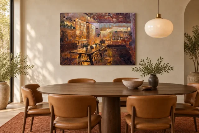
The current gallery includes existing room scenes that place the print among domestic furnishings. They can reveal how a warm interior image reads as a single object on a wall, rather than as a room you are visually entering. Notice whether the artwork remains distinct from its setting and whether its broad colour seems stronger or softer when surrounded by other materials. These are useful observations. They do not prove that the depicted furniture is included, that an installation really exists or that the picture is shown at your chosen size. Treat the visualisations as prompts for thought, not as measurements or testimonials. Your selection should survive removal of the staged context.
After looking at a room scene, return to the cover and spend a little longer with it alone. This prevents an appealing chair, lamp or wall colour from carrying the entire decision. Ask whether the cafe interior still has a coherent depth and a rewarding rhythm of details. You might also compare how the image looks against a plain light background and a darker surrounding screen area, without mistaking either for an exact wall preview. The aim is to notice the picture's independence. A work that interests you only when supported by one particular styled room may be less adaptable than you expect. A work whose warmth and organisation remain compelling on their own gives you more freedom when planning its eventual setting.
Choose a support without confusing glow with gloss
The word glow describes the image's lighting, not a requirement for a glossy finish. A matt canvas can carry a warm scene, and a photographic paper can offer its own surface character. Neptune Natural Matt Canvas 400 is specified as 100 percent cotton at 400 gsm, with a naturally warm base and irregular weave. Compatible poster choices include Oyster 271 pearl or satin photographic paper and Photo Lustre 310 photographic paper. These are concrete material facts. They do not establish a guaranteed visual effect under every light, nor do they prove a particular origin for the source image. Consult the product's available choices and the material guide before deciding which presentation fits your intentions.
Optional light, selective hand-finishing should be treated separately from the ordinary print. It is not automatically included because the image contains expressive marks, and it should not be described as real gold leaf or a complete reconstruction of thick paint. Similarly, a warm palette does not imply a metallic surface. Decide first how you want to present the print and whether you will arrange framing. Then choose the support and finish that are actually offered for that route. Supplier further reading can help explain a paper or canvas specification, but it cannot decide your visual preference. The cafe's light should remain convincing through its colour relationships, not through an assumed reflective coating that the product has not promised.
Choose the atmosphere you actually want to revisit
A final selection test is to imagine the image without the rituals associated with cafes. Would you still enjoy the interior's warmth, its accumulated details and its loosely described space? If so, you have identified visual reasons that can support a lasting choice. If not, decide whether the theme itself is enough for your purpose. Both are possible, but they lead to different expectations. An image chosen as visual company should reward looking beyond its subject label. An image chosen for a coffee corner may be satisfying because of that specific connection. Clarity about the reason helps you avoid disappointment and makes it easier to choose an appropriate presentation rather than following the most decorative room example.
Golden Glow Cafe Interior is a plausible selection for someone who enjoys expressive, warmly lit spaces and the invitation of an interior filled with ordinary things. It need not be read as a record of a real venue or a guarantee of relaxation. Its particular strengths are available in the image: light that gathers earthy tones, furnishings that establish depth and details that extend the first impression. Review the exact cover, current options and material descriptions together before ordering. Then let your choice remain specific. You are not buying every idea associated with cafe culture; you are choosing this arrangement of warm light and interior space. That narrower, clearer reason leaves plenty of room for personal associations without asking unsupported claims to justify the work.
Continue with this artwork
Find your next artwork
Three ways to trace the table, lamps and floor
Read more: Three ways to trace the table, lamps and floorRead less: Three ways to trace the table, lamps and floor
The Golden Glow Café composition leads past a long table towards a warm interior. Pale globes sit to the right and darker pendant shapes appear overhead. The brightest areas do not form one uniform patch. They let you read the room in stages, even when the smaller objects are hard to identify.
Try three routes through the cover. Begin with the table and its lower edge. Then compare the separate kinds of light. Finally, look at the darker foreground and the opening behind it. The subject suggests a café, but the design does not establish a particular address or time of day.
Golden Glow Café composition route one: follow the long table
Start near the near-left corner of the table. Follow its dark edge as it runs towards the middle distance. Then look just below it. The shapes of stools repeat along the side, although their positions and sizes vary. They give you another route into the scene without needing a line you can trace from end to end.
There are small potted forms on the table. Compare one that breaks the line of the nearer edge with another farther along. Which object interrupts the movement most? The size of the interruption depends on where you look. A small feature can make the table feel longer by separating one passage from the next.
The National Gallery's explanation of perspective provides a way to discuss apparent depth. Here, the table is one clue among several. The left wall and the paler forms at the back help too. Trace the table first and then see what direction those other areas add.
Compare the two sides of the table in the Golden Glow Café composition
Look along the upper surface, then compare it with the row of darker legs underneath. The surface has pale and amber areas. The marks underneath separate the stools and table from their surroundings. Since their shapes differ, you can keep your place even as their edges blur in a smaller image.
Try covering the nearest part of the table for a moment. Leave the bright opening and lamps in view. The room may still feel deep. Then reveal the table and see how strongly it fixes your position as a viewer. That change is a useful difference between the sense of a room and the sense of looking into it from a particular place.
Look at the table edge just to the left of the nearest plant. Some pale marks on the surface take a route different from the outline. Compare them with the lower silhouette created by the legs. If the surface catches you first, the table can look wide before you notice how strongly it moves back into the room.
Golden Glow Café composition route two: test where brightness gathers
Compare one dark pendant shape overhead with a pale round light at the right. The darker one can show up as a silhouette, while the pale globe has a bright body. Those are different kinds of emphasis. In both cases, the surrounding tone matters as much as the shape of the lamp.
Now follow the brighter left-hand stretch of cabinets or windows. It offers a larger passage of warmth than the small round lights. Work along it in sections rather than treating it as one block. After that, return to a globe. Are you drawn towards the small high point or the longer strip?
The Tate description of tone gives a way to separate lightness from hue. Try choosing two warm patches of different lightness. Then compare a pale cooler patch to the warm one. That comparison helps explain why a beige area can still look bright beside oranges and browns.
Read one lamp at a time in the Golden Glow Café composition
Choose a pale globe close to the right. Hold your attention there for a few seconds, then look at the space directly below it. Some warm marks gather near the counter area. Others turn much darker towards the foreground. The brightness of the globe does not tell you how every neighbouring area must appear.
Think about the differences without attributing a specific lighting system. A photograph of this image cannot confirm which fittings, materials or bulbs appeared in a real venue. Our guide to impressionism and looking at light gives a different example of asking what visible colour does before naming a scene.
Try to map the lights using a single word for each visible shape. You might write long for the glowing area on the left and round for the spots on the right. Then put a short mark where a dark pendant interrupts the warm field. The notes may show why the scene feels illuminated even though darkness has a deliberate place in it.
Golden Glow Café composition route three: give the quieter floor time
The lower right contains purple-brown and dark marks. They form a broad wedge beside the route of the table. Start there instead of at the lamps. Then look for a smaller patch of gold near the table. A dark area can lead into the picture rather than merely marking somewhere the light has stopped.
Notice that the stairs or rising pale forms near the middle set a direction different from the tabletop. They lead up as the table moves back. Trace each with your eye. Although both point towards the interior, they do not leave you looking at the same place.
Compare the dark edge and the upper structure
Look briefly at the pattern along the ceiling. There are lines, warm interruptions and some dark areas beyond the lamps. Then return to the floor. See whether the movement overhead seems busier while the darker lower area offers a wider pause. The route can slow down even when the subject contains many details.
Our explanation of visible relief and light helps distinguish the look of raised marks from a stated physical finish. Some floor marks in the café artwork can appear textured. However, their appearance does not show what a chosen print or studio finish will feel like.
Follow two paths out of the Golden Glow Café composition
Find the dark shape at the lower right and follow the first narrow lighter break you can see. Then try starting just under the table and working outward instead. The two routes do not have the same speed. This makes the foreground more than an area that the viewer must cross to reach the bright centre.
On a smaller view, try to keep those two routes in mind at once. If they simplify into one large dark field, widen the view again. Check whether the dark passage is still important even if you overlook some of its detail. It can give the brighter table a boundary without becoming a distinct subject of its own.
Repeat the test with your gaze near the lighter stair-like passage. A pale vertical can draw the eye upwards while the tabletop keeps pointing back. Both routes can be available in a close view.
Take the close view back to a room
In the dining-room illustration, the artwork appears above a real-looking table and near a pale pendant. Compare the dark diagonal table in the image with the smoother oval shape in the room. Notice whether the similar subjects help each other or make the picture busier. That is a useful test, not a rule to duplicate café furniture.
If you buy wall art to read from a seat or doorway, test whether the table and light still stand out in a reduced view. The companion display guide suggests a way to compare those viewpoints. Keep your own dimensions separate from the size a styled scene implies.
When you buy artwork, read the Golden Glow Café Interior product listing for the actual option. If you began with hand made wall art, check what the term refers to and what is documented for the selected finish. The photographed scene does not establish a way of making the order.
Compare another example from the impressionist wall art collection. Look for a design whose brightest area is open rather than divided by furniture. Return to Golden Glow and decide whether the dark passages or the pale reflections matter more to you. That explains more than a general preference for warm colours.
Frequently asked questions
Where should I start with the Golden Glow Café composition?
Start at the nearest corner of the long table and follow it towards the room. Then look up to the pale globes. You can compare a directional edge with a small point of brightness before examining more detail.
Does the diagonal table make the room feel deeper?
It offers one clear route into the scene. The stools, large wall areas and changes in scale support that reading. You can follow the table with other parts covered, then see what happens when the whole room comes back into view.
Are the lamps all the same sort of visual highlight?
No. Some dark shapes stand out against a lighter surround. Others are pale round marks. Compare their edges and adjacent tones. Their brightness and the visibility of their outline are different qualities.
Does the Golden Glow Café composition show a named café?
The title identifies an interior subject. The design does not give enough evidence to identify a particular place. It can still show a relationship between tables, warm walls and separate light sources without a documented address.
Why is the lower-right area darker?
It forms a passage beside the table that gives the lit areas a contrast. That is an observation about how the image reads, not a claim about where a real lamp stood or how a room was lit.
What do the small plants contribute?
They break the longer diagonal of the tabletop. Try following their positions from near to far. Some are clearer than others, which helps you compare the long edge with shorter visual stops.
Can I tell what materials are used in the café?
You can describe the visible effects and shapes. Do not infer a particular wood, metal or wall treatment from them. Treat visible colour as an attribute of the image, not evidence of an actual interior specification.
Does the Golden Glow Café composition work at a reduced size?
The warm lights, table edge and darker floor can remain evident after tiny details merge. Use a smaller view to test what matters to you. Then check that the real dimensions can give you the view you want.
How can I compare the brightest areas?
First, find one pale globe and one longer warm passage. Compare the area each occupies. Then notice how each borders a darker section. That makes it easier to see why a small spot might seem as strong as a larger one.
What does the dining image add to the cover?
It gives a separate setting in which you can consider a viewing distance and nearby furniture. The cover is better for exact image features. Use the option measurements rather than assuming the dining photograph depicts the size you will receive.
Do the printed marks prove a raised finish?
No. Differences in light and colour can make a feature appear raised. Use the written product and finish details for the item. If the actual surface matters, check what the specific selection includes before making the order.
What should I compare with another interior picture?
Try a second work with fewer light sources or a shorter foreground. Compare the route from the nearest edge to the bright area. This makes clear whether you prefer the sense of walking into the room or the effect of its colours alone.
Conclusion: follow the light through the room
Trace the table, the separate highlights and the darker area. Check which view from your own room would make those relationships easy to read. Then compare the actual available dimensions and finish rather than choosing by a staged setting alone.