Living with art
Living with a Reflective Gathering: Blue, Space and Everyday Use
Give Gathering in a Ruined Room a thoughtful setting with practical advice on sightlines, blue accents, shared rooms and presentation, while avoiding a staged or distressed-theme interior.
Decide whether the room invites looking or passing
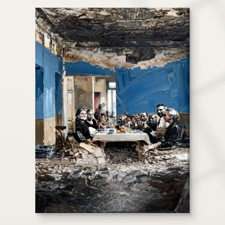
Gathering in a Ruined Room contains a social scene that rewards more than a passing glance. Before choosing a wall, decide whether your room can offer that kind of attention. A living-room chair, reading corner or home-office pause point may provide a better encounter than the busiest passage in the house. This does not mean the artwork must be hidden in a private room. It means that the group around the table should have a chance to register as people rather than a small blue pattern glimpsed while rushing past. Walk through your space and identify where you already stop, turn or sit. Those existing habits are useful evidence for placement.
Try describing the wall's daily role. Is it behind the main conversation area, opposite a desk or visible from a dining table? Each position creates a different relationship with the depicted gathering. Behind a sofa, the picture may help establish an overall atmosphere but receive less close attention. Opposite a chair, it can become a scene you revisit. Near your own dining table, the parallel between two gatherings may be engaging, but it may also feel too pointed if you prefer a lighter mood at meals. None of these outcomes is automatic. The practical task is to imagine the encounter honestly, using the room as it is actually lived in rather than as an empty floor plan or a single photograph.
Must the wall repeat the gathering's blue tones?
The artwork's blue environment can connect well with a room without requiring blue paint behind it. Start by identifying existing cool notes: a grey textile, a muted ceramic glaze, the colour of a bookcase or even the cooler tone of a stone surface. One modest connection may be enough. If you introduce a new accent, choose a quieter version of the blue rather than trying to replicate every passage. The image contains worn surfaces, light and variation, so no single paint swatch can reproduce its atmosphere. A related tone creates continuity while allowing the picture to remain a separate object. Exact matching can flatten that distinction and make a rich composition seem like a decorating sample.
Warm surroundings can be equally useful. Timber, softened cream and earth-toned fabrics can provide contrast to the cooler room within the image. This is especially helpful if you want the gathering to feel present rather than visually receding into a blue wall. Test any proposed paint or textile in the actual light before committing. A colour that appears neutral beside a small screen may turn greener or more purple next to the print and your furnishings. There is no need to solve all of these relationships before ordering, but the larger permanent surfaces deserve care. Begin with what you own, choose one connection and one contrast, and stop before the room becomes an attempt to reproduce the pictured interior.
Do not turn the house into a replica of the scene
The distressed setting is part of the artwork's content, not a requirement for the surrounding room. It can be tempting to add weathered objects, peeling finishes or numerous vintage pieces to reinforce the image. That approach may work in a carefully considered interior, but it can also become literal and heavy. A well-kept, straightforward room often provides a clearer setting because the depicted deterioration remains within the image. The contrast allows you to contemplate the scene without feeling that every nearby object is illustrating the same story. You can appreciate the atmosphere of worn architecture while maintaining a practical, comfortable home with surfaces chosen for your own needs.
Consider a simple example: a blue-toned print above a clean-lined oak cabinet, with one lamp and a small stack of books. The timber provides warmth, the broad cabinet creates a stable base and the limited objects leave the gathering legible. The arrangement does not need a distressed mirror, antique bottles and aged plaster effects to become meaningful. If you already own older furniture, keep it for its usefulness and character rather than treating it as a prop. The goal is a relationship between your life and the work, not a theatrical reconstruction. This is particularly important with an emotionally complex image: restraint around it can prevent the whole room from feeling staged as a meditation on decline.
Give faces and gestures a comfortable viewing distance
A figurative group can become frustrating if placed where the viewer is either too close to take in the whole image or too far away to perceive the people. Use a wall-safe paper outline in a size available through the current configurator, then test it from the places where you expect to look. Imagine the complete group within that outline. Do you have room to step back? Does a dining chair or desk force you into an awkward angle? Are the lower parts likely to be obscured by plants or objects? These are practical checks, not instructions to follow a universal hanging height. Your furniture, ceiling and normal viewing posture should shape the decision.
If framing a paper print, include the planned outer frame dimensions in the outline. If choosing rolled canvas, establish the finishing method before relying on the artwork dimensions alone. The product distinguishes selected image size, printed allowance and supplied flat dimensions; those are not interchangeable. A stretched option uses the chosen front-face dimensions with wrap stated separately. Read the current display rather than quoting a remembered margin from an older product. This preparation is particularly worthwhile for a scene with a shared table, because cropping by furniture or an overly low position can change the composition's centre. The practical aim is to preserve a clear view of the gathering as a whole, not simply to fit a rectangle between two obstacles.
Should a picture of a gathering face your dining table?
A picture of people around a table naturally raises the possibility of hanging it near your own dining area. The connection can be thoughtful, but it should be tested rather than assumed. Ask how the image's distressed environment and dim atmosphere feel during the meals you actually have. A room used for long conversations may welcome an unresolved social scene. A bright family breakfast space may need a different emotional register, or the print may work better on an adjacent wall than directly opposite every seat. Look from each chair, not just from the doorway. Some people may have the picture in view for much longer than others, and a shared space should account for that difference.
Avoid placing it where steam, splashes, food handling or repeated chair movement create unnecessary risk. The fact that a print is suited editorially to a room type does not make every wall in that room appropriate. If the dining area opens directly onto a kitchen, consider the actual conditions rather than the label on a floor plan. A more protected wall slightly farther away may provide a better experience and simpler care. You can still establish a relationship through sightline and colour without hanging it beside a hob or sink. The image is about a gathering, but its practical setting should be determined by the finished print's needs and by your routines, not by the desire to create a perfect subject-to-room match.
A home office can offer a separate reflective zone
In a home office, the work may be most useful as a picture to turn towards rather than a backdrop directly above the monitor. Its layered scene can reward a break from close screen work, provided the placement gives you a comfortable view. A side wall visible from a chair or a small reading area can create that separation. Test the wall while the office is in use: cables, shelves, task lighting and papers change the composition of the room. The artwork does not have to hide the practical nature of the space. It simply needs a distinct area in which the figures and blue environment can be seen without being visually cut up by equipment.
If the office doubles as a guest room, consider the picture from both functions. A wall that is excellent from the desk may place the scene directly above a sleeping position or behind a door when the bed is opened. Shared-use planning often reveals a better compromise early. You might choose a less dominant wall but a clearer sustained view, or keep the surrounding textiles lighter so the artwork's reflective mood does not define the whole room. Do not promise yourself that one art purchase will improve productivity or create a particular emotional outcome. What you can plan is a coherent visual arrangement with a usable viewing position. The rest remains a personal response that may vary with the day and the activity.
Let lighting reveal the scene without dramatising it
The image already uses dim atmosphere and contrasting detail. It does not need a theatrical spotlight to make it meaningful. Begin with the room's existing general light and check whether the people remain visible during the hours you use the space. If adding a light, choose its position to support comfortable viewing rather than to create a bright pool with dark surroundings. A lamp placed too close can produce distracting glare on a framed presentation or an uneven patch of illumination. Evaluate from the actual chair and from the doorway. An arrangement that looks striking while standing beside the wall may be uncomfortable from the normal viewing position.
Daylight deserves the same practical attention. Avoid unnecessary direct sun and strong heat sources, and consider seasonal changes rather than only the conditions on installation day. A wall that is shaded in autumn may receive more direct light at another time. These are general care considerations, not a guarantee of preservation or a claim that ordinary indoor conditions are risk-free. If you are unsure about a chosen presentation, ask a competent framer or supplier for advice specific to it. The Canadian Conservation Institute's basic painting-care guidance can help frame sensible questions about display and handling. It should be read as general further information, not as certification that this print has the same construction as a historic painting.
Separate the finish decision from the mood of the image
The scene's worn surfaces and expressive marks may make a textured support appealing, but choose the format through the actual options. Neptune Natural Matt Canvas 400 is a cotton canvas with a stated weight of 400 gsm. Compatible paper choices include Oyster 271 and Photo Lustre 310 photographic papers. The products do not become equivalent simply because they carry the same image. Rolled formats require handling and presentation decisions after delivery, while stretched canvas is offered as ready to hang. Optional light, selective hand-finishing remains separate from the ordinary print. Do not assume that a title, a blue wall or a visibly expressive brushstroke determines which finish is included in your order.
Plan the practical sequence before the object arrives. If it needs framing, know where it will be stored safely while awaiting that work and who will handle it. If it is stretched, identify suitable wall fixings for the wall construction and the supplied object rather than improvising from an unrelated picture hook. Keep care and installation proportionate to the actual presentation. No surface should be treated as waterproof, and depicted debris is not a reason to neglect the finished print. Clear planning protects the reflective experience you wanted: the image can remain the complex element while the purchase, framing and wall arrangement are straightforward. That distinction makes living with a demanding subject easier than surrounding it with equally complicated practical choices.
Review the room after removing one unnecessary thing
A useful final styling test is subtraction. Stand at the main viewing position and remove one nearby object that competes with the picture: a small ornament, a second framed image or an overly prominent textile. Observe whether the gathering becomes easier to read. If it does, you have found a practical adjustment without buying anything. If the wall then feels too bare, restore the object or try a quieter alternative. The exercise is not a doctrine of minimalism. It is a way to identify which elements contribute to the arrangement and which merely occupy space. An image with a group, a table and distressed architecture already has several layers of interest; its surroundings do not all need equal visual weight.
The finished room should remain recognisably yours. It can accommodate books, family possessions and everyday use while giving the artwork a clear field. Keep the strongest blue connection modest, choose a viewing position that allows the people to register and avoid turning the distressed setting into a decorating theme. Recheck the exact product dimensions and presentation before ordering, then allow for small adjustments once the print is in place. The goal is not to guarantee a particular mood. It is to create conditions in which the work can be encountered thoughtfully, with enough comfort and clarity that its unresolved gathering feels like an invitation to look rather than an obligation to solve. That is a practical form of respect for both the image and the room around it.
Continue with this artwork
Find your next artwork
Four checks for keeping the room and figures in view
Read more: Four checks for keeping the room and figures in viewRead less: Four checks for keeping the room and figures in view
A Ruined Room Gathering wall display gives you a choice about how closely you want to read the people around the table. From one position, the blue wall and white cloth may be enough. From nearer in, the figures and broken-looking edges begin to matter. Find a position that suits the kind of view you want each day.
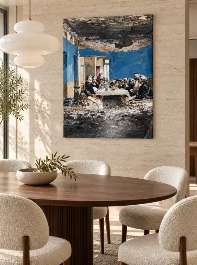
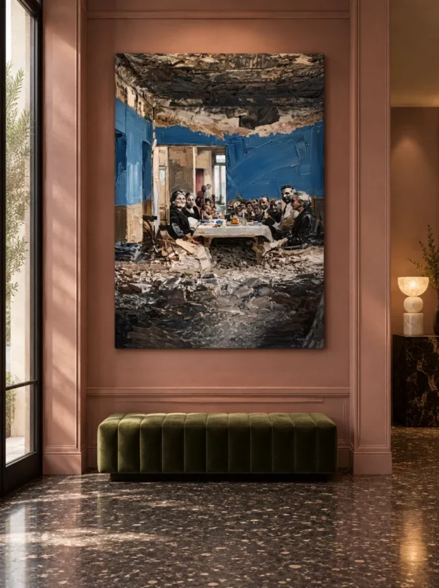
Two illustrations show this artwork in different arrangements. It sits beyond a dining table in one. In the other, it occupies a wall above an olive-coloured bench. Use them to compare height, light and attention. Then use the measurements of your own wall instead of copying either view.
Ruined Room Gathering wall display check one: set a useful viewing position
Stand where you usually enter the room. Mark the upper and lower ends of a possible position with a temporary paper footprint. Then move to the place you might look at it for longer. In a dining room that may be a seat nearer one end of the table, not its centre.
Set a small reference point inside the outline for the group of faces. Then put one a little lower to represent the dark foreground. If both stay clear when you sit, you can consider the image as a whole. If one point disappears behind a high chair back, look for a different position first.
The visual guide to Gathering in a Ruined Room gives you landmarks for this exercise. Compare how much of the bright table and the blue walls you expect to read from your seat. Then ask whether you need the faces to remain clear at that distance.
Test a second approach for Ruined Room Gathering wall display
The dining photograph does not show the view from every chair. Try both ends of your own table. A tall piece might leave its central group visible while the lower area becomes harder to see beyond a lamp or another person. Note that difference before choosing a height.
If instead you want a work that marks the entrance, test the first few steps into the room. See whether the picture is likely to arrive as a tall patch of blue or as a gathering of people. Those are both valid first impressions. Choose the one that suits the intended spot.
Ruined Room Gathering wall display check two: let nearby objects support the view
The painted table has a different outline from the broad dining table in the room photograph. They need not line up or match. A longer horizontal surface in front of the picture can make the artwork's upright format clearer. See whether that effect still works with the furniture you use.
Above the bench in the other illustration, the picture has space below it. At home that gap might change if someone puts a bag on the bench. Check the usual position rather than a tidy version of the room. Keep the lower edge clear from the approach where you want it visible.
Consider the nearby colours separately. The cool blue can stand out against a warm room, as the bench illustration suggests. You do not need to repeat that blue. Instead, ask whether a nearby saturated colour draws attention off the work. Test this with one movable object before changing anything permanent.
Compare the height needed for Ruined Room Gathering wall display
The living-room collection gives a chance to compare tall and wide designs around furniture. Keep the normal clear area of your wall in mind while you browse. If the picture you like feels too tall for a position, shifting its outline may help before you change the chosen size.
Try the bottom margin at two positions. Which keeps the larger lower passage away from furniture without pushing the group out of an ordinary view? Measure the change rather than only taking a photograph. It will be easier to apply that result to the dimensions and mounting you eventually select.
If you have other wall art nearby, compare how each piece looks from the entrance. A second design with a very strong edge may take your attention away from the people around the table. Try leaving more interval before adding a matching colour. The first question is whether each piece gets the view you want.
Ruined Room Gathering wall display check three: look in daylight and evening light
Stand in the earlier viewing position when you normally use the room. If there is daylight, note what changes across the outline rather than just whether the room is bright. Then repeat with the lamp or pendant in its ordinary position. A floor lamp that serves a chair need not be moved to match a styled image.
The Canadian Conservation Institute's explanation of light and display gives context about exposure. Use the applicable care details for the actual format you choose. A room photograph is not a recommendation about keeping every material near a window or under strong light.
Separate a bright reflection from a pale patch within the artwork
Stand slightly to one side of the usual view. If the bright area appears to move, compare that effect with the tablecloth, whose position inside the image does not change. The darker top and foreground are good landmarks to use beside it. The large blue region can then help you judge whether the whole impression remains clear.
If the available wall only works in the middle of the day, consider another position. Think about ordinary use instead of perfect conditions. A quieter view after dark might suit you better than an impressive first view you rarely have time to see.
Ruined Room Gathering wall display check four: measure the exact version before committing
Open the Gathering in a Ruined Room product listing and use the stated dimensions of the option. Mark its complete outline, including any outer edge that the listing says forms part of it. If a usable wall section is interrupted by a window or shelf, measure the remaining area rather than the total span.
The National Gallery's note on frames distinguishes the object around the picture from the subject inside it. Check whether the chosen format includes an outer frame and its measurements when listed. Do not infer those details from the shape of a display photograph.
People who buy wall art sometimes think first about whether the image suits a room. Keep that decision separate from what the item needs before it goes up. The guide to comparing ready-to-hang costs helps you list preparation and mounting separately where relevant.
When you buy artwork after a hand made wall art search, determine which part the description applies to. Our explanation of canvas and paper surfaces describes why the object and the visible image can tell you different things. The product option, not the picture, specifies what you will receive.
Keep the possible change reversible
Use paper markers or a freestanding board appropriate to the wall until you know the intended position. Try normal activities with the footprint in place. Walk around the dining table or sit near the bench. Check that you still want to see the work after the ordinary objects return.
If two sizes seem viable, mark them on separate sheets or label their corners. Then look at each from the same seat. Ask which one keeps the human group legible without minimising the ceiling and foreground. The better answer need not be the size that most resembles an illustration.
Do one test from the end of the table with the chairs pulled out as they usually are. Another person may temporarily occupy the closest seat, so do not depend on having all the space to yourself. If the outline is only readable from your chair, decide whether that is the right priority. For an alternative, try the bench wall or another spot you often pass. A view that works for more than one ordinary use can be worth the change.
Take a note of which view preserves the dark top without cropping the field below the table. That gives you a concrete reason to keep one footprint over another.
Frequently asked questions
Where should I start with a Ruined Room Gathering wall display?
Use the place where you expect to see it most. Then compare that with a second spot, such as the doorway or the far side of the table. Your usual viewpoints are more useful than standing directly in front of the wall.
Must it hang over a dining table?
No. The table in the image and the table in the room photograph are separate. A quieter wall near a bench or sofa can work just as well if the upper and lower areas remain visible.
Does a Ruined Room Gathering wall display need blue or green furniture?
No. The pictured blue can provide its own accent. Try the design beside the colours you already use. An additional colour can either support the image or compete for your attention, so compare both views before changing the furniture.
How can I tell whether the dark top is too close to other objects?
Keep the top of the paper outline visible. Check it against lamps, shelves and other nearby edges from the place you sit. If the outline seems to merge with a taller object, compare a modest position change before reducing the size.
Will I recognise the faces from across the room?
That depends on viewing distance, scale and light. Test the cover at a smaller on-screen size and compare the broad group with the smallest details. Decide which kinds of detail you need to remain available before choosing a format.
Does the dark foreground need a brighter wall?
Not as a rule. The edge may stand out or recede depending on the light and nearby colours. Compare one lighter and one darker surrounding surface before deciding that the picture requires a particular background.
Can I choose dimensions from the bench illustration?
Use it as an example of clearance, not a size chart. The bench and panelling will differ from the ones in your room. Find the actual dimensions of the selected option and mark them against the wall you intend to use.
Is window light always suitable for the picture?
No. Observe direct exposure and reflections separately. Use the care information that applies to the material and format you choose. The room illustration does not establish how a real installation will behave across a day or season.
Does a Ruined Room Gathering wall display suit a shared room?
It can. Ask which viewpoint and activity matter to the people using it. For example, you may want a design that reads from several seats without making one person move a lamp they use. Try a reversible footprint first.
Should the small details dictate a bigger option?
Not necessarily. If you enjoy the relationship between the pale table and dark spaces, those larger shapes may matter more from a distance. Choose a size that fits the wall and gives you the level of detail you actually want.
Does the pictured surface determine what I would get?
No. The photograph shows the design. Use the written details to identify the support, exact format and finish in the order. A photograph is not evidence of physical relief, frame inclusion or the way the item will be delivered.
When should I keep a shortlist instead of ordering?
Wait if the measurements are unclear or the room position only works when you move important furniture. Check the selected dimensions and finish once more. A choice that remains uncertain is easier to reconsider before it arrives.
Conclusion: leave room for the group and its surroundings
Choose the position where the people, the blue wall and the lower area give you a useful view together. Keep the scale and lighting of your real room in the decision. Then check the available product options before making the choice.