Looking closer
A Table, Blue Walls and the Unfinished Story of a Gathering
Look closely at the people, damaged setting and blue-toned atmosphere of Gathering in a Ruined Room, without inventing a history for the figures or reducing the image to decay.
Start with the relationship rather than the ruin
Gathering in a Ruined Room Expressionist places people around a table inside a distressed interior. The peeling blue walls and scattered signs of deterioration are immediately evocative, but the gathering is just as important as the damage. Begin by considering the relationship between these two elements. Does the room seem to enclose the people protectively, or does it press upon them? Does the table organise a shared moment, or does it emphasise the distance between individuals? These are visual questions rather than requests for a definitive story. The same composition may suggest endurance to one viewer and uncertainty to another. Its interest lies partly in allowing those different readings to remain possible.
For selection, this means the work should not be judged simply as a blue interior picture or an image of architectural decline. It contains human presence, social arrangement and a setting that refuses to be neutral. A viewer who wants a cheerful, uncomplicated dining scene may find its ambiguity too strong. Someone who enjoys pictures with unresolved relationships may value exactly that quality. Look at the complete cover before concentrating on damaged surfaces. If the people and their shared space still engage you after the initial atmospheric effect wears off, the work offers a more durable reason to choose it. The room is not only scenery; it participates in how the gathering is understood, while the gathering prevents the room from becoming an empty study of decay.
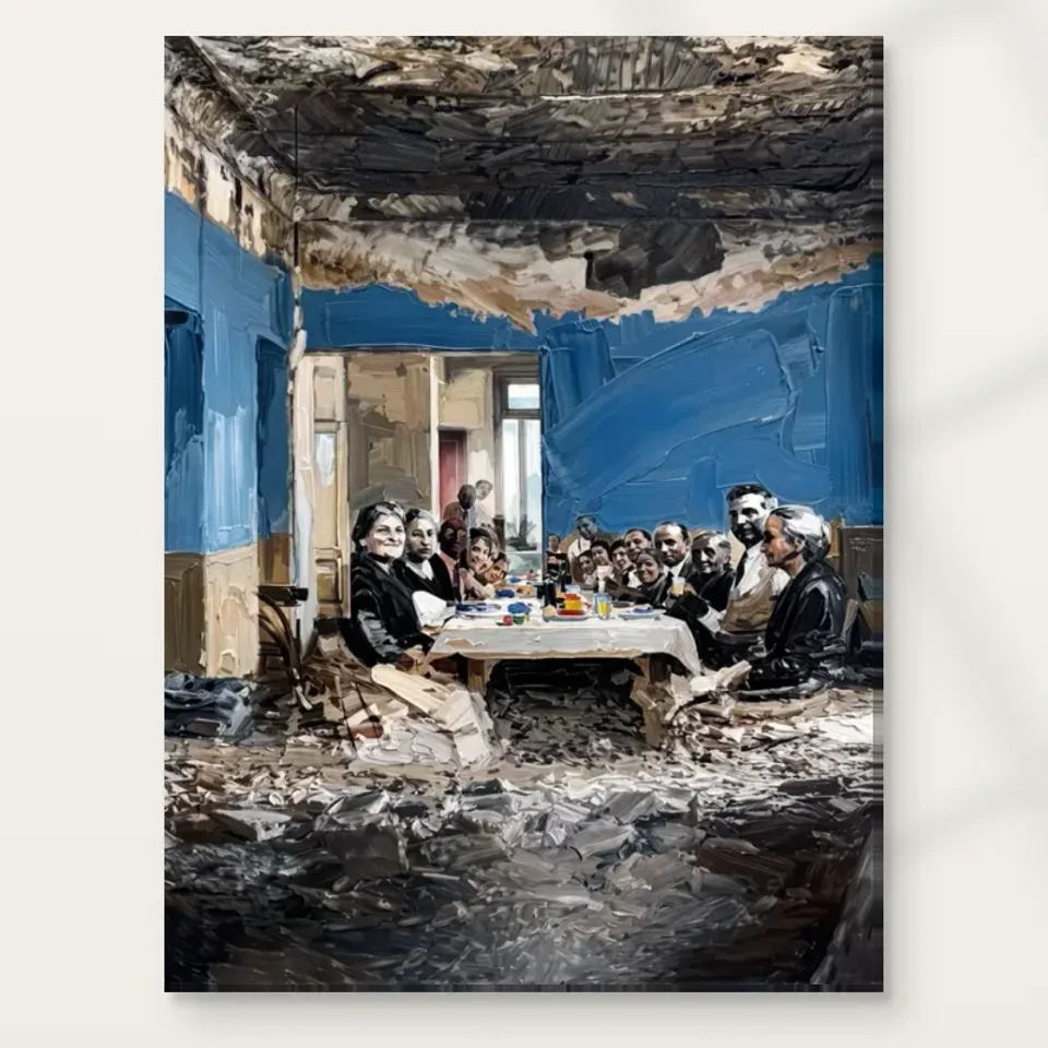
What does the shared table contribute to the scene?
A table is a familiar organising device. It gathers bodies, directs gestures and establishes a common area even when individual expressions remain hard to read. In this image, that familiarity helps the eye enter a more unsettled environment. Follow the table's edges and then look at the figures nearest them. Notice whether the shared surface connects the group as strongly as the surrounding architecture separates it. You do not need to identify a meal, meeting or occasion to appreciate this structure. The everyday object gives the composition an intelligible centre, while the expressive treatment keeps the situation from becoming a literal illustration with a single caption.
That balance can be important if you are choosing between figurative and abstract work. The gathering gives you recognisable subjects, but the emphasis on texture, dim light and deteriorating surfaces leaves considerable room for interpretation. The picture is therefore not wholly dependent on facial detail. It can be read through spacing, posture and atmosphere as well as through the identities of individual figures. Try looking at it briefly from farther away on screen. If the group remains coherent as an arrangement, you are seeing one of the composition's structural strengths. Return closer and assess whether the variations hold your attention. The useful question is whether both readings feel rewarding, not whether every element can be named or assigned a dramatic role.
Does a blue room necessarily make the gathering peaceful?
The blue-themed room is a defining feature, yet blue does not automatically make a picture peaceful. Here it belongs to walls that appear worn and to a setting described through expressive marks and dim illumination. The colour can feel atmospheric, cool or inward-looking depending on what you notice first. Observe how the figures register against it. Do warmer or brighter details bring them forward? Do darker passages connect them to the room? Such relationships are more informative than a general statement that blue is calming. Colour acquires its character from its neighbours, its extent and the kind of forms it describes. A distressed blue wall and a clear blue sky would create very different experiences even if their hues were related.
If blue is the reason you first noticed this work, test whether the attraction survives when you think about its human subject. You may want the image because it introduces a cooler palette into an otherwise warm collection. That is a useful starting point, but the gathering will still be there every day. Conversely, if you are interested in the group, consider whether the cool atmosphere strengthens that interest or creates an emotional distance you do not want. Selection becomes clearer when you separate those questions before bringing them back together. You are not choosing a colour sample with a convenient subject attached. You are choosing a particular interaction between people, painted environment and light, with blue carrying much of the atmosphere.
See Gathering in a Ruined Room and the available print choices
Distress is depicted, not a documented historical event
Peeling walls, crumbling architecture and debris can prompt a viewer to imagine a past. It would be easy to invent a war, an abandoned city, a family history or a political explanation for the scene. None of those narratives is required by the verified product description. Keep a distinction between what the image shows and what you bring to it. You can say that the room appears distressed and that the gathering feels reflective to you. You cannot responsibly turn that impression into a factual account of the people's lives. This restraint does not make interpretation less interesting. It keeps the image open rather than closing it around an unsupported story.
The same caution applies to the figures' relationship. A group around a table may be read as a family, friends or participants in a meeting, but the public copy does not establish a named group. When discussing the work with others, questions such as what holds this gathering together or how the room affects the people are more productive than assertions about who they must be. If you prefer artwork with a known narrative, documented place or identified sitter, recognise that this picture offers another kind of engagement. Its appeal depends on ambiguity and visual suggestion. That can be a strength in a collection designed for recurring conversation, but it should be chosen deliberately rather than mistaken for a historical document.
Texture changes the reading of an ordinary interior
An ordinary room can be described by clean edges and stable surfaces. Here the expressive, textured appearance makes stability uncertain. A wall does not simply stand behind the group; it carries marks that compete for attention. The eye can shift between the social scene and the surface through which the scene is rendered. Try alternating those readings consciously. First see people in a room. Then see areas of blue, pale marks, dark shapes and interrupted edges. The moment when one reading becomes the other is part of the work's interest. It can keep the composition active even after you have become familiar with the arrangement of figures.
Do not confuse that visual texture with a promise about the physical print. A reproduced brushstroke can suggest depth without being a raised layer on the supplied material. The print is available through the current product options, and any light, selective hand-finishing is a separate choice where offered. The image's distressed surfaces also do not mean that the finished object is intentionally damaged or aged. These distinctions matter because atmosphere can easily spill into assumptions about production. You may appreciate a weathered appearance while wanting a clearly specified contemporary print. Examine the complete product information for material and presentation, then let the texture function as part of the image's language rather than as evidence of an original painted surface being supplied.
Compare emotional weight rather than dramatic labels
Words such as haunting, nostalgic or melancholic may describe a response, but they can also obscure what actually produces it. Instead of accepting a dramatic label, identify the visual feature responsible for your reaction. Perhaps the dim room gives the group a withdrawn quality. Perhaps the table feels like a point of continuity amid a damaged setting. Perhaps the close gathering seems reassuring despite the environment. Naming those causes makes it easier to decide whether you want the image in your daily life. It also allows another viewer to disagree without either person being wrong about a supposed fixed meaning. The work can carry emotional weight without prescribing one emotion to everyone.
A useful comparison is a brighter social interior or an empty room scene. Against the first, this work may feel less celebratory and more reflective. Against the second, it may feel more inhabited and relational. Those comparisons reveal what the figures contribute and what the distressed setting changes. If your collection already contains several intense portraits, the gathering may broaden its focus towards shared space. If most of your pictures are landscapes, it introduces a more direct human subject. The choice should be based on that contribution, not on the idea that serious-looking art is automatically more meaningful. Quiet, humorous or decorative images can be equally valuable. This picture suits someone who genuinely enjoys its unresolved social atmosphere, rather than someone seeking seriousness as a status signal.
Compare expressionist works with different emotional registers
Look at the group as a whole before choosing a scale
The number of figures and the interaction between people and architecture mean that a small screen preview can hide useful information. Enlarge the complete cover enough to inspect the group, but avoid making a decision from one cropped face or textured wall fragment. Then reduce it again and see what remains. A suitable chosen size should serve the way you expect to look: a passing view may emphasise atmosphere, while a seated position can support attention to relationships. This is not an instruction to choose the largest option. It is a reminder to connect scale with viewing distance and subject complexity, using the current available dimensions rather than an assumption based on a styled room image.
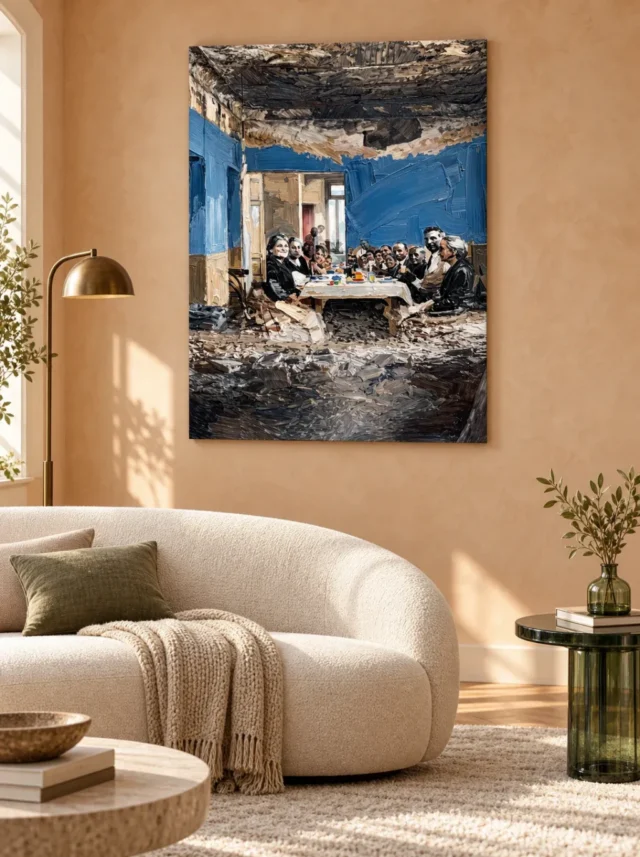
The gallery's existing room visualisations can show how the work's broad blue presence behaves among domestic forms. They cannot establish exact scale, real installation history or included furnishings. Use them to ask whether the composition remains distinct from its surroundings and whether its emotional weight seems appropriate in a room-like context. Then return to the cover without the scene. If you liked only the staged furniture, the artwork may not be the right selection. If the gathering continues to draw you back, you have a clearer basis for proceeding. In particular, make sure that the people remain important to your response. A print bought solely as an attractive blue rectangle may later feel unexpectedly demanding when the human subject becomes more apparent.
A material decision can support, not manufacture, atmosphere
A matt canvas presentation may appeal if you want the image's blue environment and broken marks to be considered without a highly glossy overall impression. The specified Neptune Natural Matt Canvas 400 is 100 percent cotton and 400 gsm, with a natural warm base and irregular weave. Those facts describe the support; they do not establish the artist, the source artwork's age or an archival lifespan. A paper option offers a different presentation route, including a separate framing decision. Compatible choices include Oyster 271 photographic paper with a pearl or satin character and Photo Lustre 310 photographic paper. Consult the actual product selection to see what is available rather than assuming every format behaves identically.
Choose a material because it fits how you want to present and care for the print, not because you expect it to make an ambiguous scene more authentic. The atmosphere is already carried by the composition. Hand-finishing, where selected, does not turn the work into evidence of a particular historical event, and canvas does not make it an original oil painting. Likewise, the distressed appearance should never be used to excuse careless handling of the finished object. Reading the supplier's specification is useful because it grounds a subjective visual decision in concrete information. Keep that information proportionate: material facts clarify the purchase, while your response to the group, table and blue room remains the reason for choosing the image itself.
Choose the question you want the image to keep open
Before making a final decision, describe the work to yourself without an adjective such as beautiful or powerful. You might say that it shows a group maintaining a shared centre in an unsettled room, or that it sets human relationships against an environment marked by deterioration. Those descriptions identify what the image does. Then ask whether that relationship interests you enough to revisit. You do not need to solve it. An unresolved scene can be good visual company precisely because it resists a single explanation. The aim is to distinguish fruitful ambiguity from simple uncertainty about whether you like the picture. The former invites looking; the latter may be a reason to compare other works before purchasing.
Gathering in a Ruined Room is a considered choice for someone who wants a figurative work with a strong environmental presence. It can be read socially, spatially and through colour without invented biographies or provenance. Its table offers a point of connection, while its blue, distressed surroundings complicate that connection. Review the current cover and product options together so the image you admire is also being ordered in a presentation you understand. If you find yourself returning to the people after exploring the walls, the composition may offer the sustained engagement you want. If the atmosphere feels heavier than you wish to live with, that response is equally useful. A good selection makes room for personal limits as well as visual curiosity.
Continue with this artwork
Find your next artwork
Three ways to read the table, walls and ceiling
Read more: Three ways to read the table, walls and ceilingRead less: Three ways to read the table, walls and ceiling
In this Ruined Room Gathering composition, the long white-covered table holds a group between blue walls. A dark ceiling presses down above it. A broad, uneven grey area fills the lower part. The faces are small in relation to the room. Yet you may notice them before you take in either of those larger fields.
Try three routes through the image. Begin with the table and the nearby faces. Then follow the passage between the walls. Finally, compare the upper and lower edges. The picture invites a story, but the visible design does not name an event, place or set of people.
Ruined Room Gathering composition exercise one: approach the table from the front
Find the brighter edge of the tablecloth nearest the bottom of the group. Follow it sideways until a chair or figure interrupts it. Then look along the long direction of the table. The rows of people make that direction easier to follow than any single unbroken line.
Look at the larger heads toward the nearer sides. They sit at unequal distances from the centre. Meanwhile, several smaller shapes lie between them. Do not start by counting people. Notice how little space the smaller features need to make you read a group further away.
The objects on the table introduce some of the smallest bright colours in the image. Find one warm fleck near a pale area. Next, compare it with a brighter blue or cool mark across the table. Neither covers much space. Their placement lets a narrow passage compete with the broad wall behind it.
Compare two directions in the Ruined Room Gathering composition
Take the near left figure as a starting point. Follow the table towards its farther end. Then start from the opposite near edge and repeat. Even if both routes reach the same region, the interruptions differ. One side may draw attention to the brighter cloth while the other sends the eye into a darker silhouette first.
Draw a short rectangle to represent the table, then mark the two faces you notice first. Your marks need not copy their features. The sketch is about where you looked. Compare it with the full image and see whether your attention fell equally on both sides. That tells you something about how the composition organises a crowded passage.
Next, look only at the dark shapes below the cloth and alongside the nearer figures. Those areas give the front edge a distinct lower boundary. If the cloth looks unusually bright, part of that effect comes from what lies immediately underneath. Check whether a similar edge outlines the back of the table or whether the group interrupts it differently.
Ruined Room Gathering composition exercise two: test the depth of the room
Find the opening in the far wall. Pale vertical marks surround a narrower bright part behind it. Then follow the edge where the blue meets the opening. The doorway or passage suggests a route beyond the table, although the image does not fully explain the building beyond it.
The National Gallery's entry on perspective is useful for talking about pictorial depth. Here, try comparing the apparent size of the nearer faces with that of the ones deeper in the room. Then see how the framing walls contribute. You do not need to draw a precise set of construction lines to notice the effect.
Put a fingertip over only the opening in a small view. Leave the group and walls visible. Do the rows at the table still suggest depth? Next, reveal the opening and cover the darker lower area. You may notice how the spaces in front of and behind the group do different kinds of work.
Check where the blue changes in the Ruined Room Gathering composition
Compare the narrow blue on the left with the larger field to the right. The right-hand passage contains broad diagonal marks. By contrast, the left-hand area has a different upright rhythm. Test where each field begins to feel like a wall rather than just a patch of colour.
Our study of colour as a structural element provides a separate example of how colour can guide a reading. This is not a claim that the works share a style or technique. Instead, ask whether the blue in this artwork leads the eye into the room or keeps it near the surface of the image.
Look from the palest part of the opening back towards the table in two jumps. A small figure sits near that route. The pale vertical and the shapes beside it can make the route uneven. That unevenness is useful to see. Otherwise, it is easy to imagine a tidy vanishing point when the marks give you several competing routes.
Ruined Room Gathering composition exercise three: compare the room above and below
Look at the broad dark passage over the blue walls. It contains uneven pale and brownish marks. Then turn to the lower foreground. The rough-looking forms there have a different slant. You can describe the contrast between ceiling and foreground without guessing what caused the damage or what the room was used for.
The Tate glossary entry on tone describes an aspect you can compare without naming a colour. Pick one darker patch above the table and one below. Follow what happens at their edges. In each place, nearby light marks affect how strongly the dark shape seems to enclose the people.
Give the foreground its own moment in the Ruined Room Gathering composition
Temporarily mask the figures and the white cloth. The lower half still gives you angled forms, pale gaps and heavier marks near the bottom. Uncover the middle and notice how those same shapes carry attention back towards the group. They do not need to identify particular objects in order to have that effect.
Our guide to reading visual relief and light explains why the apparent thickness of a mark in an image needs separate evidence about the material. The rubble-like forms can look raised in a reproduction. However, that does not tell you what texture a particular purchased finish will have.
Put the edge of the ceiling alongside the foreground
Compare the shape where the dark mass meets the right-hand blue with a ragged pale edge under the table. One sits above a colour field, while the other crosses lower grey and brown marks. Notice which change looks more abrupt. Both can make the picture appear unfinished without requiring the same kind of boundary.
Then reverse the order of your reading. Begin with one pale stroke close to the bottom and move up towards the faces. See how long you spend among the greys before the table becomes your focus. This makes a useful comparison with the quicker route down from the blue wall. Keep the route you find most revealing as your own starting point.
Compare the tall picture with the scale of a room view
The living-room illustration places the picture above a pale sofa near a brass-coloured lamp. That makes it easy to compare the large blue area with the light wall. The cover is still more useful for reading individual faces and objects on the table. Use each view for that different task.
Before you buy wall art, decide what you want to remain visible from your usual seat. In this example, the rows of faces may simplify before the pale table and darker ceiling do. The companion display guide helps you test that difference without assuming the settings depict exact sizes.
If you want to buy artwork based on the close view, check the actual size and finish in the Gathering in a Ruined Room product listing. A search for hand made wall art does not establish how a particular item is produced. Note the names of the supplied options before drawing any conclusion about what will arrive.
For a comparison, browse expressionist wall art and look for another design where large areas draw the eye towards a smaller subject. The staging may differ, but the exercise is the same. Decide whether you prefer the table's concentration here or a design that puts its emphasis near an edge.
Frequently asked questions
Where should I start reading the Ruined Room Gathering composition?
Begin with the nearer table edge and the two groups of seated figures. Then check the opening at the back. Those features offer a practical route into the room without requiring a story about what preceded the gathering.
Does the image describe a named place or event?
No wording in this guide identifies a place or an event from the image. The visible walls, group and damaged-looking surfaces are enough to discuss the arrangement. Textures and small figures are not evidence of a particular historical scene.
Why leave so much image below the table?
The darker, uneven foreground adds a substantial space in front of the group. It can delay the moment your eye reaches the table. Try looking from the lower edge first, then compare the effect of starting directly with the faces.
Does the blue wall have one uniform appearance?
No. Compare the broader passage on the right with the narrow upright area on the left. Their visible marks differ in direction and tone. Both frames can matter even when neither blue area contains the main subject.
Does the Ruined Room Gathering composition rely on the bright opening?
The opening helps to suggest another space beyond the group. The figures and long table also provide routes into the image. Try blocking one part briefly and check whether the others still give you a sense of depth.
Do small bright objects identify what the people are doing?
Not by themselves. The picture shows a group around a table and distinct marks on the cloth. You can describe where the marks occur without claiming precise objects, food or an occasion that the picture does not confirm.
Does the dark ceiling match the dark foreground?
They share some depth of tone, but their positions and marks are not the same. Try finding one pale interruption in each. How those interruptions meet the surrounding dark influences whether your attention moves to the table or the edge.
Can a thumbnail show the Ruined Room Gathering composition clearly?
It can show the relationship between blue walls, the bright table and the darker areas. It may lose smaller details of faces and the table setting. Compare both views before deciding which part you need to see from across a room.
Do the marks prove a physical finishing method?
No. An image can show the appearance of strokes and uneven surfaces without transferring their height. Use the stated finish of the particular product option for information about the item you will receive.
Is the sofa view a guide to a specific size?
It is an example of placement. The illustrated sofa and wall do not supply measurements for your room. Use the dimensions of the offered option and compare them with the usable wall area before ordering.
What makes this different from a close portrait?
The people occupy only one region of a taller setting. You can read the fuller scene by looking beyond the group to the opening, blue walls and lower foreground. Those elements have more space than they would in a tightly cropped study.
What should I compare after taking a closer look?
Compare the full silhouette from your normal viewing distance. Then check the listing for size and presentation. If the central group remains apparent while the surrounding room still matters, you can keep both qualities in mind when choosing an option.
Conclusion: keep the people and the room in the same reading
Look at the table, the far opening and the dark areas again, in that order. Decide which relationships need to remain visible in your room. Then compare the actual artwork options and choose on the evidence available.