Living with art
A Warm Portrait in a Personal Room: Living with Crimson Tresses in Brush
Plan the red-haired portrait for everyday living or a bedroom through personal comfort, quiet colour connections, evening views and clear material and installation decisions.
Show the three guide illustrations
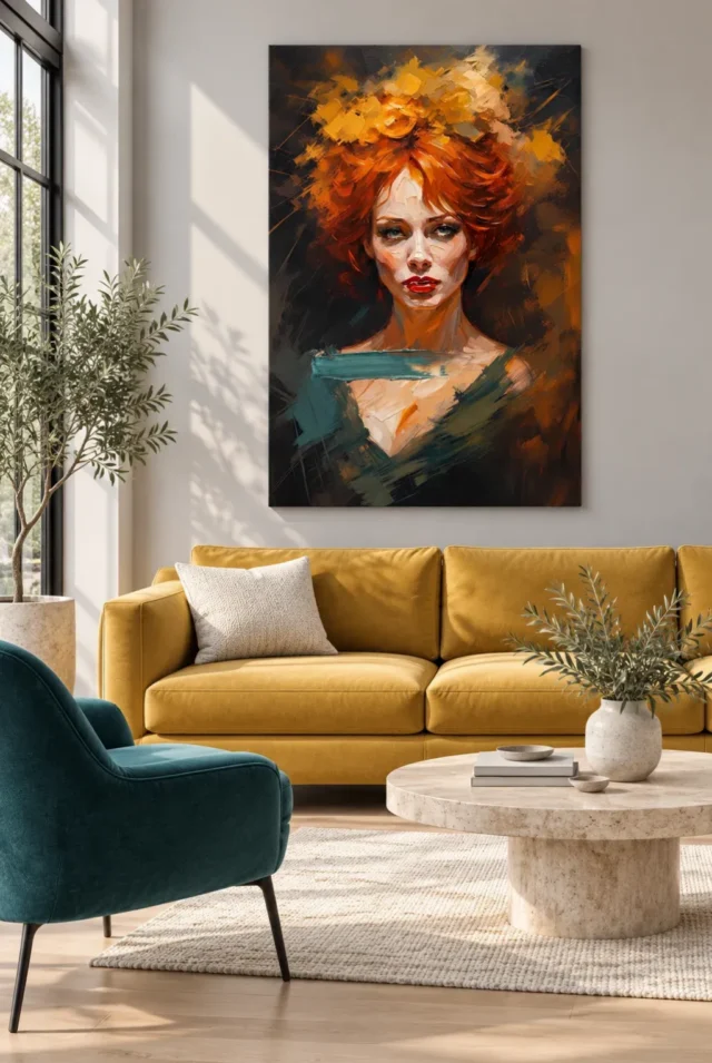
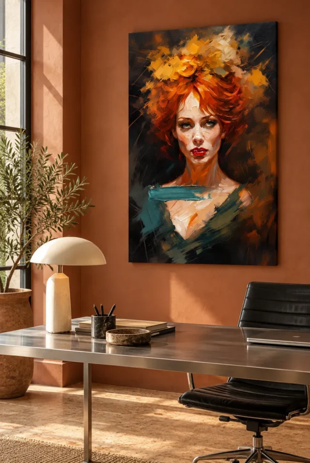
Continue with this artwork
Find your next artwork
Red Hair Portrait Styling guide
Read more: Red Hair Portrait Styling guideRead less: Red Hair Portrait Styling guide
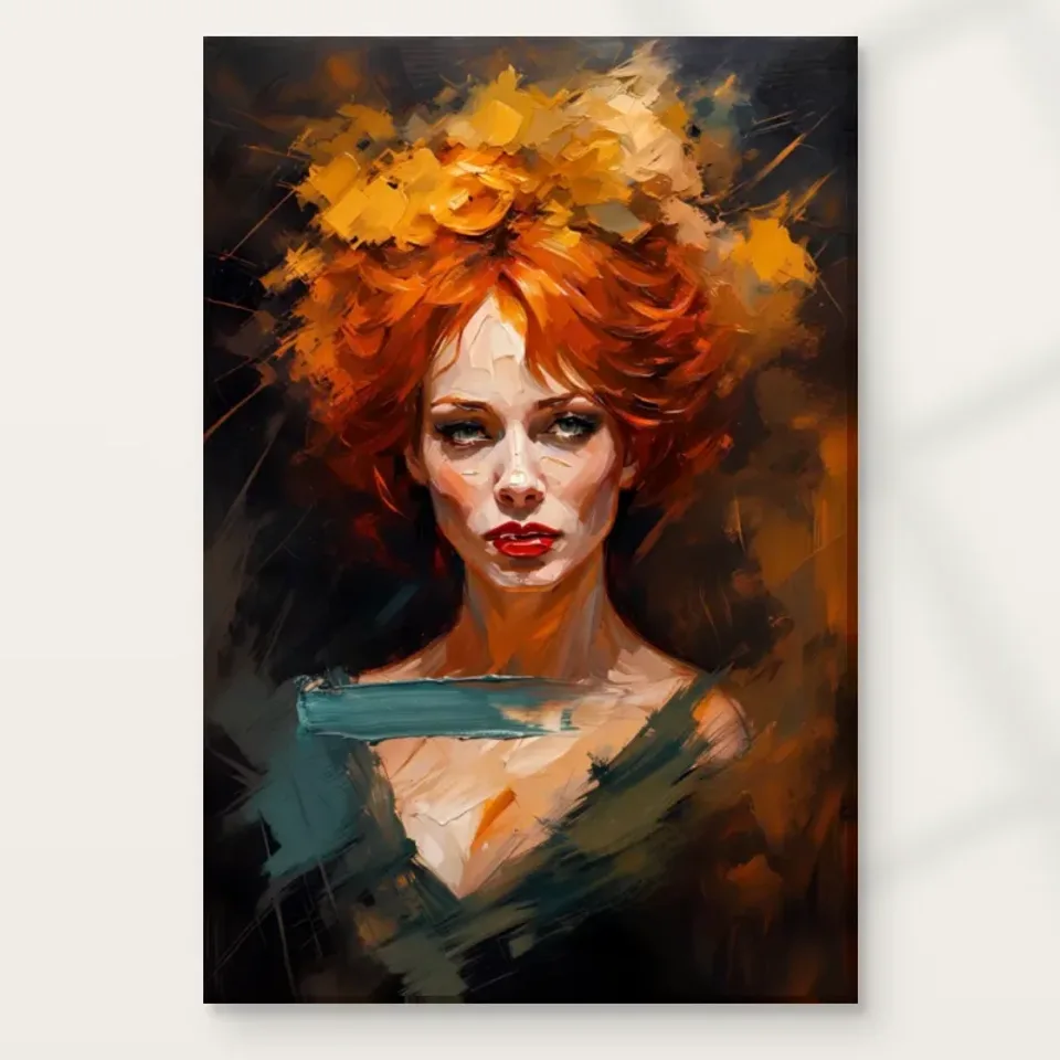
Red Hair Portrait Styling starts with a question about the room, not a matching paint chart. In Crimson Tresses in Brush, red and orange hair surrounds a comparatively still, forward-facing face. Pale marks and a touch of cooler colour near the lower edge offer other points of attention. Start by deciding which detail you want to notice most often.
If you want to buy wall art for a room you use every day, test the portrait against your routine. You might see it first when coming home, or only beside a lamp at the end of the day. Those are two chances to enjoy it, but they do not necessarily favour the same wall.
Choose between a shared room and a private view
Look first at the main place you sit. A front-facing portrait near the middle of a shared room can become a natural place to look during conversation. However, if the wall is opposite a chair used for quiet reading, an offset position might feel less insistent. Try both before choosing a size.
Compare the bedroom wall art selection if you are considering a private space. A picture beside a dressing table may be more welcome than the same picture directly opposite a bed. Alternatively, keep the red hair within view of a chair rather than the whole room. Your choice depends on where you want the artwork to meet you.
Make Red Hair Portrait Styling fit an actual routine
Try standing in each proposed spot at the time you normally use it. For example, start by opening the bedroom door, then sit where you usually read. Notice whether the face is comfortably in view without becoming the first thing you see at every turn.
Give the warm colour in Red Hair Portrait Styling enough space
The red is concentrated in the hair, not spread equally across the portrait. The slivers of paler colour prevent it from reading as an uninterrupted block. Consequently, you do not need red curtains or red bedding for the print to belong in the room. Try keeping one large surface simpler first.
The National Gallery's entry on colour describes differences in hue, tone and temperature. Use those distinctions to compare the hair with its neighbours. An orange thread and a dark red cushion can feel quite different even when both are warm. A cool grey wall can make that difference easier to see.
Try a warm accent without trying to match it
Start with the fabric or wood that is already closest to the wall. A muted ochre or warm timber might connect with the hair without reproducing it. Conversely, a scarlet object beside the art can take attention away from the smaller colour changes. Move a single object and compare the view again.
Set your viewing distance before your frame height
Take a few steps back from the displayed image and note the point at which the face remains distinct but the smaller brush-like marks become less obvious. That difference can guide placement. A print can be effective as a bold warm shape, while a closer position can give the quieter colours a chance to show.
The visual guide to Crimson Tresses in Brush looks at the design itself. Compare that reading with a measured outline on your wall. Leave clear space for the whole image, especially if an open door usually cuts across part of the proposed position.
Put Red Hair Portrait Styling into a measured test
Mark the artwork area on scrap paper. Then mark the outside size separately if your plan includes a frame. Test the outline from a place you use every day. If a tall plant cuts across it, move the outline rather than deciding that the size alone is wrong.
Treat pattern in the room as a separate decision
Plain fabric often makes it easier to follow the loose edges of the hair. However, a broad patterned rug need not compete with the face in the way a small, dense print directly beside the picture might. Consider the size and position of the pattern before you remove it.
The living room wall art collection provides other ways to compare subject and pattern against a sofa. If a strip of busy wallpaper attracts the eye first, try a wider gap between it and the portrait. This wall art can work with several colours when the details have space to remain distinct.
Give Red Hair Portrait Styling one simpler neighbour
Pick the nearest item you can move easily. For instance, swap the heavily patterned cushion nearest the picture for a plainer one. If the hair immediately becomes clearer, keep the other textiles unchanged. The aim is to isolate the cause rather than redesign a room around a single preview.
Test Red Hair Portrait Styling under the light you use
Look at the proposed wall after dark as well as during the day. A lamp can catch the eye near the portrait while leaving the face hard to see. Likewise, a bright window reflected in glazing can interrupt the warm colours from one seat but not another. Compare the actual positions rather than a phone photograph.
For paper prints, the Canadian Conservation Institute's basic care notes explain why limiting direct light exposure matters. Use that guidance to choose a location with less direct sun. It does not establish the lightfastness of an individual option, and changing the lamp angle does not provide a guarantee.
Recheck Red Hair Portrait Styling in daytime and at night
Check the outline near the place where you already use a lamp. Then look again from the same seat in daylight. If brightness changes the relationship between the face and the lower cool marks, try a nearby wall rather than assuming that you need a new fitting.
The office visualisation shows the print in another setting, but the screen and seat in your room may sit at different angles. Walk from the entrance to the desk and note when the red first comes into view. This check matters if you want the portrait visible during breaks without seeing it reflected in your monitor.
Confirm the selected support and finish
Before you buy artwork for a ready-made frame, open the Crimson Tresses in Brush product page and read the actual choices. A rolled print and a stretched canvas involve different mounting plans. For rolled canvas, note any listed printed margin separately from the width and height of the picture itself.
Visitors who search for hand made wall art sometimes want to know exactly where manual work takes place. Distinguish the printed image from any optional studio work. Check The Art of Hand-Finishing for that separate service, then confirm what the selector says for your format. A pictured thick mark does not prove the print has that texture.
Make Red Hair Portrait Styling fit your installation plan
First check the area you can see. Then allow for the presentation you intend to use around it. If you do not know how a rolled option will fit your frame or stretcher, ask before ordering. Do not guess from objects used for scale in an illustrative setting.
Leave room for a personal interpretation
The listing does not name the sitter. The colour and expressive shape of the hair can still give the portrait character. Let those things suggest a mood without requiring facts about the person. For example, the front-facing pose may read as direct to one person and calm to another.
In a shared room, compare where other people usually sit. A wall visible from more than one place may give everyone a better view, but it does not need to dominate the room. If you prefer the portrait as a more personal object, a quieter position can make that choice feel intentional.
Frequently asked questions
Is Red Hair Portrait Styling limited to bedrooms?
No. A bedroom can give the face a more personal setting, while a living room can let several people see it from different angles. However, neither use follows from the picture alone. Test the position against the activities and views the room actually supports.
Does the portrait need red accessories nearby?
No. The hair already supplies a strong warm colour. For instance, wood or a warm neutral can offer a quieter connection. If you add red nearby, check whether it draws attention away from smaller changes of colour in the image.
What if the face feels too direct from my chair?
Try a wall slightly to one side of the usual view. Then check the position again from the doorway. A different angle may make the portrait a natural part of the room without requiring you to look directly at it during every activity.
Can Red Hair Portrait Styling work against a blue-grey wall?
Yes, it can. Grey-blue can separate the warm hair from its background. However, the effect depends on the wall and lighting you have. Use a sample near the actual viewing position, and assess the whole image rather than one bright patch.
How close should I stand to choose a size?
Start where you most often look at the wall, then approach it. Check when the eyes and small colour marks become distinct in the preview. Next, use the actual available dimensions to test an outline. The preview itself cannot establish a minimum viewing distance.
Which image should I use as a measurement reference?
Use none of the room scenes as a ruler. They show how the design might relate to furnishings. Instead, read the dimensions in the product selector. Measure the visible area of your frame separately if its lip covers part of the print.
Should I put a light directly above the face?
Only choose a position after you look at the result from your ordinary seat. A lamp may introduce reflections or light the room unevenly. Conversely, a small change in angle can make the warmer and cooler passages easier to compare without changing the fixture.
What should I do about a sunny spot for a paper print?
Look for a position out of direct sunlight. For example, check the wall at the hour when the room is brightest, not just at night. If you still want a particular window-facing position, discuss display and glazing with a suitable framer rather than assuming protection.
Can I use my current frame for a different format?
Check its opening, depth and fitting method. Paper and canvas do not automatically mount in the same way. Therefore, check the chosen support and dimensions first. If you plan to use an existing frame, ask a framer whether it actually suits that option.
Does the print arrive hand-finished if the hair looks textured?
No finish follows from the gallery image. The visible marks belong to the design, while the finish depends on the product choice. If the selector offers professional studio hand-finishing and you want it, make sure you have selected it before ordering.
Is the person in the portrait identified?
The product listing does not identify the person. Likewise, the displayed expression does not prove a particular event or emotion. You can still decide whether its appearance suits the room. That judgement does not require an invented story about the sitter.
Can I place it below a shelf?
Possibly. First check whether the shelf casts a shadow on the proposed wall or obstructs the view when you sit down. Also note any objects that project over the shelf edge. Choose a position that leaves the face and the red outline visible together.
Choose an ordinary view you will enjoy returning to
Red Hair Portrait Styling works best when you can describe where you will see the finished display. Picture the seat, doorway or reading lamp you already use. Then compare the wall space, actual format and finishing options. If the face and warm colours hold your attention from that position, consider Crimson Tresses in Brush for it.