Looking closer
White Dress, Green Field and a Seated Pause: Bride in Ivy Light
Explore the white dress, seated pose, green-brown surroundings and chandelier motif in Bride in Ivy Light, while separating its bridal title from an undocumented wedding or sitter identity.
The seated figure changes the pace of the dress
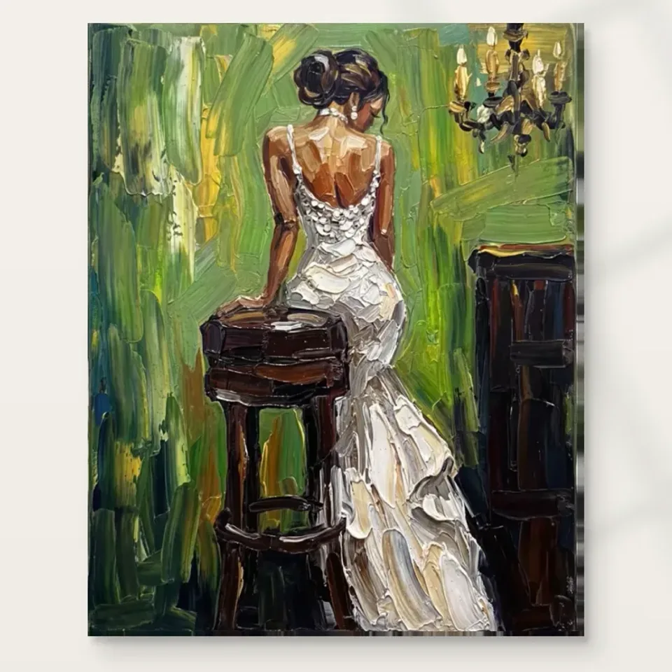
Bride in Ivy Light presents a woman in a flowing white dress seated on a wooden stool. That combination deserves attention before the bridal association takes over. A flowing garment can suggest movement, while a seated pose introduces a pause and a more settled relation to its support. The image brings those qualities together rather than choosing between them. Look at how the dress extends the figure's presence and how the stool anchors it. The scene can be assessed through those visible relationships without requiring a story about a ceremony, a specific person or the occasion before or after the represented moment.
The title uses Bride, but the public information does not document a wedding, identify the sitter or establish a real event. A white dress and a poised seated figure can evoke bridal associations without proving them as biography. Keep that distinction in mind if you are selecting the work for a personal milestone. The image may feel appropriate to your association, yet it is still being chosen for its appearance rather than as evidence of an identified ceremony. This honest boundary leaves the composition open to viewers who are more interested in drapery, colour or stillness than in a narrative of marriage.
Notice which element you recognise first. It may be the large light garment, the person within it or the green surrounding field. Then ask how the others change that first impression. A white shape becomes a dress through its relationship to the figure; the dress becomes more prominent through its contrast with the setting. The work's particularity lies in those connections. A general liking for white gowns may begin the selection, but a sustained reason should involve how this image arranges one. The seated pause and surrounding colours can make it different from another figure in similar attire.
Why does the white dress hold the eye?
White is not an absence of information here. The source description notes expressive-looking strokes that define the garment and its surroundings. Study the light dress as a field containing changes of value, direction and apparent density, not only as a bright silhouette. Those changes can help the garment feel flowing without making every fold equally definite. The contrast with the surrounding green and brown gives it prominence, but the dress also needs its own internal relationships to remain interesting. A large light area can be both a clear anchor from afar and a place for slower looking close up.
Compare the outer shape with the smaller passages inside it. The outer shape establishes how much space the garment occupies, while internal changes suggest how that space is described. If you focus only on the bright outline, the work may seem simpler than it does under longer inspection. If you focus only on marks, you may lose the connection between dress and seated body. Move between those levels deliberately. This is useful when choosing a print because the broad shape and smaller variations will not be equally available at every size or distance. Your main reason should match the encounter you intend to have.
Do not assume the print's white will behave like an actual dress under light, or that the represented folds are physical relief. They are image relationships reproduced on a selected support. The subject can appear luminous through contrast without containing fabric or raised paint. This distinction allows the dress to be enjoyed fully as a visual form. It also prevents a strong impression of material from becoming an unsupported product claim. What is supplied is governed by the format and finishing choices, while the garment's apparent texture remains part of what the artwork depicts.
Green and brown create a setting without requiring a named garden
The current description identifies varying greens, with brown also noted in the excerpt. Look at how those colours establish a field around the lighter figure. They can make the white dress more distinct while also introducing changes of density and atmosphere. The title's ivy association should not be used to identify a botanical species or prove a real garden location when the described background remains expressive and partly abstract. You can enjoy a lush-looking setting without claiming every green mark represents a particular plant. The useful observation is how the field supports and complicates the figure's light presence.
Consider whether the green areas feel like an environment the woman inhabits or a more open colour field around her. The image may support both impressions at different moments. This flexibility can be part of its appeal, especially if you enjoy a recognisable figure within surroundings that remain less literal. If you prefer a detailed, clearly located scene, compare another image before deciding. The question is not whether one mode is more artistic, but which kind of information you want. Bride in Ivy Light can offer a clear person and garment while allowing the setting to remain suggestive rather than fully mapped.
The warm and cool relationships may matter more than exact colour names. A brown passage can provide a different visual weight from a green one, and their neighbours can alter how each is perceived. Look at those relationships within the complete composition rather than treating the palette as a list of interior paint options. The work's colour is doing more than matching a possible room. It helps establish the figure's presence and the pace at which surrounding detail is discovered. If that interaction continues to interest you, it supplies a specific reason for choosing this particular white-dress image.
What does the chandelier add beyond ornament?
The product description identifies a chandelier within the composition. Its presence introduces a constructed decorative element alongside the figure and green surroundings. Notice whether it changes your sense of the setting, making the image feel less like an open natural field and more like a meeting of different visual cues. You do not need to identify a real interior or a historical lighting style. The chandelier's visible role can be considered through its scale, detail and relationship with the dress. It may provide another point of attention without becoming the subject that explains every part of the scene.
Avoid treating a depicted light fitting as proof of actual illumination or a documented room. The image can use a chandelier motif for atmosphere and ornament while remaining expressive in its spatial description. This is a useful distinction if you are attracted to the work's slightly indeterminate setting. A familiar object can offer recognition without closing down every ambiguity. Ask whether the chandelier enriches that balance or whether you chiefly want the figure and dress. Comparing the work with a simpler seated portrait can reveal how much this additional element contributes to your preference.
Stillness can be made from active-looking marks
The woman's seated pose can appear composed while the represented handling remains lively. Look for changes in how the dress, figure and background are described. Some passages may support quick recognition, while others remain more open as marks and colour. This difference can create a quiet subject without making the surface visually inert. The public impressionist label is useful as a browsing description of the image's appearance, not proof of a named maker or historical movement membership. The work can be assessed through the actual balance of readable form and expressive-looking treatment present in the cover.
The combination is worth comparing with a more sharply defined portrait. A clearer edge everywhere might make the setting more literal but reduce some of the transitions that interest you here. Conversely, a more abstract image might offer richer uncertainty but less of a stable seated figure. You may prefer the present balance between those possibilities. Identifying that preference is more useful than assuming all white-dress images offer the same elegance. The specific pace of recognition, and the way the garment remains available within a more open field, can be central to this composition's character.
The apparent worked surface does not establish physical impasto on an ordinary print. You can enjoy its visual energy while keeping the supplied material separate. This matters because white passages can make represented ridges and highlights especially persuasive. A reproduction's support and any optional finish have their own actual properties. Those are selected through current product information rather than inferred from the source image's appearance. The visual relationship remains worthwhile even when understood honestly: a seated figure, a luminous-looking garment and an active setting can be compelling without becoming a claim of hand-painted relief.
The broad dress and the smaller details need room to coexist
At a distance, the white garment may become the strongest recognisable shape, while the stool, chandelier and smaller background passages become less distinct. Closer viewing can restore those details. Choose the print size according to which encounter matters most. A larger version can offer more information but requires enough distance to see the whole seated arrangement. A smaller version near a chair can support a deliberate close view. Neither is automatically more graceful or more faithful. The useful question is whether the selected scale lets the relationships that attracted you remain available in the place you intend to look.
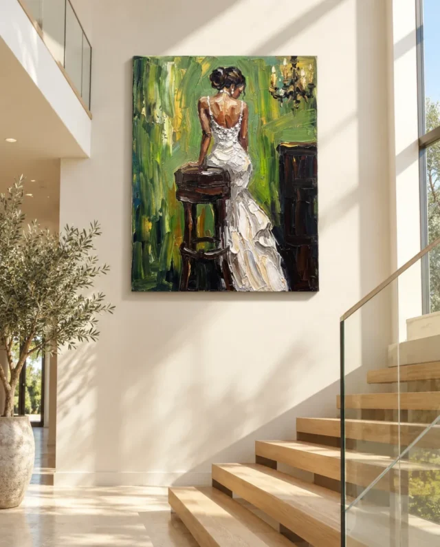
The existing room visualisations help compare an isolated cover with a wider interior context. They are illustrative scenes, not proof of installations, precise scale models or lists of furnishings supplied with the print. Use them to notice whether the dress remains a complete form among other objects, then measure your own wall with the current dimensions. Include any later frame or mount. The print size does not establish the original physical size of an undocumented source painting, and the apparent proportions of a staged room should not silently determine your real presentation choice.
Preserve the complete image in planning. Do not crop away a background element or stretch the dress to fit a narrow gap. If a lamp or plant would obscure part of the scene from the priority seat, adjust the surroundings or choose another wall. The stool and setting may matter even if the white garment attracted you first. A picture selected for a broad form can still benefit from its supporting details, and losing them accidentally is different from deciding that a smaller-scale impression is sufficient. A thoughtful plan knows which kind of encounter it is providing rather than discovering that limitation after installation.
Choosing the print support for the image you actually see
Neptune Natural Matt Canvas 400 is the stated canvas option, with a cotton support, natural warm base and matt textured character. Compatible photographic paper choices provide another route for a later frame and mount. Consider how each presentation would hold the light dress within its darker setting. A boundary around the image can create a visual interval, while a canvas presentation can meet the wall differently. The support should be chosen through actual material information and your intended display, not an assumption that a bride-like subject requires a traditional frame or that an expressive-looking surface must be canvas to be legitimate.
Optional light selective hand-finishing is separate where available and selected. Do not infer additional physical work from the white garment's apparent highlights or from the source description's language about texture. The manufacturer's page is useful further reading about the support, not evidence of a wedding, a sitter identity or provenance. Keeping those roles clear makes the selection more precise. The artwork can remain open in interpretation while the actual reproduction is understood through the current format, dimensions, presentation and finish rather than through an imagined original or a material story the public information does not establish.
A personal association without a compulsory wedding story
After looking at alternatives, describe what remains particular about this work. It might be the seated pause within a flowing dress, the white-green contrast or the way a chandelier complicates the setting. Those observations are enough to ground a choice. A bridal association may be meaningful to you, but it need not be the only route into the image. Someone else may see a poised figure and a study of light material against a lush-looking field. The work can hold those responses without requiring an identified ceremony or a single narrative that every viewer must accept.
For a gift, consider that distinction carefully. An anniversary, engagement or wedding connection does not automatically mean the recipient wants a bride-like image in their home. Their taste in figurative work and their comfort with a personal association matter more than the occasion alone. You can explain the visual feature that attracted you without claiming the picture represents their event or relationship. This leaves the recipient free to enjoy the composition on their own terms, whether through dress, colour, pose or another association, rather than asking them to adopt a story supplied to make the gift seem symbolic.
Then make the practical selection independently. Review current size, medium, presentation and any optional finish, keeping the room scenes as illustrations and material information as support guidance. Bride in Ivy Light does not need a documented wedding or physical fabric to offer a specific visual encounter. A light flowing garment is held within a seated arrangement and a more indeterminate green-brown setting. If that balance continues to interest you beyond the title's first association, the work has supplied a grounded reason for repeated looking and for a considered place in a collection.
Continue with this artwork
Find your next artwork
Three ways to look at the dress, greens and stool
Read more: Three ways to look at the dress, greens and stoolRead less: Three ways to look at the dress, greens and stool
The Bride in Ivy Light composition lets you recognise a white dress almost at once. However, the woman faces away, and the painting gives little of her expression. A dark stool, a nearby arm and a slice of warm skin carry some of the weight. Together they keep the dress from floating in the green.
The title supplies a bridal reading. The image lets you test that reading without supplying a wedding story. Begin with the movement from narrow straps to a broad hem. Then see how green changes the dress edge. Finally, look for the parts of the room that hold the figure in place.
Bride in Ivy Light composition exercise one: trace the dress
Start with the narrow straps. Follow one of them to the pale bodice, pausing where the back meets the brightest whites. Move lower and watch the outline change. It draws in at the waist before the dress opens into larger folds. Those changes are easier to spot than any exact fabric detail.
The brightest notes do not describe the whole dress. Thin cool shadows and warmer lights cross the lower section. Consequently, it may read as one large pale shape from a distance and as many shorter marks close up. Try shifting between the two scales without losing your place.
The Tate definition of tone gives a useful distinction between lightness and colour. Here, a grey crease in the dress may separate two light shapes without becoming the darkest thing around it. Compare that crease first with the adjacent white, then with the stool.
Find the turn in the Bride in Ivy Light composition
Look where the skirt brushes the edge of the dark furniture. The outline widens towards the lower right rather than extending evenly in every direction. Then trace the line of the bare arm back towards the shoulder. That narrower line gives the eye a route up the image, against the broader drift of the dress.
Where the hand meets the stool, stop treating the white dress as an isolated landmark. A relatively small contact helps connect light fabric with a broad dark mass. Next, cover the stool on a screen without covering the hand. The figure can feel less anchored even though the dress itself has not changed.
Bride in Ivy Light composition exercise two: separate the greens
Put aside the idea of one uniform green background. On the left you can find tall dark streaks and brighter yellow-green passages. Near the right, a broad stroke moves differently behind the upper body and lamp-like object. Compare the directions before deciding which patch is brighter.
Try drawing three small ovals on paper. Use each to stand for a different patch of surrounding green. One might tend towards yellow, one towards olive and one towards a cooler dark. Do not treat the sketch as a set of paint specifications. It simply makes three neighbours easier to compare.
Return to the dress after looking past it for a moment. The pale outline can feel sharp alongside dark green and softer next to a lighter passage. This is why a white shape need not have a uniform border. Follow its boundary in sections and check where you first lose track of it.
Does the Bride in Ivy Light composition show identifiable ivy?
The title says Ivy Light, but broad marks do not identify individual leaves. That distinction matters when you describe this artwork to someone who has not seen it. You can say the field looks leafy or lively. You do not need to say which plant appears there, or whether the scene took place outdoors.
Compare the direction of a green mark with the direction of a crease. Their sizes and colours differ, yet both can move your eye across the same area. For a longer look at this distinction, read our guide to impressionism and changing light. It gives a different starting point from identifying objects.
Bride in Ivy Light composition exercise three: check the dark objects
The stool offers several things to follow: the rounded seat, the legs and a lower curved connection. Meanwhile, a dark upright near the right edge answers its visual weight. These forms interrupt the white and green. Compare where each begins, where the dress overlaps it, and what remains of its outline.
For a simple experiment, look mainly at the right edge for a few seconds before returning to the figure. See whether the nearby pale hem seems to step forward more strongly. Then try exactly the same thing with the stool. Different starting points can make one dress edge easier to notice than another.
The warm, light details above the right side draw attention on a very different scale. They punctuate a high corner rather than supporting the figure below. Trace a triangle between those small lights, the shoulder and the dark seat. This lets you compare positions without inventing a lighting plan for the depicted room.
Try a closer look at the negative shapes
The opening beneath the seat does not have the same job as the dark legs. Focus on the small spaces the legs enclose. One lets a warmer note through. Another puts the floor and the stool rather close in tone. These spaces help the seat occupy the foreground without making it a single dark silhouette.
Look at the small region between the bare arm and the side of the dress. Rather than naming another object, trace the green that remains there. The width changes along the arm. As a result, the detail can hint at the figure's lean even when the hand is hard to see.
Now make a thumbnail sketch with only the three largest spaces that interest you. Leave out the face and the creases. For example, mark the space near the shoulder, under the seat and beside the hem. Compare those intervals with the larger image. The sketch can show what the figure needs around it as well as what defines its outline.
Read visual texture in the Bride in Ivy Light composition
The marks in the dress give an impression of thickness. However, visual brushwork is not a measurement of the surface you will receive. Tate's explanation of impasto concerns physically thick paint. Use it to distinguish an actual raised medium from an image that looks as though it has relief.
Our comparison of mark, light and relief explains why a bright edge beside a shadow can imply height in a photograph. Notice that effect around the largest folds here. Then consult the written product option if a physical finish matters to you. Neither the magnified view nor the staged scene establishes how every option was made.
Compare the close view with a picture on the wall
The stairwell image places the design near timber steps, glass and daylight. Compare the edges of the dress in that illustration with the closer cover. If one pale fold disappears, it may simply be smaller or shown at a different angle. The display image can help you place the silhouette, rather than count its marks.
When you buy wall art, separate those two jobs. Use the close view for content and the room scene to imagine viewing distance. For example, a dark mass in the room view may survive at a distance even while the creases blur. Our Bride in Ivy Light room guide goes further into placement.
Put the close view and the stairwell image alongside one another. Pick the same fold in both, then compare how much attention the pale wall attracts. Notice whether the inner edge of the dress, near the stool, stays clearer than the outer edge. That is a specific comparison you can repeat, without assuming the two photographs must look identical.
When preparing to buy artwork from a room image, check the real item dimensions and presentation. If your search started with hand made wall art, verify whether you are selecting a print, hand-finishing or something else. The image's apparent brush marks alone are not evidence that the purchased wall art is an original painting.
The Bride in Ivy Light product page shows the options for this design. If the white silhouette appeals but you want to compare how another figure meets the viewer, browse the figurative art range. Notice whether the next work depends on a face, a gesture or another strong shape.
Frequently asked questions
Where should I begin with the Bride in Ivy Light composition?
Start at the shoulder strap and follow the dress down to the first broad fold. Next, go back up via the bare arm. This gives you two different routes before you look outside the figure.
Does the image reveal the woman's expression?
Not clearly. You see the figure mainly from behind as the head turns. Therefore, posture and the hand's contact with the stool tell you more about the arrangement than any guessed expression.
How does the stool change the Bride in Ivy Light composition?
It puts a compact dark shape next to a mostly pale stretch. The horizontal seat also interrupts the vertical flow. Compare that short interruption with the way the skirt continues down and right.
Which green should I compare with the dress first?
Choose a green that actually touches one of the dress edges. Then choose another patch farther away. Comparing immediate and distant neighbours makes it easier to see why the same white does not always look equally sharp.
Does the title tell me which plants or room I am seeing?
No. It gives a name to the work, rather than a botanical or architectural record. Short, leafy-looking strokes and dark furnishings can suggest a setting without identifying a particular species or place.
Does Bride in Ivy Light composition depend on white alone?
No. The pose, green intervals and furniture also matter. To see that, crop out the lowest pale folds on a screen. The upper part still holds together through the hand, shoulder and objects around them.
Can I tell the type of cloth from a close-up?
No. You can distinguish pale creases, darker spaces and the fall of the skirt. Those visible qualities do not establish a particular fabric. Likewise, the pattern of highlights cannot tell you whether the garment has embroidery or another construction.
Why are the small golden marks in a corner important?
They stop the upper part of the picture relying only on the head. Look at the gold-toned marks and then at the light on a nearby shoulder. The two areas compete differently because their shapes and positions differ.
Do likenesses in the stairwell image imply particular dimensions?
No. The wall and furniture in that illustration are reference points for the scene only. Compare the measurements listed for the format you are considering with your own space, rather than estimating centimetres from the steps.
What can I compare from across a room?
Start with the turn between the upright body and the sweep of the lower dress. Then check whether the dark stool still separates it from the background. These broad relationships may outlast the smallest clusters of marks.
What if my screen makes the greens more saturated?
Compare the large dark and light passages first. Screen settings can change how vivid the greens seem. The boundaries between the major areas may still help you decide which feature you want to see every day.
Do visible marks prove that a print has raised texture?
No. A reproduction can show changes of tone and edges without reproducing their height. Check the finish information for the item you select. That distinction is more reliable than a visual impression of a thick mark.
Conclusion: return to the lower edge of the dress
Make one more pass from the shoulder to the skirt, then check the stool and greens that shape the silhouette. If those relationships appeal at a distance as well as close up, compare available presentations on the product page. Choose the option that fits how you expect to view the image, not the scale suggested by a room illustration.