Living with art
A White Dress in a Lived-In Room: Placing Bride in Ivy Light
Plan Bride in Ivy Light around bedroom and living-room routines, the visibility of its white garment and the scale of nearby furnishings, without needing a bridal theme or a fully green room.
Should the room respond to the title or the complete image?
Start with the complete image rather than assuming Bride in Ivy Light requires a bridal setting. The work presents a woman in a white dress, a seated pose and green-brown surroundings with a chandelier motif. Those visible elements can be enjoyed in a bedroom or living room without turning the space into a celebration display. Decide what attracts you and where that encounter is welcome. It may be the broad light garment, the poised figure or the relationship with the surrounding field. The title can add a personal association, but it should not make the room plan for you before its actual use has been considered.
If the room is shared, ask whether that association is comfortable for its users. A person may enjoy the figure but prefer not to make a wedding-related image the main waking view. Another may find the title less important than the colour and pose. These are useful preferences rather than obstacles. The public information does not identify a real bride or documented ceremony, so the room does not need to represent one. A thoughtful placement can allow several responses, leaving the artwork meaningful without making it a compulsory statement about the household's relationship history or future plans.
Choose a role before selecting scale. An arrival view, a picture beside a reading chair and a work opposite a bed are different encounters. The white dress may remain clear from farther away, while smaller setting details need a closer position. If you value those details, make a practical closer view available. If you chiefly want the broad white-green relationship, a more distant view may be sufficient. Neither decision is inferior. The aim is to connect your actual reason for choosing the image with a place and size that can support it during everyday use.
Review Bride in Ivy Light sizes and presentations
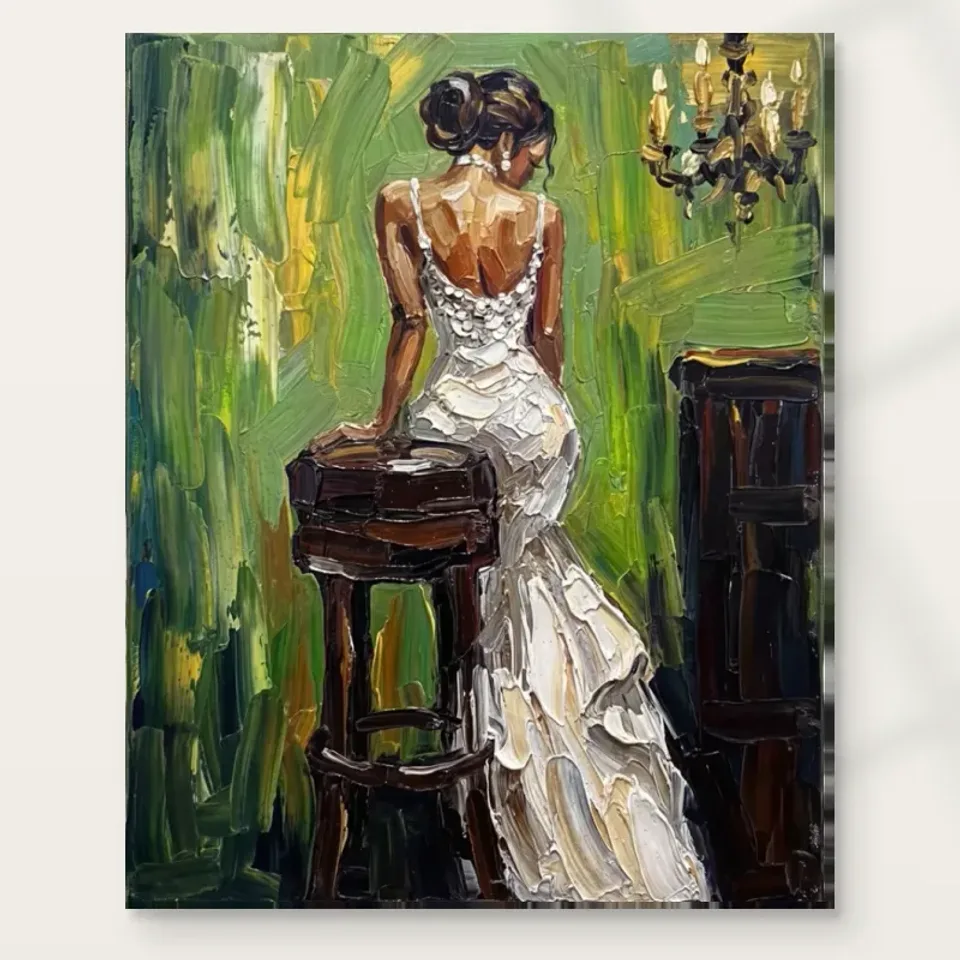
Where would the seated figure fit within bedroom routines?
A bedroom contains more than a bed. It may include dressing, reading, storage and occasional work, and each activity offers different sightlines. Compare the image above a headboard, opposite the pillows and on a side wall. Above the bed it becomes prominent on entering; opposite it, the figure may be seen directly on waking; near a chair, it can be approached more deliberately. A white-dress subject does not automatically belong in any one of those places. Choose through the habits and preferences of the people using the room, not through a convention that intimate or bridal-looking art must occupy the main bed wall.
Check the view with usual furnishings in place. A high headboard, bedside lamp or wardrobe edge may change how much of the complete scene is visible. The broad dress can remain recognisable even when the stool or background is hidden, but that may not preserve the relationship you chose. Move a nearby object where practical before pushing the print to an uncomfortable height. The scene should not require necessary furniture to remain awkwardly positioned. A successful bedroom placement is one where the artwork and ordinary routines coexist, rather than one that works only in a cleared photograph taken from the doorway.
Evening conditions matter if the room is mostly used under lamps. Inspect from the bed and chair, not only standing. A reflection on a glazed print can pass across the white garment from one angle, while canvas may receive uneven light from a close lamp. Keep any fitting safely separated and adjust direction or location before assuming stronger light is needed. The figure's light dress can have a clear presence without a dramatic spotlight. The room should remain comfortable for sleep and reading, with the image available rather than dependent on a special display mode that is rarely used.
Does the white dress need other large white objects nearby?
The print can provide its own large light form. It does not need to be matched with a white sofa, bedding or a broad pale wall in order to belong. Look at the room's existing light-dark balance. A pale object below the picture might connect pleasantly, or it might make the garment less distinct as a separate visual event. A quieter darker furnishing can provide another kind of relationship. Judge the whole view from the priority seat rather than selecting objects individually by colour name. The artwork's white is part of a figure and setting, not an isolated sample to repeat.
If you do want a connection, consider scale and surface rather than exact matching. A modest pale textile may be sufficient, while a second very large white field could dominate the view differently. Device screens are not reliable paint or fabric specifications, and the selected print will have its own medium and room-light conditions. Use real samples for permanent changes and observe them through the day. A small difference in warmth or value can be convincing. Coherence does not require every white in the room to become identical, especially when the image's interest depends on subtler relationships within the dress.
Keep accessories flexible at first. Move a throw, cushion or lamp and see whether the complete image becomes clearer. Avoid buying a set of objects solely to explain the dress. The room may already provide enough connection through its overall quietness or its mix of natural-looking materials. A work can remain intentionally distinct from its surroundings. That independence is useful later when bedding, a chair or a wall colour changes. The picture should not make every ordinary furnishing decision feel like a test of whether a carefully matched bridal scheme has been preserved.
Green can remain inside the painting
The green field offers several possible room relationships, but a fully green setting is not required. The image may be more distinctive against a quieter existing wall. If the room already has green furnishings or plants, assess their actual visual weight rather than assuming the shared colour guarantees harmony. A large plant can physically interrupt the scene from one seat, and a strong patterned textile can compete with the represented background. The useful question is whether the figure and setting remain legible together. Matching the colour name does not resolve those more important spatial and visual relationships.
If you prefer a stronger colour connection, begin with one element and observe it under normal lighting. Permanent paint choices should be made through real samples, not the image's on-screen hue. The title's ivy association also does not require botanical styling around the print. The public description supports a green, expressive setting rather than a documented plant species or garden. You can let that setting remain a visual field. The room's real plants, if present, should be chosen and positioned for their own practical needs, with watering and misting kept away from the artwork rather than treated as part of its atmosphere.
A living room can give the figure a less personal role
In a living room, the image may be encountered chiefly as a seated figure and a broad light-dark arrangement. That can be a useful alternative if you like the work but do not want its bridal association close to a private bedroom routine. Consider whether it should be a direct focal point or a side-wall view. The furniture should continue to support conversation and ordinary leisure. There is no need to make every chair face the picture. A deliberate place can give the scene a clear presence while allowing people in the room to look at one another without the artwork becoming the unavoidable centre of every exchange.
Check the view from several regularly used seats. A low armchair may see the lower dress behind a table object, while the sofa offers a clear whole scene. Decide which view has priority and adjust the surroundings where practical. You do not need to optimise every corner equally, but the intended encounter should be honest. If smaller details matter, choose a position where a person can approach safely without blocking circulation. A large print above deep furniture may be impressive at distance yet make close looking impractical. The selected scale should serve the level of attention you actually want to offer.
Keep the image open in conversation. It is enough to describe a woman in a white dress within a green-brown setting. You may share a personal association with the title, but do not present an identified wedding or sitter as fact. This leaves other viewers free to notice colour, garment and pose. A living room can contain evocative figurative work without becoming an explanation of the household's private life. That distinction can make the display more generous: the picture has a meaningful place while people are not required to adopt a particular symbolic story before they are allowed to enjoy it.
The complete presentation must fit before the theme does
Review the current format, selected dimensions and presentation details before finalising the wall. A poster is supplied rolled and unframed; a later mount and outer frame enlarge its footprint. Rolled canvas also needs a subsequent plan, while stretched canvas has current configurator information for the image face and printed wrap. Use those details rather than an old allowance or the apparent proportions of a visualisation. The selected artwork size does not establish an original physical painting's size. A precise plan concerns the object you will actually receive and how its finished boundary relates to furniture and nearby architectural features.
The image's apparent fabric and painted texture remain represented qualities. An ordinary reproduction is not actual cloth or physical impasto because the dress looks richly worked. The stated canvas and compatible photographic papers have their own surfaces, with light selective hand-finishing optional where offered and selected. Confirm the chosen version with anyone framing or handling the print. A frame can provide an interval around the scene, while canvas can meet the wall differently. Choose through the presentation you prefer and the real space, not a rule that a bride-like image must have an ornate traditional surround to be appropriate.
Use fixings suitable for the finished weight and wall construction, asking for competent installation advice where uncertain. Keep clearance from doors, moving chairs and other routine contact. If the picture is above a bed or seat, secure installation is a priority rather than a detail to resolve after the visual alignment. Leave practical access for removal during redecorating as well. A good setting should remain workable when the household is busy and furniture moves. The artwork can suggest a poised pause while its real placement stays stable, safe and compatible with everyday use.
A luminous-looking garment still needs sensible light and care
Observe the proposed wall across the day. A light garment within a print does not require direct sunlight to look effective, and direct exposure should be avoided. Check for strong heat, rapid local environmental changes and likely splashes as well. A bright reflection can obscure the dress's subtler variation even if the broad white shape remains visible. Inspect from the actual seats and adjust existing lighting safely where possible. The objective is a clear complete scene under normal room use, not an unusually dramatic display that depends on conditions you cannot or do not want to maintain.
General conservation reading can explain common display risks, but it is not a universal cleaning method or a durability promise for every reproduction. Follow the supplied medium's care advice. Do not apply household products to the image face or assume a textured-looking surface can tolerate rough contact. Support the finished item appropriately when moving it rather than pressing the represented garment or background. These ordinary precautions keep physical expectations honest. The picture's visual richness belongs to its image relationships, while the actual object benefits from a stable, suitable environment and straightforward care rather than exaggerated claims of permanence.
Let the room stay lived in rather than arranged for an occasion
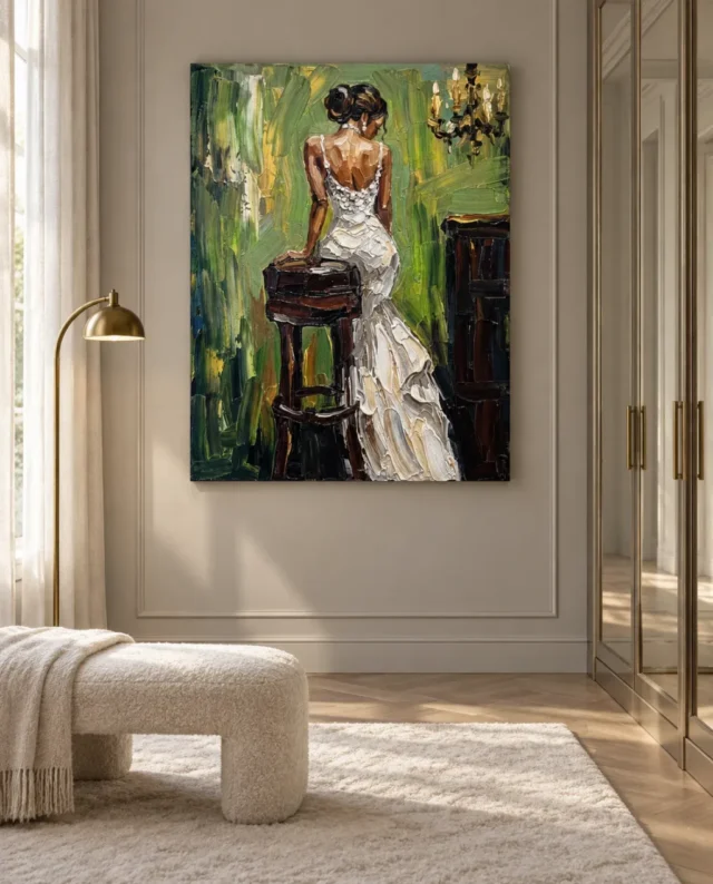
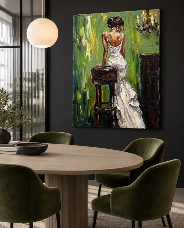
The existing room visualisations offer broader contexts for the same image. They are not records of customer installations, exact size guarantees or lists of included furnishings. Use them to compare the scene's whole-image presence with the cover's detail, then return to your own measurements, light and routines. Your room may give the work another role entirely. That is not a failure to reproduce the visualisation. The aim is to make the complete image welcome and legible in a real setting, not to copy a staged arrangement that may not accommodate the people and objects in your home.
After installation, review the result with ordinary belongings returned. Is the dress visible as a complete form? Do lamps or furniture hide details you care about? Does the subject remain comfortable in the chosen shared or private view? Small adjustments can clarify the relationship without a larger redesign. Do not preserve a first arrangement solely because it looked finished in a photograph. A room's daily use provides better evidence. The work can become familiar while textiles, furniture and routines change, provided its central encounter remains available and the actual print stays safely accommodated.
Bride in Ivy Light can have a lasting place without becoming a permanent occasion display. Its white dress, seated pose and green-brown field offer a particular figurative relationship, while the title can remain one association among several. The room does not need bridal objects, matching fabric or a literal garden theme to justify the choice. Give the image a clear view, an honest physical presentation and suitable light. Then let it share the home with ordinary life, where its poised figure can remain interesting without requiring the household to keep performing a symbolic story around it.
Continue with this artwork
Find your next artwork
Four checks for placing Bride in Ivy Light
Read more: Four checks for placing Bride in Ivy LightRead less: Four checks for placing Bride in Ivy Light
A Bride in Ivy Light display can make a pale room feel less plain or a dark dining area feel less closed in. The large white skirt does not need a white wall. Instead, the greens, dark furniture within the image and room lighting influence how the skirt appears.
Two illustrations give you a useful contrast. One shows the design beside a window and lamp, above a pale bench. The other places it behind a round table against a dark wall. Try four checks in your own room before taking either picture as a rule for where this artwork belongs.
Bride in Ivy Light display check one: start at your normal approach
Stand where you enter the room rather than directly in front of the intended wall. Mark two plausible positions with removable paper guides, if your surface allows them. Then use the doorway or nearest clear approach to compare those positions. Note how much of the rectangular opening you can see.
The print has a fairly concentrated upper figure, with the skirt spreading into the lower right. Therefore, the upper centre and lower corner both deserve a clear view. A high chair back might cover the lowest part from one seat. A pendant nearer the wall might matter from a different angle.
Move to the place you actually use for reading, eating or getting ready. If you chose the wall from the doorway alone, the image may end up facing the wrong audience. A smaller piece on the more useful sightline can do more than a larger one partly hidden by furniture.
Set a second viewpoint for the Bride in Ivy Light display
In the pale-room illustration, the bench is near the front of the view. The design sits upright farther back. At home, stand at that kind of side angle as well as straight on. If the dark frame of a door or cupboard makes the outer green edge hard to see, note it.
Check whether a seat, dresser or shelf falls between you and the wall when you take two steps. The question is not whether the room looks symmetrical in a photograph. It is whether the image stays comfortably visible from where you spend time.
Bride in Ivy Light display check two: choose a furniture relationship
Compare the visible body of the artwork with a piece of furniture, not an entire room palette. The light bench in one photograph does not echo the dark stool pictured within the artwork. However, it can make the lighter forms in the image feel at home. Those are separate relationships.
In the dining illustration, rounded furniture gives the scene softer edges. The angled pendant and chairs also create visual activity around the print. Look at the gap between the tabletop and the art. At home, that gap can change with a deeper bowl, a vase or your view when seated.
Our guide to scale and wall art for living spaces lets you compare a different type of display. The furniture in a multipurpose living room may sit farther from the art. In contrast, dining room chairs can form a nearer foreground and matter more in a lower sightline.
Give the Bride in Ivy Light display room for its greens
Pick no more than one thing you want to relate to the green field: a textile, a plant or even a book spine. Then look again without that item. The picture need not match the furnishing. In practice, the important decision can be whether the greens have a distinct edge beside the wall.
If a dark wall puts the lighter folds forward, check the opposite effect as well. The dark furniture inside the picture might blend into its surroundings. Meanwhile, a pale wall can keep the outer shape clear while offering less contrast to the dress. Choose which effect matters more from your actual seat.
Bride in Ivy Light display check three: compare two ordinary kinds of light
Make one observation in daylight and another under your normal evening lighting. In the window-and-bench scene, light reaches the wall from the side. The dining photograph puts a glowing pendant in the viewer's field. Neither proves how a given format will reflect light in your room.
The Canadian Conservation Institute's discussion of light explains why display conditions matter to objects. Follow the handling and care instructions that apply to the option you buy. Use this placement exercise to spot intense direct light or a reflection before you decide.
If a lamp seems to dominate, first keep it in its normal working position. Then change where you stand. A glare patch that moves when you take one step is a different problem from a naturally dark band in the image. If the lamp needs to light a reading chair, preserve that function.
Check the pale dress before the wall colour
In each light, start at the lower edge of the skirt. Can you still see the larger divisions even if the small marks merge? Then notice where green touches the outline. Try these observations before deciding that your room needs a different lamp or a new paint colour.
Use our close visual guide to Bride in Ivy Light to find those features in the first place. It separates the stool, dress and green field. In a display decision, they give you particular places to look instead of relying on a verdict such as too busy.
Bride in Ivy Light display check four: confirm the dimensions and format
Use the measured height and width from the chosen option, not a ratio calculated from a room view. Cut a paper shape or mark two corners on a temporary board. Check the higher and lower edges alongside the furniture. Then repeat the earlier sightline test with both corners in place.
The National Gallery's explanation of picture frames offers a way to think about an edge as a separate object. For a current order, the listing determines what arrives. If an option adds a visible edge or an outer frame, use its full stated measurements when available.
The Bride in Ivy Light product listing is the place to compare the actual selections. If you plan to buy artwork with a studio finish, check which selection names that finish. If your search started with hand made wall art, do not assume the illustrated design shows a single entirely handmade original.
When you buy wall art, the amount of preparation matters alongside the visual result. Read our comparison of listed and ready-to-hang costs before assuming two formats arrive in the same condition. To see why printed wall art can look textured, our guide to canvas and paper surfaces separates appearance from material.
Finish a mock-up before rearranging a room
Try the paper footprint first with the furniture as it is. Put the most frequently used chair where it usually sits. Leave the pendant, lamp or curtains where you normally keep them. It is much easier to move a temporary outline than to change a room that already works.
If you still prefer a different position, adjust only one dimension at a time. Moving the guide lower and closer to a window in the same test makes it hard to tell why it improved. Start with a single change and note what it does to the skirt or green edge.
Before you decide between two placements, check the height of the objects that will stay nearby. In the pale room, a lamp reaches into the lower part of the setting. In the dining view, a pendant occupies the opposite area and can matter from one shoulder of the table. Look for the comparable obstruction in your room rather than matching fixture heights to either photo.
If you ordinarily share the room, give someone else the same two viewpoints. Ask them where the eye reaches the white shape first, rather than asking which position is nicer. Then note the position where both viewers can make out the skirt without moving out of the normal route. This is useful evidence even if you prefer different colours or kinds of furniture.
Frequently asked questions
Should a Bride in Ivy Light display sit on a dark wall?
It can, but try both edge and silhouette tests. A dark surround can make the skirt stand out. It can also make the boundary beside the darker marks less obvious. Decide which effect looks better from the usual approach.
Can I compare wall positions without hanging anything?
Yes. Use a measured paper shape or a lightweight temporary board. If the finish on your wall is delicate, avoid sticking anything to it. Check the guide from both a doorway and the nearest place you normally sit.
What should the Bride in Ivy Light display share with the furniture?
It need not repeat a particular colour. Instead, try leaving a clear gap around the image and give its wider lower half some breathing room. A single quiet connection can be more useful than several colour matches.
Does the staged bench tell me the right width?
No. The picture shows one arrangement. It does not measure your wall or bench. Mark out the version you plan to order, then see where its sides land against the furniture you already have.
Is a position at the head of a dining table always best?
No. The best view may come from one side or the main entrance. Sit in the places people actually use. A decorative lamp or high chair can change which part of the image remains visible.
Should the greens repeat the colour of my dining chairs?
No. The dark dining scene offers one example, not a prescription. The green in the image can hold on its own. Test whether it stays distinct from your wall without adding a green chair or accessory.
Does the Bride in Ivy Light display need a dedicated art light?
Start with the lights already in the room. Check whether you can see the large folds and the outline at night. If glare is the problem, a different viewing angle may help more than another light source.
Will the pictured finish look the same next to my window?
Not necessarily. The room view and your own light have different conditions. Check the selected finish and avoid treating a photograph as a reliable sample of sheen. The arrangement can still help you compare possible positions.
Can this artwork work without formal decoration around it?
Yes. Read the neighbouring space before matching decorative motifs. A plain wall or simple piece of furniture can make the light folds and dark shapes easier to distinguish. You do not need to furnish the room around the title.
What if the bench moves regularly?
Test the outline with the bench in each normal position. The display should not depend on a photograph-perfect arrangement. Choose a spot where the design still reads when the bench moves and your daily route stays clear.
Which part should stay easy to see from across the room?
Start with the silhouette of the lower dress and the contrast against the dark seat. Tiny highlights can disappear at a normal viewing distance. The broader movement of light against green and brown should still give you something to follow.
Is the room photograph a promise of how the item arrives?
No. It illustrates a display, not the contents of the parcel. Use the specific format and finish details in the product selector. Check mounting or preparation separately if you plan to show it as soon as it arrives.
Conclusion: choose a wall you use, not just one you photograph
Keep the position where the dress stays readable and the room remains practical. Compare daylight and evening light before fixing a preferred height. Then return to the product options with the measured space in mind and choose the format that fits it.