Living with art
A Monochrome Face with Room to Breathe: Placing Black and White Textures
Plan a clear setting for this fragmented monochrome face by managing visual contrast, screens, patterned objects, viewing distance and the practical needs of the chosen support.
Will the room welcome this much contrast?
Black and White Textures may be easy to coordinate by colour, but it is not a quiet background image. Its fragmented face and bold marks can create a strong point of attention. Before choosing a wall, consider how much contrast the room already contains. A black television, patterned rug, open bookshelf and several bright lamps may form an active setting even if the palette is largely neutral. The print can work within that environment, but it needs a deliberate role. Ask whether you want another focal point or whether the room would benefit from the artwork replacing, rather than joining, an existing concentration of visual activity.
Spend time in the room at the hours you normally use it. A high-contrast face may be welcome during an energetic afternoon and feel different in a quiet evening. Your response matters more than a rule that monochrome art suits every contemporary home. If sharing the room, consider the preferences of others who will see it regularly. There is no need for everyone to interpret the face in the same way, but the image's intensity should be welcome. A personal art choice can remain expressive without being installed in the most unavoidable position for every member of the household.
If you are uncertain, begin with the proposed size marked on the wall rather than immediately reorganising the room. Notice how much of the wider view the rectangle occupies. This will not reproduce the artwork's detail, but it can clarify its intended prominence. Then compare the full product image with that placement in mind. The aim is not to tame the print until it becomes neutral. It is to give an active image a setting where its energy feels chosen rather than accidental, and where the room continues to work for the people who use it.
How much bare wall does a fragmented face need?
There is no universal measurement of breathing room, but the image benefits from a clear boundary. Strong marks within the artwork can become harder to distinguish if neighbouring objects have similar small-scale contrast. Look at the wall immediately around the proposed position. A shelf of book spines or a cluster of small frames may extend the visual fragmentation beyond the print. A pause of plain wall can help the face remain one image. This does not require an empty room. It requires deciding where the artwork ends and the surrounding collection begins, so the viewer is not asked to sort everything at once.
Try removing one neighbouring object at a time and observing the difference. You may find that a small adjustment in spacing is enough. If the print hangs above furniture, keep the everyday contents of that furniture in the trial. A console may need to hold keys or a lamp; a desk may need tools and notes. The arrangement should accommodate those uses rather than rely on an unrealistic empty surface. The fragmented portrait can carry visual complexity within its own rectangle while the furniture remains practical. This division can make the room feel intentional without demanding constant tidying for the sake of the artwork.
A frame can provide another kind of boundary if you choose a poster presentation. Its width and colour should be judged with the actual image and wall, not by an automatic rule that monochrome art needs a black frame. A dark border may reinforce the graphic effect; a lighter one may create separation. Seek suitable framing advice for the chosen paper and dimensions. The important point is that the finished object should read clearly in your room. Include the frame's outer size in any wall plan, because the boundary you add is also physical space you must accommodate.
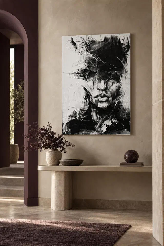
A television and a face should not compete by accident
Screens are often the strongest dark rectangles in a living room. Placing this print immediately beside a television can create a relationship between two high-contrast areas, especially when the screen is off. That may be intentional, but test it rather than assuming that shared black-and-white tones make them natural companions. When the television is on, changing images and light can compete with the artwork. A different wall may allow the fragmented face to retain its own presence. You do not need to hide technology; you need to decide whether the print and screen should share a focal zone or occupy different parts of the room.
Consider the view from the usual sofa. If you would see the print constantly beside the screen, ask whether that is enjoyable during both watching and resting. A work that rewards sustained attention may be better placed where it can be looked at independently. Conversely, a side wall may give it a quieter role without making it insignificant. Follow the real sightline rather than the available wall area alone. The subject's face can draw attention even when it is not placed centrally. A well-chosen secondary position may offer more satisfying encounters than a crowded place beside the room's main electronic focus.
The same principle applies in a home office. A monitor, pinboard and fragmented portrait can create a dense field of information. If you enjoy that environment, keep a clear separation among their functions. If you prefer a calmer desk view, place the artwork to one side or on a wall seen during breaks. Do not expect the image to improve concentration or provide a particular emotional benefit. Its practical value is as a picture you enjoy. Choose a position that makes that enjoyment available without turning the working view into an accidental contest among several equally insistent surfaces.
Use texture and colour elsewhere as counterpoints
A monochrome artwork does not require a monochrome room. An existing coloured chair, warm timber or soft textile can provide a useful contrast to its sharp tonal language. Start with the materials already present. The print may connect with a dark furniture edge while remaining distinct from a coloured wall. That can be more interesting than matching every object to black or white. Consider the scale of pattern as well as hue. A large plain surface can support the image's small broken marks, while another intricate high-contrast pattern may make the entire view feel busier than intended.
If the room already contains a patterned rug or cushions, you do not automatically need to remove them. Look at their distance from the print and the role each plays. A pattern across the floor may be separated enough to coexist, while a busy fabric immediately beneath the image may merge visually with it. Try the actual view before deciding. The useful question is where your eye rests and whether you can move comfortably between the artwork and the rest of the room. A coordinated scheme is not the goal in itself; a legible and personally enjoyable relationship is.
Avoid using the artwork as a reason to purchase a complete new set of accessories. Its limited hue range may already make it flexible. One or two existing material connections can be sufficient. If you do change wall colour, test physical samples under the room's real light rather than assuming that a screen image establishes an exact white or black to match. Subtle differences in surrounding tone can affect how emphatic the print feels. The final arrangement should work as a lived-in space, not only as a close photograph in which every object has been selected to repeat the artwork's palette.
Match viewing distance to the amount of detail you enjoy
This fragmented face can change character with distance. Across a room, the larger tonal arrangement may gather into a human presence. Nearby, individual strokes and gaps can become more dominant. Choose a position that supports the aspect you most enjoy. If the broad face is the attraction, a clear room-distance view matters. If you are fascinated by the smaller marks, leave an approach route. Avoid hanging it above furniture so deep that no one can comfortably get near, then expecting close details to become a daily pleasure. The placement should follow the intended encounter, not just the shape of the wall.
A larger size does not automatically solve every viewing issue. It can make the marks more prominent as well as the face more visible. A smaller presentation may offer a more intimate encounter while still carrying strong contrast. Make a full-size outline of the finished object and compare it with furniture and architectural features. Include the frame if applicable. The existing room visualisations are illustrative rather than scale evidence. Use them to prompt ideas, then confirm the dimensions for your exact selection. This keeps the decision grounded in your own room instead of in an impression created by a staged scene.
If the available wall is narrow or interrupted, consider whether the print has enough space to remain one coherent object. A door edge, tall lamp or shelf can divide the view. Moving the work slightly may be more effective than choosing a much smaller size. Check from several ordinary positions, including seated ones. The image's internal fragmentation should be an artistic quality you choose to enjoy, not a confusion added by accidental obstructions. A clear external setting lets the face dissolve and return within the picture on its own terms.
Explore the Abstract art collection
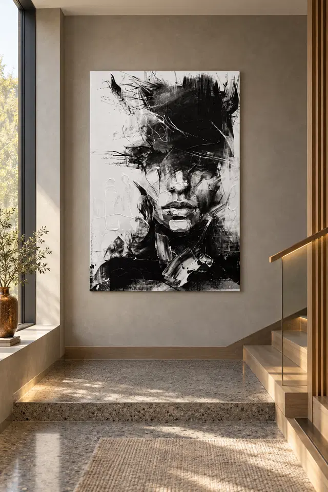
Choose the support without inventing a tactile surface
The black-and-white marks depict texture, but the supplied print should not be expected to contain thick raised paint on every stroke. Light selective hand-finishing is optional and separate from an ordinary order. Review the actual finish control rather than inferring it from the image's intensity. The verified canvas is Neptune Natural Matt Canvas 400, a 400 gsm cotton canvas with a natural warm base and irregular weave. Compatible paper choices include Oyster 271 pearl or satin photographic paper and Photo Lustre 310 photographic paper. These are support facts, not promises that the artwork will become a physical collage or an original painted surface.
A poster is supplied rolled and unframed, so plan an appropriate frame or presentation. The manufacturer's Photo Lustre page below offers further reading about one available paper. It does not certify the image's provenance or lifespan. If selecting canvas, distinguish rolled and stretched presentations and check the current dimensions. Rolled artwork size, printed allowance and supplied flat size are different pieces of information; stretched front-face dimensions and wrap are stated separately. Do not use an old margin example as a universal rule. A clear order review helps you plan the actual outer size and installation sequence rather than relying on a remembered or imagined object.
For a framed presentation, check reflections from windows and lamps in the regular viewing positions. A strong reflection across the face can interrupt the image in a way you did not intend. Canvas has different surface behaviour but still needs a suitable display location. Keep the print away from avoidable splashes, persistent damp and direct heat. Use wall fixings appropriate to the finished object's weight and the wall construction, and seek competent help where necessary. These practical choices allow the expressive image to remain the focus instead of becoming a source of installation or care worries.
Let an unresolved image have a clear practical place
After hanging the print, give yourself time to notice it during ordinary use. The face may become more familiar while its fragmented marks remain interesting. You do not need to settle on a single emotional interpretation. An image can be intense without being a statement about your own mood, and a shared room can hold different responses to it. What should become clear is the practical arrangement: the view is unobstructed, the object is securely presented and the surrounding area allows the artwork to be read. External clarity can support internal ambiguity rather than trying to eliminate it.
If the room starts to feel visually crowded, simplify the immediate neighbours before deciding that the print is too much. If its presence remains unwelcome even with a clearer setting, a different wall or a quieter image may be the better choice. That is not a failure of taste. Art is encountered within changing routines and spaces. The Living Room, Reception and Abstract collections offer comparisons if needed, while the product page provides exact current choices. Use those comparisons to understand what kind of attention you want to invite rather than to find a universally correct monochrome scheme.
The strongest placement for Black and White Textures is one where its face can emerge without competing with every object in the room. Let the artwork carry the fragmentation and let the room provide a usable framework around it. You can retain coloured furniture, personal possessions and ordinary household activity. The print does not need a gallery-like environment or a promise of modern sophistication. It needs a welcome place, a clearly understood support and enough visual space for its particular movement between recognition and abstraction to remain interesting over time.
Continue with this artwork
Find your next artwork
Four checks for displaying Black and White Textures
Read more: Four checks for displaying Black and White TexturesRead less: Four checks for displaying Black and White Textures
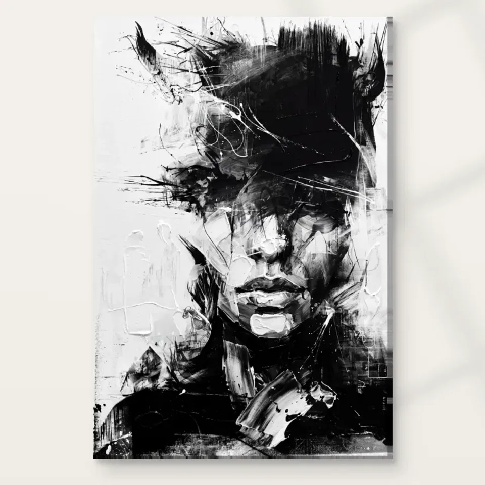
A Black and White Textures display uses more than a dark mark on a pale wall. In this artwork, the lighter left side and the heavier upper right do not ask for the same thing from their surroundings. Check how each edge reads before choosing a position. You may find that a modest shift is enough.
The console and landing examples have different architecture around the same image. They can help you think about views, not copy their dimensions. Try four checks: the edges, the route people take, the light over a normal day and the actual outline of the selected presentation. Keep the existing room in mind throughout.
Black and White Textures display check one: test each edge separately
Stand where you normally see the proposed spot. Mark the outside outline of the presentation you are considering. Then look along both sides separately. The light part of the image could look fairly close to the tone of a pale wall. In contrast, a dark part nearer the other side might stand out clearly.
You need not make both edges equally obvious. For example, let the left remain quieter if the dark gestures are the part you want to notice first. However, if you lose your sense of the whole rectangle, try a different place or compare a physical frame you actually intend to add.
Our visual study of the mouth, white passages and crossing marks can help identify a landmark. Look for one close to an edge and another in the central face. Then compare whether those details remain distinct when the outline is near a door or a contrasting wall seam.
Compare a Black and White Textures display beside warm colour
The console visualisation puts muted warm furnishings under the image. That arrangement makes it possible to try the piece without matching everything to black and white. Look at a warm wall you already have. Similarly, test a timber edge if one is nearby. Notice whether it becomes a second upright that competes with the image.
If you plan to buy wall art for a pale landing, a simple edge test may be more useful than painting the wall. Tape a removable guide only where the wall finish permits it. Check the view with the furniture in its usual place before buying a border or changing the room.
In the console scene the left side of the image sits fairly near a darker opening in the architecture. Look at that relationship, then check any doorway or alcove near your own candidate wall. A dark adjacent area can change where you notice the pale rectangle. Therefore, compare the position with the opening included in your view rather than cropping it out.
Black and White Textures display check two: look along the real approach
Stand at the entrance and then at a stable point farther in. Can you see both the chin and the dark upper patch? Occasionally a tall console object will hide the lower face before you notice it at all. Remove only that object for a test rather than rethinking everything else in the room.
The staircase visualisation above may suggest a long view. It does not supply measurements or an installation method. If you are considering a landing, test from a place where you can stop safely. Moreover, consider what someone can see while walking past as distinct from what you can see while standing still.
Set a second viewpoint for a Black and White Textures display
The Golden Ads hallway wall art selection offers an alternative if the large dark shape feels too close to a dark doorway. Keep the same opening in your comparisons. Then decide whether you want an image that registers quickly at one glance or one you can see at leisure from a nearby room.
From a seated position, the breaks near the mouth and pale side may become more evident. Check whether the proposed display sits partly behind furniture from there. In particular, see what changes when you slide the marked position sideways. You might recover a feature without choosing a different height or display size.
There is a separate test for a wall you often see from a nearby room. Note which features remain visible when you leave the door partly open as you normally do. Then compare a second position without moving the door. Otherwise, an unusually clear view during the test may conceal the very issue that will bother you later.
Black and White Textures display check three: use the room's usual lamps
Try the wall in daylight and under the lamps you generally switch on at night. If a reflection hides a fine white line in the dark, shift your viewpoint slightly. However, if the same detail disappears everywhere at that time, compare another place under a better light before deciding the print can't work.
The Canadian Conservation Institute's explanation of light exposure helps distinguish viewing conditions from longer exposure. Use it as general context only. A bright room visualisation does not promise anything about the life of an item or establish the light levels appropriate to every material.
Our comparison of print surfaces and different kinds of sheen provides a separate check if you will be adding glazing or comparing finishes. Think about the physical surface rather than the contrast in the image. In particular, a bright stroke inside the artwork does not determine how the supplied surface behaves under a lamp.
Test contrast at the edge of a Black and White Textures display
Compare a quiet wall with one where daylight creates sudden bands across the surface. If both spots seem useful, see which lets you keep the grey passages distinct. Nevertheless, do not give up a lamp you need for another task. Many rooms work better with a different position than with an inconvenient change to useful lighting.
For broader considerations, see the Institute's general guidance for displaying and handling paintings. Use care instructions relevant to what you choose. It is useful to know the difference between a question about placement and a question about the actual material. One photograph answers neither on its own.
Black and White Textures display check four: verify the complete outline
Once one position looks promising, open the Black and White Textures artwork listing. Read the actual options and note what would be supplied. If you searched for hand made wall art, verify whether a term refers to printing, finishing or another operation. A picture of thick-looking marks is not a product specification.
If a frame or mounting step is separate, use the guide to the total cost of a ready-to-hang setup. Compare the width of the complete display with the usable space, rather than treating the listed image area as the full footprint. That separation matters when you buy artwork for a narrow place beside another feature.
Compare final candidates for a Black and White Textures display
Take the two positions you liked and use the same outline in both. If one makes the face easier to follow and the other makes the outer shape clearer, choose which effect matters more. Consequently, you can decide on the location with a concrete reason rather than ranking the walls by how empty they look.
If you would pair the print with another one, make that a separate comparison. At first leave the second place empty. Then try a quiet shape in the space beside it. Because the dark region in this picture is already broad, a competing image might make your eye skip the thin pale details you wanted to see.
Frequently asked questions
Do I need a pale wall for a Black and White Textures display?
No. A pale wall can make the dark area easier to notice at once, while a darker surrounding wall can give the pale marks greater contrast. Compare each in ordinary light. You may prefer a site where only one edge stands out.
Will a large object on a console hide the artwork?
It depends on your position and the outline. For example, a tall vase may cross the lower part only when you enter from one side. Test the console as you usually use it, then move just the item that seems to cause an obstruction.
Can I use a Black and White Textures display on a narrow landing?
First check for a safe, unobstructed view. Then consider the actual dimensions and complete presentation. A landing illustration does not establish suitable space in another home. If the opening is uncertain, start with a temporary outline and decide from a level position.
Should I match this monochrome image with black furniture?
You do not need to. In the illustrated rooms, calmer furniture or warm neutrals leave much of the visual contrast to the picture. Try the work beside the things you have. Also, look for a clear section of wall rather than another decorative match.
Why does the upper half matter from the doorway?
It has some broad dark shapes that may be apparent before the smaller facial details. That can make the piece readable at a glance. Nevertheless, try the doorway with the door in its usual position, since it may shorten the view.
How can I test a Black and White Textures display in evening light?
Start with the lamp you normally use. Then look for the distinction between faint grey marks and a temporary bright reflection. Move slightly while looking at the same area. If the glare moves, compare an alternative angle or another position.
Does the pale edge need a frame?
Not for every presentation. First confirm what the selected item includes and which framing options suit it. Then test how clearly the light area stands apart from the wall. A pale patch can belong to the image without needing an extra visible edge.
Can the landing example tell me how high to hang it?
No. Treat the scene as a display idea, not a height recommendation. Use real measurements and a viewpoint you can check safely. In particular, consider the complete size and what happens as you enter, sit down or open a nearby door.
Is the darkest area always the first thing I see?
No. A bright neighbouring wall or an existing object can draw your eye first. Similarly, standing close may make a small feature more noticeable. Judge how the work enters view during normal use instead of relying on one cropped image.
Will a large print make the face look clearer?
It can make more details visible from the same distance. However, it might also fill too much of the opening or give less room to see the edges at once. Compare actual sizes and test each outline from both of your viewpoints.
What if I mostly want the work for its abstract shapes?
Then choose a position from which you can enjoy the wide pale and dark passages without needing to identify the face. A focused light on the nose is not necessary. Look at where the stronger shapes fit beside the room's existing boundaries.
What should I check before choosing the final setup?
Confirm the size and presentation on the listing. If anything extra changes the outside dimensions, update your measurement. Next, check the wall and available view again. The choice is more reliable if it doesn't depend on anything the mock-up appears to promise.
Finish the Black and White Textures display where both tones have room
Return to the site that gives the pale edge and dark marks enough room to work together. You do not have to see every fine detail from every position. Instead, decide whether the image still attracts you both when you pass and when you stop.
Check the actual option before ordering, then choose the one that fits your measurements and ordinary view. This keeps the work's contrasts intact without asking the room to become a replica of the staged example.