Looking closer
Finding a Face in Black and White Textures: A Guide to Fragmented Form
Follow the shifting boundary between face and abstract marks in this monochrome print, looking at contrast, empty passages and the changing experience of viewing distance.
When do scattered marks become a face?
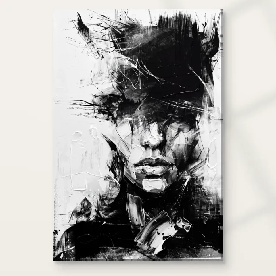
Black and White Textures Abstract presents a face through fragmented marks rather than a continuous outline. That makes recognition an active part of looking. You may notice a feature, connect it to another passage and suddenly read a human presence within the surrounding activity. Then a different area may return the image to abstraction. This shifting experience is more specific than simply describing the print as dramatic. The interest lies in the threshold between identifiable form and marks that remain open. Begin by noticing when the face becomes clear to you, without assuming that every viewer will find it at exactly the same moment.
The current copy describes bold brushstrokes, splatters and features that seem to dissolve into their surroundings. These are visual descriptions, not a verified account of a person's identity or psychological state. It is tempting to turn fragmentation into a story about the sitter, but the picture does not require that explanation. You can respond to its unsettled appearance while leaving the subject unnamed. The face may feel intense because of contrast and interruption rather than because it represents a documented emotion. Keeping those possibilities distinct gives you a more careful and flexible way to appreciate the work.
For selection, ask whether you enjoy having to complete the image in your mind. Some people prefer a face that remains immediately legible from every distance. Others enjoy the moment when scattered marks gather into recognition. This print belongs to the latter conversation, even if the central presence becomes familiar with repeated viewing. A sustained attraction may come from the way you keep moving between face and field. If that movement is what you value, the artwork offers more than a generic black-and-white accent for a room.
Why is monochrome not the same thing as neutral?
The absence of vivid hue does not make this image visually quiet. Black and white can create strong differences, and abrupt transitions may feel more insistent than a muted colour palette. Look at the distribution of dense dark passages and lighter openings. The print's energy comes partly from how those areas interrupt each other. A room may contain few colours and still feel busy if many surfaces use strong contrast. This is useful to remember when choosing the artwork: its monochrome palette offers colour flexibility, but its arrangement remains active and should be assessed on that basis.
Instead of treating black as foreground and white as background automatically, let your attention move between them. A light passage may help define a feature, while a dark mark may connect the face to the surrounding field. The roles can change across the image. This is one reason the composition can feel dynamic without a depicted action. The eye keeps revising the relationship between occupied and open areas. You do not need a technical label to follow this. Simply notice which shapes seem to come forward and which recede, and whether that experience changes when you step back.
If you are considering the print because it will match a monochrome interior, look at it for longer than a thumbnail glance. Matching colour categories is not enough to determine whether you will enjoy its intensity. Compare it with a quieter black-and-white image if possible. You may find that the fragmented face is exactly the focal point you want, or that a less interrupted composition suits your taste better. Either result is useful. The goal is to choose a particular visual rhythm, not to assume that every image without strong colour behaves as a neutral object.
Look at the gaps as carefully as the brushstrokes
The most forceful marks naturally attract attention, but the lighter gaps help make them understandable. An opening can separate two features, provide a pause or prevent a dense area from becoming one indistinct mass. Spend a viewing session looking for these interruptions rather than following the darkest strokes. You may discover that the face depends as much on what is not filled as on what is strongly marked. This changes the way texture is understood. It becomes a relationship between activity and restraint rather than a simple accumulation of visual noise across the whole rectangle.
A gap does not have to be empty in meaning or entirely blank in appearance. It can participate in the image by allowing nearby marks to be read. The same principle applies to the surrounding field. A busy area may feel explosive because another area gives it contrast. If every part were equally dense, the sense of fragmentation could become less distinct. Look for that internal balance before accepting the source copy's word chaos as the whole explanation. The print may suggest disorder while still depending on an arrangement that lets a human form emerge.
This is a useful selection exercise because it slows down the first impression. You may initially respond to the image's impact, then find a quieter structure within it. If those discoveries are rewarding, the work may hold your attention over time. If you feel only the impact and do not enjoy returning to the gaps and connections, that is a reason to compare alternatives. A picture does not have to become easy or restful to be worthwhile, but the kind of difficulty it offers should be one you actually welcome in an object you plan to see often.
Fragmentation can remain open rather than diagnostic
Faces invite emotional interpretation, especially when their features are interrupted. You may see tension, vulnerability, determination or something less nameable in this print. Those responses can be meaningful without becoming facts about a depicted person. The current product information does not establish a sitter, event or psychological condition. Avoid using the image as a diagnosis or a complete story. Its visual uncertainty is part of the work, and leaving that uncertainty intact can make it more interesting. A face assembled from marks can suggest many experiences while remaining a visual construction rather than evidence about an individual.
Consider how the fragmented form differs from a straightforward portrait. In a conventional close view, the viewer may spend time reading a gaze or expression. Here that reading is repeatedly interrupted by the surrounding strokes and splatters. The interruption is not merely an obstacle. It becomes part of the encounter. You are asked to notice both the person-like form and the means by which it is presented. That double attention may appeal if you enjoy figurative imagery but do not want a fully descriptive face to dominate the experience. It allows recognition and abstraction to share the same field.
If choosing the print for a shared room, remember that other people may read it differently. You do not need agreement on one emotion for the artwork to have a place. What matters is whether its intensity is welcome in the setting and whether its visual ambiguity interests you. A title can identify the monochrome texture without resolving the face into a single narrative. Let conversation remain exploratory. Questions about what is visible and how the marks connect are more grounded than confident claims about what the unknown subject must be feeling.
Distance changes the amount of face you can hold at once
At close range, individual marks may become dominant. From farther away, they can gather into larger forms and make the face more coherent. This difference is particularly important for an abstracted portrait. Do not choose solely from the largest close-up or the smallest thumbnail. Each shows one aspect of the work. The everyday experience of a wall print often begins across the room, then changes when someone approaches. Ask whether you enjoy the image at both distances. A detail can be fascinating while the whole feels too busy, or the whole can be compelling while fine marks remain secondary.
Try moving between the two views without deciding that one is more correct. The close view reveals the vocabulary of strokes and gaps; the distant view reveals how they cooperate. The face may seem to dissolve and return as your attention changes. That is not a defect to be corrected by a larger size. It may be the very quality that distinguishes the print from a literal portrait. If you prefer stable recognition, choose accordingly. If you enjoy the shifting threshold, make sure the planned wall allows at least some opportunity for both near and room-distance encounters.
Size should follow that intended experience. A larger print can make marks more physically prominent, but it does not automatically make the composition calmer or more legible. A smaller one can concentrate the contrast and encourage approaching it. Consider the actual wall and expected viewing distance before deciding. The existing room images are visualisations, not measurements of a particular print in your space. Use them to imagine possibilities, then return to the product dimensions and your own room. The artwork's changing readability is a reason for thoughtful scale selection rather than a simple argument for maximum size.
Compare abstraction by the amount of recognition it retains
The Abstract and Expressionist collections offer useful comparisons, but direct looking is more important than the labels. Some abstract images retain no clear human subject; others, like this one, allow a face to emerge from active marks. Ask how much recognition you want. A completely nonfigurative work may offer a more open field, while a clear portrait may provide a steadier human presence. Black and White Textures sits in a productive middle area. The appeal may come from not having to choose between a face and an abstract arrangement. That balance is particular enough to guide a careful comparison.
When considering a companion work, look beyond shared monochrome colour. A second high-contrast fragmented face might create an intense pair, while a quieter geometric or landscape image could provide a different pace. You can choose either relationship deliberately. Avoid assuming that all black-and-white prints naturally belong together at close spacing. Density, direction and the scale of marks can make them compete even when their palette matches. A coherent group may need separation or a less active neighbour so that each image retains a clear boundary and its own way of attracting attention.
Return to the work alone after making comparisons. Does the face still draw you back? Are you more interested in the large tonal arrangement or the smaller fragments? Naming that preference can help you choose a format and placement later. It also keeps the decision from being driven by the broad idea of contemporary monochrome decor. You are selecting this particular relationship between human form and abstract field. If it remains engaging without a styled room or an invented emotional story, the visual reason for choosing it is already strong.
Understand printed contrast without expecting raised paint
The source image's texture is a visual quality. It does not establish that every dark stroke will be physically raised or that the supplied object contains thick painted impasto. Optional light selective hand-finishing is a separate choice, not an automatic result of an expressive image. Review the current product controls for the actual order. The distinction lets you enjoy the fragmented marks as printed imagery while making an informed material decision. A monochrome image can retain its striking relationships on a continuous support without becoming a unique original painting or a surface assembled from separate physical fragments.
The verified canvas support is Neptune Natural Matt Canvas 400, a 400 gsm cotton material with a natural warm base and irregular weave. Compatible paper choices include Oyster 271 pearl or satin photographic paper and Photo Lustre 310 photographic paper. The manufacturer's Oyster page below is further reading about one support, not a guarantee about the artwork's identity, origin or lifespan. Posters are rolled and unframed, so a later presentation plan matters. Canvas has its own rolled and stretched options. Consider the finished object as well as the image, especially if a frame will add a strong boundary around the monochrome field.
Choose Black and White Textures because you want to keep returning to the way a face appears within broken marks. It does not need to produce a universal emotion, fit every modern room or demonstrate a named technique. If you enjoy the overall contrast and the smaller gaps that hold it together, the print offers a sustained visual conversation. Confirm the exact size, support and finish before ordering. Then allow the image to remain partly unresolved. Its strongest quality may be the repeated experience of finding form without ever reducing the entire picture to one fixed reading.
Continue with this artwork
Find your next artwork
Three ways to see the face and the surrounding marks
Read more: Three ways to see the face and the surrounding marksRead less: Three ways to see the face and the surrounding marks
This Black and White Textures composition makes the mouth easier to find than the eyes. A pale chin and grey marks around the nose offer more clues. However, a dense band of black strokes runs across the upper face. It can turn a recognisable person into a much less settled arrangement of shapes.
Try three approaches to the artwork. Start at the mouth, work across the darker upper region, then spend time on the pale areas. Each route can reveal a different balance between the face and the surrounding marks. That is useful whether you are considering the image for its subject or for its contrasts.
Black and White Textures composition route one: start below the eyes
Look at the central mouth without following the neighbouring strokes for a moment. There are both pale and dark edges, not a single line. Notice the light patch on the chin after that. The two features provide a lower centre even if much of the top doesn't immediately suggest a head.
Now travel from the mouth towards the nose. The small break between the shadow and the lighter region above can look clearer than the outline of the cheek. In contrast, parts of the outer face are broken up by other marks. This difference encourages you to recognise the figure in stages.
The National Gallery's glossary on composition explains how parts form an arrangement. Here that approach helps you look at shapes before you try to identify a person. For instance, two nearby highlights may help orient you even though neither describes a complete feature by itself.
Put a finger beside the preview to mark the central line of the face. Then see how another feature sits in relation to it. The brighter patch under the mouth and the dark touches beside it need not seem symmetrical. However, the small departures can help you read a face that feels partly interrupted instead of neatly arranged around two sides.
Restart the Black and White Textures composition at a narrow patch
Pick one bright stroke next to the mouth and try to locate it again after you look away. Do not enlarge the entire image at first. Therefore, you can see whether that small bright edge ranks among the first things you notice, or only becomes important after the lower face is already clear.
The figures and boundaries in our Cubism guide offer another way to think about incomplete appearances. They are an exercise in looking, not evidence that this contemporary image is a historical Cubist painting. Compare how long it takes you to find a recognisable detail in each, rather than fitting the work to a label.
Black and White Textures composition route two: let the dark field lead
Start with the deep area above the nose. On the upper right it spreads almost to the top of the image, while on the left it breaks into scattered marks. The dark isn't simply an outline round two eyes. Instead, it extends out into a much stronger arrangement which has its own irregular boundary.
Notice how some pale lines cross that region. A small loop can bring your eye back towards the centre, while longer striations extend in other directions. Their contrast helps them read over the black. Nevertheless, they do not tell you where one layer sat relative to another during manufacture.
Compare the dense uprights near the top of the artwork with the thinner trails reaching leftwards. The vertical marks can gather the upper region together. Meanwhile, the thinner trails send your eye into the open field. Following either set changes how quickly you return to the facial features.
Look twice at tone in the Black and White Textures composition
The National Gallery's introduction to chiaroscuro supplies a useful starting point for comparing light and shade. Here, the darks can push a nose or mouth into view while disguising a possible eye. That is a description of the effect, not a reconstruction of any lighting or paint recipe.
Look above the upper edge of the nose and ask whether your eye keeps trying to find a gaze. Then watch the same region as an area of moving black marks. You may not settle between those readings straight away. That uncertainty is part of the image, not information missing from an art-history label.
The sweep above the face also has a different visual weight from the wide shape near the lower edge. Compare them with the middle covered on a screen. Then restore the central features. As a result, the same upper region can seem to change from a separate dark area into a part of a figure, without any mark changing place.
Black and White Textures composition route three: read the whites
From the face, look to the large pale region on the left. It is easy to mistake it for space left over. However, there are softer grey touches and faint marks inside it. Look for a curved light stroke that stays visible even though it does not offer the same contrast as the black above.
Follow the pale area down to the bottom, then look across the heavy black shape near the base. On the lower right, an angled shape cuts through that dark. It pulls you towards another edge rather than stopping at the chin. Compare that direction with the pale height on the left.
Our guide to how marks can imply physical relief helps distinguish apparent thickness from material. In particular, a white stroke with a clear edge may seem to sit above the image. That appearance doesn't establish raised paint on a supplied print. Check the actual description and finish rather than assuming the technique.
Look at the same pale area at different screen sizes. Try to keep the whole image visible in one comparison. As a result, an area that seems plain from far back may show enough marks on a larger image to answer a different question. It need not serve as an empty border.
Carry the Black and White Textures composition into a comparison
Before you buy wall art, choose another image with strong light and dark, but fewer crossing marks. The abstract wall art collection gives you choices to compare. If you miss the spreading dark band even when the new picture shows a clearer face, you have identified a quality that matters to you.
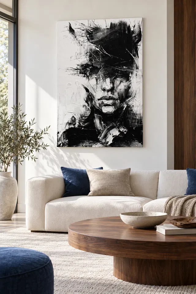
If the sofa setting above appeals, compare the same print alone first. A pale wall and a light seat make quieter forms around the face. However, when you buy artwork, the surrounding room is not part of the selection. For practical comparisons, see our room placement guide for Black and White Textures.
Choose from the actual listing after a Black and White Textures composition study
See the current Black and White Textures options to check the offered size, surface and presentation. If you searched for hand made wall art, check how the selected item is made and finished. Neither the appearance of a pale stroke nor the spread of a dark mark answers the physical question by itself.
If you want to see particular details, record where you would normally stand or sit. Try to keep the picture's main outline in view before you check close details. A useful purchase is one that makes sense at both distances you use regularly, even when the kind of image you notice changes.
Frequently asked questions
Where does a Black and White Textures composition reading begin?
The mouth is a useful first landmark because several clear changes in tone surround it. Then look up and see how quickly the figure becomes less certain. Other starting points are possible, but this one helps you see how much recognition depends on the lower face.
Does the upper dark area hide every hint of the eyes?
Not necessarily. One darker edge or grey patch may suggest part of an eye without fully revealing it. Try viewing the same area as an arrangement of marks as well. That alternative doesn't require you to decide which feature belongs to which shape.
Does the Black and White Textures composition use only two tones?
No. Grey differences matter around the cheek, nose and edges of the darker field. Meanwhile, the widest light and dark shapes usually remain clearer from farther back. Look both at the overall contrast and at the smaller changes within it.
What do the fine white lines do above the face?
They cross through sections of the denser dark and make some areas easier to follow. For example, a curved pale mark can give you a route back toward the middle. The picture does not need to identify the marking tool for that relationship to work.
Is the large pale area on the left just unused space?
Pay close attention to the faint marks within it and the dark ones along its boundary. It may look open, but that does not make it neutral. Instead, compare how much more active the dark appears beside it than it might inside a dark surround.
Can the Black and White Textures composition tell me how the surface feels?
No. Several strokes make a convincing visual suggestion of a textured surface. However, appearance differs from the thickness, coating or finish of the actual print. Rely on the listed format and option for those facts rather than a close-up of the image.
Does this artwork identify a sitter?
The guide makes no identification. You can compare the chin, outline and fragmented upper area as features of a face. Moreover, that comparison need not provide a name, an emotional biography or a comment on where the person may have lived.
What should I compare beside a different monochrome picture?
Choose a single dark field or a distinct border in both. Then ask which piece offers more room for your eye to move without losing its main feature. This comparison tells you more about the arrangement than a tally of light and dark areas.
Does the sofa illustration indicate the size of the print?
No. It offers an approach to placement using furniture as a visual reference. Use a real measurement when you consider a chosen size. In particular, separate the image dimensions from the full outline if you plan to add a frame of your own.
What is easy to miss if I only use a thumbnail?
The faint lines and transitions around the cheek may receive less attention. Conversely, the large upper and lower regions can seem easier to compare. Use both scales so you can tell which part you notice at a glance and which rewards a longer look.
Can I appreciate this artwork without seeing a face?
Yes. Follow the upright, horizontal and sloping marks as arrangements in their own right. A strong impression of movement can remain even if you do not assign the marks to a person. The composition provides more than one way to keep looking.
When should I verify an optional finish?
Check the chosen option with its material and size before deciding what to order. For example, additional finishing need not affect every part of the depicted image in the same way. Use verified descriptions rather than assuming that an existing room photograph shows that option.
Finish the Black and White Textures composition with one detail in mind
Look at the complete artwork once more. You may remember the mouth, the breadth of the black field or the thinner activity in the white. If you can say which contrast would hold your attention over time, you have a more practical reason to choose the print than the word monochrome on its own.
When ready, compare the options with your wall and pick a format that suits the distance you need. Check what the presentation includes. Then choose the work for the particular shift between face and marks that drew you in.