Looking closer
Ornate Persian Script: Looking Between Floral Borders and Dark Letterforms
Explore how red floral corners, a pale lower ornament and layered dark script organise this image, without inventing a translation, provenance or metallic finish.
What holds the image together before you read any script?
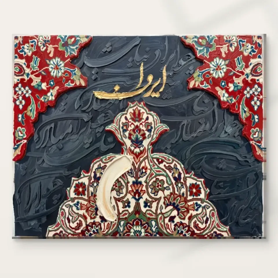
Ornate Persian Script can first be approached through its arrangement of large areas. Red floral passages enter from the upper corners, a pale ornament rises from the lower edge, and a darker field occupies much of the space between them. A smaller warm, golden-looking inscription sits within that field. These elements establish a clear structure before the eye follows an individual letter-like shape. The work is therefore not dependent on immediate reading for its visual organisation. Colour, direction and the balance between patterned and quieter areas already provide a useful entrance into the picture.
The top and bottom do not mirror one another exactly. The red corner passages leave an opening across the upper middle, while the pale lower ornament rises towards the centre. That creates a meeting between shapes arriving from different edges. The dark background remains visible around them, carrying its own sweeping marks. Follow this larger arrangement before examining the small flowers. It helps explain why the image can remain recognisable as a whole even when the intricate details are reduced on a screen or viewed from farther across a room.
A productive first question is which relationship attracts you most. You may enjoy the red against the dark field, the elaborate lower shape, or the way script-like strokes move behind the ornament. Those are different reasons for choosing the same work. Identifying yours makes comparison with other prints more useful. It also avoids reducing the image to the broad statement that it contains decorative writing. The writing, borders and floral forms have distinct roles, and their interaction is part of what gives this particular arrangement its character.
The corners behave like interrupted borders
The red floral areas do not form a simple rectangular frame around the entire image. They enter from the upper corners with irregular inner edges, creating something more like openings around the dark centre. Small pale flowers, blue-green details and curved stems make those areas busy at close range. At a distance, their stronger red becomes the more immediate fact. The difference between those two readings is important. You can appreciate them as large colour shapes without losing the possibility of discovering their smaller pattern later, when the print is seen from a closer position.
Look at where the inner edge of the red meets the dark field. That boundary is more active than the straight outer edge of the finished picture. It alternately narrows and opens the central area, leading attention around rather than simply enclosing it. The floral passages also bring a different rhythm from the long calligraphic-looking strokes behind them. Repeated blossoms offer small intervals; the darker marks travel in larger curves. Their coexistence gives the image more than one pace, which is useful to notice when deciding whether the elaborate pattern feels engaging or too active for your preference.
Because the corners suggest a border, it is easy to mistake them for a separate physical surround. They are part of the artwork image, not proof of an included ornamental frame or a textile edge attached to the delivered print. The current presentation selection determines the supplied object. Keeping that distinction clear lets you consider the red corners as compositional features while making any framing decision separately. An additional frame may echo or contrast with them, but it should not be assumed to exist merely because the reproduced design contains its own decorative boundary.
The lower ornament gives pattern a large silhouette
The pale ornament rising from the bottom has enough scale to be read as a shape before its internal pattern is inspected. Its pointed upper feature, spreading sides and curved details create a substantial presence within the composition. Red, green, blue and darker marks occupy the lighter ground, giving it a more intricate interior. This combination of broad silhouette and fine activity connects the lower part to the upper corners without copying their form. The image can feel related across its edges while retaining a difference between the enclosing red and the rising pale element.
Within this lower area, a broad cream stroke stands apart from the smaller pattern. It interrupts rather than neatly follows the ornamental system around it. That interruption is worth looking at because it prevents the design from becoming only an evenly repeated surface. Its scale is closer to the large dark strokes in the background than to the small flowers. The picture therefore sets different kinds of mark against one another: patterned detail, calligraphic sweep and a more blunt painted-looking gesture. You do not need to know the physical process behind the image to notice those visual differences.
When comparing print sizes, consider whether you mainly value this broad arrangement or the small pattern inside it. A passing view can register the lower silhouette and red corners clearly, while a closer encounter makes the finer motifs more accessible. The available wall and viewing position should guide the selected dimensions. It is not enough to assume that an intricate image always benefits from the largest possible version. A smaller, approachable print may offer more opportunities for detail than a larger one placed too far away or beyond furniture that makes a closer look awkward.
Can the writing be appreciated without inventing a translation?
Yes. The product title identifies Persian script as part of the image's character, but the available product information does not supply a verified transcription or translation of every visible form. A responsible description should not invent a poem, religious quotation or personal message to fill that gap. Nor should it identify a particular calligrapher or school solely from resemblance. You can discuss the curves, overlaps, spacing and contrast as visible features while leaving unverified wording unclaimed. That approach preserves both the visual interest of the work and the distinction between interpretation and established product information.
The darker script-like forms play an especially interesting role because they sit close in value to the surrounding field. They are legible as moving shapes without always standing forward as high-contrast text. The warmer inscription near the top is more conspicuous, giving a smaller focus within the broader network. These differences invite movement between looking at writing as language and looking at it as form. A viewer who can confidently read a particular passage may bring additional personal knowledge, but that does not license a product description to assign unverified words or meanings to all the marks.
If exact wording is essential to your choice, seek a verified reading rather than treating a decorative title as a translation. For example, a gift intended to carry a specific message requires more certainty than a print chosen for its formal interplay of script and ornament. The image can be enjoyed for its visual qualities either way, but the reason for the purchase should remain clear. An honest boundary around meaning is more helpful than a polished story that cannot be supported. The work's abundance does not need a fabricated quotation to become worth looking at.
Inspect Ornate Persian Script and its current finish selection
Dark-on-dark strokes create a different kind of contrast
The central field is not flat black. It contains blue-grey variations and raised-looking curves that catch apparent light along their edges. Some marks travel diagonally, some curl back, and others disappear beneath the larger ornaments. Because their colour is close to the field, they introduce complexity without competing with the red corners in the same way. This is a quieter contrast of value, direction and depicted relief. Looking at it separately can reveal why the centre feels active even in areas without a bright accent or a small floral motif.
These darker passages help connect the open spaces between ornaments. They can suggest continuation beyond the edges or behind the patterned shapes, giving the composition a layered character. That is a visual effect rather than evidence of several separately attached physical materials. The work can be discussed as combining different kinds of imagery without certifying an actual mixed-media construction in the delivered print. Where the browsing category uses Mixed Media, treat it as a way to explore related visual approaches, not a specification replacing the current material and finish selection.
For screen viewing, make sure the darker area is not lost to an extreme brightness setting or a reflection on the display. Exact colour reproduction should not be promised from an uncalibrated device, but the main distinction between the brighter ornaments and the darker moving field should remain understandable. Look at the complete image as well as an enlarged view. A close detail can emphasise the apparent ridges, while the full composition shows how those marks support the red and pale areas rather than existing only as an independent texture sample.
Gold-coloured imagery is not a gold-leaf specification
The smaller warm inscription has a golden appearance within the image. That is a description of colour and depicted light, not evidence that the ordered print contains gold leaf, metallic ink or a reflective applied metal. The same distinction applies to the thick-looking cream and grey marks. Their apparent shadows and edges can be reproduced in an ordinary print without carrying the same physical relief. These differences are particularly important in a work where ornament and material-looking passages are prominent. The image can look richly worked while the product remains precisely a selected printed reproduction.
Neptune Natural Matt Canvas 400, where offered in the current options, is a 100% cotton canvas at 400 gsm. Its own weave and natural base contribute to the support, independently of the script and flowers depicted on it. Compatible photographic paper options have different surface properties. The manufacturer reference below explains the canvas material; it does not authenticate a traditional object behind the image or establish the composition's physical layers. Use that reference for the support and the product controls for the actual variant, keeping those sources of information distinct.
Optional light selective hand-finishing is another separate matter. The words Hand Finished in a public title should not make every unembellished version sound like an individually painted object. Confirm the selected finish and consult the finishing information if that aspect matters to your order. It is possible to value the design mainly for its layered appearance and choose a straightforward print. It is also possible to consider an offered additional finish. What matters is that the final specification, rather than an assumption based on the image's apparent texture, describes what you intend to receive.
Compare arrangements of ornament, not imagined authenticity
When comparing this work with other abstract or mixed-appearance prints, look at how much of each image is densely patterned and how much is left relatively open. Ornate Persian Script uses strong corners, a rising lower form and a dark moving centre. Another image might repeat a motif evenly across the whole surface or isolate one inscription on an otherwise quiet background. Those are meaningful compositional differences. They can explain your preference without requiring an unsupported claim that one work is more historically authentic, more spiritually significant or more closely connected to an identifiable maker.
You can also compare the relationship between large gestures and fine motifs. Here, the broad cream stroke and dark curves interrupt the small patterned detail, giving the eye a change of pace. If you enjoy that interruption, search for the same kind of tension rather than merely the same palette. A collection need not consist only of red, cream and dark grey to feel considered. It may instead reflect an interest in how recognisable ornament meets freer mark-making. That is a visual connection you can assess directly across the individual images.
Keep personal associations separate from product provenance. The design may remind someone of textiles, familiar writing or decorative traditions they know, and those connections can be genuine parts of their response. They do not establish the age, origin or cultural history of an unidentified physical original. Describing an association as your own leaves space for it without presenting it as verified evidence. The work already provides a distinctive meeting of borders, lettering-like forms and painted-looking marks. It can stand on that arrangement while the factual limits remain visible and honest.
Compare layered visual approaches in the Mixed Media collection
A final check of orientation, boundaries and print choice
Return to the full artwork view before making a final selection. The red corners belong at the top of the supplied composition, and the pale ornament rises from the bottom. The script-like forms are part of that arrangement, so a casual rotation or mirrored view would change more than an abstract pattern. Consider the work in its actual displayed orientation. You do not need to resolve every written element to notice that the balance between the upper opening and the lower rising form is specific, rather than interchangeable with any other direction.
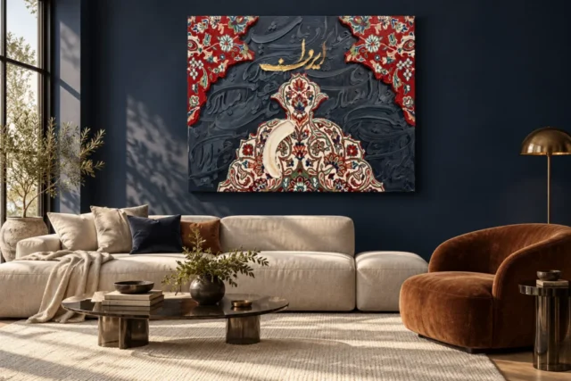
Then review the chosen artwork dimensions, material, presentation and finish. If a room visualisation prompted the selection, set its furniture and apparent scale aside while confirming the actual options. The scene is illustrative and does not tell you the outer dimensions of any separate frame you may arrange. A decorative border within the image is also not a physical frame supplied around the print. Making these checks together connects a considered visual preference with a clear physical specification, without asking the product title or a styled room to supply information they cannot establish.
The strongest final reason for choosing this image may be its changing pace: a red floral edge noticed quickly, a larger pale ornament, and darker curves that emerge more gradually. That offers several kinds of looking within one composition. It does not require a manufactured story about a poem or a promise of literal metal and raised paint. With the distinction between visible appearance, personal association and supplied material kept clear, you can appreciate the work's richness on its own terms and make a print choice based on information that is actually available.
Read the print-material and optional finishing information
Continue with this artwork
Find your next artwork
Look between the borders and the letterforms
Read more: Look between the borders and the letterformsRead less: Look between the borders and the letterforms
The Persian Script composition asks something unusual of a viewer: look before you read. Ornate Persian Script layers red floral corners, a pale rising ornament and a dark field of writing-like marks, so the eye has several doors into the same picture. This guide offers four looks that work for any viewer, whatever languages they know.
Each look takes only a few minutes. You will start with the large arrangement, move to the corner borders, then the lower ornament and finally the dark field itself. Together they build a judgement you can trust more than a first dazzled glance.
Persian Script composition: the large arrangement first
Begin at arm's length from your screen and take in the whole rectangle. Red patterned passages enter from the upper corners. A pale ornament rises from below. Between them sits a darker field that carries its own sweeping marks. That three-part structure holds the image together before any single detail matters. Commit the broad map to memory before you zoom in, because the details make more sense once the large relationships are fixed.
Notice what the arrangement does not do. The corners do not meet to form a complete frame, and the lower ornament does not mirror them. The imbalance is deliberate in effect, because it keeps your eye travelling between top and bottom. A symmetrical design would feel settled; this one stays alert, and the alertness keeps the pattern rewarding on every fresh look.
Give the whole a second minute with fresh eyes. First impressions of ornament can blur into a general sense of richness. Slower looking separates the parts, and the parts are where your long-term enjoyment will live. A picture that divides cleanly into readable regions is easier to love deliberately.
Persian Script composition: name what draws you
Ask yourself which region pulls you hardest. Some viewers go straight to the red corners, others to the pale ornament, and a few to the darker centre. Your answer matters later, because it tells you what to protect when you choose a size and a wall.
Persian Script composition: the interrupted borders
Look closer at the red passages. They enter from the upper corners with irregular inner edges, so they behave less like a picture frame and more like curtains parted at the middle. Small flowers, curved stems and blue-green details keep them busy at close range, while from a distance their redness is the main fact.
That double behaviour is worth testing in yourself. Step back until the flowers dissolve, then approach until the red becomes pattern again. A border that works at both distances gives the print a long life, because it offers something to the passer-by and something different to the person who stops.
Also notice where the red lets go. The inner edges narrow and widen instead of running straight, so the centre opens and closes like a view through a doorway. Those irregular releases guide your route far more gently than a hard rectangular frame ever could.
Borders are part of the image, not the frame
Remember that these ornamental edges live inside the picture. They do not promise a decorative physical frame around the delivered print. Any frame you choose is a separate decision, and a simple one usually serves the internal pattern best.
This distinction saves money and disappointment. A heavily ornamented frame would double the pattern and shrink the image. A quiet mount and a plain frame give the printed border room to operate, which is what the design was built to do.
Persian Script composition: the rising lower ornament
The pale ornament at the bottom reads as a silhouette before it reads as decoration. Its pointed crown and spreading sides give it almost architectural weight. Within that light shape, smaller marks in red, green and blue reward the close viewer without disturbing the distant one.
Watch how one broad cream stroke interrupts the ornament's pattern. That blunt gesture sits closer in spirit to the dark background's sweeps than to the fine flowers. The interruption keeps the design from behaving like printed wallpaper, and it gives your eye a welcome change of pace.
Spend a moment on the ornament's interior too. Small marks in several colours sit inside the pale silhouette without disturbing its calm. That discipline is rare. Many decorative images let detail leak everywhere, while this one keeps its finery inside a shape you can read from the doorway.
Persian Script composition: pattern with a pulse
Ornament can be mechanical, but here it is not. The mix of small repeated motifs and large free strokes gives the design a pulse. If you enjoy that tension, you will probably enjoy the picture for years, because the eye never quite finishes reconciling the two.
For context, the long tradition of Persian calligraphy shows how writing and ornament have shared surfaces for centuries. This image borrows that conversation visually, although the product information offers no verified transcription of its marks.
Persian Script composition: the dark field is not background
Give the darker passages their own look. They sit close in value to the ornaments yet contain curling, diagonal strokes that catch apparent light along their edges. Because they neither shout nor disappear, they act as a connective tissue between the red corners and the pale rising shape.
Try squinting until the bright areas blur. The dark field still moves. That movement explains why the centre never feels empty even where no flower or letterform stands forward. A flat black centre would make the picture feel like a border in search of content.
Look for the points where dark strokes slip beneath the ornaments. Those disappearances suggest layers without insisting on them. The sense that some marks continue out of sight gives the flat image a quiet depth, and it rewards the viewer who enjoys following a route that refuses to complete itself.
Read the marks as form before language
The writing-like curves invite decoding, and it is fine to enjoy them simply as form. Spacing, rhythm and contrast carry meaning for the eye even when no verified wording is claimed. The broader world of Islamic calligraphy shows how honoured that dual reading has been.
Try following one curve with a finger in the air. Notice where it thickens, where it thins and where it yields to another mark. You are reading with your hand what your eye reads alone, and the exercise reveals how much choreography sits inside the darker field.
Persian Script composition: gold-looking marks, honest materials
The small warm inscription looks golden, and that is a description of colour, not a materials certificate. An ordinary print reproduces the appearance without gold leaf or metallic ink. Enjoy the effect freely, but order the object with clear eyes about what a print can deliver.
For canvas, the specified option is PermaJet's Neptune Natural Matt Canvas 400, whose warm cotton base suits this warm-on-dark palette perfectly. Compatible photographic papers give a smoother, cooler presentation. If you buy artwork with a golden accent, decide which surface character suits it before you choose a size.
When you buy wall art with this much internal pattern, the reading you have just done is your best protection. A quick thumbnail makes every ornate print look equally rich. The four looks separate this one's actual structure from the general promise of intricacy.
Keep the finish question separate
Hand Finished names a product family rather than a promise about every order. The configurator lists the light selective finish as a stated option where available. Left unselected, the piece remains a faithful reproduction, and calling it hand made wall art would misdescribe what arrives.
Treat the depicted texture the same way. Thick-looking cream strokes and shadowed ridges belong to the image's appearance. The physical print has its own surface, described in the material specification, and that surface is what you will dust, frame and live beside.
Frequently asked questions
Does the artwork contain a readable poem?
No verified transcription or translation is supplied with the product information. You can enjoy the letterforms as form and rhythm, but you should not assume a specific poem, quotation or message without an independent verified reading.
Is the gold area real metallic ink?
No. The gold appearance is reproduced colour within the image. The printed object does not contain gold leaf or reflective metal unless a stated finish option separately says so, and none should be assumed.
Is this a genuine antique manuscript?
No. It is a contemporary printed artwork with a script-and-ornament design. Nothing in the product information claims an identifiable historical original, a named calligrapher or a documented provenance.
Does hand made wall art describe this print?
No. The phrase does not apply to a standard order. The Hand Finished title names the product family, and any light hand-finishing is an optional configurator choice that must be selected explicitly.
Which orientation is correct?
The red corners belong at the top and the pale ornament rises from the bottom. The composition has a definite top and bottom, so hang it as displayed on the product page rather than rotating it to fit an awkward gap.
Will the dark centre look flat in a dim room?
The centre is not flat black; it carries quieter curling strokes. Even so, give the wall enough comfortable light for those subtleties to remain visible, especially if you enjoy close looking in the evening. A soft lamp nearby usually reveals more than a bright one opposite.
Canvas or paper for this design?
Canvas adds warmth and a slight weave character that suits the ornamental palette. A framed paper print gives a crisper, cooler reading of the fine detail. Choose by the presentation you want, not by a claim that one is more authentic.
Does it suit a minimalist room?
Surprisingly well, because the design concentrates its complexity inside one rectangle. A plain wall lets the corners and dark field read clearly, and the print can serve as the room's single ornamental event. This is wall art that supplies the decoration, so the room itself can stay quiet.
Can I give it as a gift with a message?
Yes as a beautiful object, but not as a verified message. If the wording must mean something specific, obtain a verified reading first rather than relying on the decorative title. The design's beauty needs no invented inscription to make it generous.
How large should I go?
Match the size to your closest comfortable viewing distance. The fine flowers and dark strokes reward proximity, so a modest print on an approachable wall often beats a large one you can never stand near. Measure the wall first, then imagine standing one step closer than usual.
Will red corners fight a colourful rug?
Only if the patterns compete at the same scale. A broad, quiet rug usually coexists happily, while a dense floral rug beside the print may tire the eye. Test with the actual textiles in place. Move the rug or the hanging position before you blame the picture.
Where should I look first in the artwork?
Start with the pale ornament, because its silhouette anchors the whole. Then let the red corners pull you upward and the dark field slow you down. That loop is the natural circuit of this artwork.
Conclusion: the Persian Script composition's four looks
Take the four looks once more: the large arrangement, the corner borders, the rising ornament and the dark field. When the Persian Script composition keeps its hold once each look is familiar, the richness proves structural rather than merely decorative. Current formats sit on the product page, and the Persian Script wall display guide covers placement. To look wider, set it beside the abstract and mixed media collections, or work through the product page evidence guide first.