Living with art
Living with Ornate Persian Script: A Clear Place for Pattern and Writing
Plan a setting for the artwork's floral corners and dark calligraphic field through orientation, neighbouring patterns, real wall dimensions and a considered print presentation.
How much surrounding pattern does the floral border need?
Ornate Persian Script already contains several kinds of pattern: small flowers, curved stems, a large pale ornament and darker sweeping forms. A room does not need to repeat them all to make the picture feel connected. Start by deciding how much additional visual activity belongs immediately around it. A plain wall can make the internal pattern easier to explore, while a room with existing textiles may provide a richer context. Neither approach is inherently more authentic. The useful question is whether the artwork remains readable as a distinct arrangement among the furnishings you already use.
If a rug, curtain or upholstered piece carries a strong motif, compare the size of that motif with the detail in the print. A broad pattern can interact differently from many tiny repeated flowers. You might find that the two can coexist when separated by a quieter area of wall or furniture. You might also find that a very busy neighbouring surface leaves little opportunity to notice the darker script-like field. Assess the combination from the principal view, not just by holding a fabric sample beside a phone screen. Scale and placement matter as much as similarity of colour.
There is no requirement to buy a matching textile before choosing this work. The picture can be the one concentrated source of ornament in a comparatively simple room. If you already have a layered interior, it may be enough to simplify the objects directly below or beside the print. These reversible adjustments are useful first steps because they let you assess the arrangement without redesigning the whole space. The aim is to give the floral border a clear role, rather than treating it as an instruction to reproduce its pattern throughout the room.
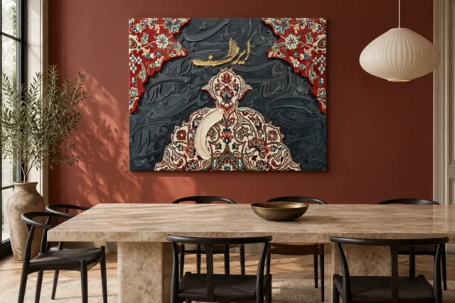
Keep the work's own orientation distinct from the wall's shape
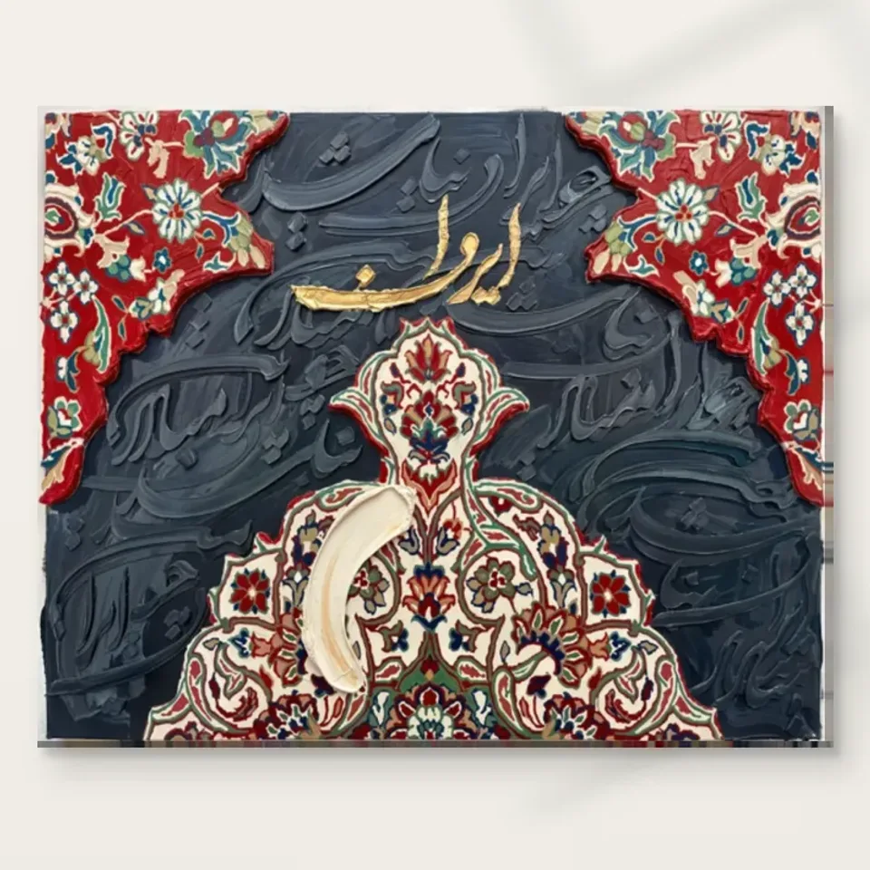
The composition has a particular top and bottom. Red patterned corners open around the upper area, and a pale ornament rises from below. Script-like marks take part in that arrangement, making orientation more than a matter of which rectangle best fills a gap. Consider the image as displayed on the product page rather than imagining that it can be freely rotated to suit an inconvenient wall. If the available place calls for a different shape, another location may serve this work better. A practical fit should not depend on changing the relationships that made the design interesting.
The same care applies when discussing separate framing or mounting. Show the full image and the intended orientation to the person preparing the presentation. Do not rely on a loose description such as patterned abstract art, which could obscure the fact that writing-like forms and directional ornaments are involved. The artwork's boundaries and orientation should remain clear throughout the process. This does not require claiming a verified translation of the marks. It recognises that the supplied image is a specific composition, not a repeating decorative surface intended to be cut or turned without consequence.
An outline of the proposed finished object can help establish how it sits on the wall, but remember that the outline contains no directional information. Keep a reference to the actual artwork alongside that measurement exercise. Check the selected artwork dimensions and any additional frame or mount rather than judging the outer size from a visualisation. The design contains a border within the image; that border does not establish an included physical frame. Separating those ideas makes the installation plan clearer and prevents an apparent fit on paper from depending on assumptions about the supplied object.
Where will someone have time to notice the darker writing-like field?
The red and pale ornaments can register quickly, while the dark-on-dark curves may take longer to notice. That gives you two possible modes of display. A passing view can enjoy the broad arrangement, and a pause nearby can reveal a quieter layer. Think about whether your proposed location allows both or mainly one. In a hallway, a place near a natural stopping point may offer more time than the narrowest part of a route. In a sitting room, a view beside a chair can invite attention without requiring someone to cross the room every time.
Do not assume that making the print larger automatically creates a better close encounter. A large work above deep furniture may still be difficult to approach, while a more modest print on an accessible wall can reward detailed looking. Match the selected dimensions to the actual viewing distance and the available movement around the furniture. The work's complexity is a reason to consider those relationships, not a rule requiring the largest format. You can decide that a strong broad view is enough, provided that decision is made consciously rather than discovered after the piece has been hung.
Light is part of access too. The darker field needs enough comfortable illumination to reveal differences without a harsh reflection taking over. Check the wall during the times the room is normally occupied. A position that looks good for a few minutes of bright daylight may be less useful during an evening spent nearby. The work should not require a phone torch or an awkward stance to inspect its quieter marks. Its gradual discoveries are most satisfying when they arise naturally within ordinary use of the room.
Distinguish decorative writing from practical information
In a home office or shared reception, this artwork may sit near functional writing: calendars, labels, signs or framed certificates. Those elements ask viewers to read for different reasons. A schedule needs quick access to information; the artwork offers a more open encounter with form and possible language. Give each a clear place rather than allowing them to blur into one busy noticeboard. The image does not become an office sign simply because it contains script-like forms, and no verified business message or welcoming phrase should be invented to make it serve that role.
If a specific written meaning is important to the setting, obtain a verified reading before relying on it. The product information does not supply a complete authenticated transcription or translation. This matters for gifts, institutions or spaces where a particular message is expected. You can still select the work for its floral design and layered appearance, but that is different from choosing it to convey a confirmed quotation. Stating the distinction helps avoid a mismatch between an attractive decorative choice and a functional expectation the image has not been shown to fulfil.
A clear separation can be simple. Practical papers can occupy a working area, while the print sits on a quieter return wall visible during a pause. In a reception, necessary directional signs should remain easy to identify without competing with the artwork's elaborate forms. You do not have to remove useful information to create a polished display. Instead, let the room communicate its functions plainly, then allow the artwork to contribute a different kind of interest. That is more adaptable than forcing every written surface into the same decorative scheme.
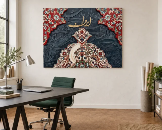
Use colour relationships without promising a metallic room accent
The image contains warm golden-looking marks, but these are reproduced colours rather than a guarantee of applied metal. Do not plan a display on the assumption that the print will reflect light like a gold-leaf object or match the changing shine of brass furniture. You can relate warm tones more loosely through wood, fabric or existing objects, or let the warm inscription remain a small independent accent. The red corners and dark grey field occupy much more of the image, so a room scheme based solely on the apparent gold can miss its larger balance.
The pale lower ornament offers another connection, particularly in a room with lighter furnishings. A cream sofa or a pale tabletop may provide a broad relationship without requiring an exact match to a screen colour. Darker furniture can connect with the field behind the script, but clustering too many dark objects together may make the overall wall arrangement heavy. Look at the combined view rather than treating each colour as an isolated instruction. The picture brings several possible relationships, and you do not need to activate all of them at once.
Test changes with movable objects before making permanent decorative commitments. An existing vase, a stack of books or a different position for a lamp can show whether a colour echo helps or distracts. The artwork should remain coherent when those small items change again. This matters in rooms used by several people, where not every object can be selected for a single image. A thoughtful place for the print can accommodate ordinary belongings without turning the surrounding space into a fixed set assembled to demonstrate red, cream and grey.
Choose the physical boundary separately from the printed border
Because the artwork includes ornamental edges, an additional presentation boundary deserves careful thought. A highly decorated frame could echo those edges, but it could also add another pattern before the viewer reaches the image. A simpler presentation can give the internal detail more emphasis. There is no universal answer independent of the room and chosen material. What matters is recognising that the border inside the composition and any physical frame around the print perform different jobs. The former belongs to the image; the latter is part of the final object and may be arranged separately.
A photographic paper print, if selected and compatible, may be presented with a mount and glazing through a separate framing arrangement. Discuss appropriate support and protection with a competent framer rather than choosing solely by appearance. The conservation source below gives general information about care of art on paper; it does not certify a particular frame or apply identically to every support. Keep the current material choice clear. Canvas and photographic paper are not interchangeable just because both reproduce the same floral and script-like design.
If selecting a canvas option, confirm whether it is supplied rolled or stretched and what further preparation that entails. Check optional hand-finishing as an actual chosen specification rather than assuming it from the title. The image's visible ridges do not establish equivalent physical paint relief. These practical distinctions influence the finished edge, outer dimensions and installation needs. A convincing decorative idea becomes much more useful when it is matched with a clear description of the object to be delivered, rather than relying on the rich appearance of the design to imply every aspect of its presentation.
Confirm Ornate Persian Script's current material and presentation
Learn from the room scenes without copying their assumptions
The existing visualisations place the design in several furnished settings. They can suggest a relationship with a table, a seat or a working area, but they are not measurements of your wall or evidence of a real installation. Notice what prompts your interest in a scene. Is it the artwork itself, the large quiet wall, the furniture arrangement or the light? Separating those influences helps identify which part of the idea can be translated to your own space. You may only need the relationship between a patterned image and a plain surface, not the entire pictured interior.
Confirm scale independently using the selected artwork dimensions and the complete outer dimensions of any additional presentation. Keep doors, furniture use and practical circulation in mind. A wall that appears generous when empty may be less usable once a cupboard is opened or a chair is moved. In a busy family home, the print's lower edge should not occupy a place likely to be repeatedly brushed by bags or coats. Choose suitable fixing methods for the actual finished object and wall, with appropriate advice rather than an estimate based on how light the visualised print appears.
Finally, return to the artwork-only view. The reason to order should survive the removal of the styled setting. You might value the patterned red corners, the pale rising ornament or the darker curves that emerge more slowly. Those are qualities the image itself supplies. A room scene can help you imagine living with them, but it cannot guarantee the atmosphere of your own room or include the objects pictured around the print. Keeping that boundary clear lets inspiration remain useful without becoming an unspoken product promise.
Let a layered work live in a changing room
A richly patterned print can become a stable element while smaller parts of a room change. You do not need to maintain a precise arrangement of accessories for it to remain considered. Seasonal textiles, different books or a new chair can alter the surroundings without invalidating the choice. Begin with the durable relationships: an appropriate wall, comfortable light, a clear orientation and a suitable physical presentation. Those are more likely to continue working than a display that depends on several specially matched ornaments being kept in exactly the same places.
This flexibility also leaves room for personal associations to develop. The image may remind different people of familiar writing, textiles or decorative traditions. Such responses can be enjoyed without turning them into assertions about an unidentified original or a verified quotation. In a shared home, the work can support more than one way of looking. One viewer may notice the flowers first, another the darker strokes. A good location allows those encounters without requiring everyone to accept an invented explanation or read a message the product information has not confirmed.
Before completing the order, check the selected material, size, presentation and finish once more against the display plan. The object should fit the actual wall and your intended preparation after delivery. Then allow the design to do the work for which you chose it: offer pattern, directional movement and a layered field that can be looked at quickly or explored more slowly. It does not need a room-wide imitation of its motifs, a supposed gold surface or a fabricated translation to become a distinctive and usable part of an everyday interior.
Read the Golden Ads guide to print supports and finishing
Continue with this artwork
Find your next artwork
Give pattern and writing a clear place
Read more: Give pattern and writing a clear placeRead less: Give pattern and writing a clear place
A Persian Script wall display succeeds through decisions, not luck. Ornate Persian Script packs floral corners, a rising pale ornament and a dark lettered field into one rectangle, so the room around it needs thought rather than wealth. This guide settles five placement decisions before you drill anything.
The decisions build on each other. You will set a pattern budget for the surroundings, fix the orientation, choose where people pause, plan the colour echoes and settle the physical boundary. None of them costs more than attention, and all of them protect the picture's particular richness.
Persian Script wall display: set the pattern budget
Decide how much ornament the room already spends. A patterned rug, printed curtains and a busy sofa can each be lovely, yet together with this print they may exceed what one wall can hold. Count the patterned surfaces visible from your main seat before you add another.
A plain wall beside simpler textiles gives the floral corners room to operate. A layered room can still work if one quiet interval separates the print from its busiest neighbour. The goal is a conversation between pattern and plain, not a competition between two kinds of intricacy.
Judge the budget from the seat you use most. A room can hold more pattern in passing than it can under a steady gaze. If the combined view feels restless after five quiet minutes, reduce one neighbouring pattern rather than demoting the print to a busier wall.
Simplify objects, not the room
You rarely need to redecorate. Move a stack of patterned cushions, regroup a shelf or shift a throw, then live with the change for a few days. Small reversible moves reveal whether the picture gains the clarity it needs without any permanent commitment.
Seasonal changes deserve the same test. Winter throws and summer cushions can quietly raise the pattern count. Rotate one textile at a time, then sit with the result for an evening. The print should still read first from your usual seat. If a seasonal layer steals that attention, retire the layer rather than the picture. Over a year, these small trials teach you more than any single afternoon of arranging. They also keep the room alive around a fixed image, which matters for a piece you intend to keep for decades.
Persian Script wall display: fix the orientation
This design has a definite top and bottom. The red corners open across the upper area, and the pale ornament rises from below. Rotating the image to suit an awkward gap would break the relationships you are buying. Treat the orientation as fixed, then find the wall that fits it.
The same care applies at the framer's bench. Show the full image in its correct orientation and say plainly that writing-like forms are involved. A loose description such as patterned abstract could lead to a mount cut for the wrong edge. Clarity at this stage costs nothing and prevents an expensive mistake.
Keep a reference image beside any paper template you tape to the wall. The template fixes the footprint but not the direction. Checking both together takes a minute, and it protects the balance between the upper opening and the lower rising form.
Persian Script wall display: the border is not the frame
The design contains its own ornamental boundary inside the image. That internal border does not mean a physical frame is included or required. Plan the outer presentation separately, and let the printed pattern do its own work at the edge of the picture.
Persian Script wall display: choose where people pause
The red corners register quickly, but the darker field reveals itself slowly. Decide which encounter your wall should favour. A hallway near a natural stopping point lets both happen, because people pass and occasionally stand. A narrow corridor that only ever rushes past will waste the quieter layer.
In a sitting room, hang the print where someone can linger without blocking traffic. Beside a reading chair or opposite a sofa both work. Avoid walls above deep furniture that nobody can approach, because the dark-on-dark strokes reward the viewer who gets close enough to see them move.
Ask who in the household actually stops to look. If that person is you, favour your own route through the room rather than a theoretical visitor's. A picture lives with its regulars, and the regulars decide which wall is truly public.
A simple chair test settles most arguments. Place a chair where a viewer would naturally pause, then sit for ten minutes without your phone. Notice whether your eye returns to the golden-looking passages or wanders off the edge. If it wanders, the print may sit too high, too low or too far from the pause point. Adjust the position before any drilling. This costs one evening and saves a lifetime of slightly wrong placement. Visitors rarely tell you when a picture hangs awkwardly, so let the chair speak first.
Persian Script wall display: light the pause
Gradual discoveries need comfortable light. Check the wall in the evening, when the room earns its keep. A position that gleams for ten minutes of morning sun but sits in gloom all evening will frustrate the slow looking this design invites.
Persian Script wall display: plan colour echoes loosely
The warm golden-looking marks tempt you to match them. Resist precision. Those passages are reproduced colour, not applied metal, so a scheme built on matching their shine will disappoint. Connect through warm wood, a rust textile or a cream surface instead, and let the red corners carry the louder conversation.
Count the dark objects too. Several dark pieces near the print can pull its centre into gloom, while one pale object near the bottom can answer the rising ornament. When you buy wall art with this much internal variety, a single well-chosen echo usually outperforms a coordinated set.
Remember that wall art of this kind already contains its own colour story. The room does not need to retell it. A calm setting lets the red corners and pale ornament speak at their intended volumes.
Limit yourself to two echoes in the whole room. One warm note and one red note are enough. A third echo starts to look like a theme, and themes tire quickly. The picture itself contains more variety than any room should repeat. Treat the echoes as polite greetings rather than a chorus. When in doubt, remove the newer object and see whether the print relaxes. Rooms usually tell you when they have enough, but only if you give them a quiet week to speak.
Test echoes with movable objects
Try a vase, a cushion or a lamp in the proposed position before you paint anything. Live with each experiment for a few days. The picture should stay coherent as those small objects change again, because a room that must be frozen to suit one print will not stay frozen for long.
Persian Script wall display: settle the physical boundary
An ornamental image asks for restraint at its edge. A heavily decorated frame doubles the pattern and crowds the design. A plain frame or a clean canvas edge gives the internal ornament the stage. The long record of framing choices shows how much the boundary changes what a picture feels like in a room.
Know your support before you order. The canvas route carries PermaJet's Neptune Natural Matt Canvas 400, whose warm cotton base flatters the warm passages. The manufacturer's canvas specification explains that material, while posters arrive rolled and unframed for a separate framing plan.
Confirm the finished dimensions after the presentation decision, not before it. A mount and frame add real centimetres, and a wall that fits the image may not fit the object. Measure the gap with the frame included, and the installation day will be uneventful.
Wall preparation matters more than most guides admit. Fill old holes, sand the patches and let fresh filler dry overnight. A smooth wall keeps the frame flush and stops small shadows from exaggerating every bump. Brick and plaster both hold this print well with the right fixings. When in doubt, choose the fixing rated for twice the weight. Those few extra minutes protect both the wall and the picture for years.
Keep the finish honest
Hand Finished names a product family rather than describing each order. The configurator presents the light selective finish as an optional choice where available. A standard print is not hand made wall art, and its depicted ridges do not imply raised paint on the surface you receive.
Frequently asked questions
Does the print include a real frame?
No. The ornamental border lives inside the image. Any outer frame is a separate decision and purchase, so plan the finished footprint with your chosen presentation in mind.
Which way up does it hang?
The red patterned corners sit at the top, while the pale ornament rises from below. The product page displays the correct orientation, and the design should be hung exactly as shown.
Is the golden writing real gold?
No. The golden appearance is reproduced colour within the picture. No metallic leaf or ink is implied, and the print should not be expected to shine like metal when light moves across the room.
Does hand made wall art apply to this piece?
No. The Hand Finished title names the product family. Any light selective hand-finishing is a configurator option that must be chosen, and a standard order arrives as a faithful print.
Will it overwhelm a small room?
Not necessarily. One ornament-rich image in a quiet room reads as a deliberate centrepiece. Trouble starts only when several busy surfaces compete nearby, so simplify the neighbours before blaming the picture.
Is a hallway a good place for it?
Yes, if the hallway offers a natural pause. Near a doorway where people slow down, the red corners greet the passer-by and the darker field rewards the person who stops.
How do I clean around the detail?
Dust gently with a dry, soft cloth and avoid sprays. Follow the care guidance for your chosen support, and let a framer advise on glazing if you want easier cleaning behind glass.
Can it hang opposite a window?
Avoid direct opposition if the presentation is glazed, because reflections will cut the dark field. A wall perpendicular to the window usually keeps the whole design readable across the day.
Does the artwork carry a specific message?
No verified transcription or translation accompanies the product information. Enjoy the letterforms as design, and seek an independent verified reading if a specific meaning matters to you.
What size fits this patterned piece?
Match the size to the closest place someone can comfortably stand. The fine detail rewards proximity, so a modest print on an approachable wall usually beats a grand one nobody can near.
When is the right time to buy artwork like this?
Buy artwork when the five decisions above have real answers. A wall chosen, an orientation fixed and a presentation planned turn a rich image into a settled part of the home.
Will it date as tastes change?
Ornamental designs with genuine structure age slowly. Because this one balances pattern, silhouette and a quieter dark field, it is more likely to settle into the room's long story than to read as a passing fashion.
Conclusion: the Persian Script wall display's five decisions
Work the decisions once more: pattern budget, orientation, the pause, the colour echoes and the physical boundary. A Persian Script wall display that clears all five will look inevitable rather than placed. The product page lists formats and finishes, and the composition reading guide holds the close looks. To finish, weigh the hallway setting, the print materials guide and the total cost guide before you order.