Looking closer
Giraffe in the Loo: Why a Quiet Monochrome Scene Can Be So Absurd
Look at the giraffe, newspaper and tiled setting as a carefully balanced visual joke, with attention to scale, grayscale and the difference between realism and plausibility.
Why does an ordinary bathroom make the giraffe funnier?
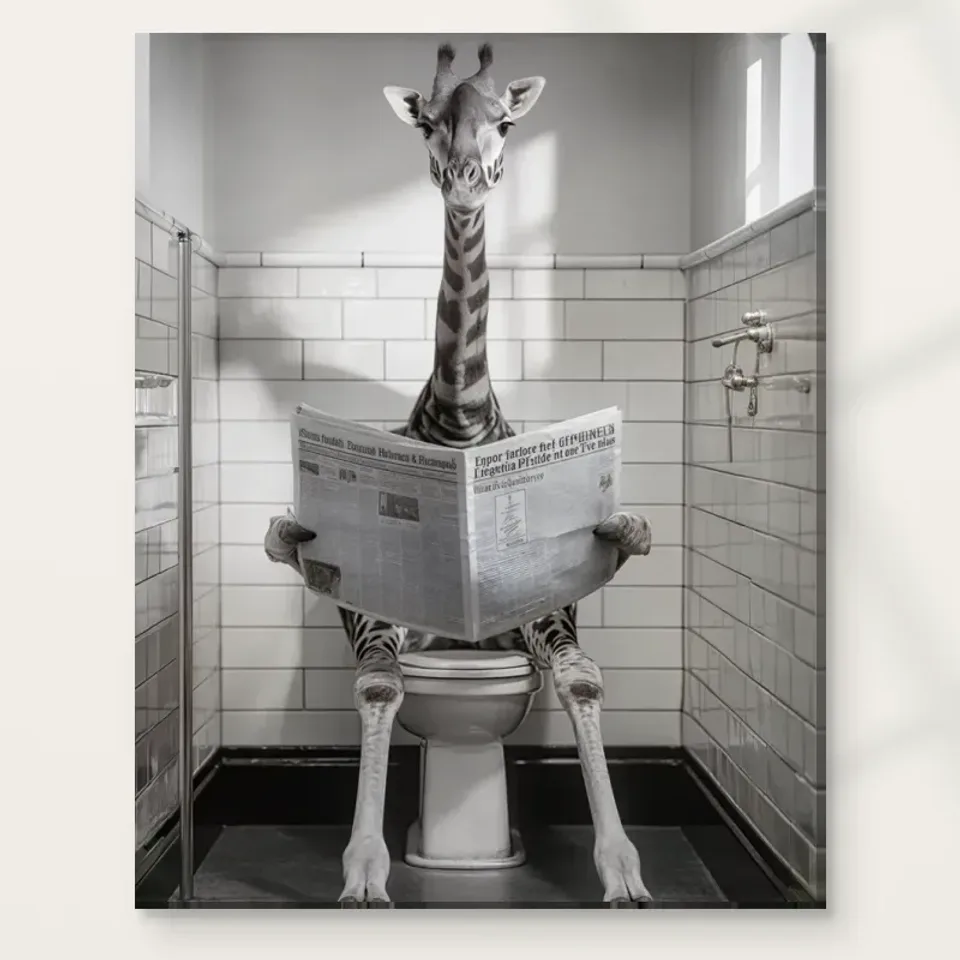
Giraffe in the Loo begins with an immediately understandable mismatch. A giraffe is seated on a toilet, reading a newspaper, within a recognisable bathroom setting. The joke does not depend on a long explanation. We understand the ordinary activity and then notice the extraordinary participant. That simplicity makes the image accessible, but it does not mean there is nothing more to look at. The tiled environment, grayscale palette and convincing sense of light give the unlikely scene a stable setting. The more ordinary the room appears, the more clearly the giraffe's presence becomes the central disruption.
Notice that the humour is not presented only through a cartoon symbol or a written punchline. The image gives the animal an everyday task and allows the setting to remain relatively composed. This contrast between matter-of-fact presentation and implausible event is its distinctive attraction. If the bathroom itself were equally chaotic, the giraffe might seem less surprising. Instead, the room supplies an orderly reference against which we judge the mismatch. You can enjoy that relationship without needing a complex symbolic interpretation. Sometimes the most rewarding question is simply why the scene feels so calmly convinced of its own absurdity.
For a buyer, this is a useful distinction between a quick novelty and an image whose visual handling you genuinely like. Look after the first smile. Do the shapes, light and grayscale relationships still appeal? If they do, the print may offer more than a one-time joke. If the appeal depends entirely on surprise, consider whether you are happy for it to become a familiar household image. There is no wrong answer, but noticing the difference helps you choose humour that will remain welcome rather than relying on a reaction that can only happen once.
An elongated neck changes the room's proportions
The giraffe's long neck is essential to the visual mismatch. It makes a familiar human-scale room suddenly seem inadequate or strange without requiring the architecture to change. We recognise the toilet, newspaper and tiles, yet the animal's proportions make us reconsider their scale. Follow the vertical emphasis of the neck and compare it with the surrounding room divisions. The effect can feel elegant as well as comic. An unusual body is placed among regular surfaces, so the scene has a strong structural contrast before we think about its story.
The neck also helps the image retain a clear overall shape when seen from farther away. Smaller newspaper details may disappear, but the unusual silhouette can remain legible. This matters when considering print size or viewing distance. The joke has two levels: a broad recognition of an unexpected animal in a domestic setting, and a closer discovery of its activity. You may enjoy one more than the other. If you want the newspaper-reading idea to be noticed immediately, consider how clearly it reads in the scale you plan to display. If the silhouette alone delights you, a more distant view may still work well.
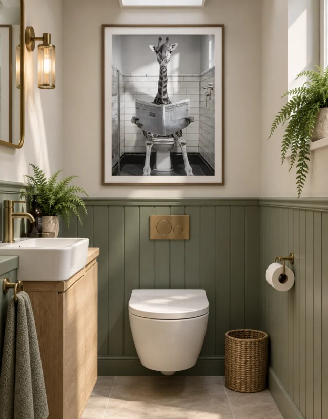
Avoid treating this playful scale relationship as a measurement of either a real bathroom or a real animal. The artwork presents an invented scene, and the room visualisations are also illustrative. Neither should be used to establish exact proportions for your wall. The useful observation is visual rather than numerical: a tall, distinctive form interrupts a regular setting. That relationship gives the print its recognisable character and helps explain why the composition can work even when many small details are not being studied.
The newspaper makes the impossible look routine
The newspaper is more than an accessory. It gives the giraffe an action associated with a familiar domestic pause and makes the animal seem occupied rather than merely displayed. A giraffe standing in a bathroom would already be surprising; a giraffe reading there suggests that it belongs to the routine. The image gains much of its humour from that apparent lack of surprise within the scene itself. The viewer is startled, but the depicted activity appears to continue. This difference between our reaction and the subject's apparent normality keeps the joke gentle rather than frantic.
Look at how the paper-like shape relates to the animal and the surrounding fixtures. It can create a broad interruption among longer lines and patterned surfaces, giving the eye another clear form to recognise. There is no need to invent the content of the newspaper or read unclear text as a hidden message. Its role as an object is enough. Like a prop in a staged scene, it makes the activity legible. The visual interest comes from the combination of objects, not from an authenticated printed story or a documented occurrence.
When deciding whether the print suits your taste, consider the kind of humour you prefer. This scene invites a smile through incongruity rather than through ridicule of a real person. It is domestic, slightly deadpan and visually specific. Some viewers will enjoy that understatement more than a loud graphic joke. Others may want a less literal image. Your response to the newspaper-reading detail can help clarify the choice. If it continues to amuse you after the animal's presence is no longer surprising, the artwork has found a durable point of connection.
Grayscale keeps the joke from becoming visually noisy
The source description identifies a monochrome or grayscale palette. This choice is important because it allows the image to be unusual in subject while relatively restrained in colour. Instead of relying on a vivid decorative accent, the print asks you to notice light, shadow, edges and differences between pale and dark areas. That restraint can make the improbable scene feel more composed. It also means the artwork may enter a room without introducing a new bright hue, although its subject will still attract attention. Quiet colour should not be confused with a quiet idea.
Compare the lightest and darkest parts rather than assuming that all grayscale images behave alike. The tile setting can provide regularity, while the animal and newspaper introduce different shapes and tonal densities. Light described as entering through a window helps give depth to the scene. The image can therefore look convincing in its treatment of space while remaining impossible in its premise. This distinction is central: realism in the handling of light does not make the event plausible. The humour depends on those qualities being able to coexist, not on the viewer mistaking the scene for documentary evidence.
A reduced view can help you judge whether the overall tonal arrangement appeals. Then examine the larger view for the details that support the setting. If you like both the broad contrast and the finer scene, you have more than a subject-based reason to choose the print. If grayscale art tends to feel too cool or austere to you, notice whether the humour changes that response. The artwork may offer a different balance from a solemn monochrome portrait or architectural photograph, even though all three could use a similar absence of strong colour.
Repetition gives the giraffe a stage
There is a pleasing difference between the scene's visual patience and the speed at which the joke arrives. You can understand the premise almost immediately, then spend much longer noticing how calmly it is staged. The surrounding order gives that second phase somewhere to happen. Instead of demanding continuous laughter, the image can settle into an odd kind of composure. This may be why a restrained presentation is worth considering even for such a playful subject. The humour is already inside the picture; it does not need an exaggerated frame or an additional written joke to make the arrangement understandable. Let the setting do its quiet supporting work while the animal remains the unmistakable exception. The repeated surfaces offer a stable measure against which that exception stays clear.
A tiled bathroom supplies repeated divisions, and repetition can make an unexpected form more noticeable. Regular surfaces establish a pattern that the giraffe does not follow. The animal's distinctive proportions and the newspaper-reading action break that order. This is an effective way to organise a visual joke: provide enough consistency for the interruption to be clear. You do not have to count tiles or reconstruct the room to appreciate it. Simply notice how the regular setting supports the unusual subject instead of competing with it for attention.
The setting also carries associations of privacy and routine. Those associations make the giraffe's presence more surprising than it might be in an open landscape. The image takes an everyday interior and makes it strange through one major substitution. This does not require a claim about the intentions of a named artist or a connection to a particular historical movement. The Surrealist collection label offers a useful browsing route for other implausible combinations, but the image can be understood directly through its objects. A clear personal response is as legitimate as an elaborate theoretical reading.
Ask yourself whether the surrounding room is part of what you enjoy. Some humorous animal prints isolate the creature on a blank background. Here the domestic setting contributes substantially to the effect. If you appreciate the tiled order, lighting and recognisable fixtures as well as the giraffe, the whole scene may retain interest over time. If you only want the animal, a simpler image might better match that preference. Looking at the setting prevents the selection from becoming a generic choice of favourite species and keeps attention on what makes this particular print distinctive.
Does the tiled scene tell you anything about the print's surface?
The artwork's convincing surfaces are depicted within the image. Tiles that appear smooth are not actual bathroom tiles on the ordered print, and visual texture is not automatically physical texture. This may seem obvious, but it matters when a product title includes Hand Finished. The current finish control determines whether light selective hand-finishing is selected; it is not a blanket property inferred from the title. An ordinary print remains an ordinary print even when the image contains persuasive material detail. Enjoying the scene and understanding the supplied object are related but separate parts of the decision.
The verified canvas option is Neptune Natural Matt Canvas 400, a 400 gsm cotton canvas with a natural warm base and irregular weave. Compatible poster options include Oyster 271 pearl or satin photographic paper and Photo Lustre 310 photographic paper. These supports can present the same image differently as physical objects. None of those facts turns the print into a waterproof bathroom fitting. The subject's location does not establish environmental suitability. Review current product information and relevant care guidance before deciding where and how to display the actual object.
The manufacturer's canvas page provided below is useful further reading about that support, not a guarantee about every possible display condition. If tactile appearance is important to you, do not infer raised detail from the product photograph alone. If the joke and tonal structure are the main attraction, assess them as printed imagery. A clear understanding of the medium can make the choice more satisfying, because it avoids expecting the object to behave like the tiled room it depicts or like a unique original assembled from different materials.
Select humour you will still enjoy when it is familiar
Humorous art changes as we live with it. The first viewing delivers surprise, while later encounters depend more on affection, visual quality and the pleasure of a familiar absurdity. Imagine the print after a month rather than only at the moment you first see it. Would you still enjoy the giraffe's composed activity and the orderly room around it? A small recurring smile can be a perfectly good reason to own an artwork. It does not need to become a profound statement or provoke a new reaction from every visitor to justify its place.
Compare it with other Surrealist or Contemporary options if you are uncertain. Look at the type of mismatch each work uses and how directly it communicates. This giraffe scene is unusually specific: an animal, a private room and a newspaper combine in a recognisable routine. A more abstract surreal image might leave the viewer with broader uncertainty. Decide which kind of experience you prefer. If buying for a shared space or as a gift, consider whether the humour is welcome to the people who will encounter it regularly, without assuming that everyone will respond in exactly the same way.
Return finally to the grayscale composition, not only the punchline. The strongest selection combines a subject you like with a visual arrangement you want to keep seeing. The existing product page provides the available size, support, presentation and finish choices, while the related collections offer comparison. Let the title introduce the scene without dictating your entire response. Giraffe in the Loo can remain delightfully implausible, visually orderly and modestly amusing all at once. Choosing it on those particular terms is more useful than asking it to be universally funny or to transform every bathroom into the same kind of room.
Continue with this artwork
Find your next artwork
Read the neck, the tiles and the newspaper
Read more: Read the neck, the tiles and the newspaperRead less: Read the neck, the tiles and the newspaper
The Giraffe in the Loo composition starts from a mismatch you grasp in a second. A giraffe sits on a toilet, reading a newspaper, inside a recognisable tiled bathroom. The joke needs no explanation. However, the speed of that first smile is exactly why a second look matters before you buy. What survives the surprise is what you will actually live with.
The four looks in this guide move past the punchline. They cover the orderly room as the joke's foundation, the neck against the tiles, the newspaper as routine and the grayscale restraint. Each one asks whether the image still rewards you once the surprise has faded. That question separates a quick novelty from a print you will genuinely enjoy for years. It also gives you a calmer basis for comparison than a first laugh ever could.
Giraffe in the Loo composition: the orderly room is the joke's foundation
Notice how calm the setting stays. The tiles, the fixtures and the window light all behave as if nothing unusual were happening. That composure is not a background detail. It is the mechanism that makes the giraffe disruptive. If the bathroom itself were chaotic, the animal would feel less surprising. The regular surfaces supply a measure, and the giraffe refuses to follow it.
As a result, the humour depends on contrast rather than noise. The image gives an everyday task to an impossible participant and lets the room stay matter-of-fact. You do not need a symbolic reading to enjoy this. Sometimes the most rewarding question is simply why the room stays so calmly persuaded of its own absurdity. A clear personal response is as legitimate here as an elaborate theoretical one.
For a buyer, this distinction has practical weight. Look beyond the first smile at the shapes, the light and the grey relationships. If those still appeal, the print offers more than a one-time reaction. If the appeal rests entirely on surprise, however, decide whether you welcome it as a familiar household image.
Giraffe in the Loo composition: read the neck against the tiles
The giraffe's long neck drives the visual mismatch. That neck lets a human-scale room feel suddenly inadequate, and yet the architecture itself never changes. Follow the vertical of the neck and compare it with the regular divisions of the tiled walls. The result can feel elegant as well as comic: an unusual body resting among regular surfaces, so the scene carries a strong structural contrast before you think about its story at all.
The neck also gives the print a clear silhouette from across a room. Smaller details, such as the newspaper, may dissolve at distance. The tall unmistakable outline survives. Therefore the joke works on two levels: broad recognition of an unlikely animal, then closer discovery of what it is doing. Consider which level you want at the size you plan to hang. A corridor view favours the silhouette, while a close hang rewards the reading detail.
Treat this scale play as visual, not numerical. The scene is invented, and the room visualisations are illustrative. Neither measures a real bathroom or a real animal. The useful observation is simpler: a tall, distinctive form interrupts a regular setting, and that interruption is the composition's recognisable character. You do not need to count tiles or reconstruct the plumbing to appreciate it.
Giraffe in the Loo composition: the newspaper as deadpan routine
The newspaper does more than decorate the scene. It gives the giraffe an occupation, and an occupied giraffe is far stranger than a displayed one. A standing giraffe in a bathroom would already be surprising. A reading giraffe suggests the activity belongs to its routine. The viewer is startled; the reader appears to continue. That gap between your reaction and the subject's apparent normality keeps the humour gentle rather than frantic.
Seurat's Bathers at Asnières offers a documented parallel in deadpan calm. The National Gallery describes figures absorbed in their own thoughts beside the Seine, suffused with hazy sunlight, as if time were suspended. The giraffe's reading pause shares that suspended quality, transposed into a tiled interior. Neither scene hurries to justify itself.
Resist inventing the newspaper's contents, by the way. Illegible print is not a hidden message; the object simply does its job. As with a prop in staged theatre, the activity stays legible. Interest here grows from the combination of animal, paper and plumbing, not from any documented event.
Giraffe in the Loo composition: grayscale as restraint
The monochrome palette lets the subject be wild while the colour stays quiet. Instead of adding a bright hue to your room, the print asks you to notice light, shadow and edges. That restraint keeps an improbable scene feeling composed. Quiet colour, however, should never be confused with a quiet idea. The premise remains loud even when the palette whispers.
Compare the palest and darkest passages before judging the whole. The tiles supply regularity; the animal and the paper interrupt it with different tonal densities. Window light gives the space depth, so the image can look convincing in its handling while remaining impossible in its premise. Realism of light does not make the event plausible, and the humour depends on exactly that coexistence. If you like both the broad contrast and the finer detail, you have more than a subject-based reason to choose the print.
Depicted tiles are not supplied texture
Those convincing surfaces live inside the image. Tiles that appear smooth are not actual tiles on the delivered object, and visual texture is not automatically physical texture. This matters because the title includes Hand Finished. The current finish control decides whether an optional light, selective finish applies. An ordinary print remains an ordinary print, whatever the picture persuades your eye to believe.
Keep the two judgments separate and both stay easy. Enjoy the depicted room as imagery, then choose the physical object on stated facts. Nothing in its title makes the print hand made wall art by default, and no depicted bathroom makes any version waterproof. If tactile texture matters to you, do not read raised detail into the product photograph on its own. If the joke and the tonal structure are the main attraction, assess them as printed imagery instead.
Giraffe in the Loo composition: novelty or lasting image?
Humorous art changes as you live with it. The first viewing delivers surprise; later encounters depend on affection and visual quality. Imagine the print after a month rather than at first sight. Would the giraffe's composed activity still amuse you? A small recurring smile is a perfectly good reason to own a picture. The image does not need to become a profound statement to justify its place. Neither does it need to provoke a fresh reaction from every visitor.
When you buy wall art with a joke inside it, compare the type of mismatch each candidate uses. The surrealist collection offers other implausible combinations, some broader and more uncertain than this one. This scene is unusually specific: one animal, one private room, one newspaper. If you buy artwork for a shared space, moreover, consider whether the humour welcomes the people who will meet it daily. A gift chosen on a single laugh can fade quickly; a gift chosen on composition tends to last.
Wall art earns its place through repeated viewing, not through a single laugh. Artwork that depends on one reaction should be chosen more cautiously than artwork whose arrangement you admire. The ready-to-hang cost comparison keeps the practical side equally clear before you commit.
Giraffe in the Loo composition: the stated supports
For this piece, the specified support is Neptune Natural Matt Canvas 400, a 400 gsm cloth woven wholly from cotton and carrying a warm base tone with an irregular grain. The manufacturer's Neptune canvas specification sets those figures out in full. Oyster 271 and Photo Lustre 310 form the compatible poster papers here, and each carries a declared surface character of its own. None of these facts turns the print into a bathroom fitting, though. The depicted setting says nothing about moisture resistance, so the care questions belong to the living guide.
Pick the format with your presentation plan in mind. A poster suits framing bought separately, while rolled and stretched canvas follow their own practical routes. The current configurator states which pairings are actually offered, so treat it as final. The print materials guide sets out the supports in plain terms. In practice, that means reading one specification page instead of trusting a memory of the gallery scene.
Finally, read this guide together with the Giraffe in the Loo living guide. One tests the image; the other tests the wall, the moisture and the sightlines. Both matter before the giraffe moves in.
Frequently asked questions
What are the four looks in the Giraffe in the Loo composition?
The orderly room as the joke's foundation, the neck against the tiles, the newspaper as routine and the grayscale restraint. Together they test whether the image outlives its surprise.
Is the print only a novelty joke?
Not necessarily. The surprise fades, but the composition, light and tonal structure remain. Judge those after the first smile to see what you would actually live with. A familiar absurdity can stay welcome for years.
Why does the calm bathroom matter so much?
Because contrast carries the humour. An ordinary, orderly setting makes the giraffe more disruptive. A chaotic room would compete with the animal and weaken the effect. The tiles give the eye a rhythm; the giraffe breaks it.
Does the long neck affect which size I choose?
Yes. The silhouette reads clearly at distance, while the newspaper detail needs closer viewing. Decide which level of the joke you want at your planned scale.
What does the comparison with Seurat teach?
That deadpan calm is a compositional tool. Seurat's suspended riverside pause and the giraffe's reading break share a refusal to hurry. The humour here works the same way.
Should I read anything into the newspaper's text?
No. Illegible print is not a hidden message. The newspaper is a prop that makes the routine legible, and its contents are neither stated nor relevant.
Does Hand Finished make it hand made wall art?
No. Where offered, the optional finish stays light and selective; it does not come with every variant. Your order controls, not the title, settle that question.
Will the print feel like real tiles or raised texture?
No. Depicted surfaces are appearances within the image. The physical surface follows the stated support and any finish you actually select.
Is grayscale easier to place than colour?
Easier in hue, not in presence. The print adds no new bright colour to a room, yet its subject still attracts attention. Plan for attention, not just for palette. A monochrome joke remains a joke.
Is the humour suitable for shared spaces?
Often yes, because the joke is gentle and incongruous rather than mocking. Still, consider who will meet it daily, since responses to deadpan humour vary.
Which supports are stated for this image?
Neptune Natural Matt Canvas 400 is the specified cotton canvas. Oyster 271 and Photo Lustre 310 sit alongside it as the compatible poster papers. The configurator lists the current combinations.
What should I verify before ordering?
Confirm the support, the dimensions, the presentation and any chosen finish. Then return to the image and check that the scene still amuses you once the surprise is expected. That second visit tells you more than the first one did.
Conclusion: let the room stay calm and the giraffe stay unlikely
Run the four looks once more and name your reason in plain words. Perhaps you enjoy the orderly tiles, the tall silhouette, the deadpan newspaper or the quiet grayscale. Each is specific enough to guide a choice. See Giraffe in the Loo on its product page , and weigh the listed support, size and finish against that reason.