Looking closer
Closeness and Concealment in Blindfolded Whisper
Study how Blindfolded Whisper arranges two close figures, a covered gaze and warm expressive marks, while keeping visible detail separate from an invented story about the couple.
Start with the space between two people
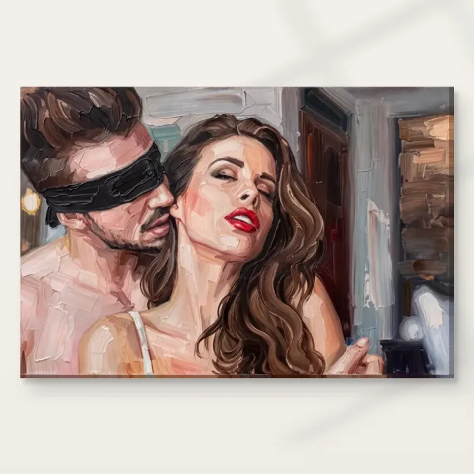
Blindfolded Whisper offers a close encounter rather than a broad scene. The source description identifies a blindfolded man near a woman, brought together in an intimate composition. Before deciding what happens between them, consider how little space separates the figures and how much of the image that relationship occupies. Closeness can be a formal arrangement as well as a subject: contours approach, areas of colour meet, and one figure changes how the other is seen. This gives the work a different centre of gravity from an individual portrait. The essential unit is not simply a face, but the charged interval between two people.
Look at the complete image before enlarging an isolated facial feature. Cropping your attention too quickly to a mouth or blindfold can make a single detail stand for the whole work. The larger arrangement may be more complex, with the figures' nearness and surrounding marks sharing the task of creating intimacy. Ask what you would lose if either person were removed from your mental picture. If the work's main interest disappears, you are responding to a relationship within the composition rather than to two independent portraits placed beside one another. That is a useful distinction when choosing among figurative works for a collection.
Where does attention go when one gaze is covered?
A blindfold changes the usual expectations of portrait looking. Eyes often provide a route into an image and seem to establish an exchange with the viewer; here that route is interrupted for one figure. Notice where your attention goes instead. It may move towards the woman's face, towards the proximity of the two heads or towards the larger arrangement of light and colour. The covered gaze does not make the rest of the face irrelevant. It makes the relationship among available details more consequential, because the viewer cannot use both figures' eyes in the familiar way to organise the encounter.
Do not assume that the blindfold establishes a complete narrative. The visible motif does not independently prove the figures' identities, intentions, emotional states or the circumstances of the moment. You may find the image tender, mysterious or uncomfortable, and those responses are worth acknowledging as interpretations. What can be described more securely is the compositional effect: one gaze is concealed while the figures remain close. This lets you discuss the work precisely without claiming access to an unseen before or after. It also allows another viewer to respond differently without either person needing to invent evidence to defend a preferred story.
Warm colour can connect figures without explaining them
The product description emphasises a warm palette and expressive handling. Warmth here can be studied through relationships among passages rather than used as a shortcut for romance. Look at whether similar colours cross from one figure to the other or whether changes of light keep them distinct. Shared colour can make two bodies feel part of one pictorial field even when their shapes remain readable. Differences in value can then preserve the separation necessary for the encounter to make sense. This interplay is more specific than calling the work warm in both the temperature and emotional senses of the word.
A useful exercise is to describe the image without naming a feeling. You might note two close figures, one with covered eyes, described through warm and darker marks. Then add your interpretation as a separate sentence. Keeping those statements distinct can reveal which features actually produce your response. Perhaps it is not the warmth itself but the contrast around the faces, or not the blindfold alone but its relation to the woman's visible features. This method does not make looking clinical. It gives an emotionally suggestive picture enough attention that its particular arrangement remains visible beneath the associations its subject naturally brings.
The small red accent and the larger tonal field
The existing media description identifies the woman's red lipstick. A concentrated red detail can have substantial visual weight even when it occupies a small area. Consider it in relation to the whole picture rather than treating it as an isolated decorative accent. Does it pull attention towards the encounter after your eye has wandered through darker areas? Does it sharpen a facial feature that might otherwise merge with the expressive marks? Its role depends on neighbouring tones and the scale at which you view the image. A detail that seems dominant in an enlarged cover may become one punctuation mark in a broader room view.
This matters when comparing Blindfolded Whisper with other portraits that use a red mouth. A shared motif does not mean the pictures do the same thing. In an individual close-up, the red might concentrate attention on one person's expression. In a two-figure image, it also participates in the distance and direction between people. Compare those relationships before deciding that the works would make an obvious pair. You may prefer the relative complexity of two figures, or discover that a simpler face-led composition suits your collection better. The red detail is a useful point of comparison, not a sufficient reason on its own to group unrelated works.
Gestural marks hold the encounter together
The image's expressive appearance is part of how the figures are linked. Rather than expecting each contour to behave like a precise anatomical diagram, notice where marks create continuity across areas and where they break that continuity. A soft or interrupted boundary can make the encounter feel close in a different way from two sharply cut silhouettes. Meanwhile, a firmer passage can anchor the recognition of a face or a gesture. This alternation allows the image to remain figurative while giving the represented handling an important role. The work's interest need not be reduced either to the subject alone or to an abstract pattern alone.
Take a slower look at the transitions around the heads and their surroundings. If you find yourself repeatedly returning to the same passage, ask whether it is because the detail is clear or because it remains unresolved. Both kinds of attraction are possible. Some viewers enjoy immediate readability; others value a picture that does not settle into one fixed account. The practical selection question is which experience you want to revisit. Expressive marks can support a recognisable relationship without explaining every physical detail, and accepting that degree of openness may be central to enjoying this particular work beyond an initial dramatic impression.
Intimacy does not need an invented cast
There is no verified name, biography or historical occasion for the figures in the supplied description. It is therefore more useful to treat them as depicted people than as characters you can identify. The title's whisper is evocative language, not proof of audible speech or a recorded conversation. Similarly, the visual closeness does not establish what either figure is thinking. A careful reading can remain interested in concealment and connection without turning those themes into factual claims. This preserves the difference between an image's ability to suggest and the evidence required to make a statement about real people or a documented event.
If you enjoy narrative art, you can still bring imagination to the image. Simply hold the imagined story lightly. Another visit may produce a different account, and another viewer may focus on an entirely different part of the encounter. This flexibility can be rewarding in an artwork kept at home, where its context shifts with your attention. If you prefer pictures with an explicit, documented subject, the uncertainty may instead be a reason to choose something else. Neither preference needs justification through grand claims. Blindfolded Whisper's selection value can lie in whether its unresolved human relationship is something you want to keep seeing.
What survives of the two-person encounter at a smaller scale?
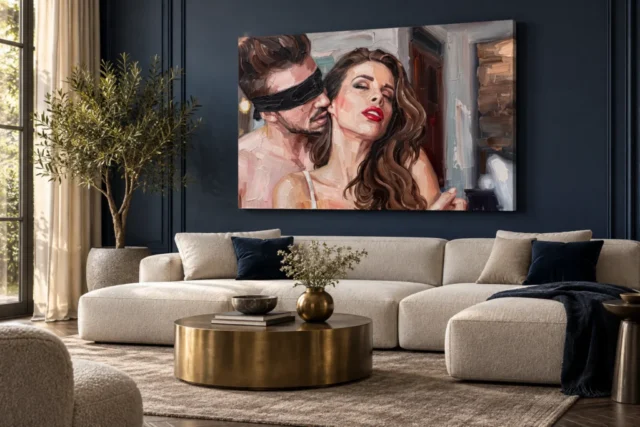
Use the existing room visualisations to consider what remains when the figures are no longer enlarged on a screen. The blindfold, facial contrast and proximity may be read first, while finer marks become less distinct. This can make the work feel more direct rather than less interesting, because the central encounter becomes a compact visual unit. Alternatively, you may find that the details you most value require a closer viewing position. Neither observation tells you to choose a universally correct size. It helps you connect the actual reason for your interest with the conditions under which you expect to see the print.
Remember that the room images are visualisations, not verified installations or demonstrations of the exact dimensions you will order. They can help compare the image with surrounding objects, but the configurator determines the available artwork size and presentation details. If you are drawn to a detail close to an edge, inspect the complete cover and the selected presentation carefully rather than assuming a room mockup establishes its final treatment. A photograph of your own proposed wall with a measured outline can complement the visualisations. One offers an imaginative context for the subject; the other establishes the real space available in your home.
The printed surface is a separate decision
The product title begins with Hand Finished, but the actual finish remains a selectable product choice where offered. Do not infer that every version includes hand-applied work. The image's represented brushwork also does not establish real raised paint on an ordinary print. These distinctions are important because the composition's close, expressive appearance may encourage assumptions about tactile material. Judge the image for its visible organisation, then assess the support and optional finishing separately. This keeps a preference for visual texture from becoming an expectation that every mark seen online will exist as a physical ridge on the supplied reproduction.
The stated Neptune Natural Matt Canvas 400 has a cotton support and matt textured character; paper choices offer another presentation route. If you plan to frame a poster, consider how a mount and outer frame would change the intimacy of the image's boundary. A broad visual interval can make the encounter feel more contained, while a more direct canvas presentation may place it closer to the surrounding wall. These are choices of display language, not claims about authenticity or hierarchy. Manufacturer information can help clarify a medium's stated properties, but it cannot identify the figures or establish the source work's provenance.
An emotionally specific work needs a specific reason for choosing it
Some images are selected chiefly for colour, while others are selected for the kind of encounter they present. Blindfolded Whisper is likely to make those reasons difficult to separate completely. Its figures are close, one gaze is concealed, and the warm expressive field contributes to the impression. Ask yourself which of those elements is indispensable. Would you still want the image if its palette were quieter? Would its colour be enough without the two-figure subject? These are imaginative questions, not invitations to edit the artwork. They help identify whether your interest is primarily formal, relational or a combination you cannot usefully divide.
For a gift, that specificity becomes especially important. An intimate image should suit the recipient's own taste and comfort, not merely an assumption about what a couple or a bedroom ought to contain. You may know that the person collects expressive figurative work and welcomes ambiguous subjects; that is a stronger basis than deciding that a romantic occasion requires a romantic-looking picture. The blindfold motif may be compelling to one person and unwelcome to another. A thoughtful selection leaves room for that difference, and it does not need to turn the image into a public statement about the recipient's relationship or private life.
If your reason remains uncertain, compare the image with a single-figure portrait before deciding. That contrast removes the assumption that all expressive faces create similar encounters. You may discover that it is the doubled presence, not the warm colour, that makes this work memorable. Equally, you may prefer the more solitary relationship of another image. Either outcome clarifies the choice by testing the feature that makes this composition particular.
Keep the encounter open after the first impression
Return to the complete cover after examining other works and let the first impression happen again. Does the proximity still interest you? Does the concealed gaze remain an engaging visual interruption, or has another passage become more important? A lasting preference often becomes clearer when you can name a relationship rather than an adjective. You might choose this work for the way two figures share a warm field while one usual point of contact, the eyes, is withheld. That reason belongs specifically to this composition and can remain useful even if your emotional interpretation of it changes with time.
Complete the selection by checking the current medium, size, presentation and optional finish on the product page. Those practical details are independent of the imagined story. No room scene establishes a real installation, no evocative title proves a biography, and no printed brushstroke alone confirms physical impasto. With those boundaries clear, the work can be enjoyed for what it visibly offers: an intimate two-person arrangement, a redirected gaze and expressive marks that keep the encounter from becoming entirely settled. The decision is whether that particular kind of unresolved closeness belongs among the images you want to encounter repeatedly, rather than whether you can explain it once and for all.
Continue with this artwork
Find your next artwork
Read the space between the two figures
Read more: Read the space between the two figuresRead less: Read the space between the two figures
The Blindfolded Whisper composition offers a close encounter rather than a broad scene. Two figures share the frame, one of them blindfolded, and warm expressive marks fill the space around them. Before you decide what passes between the pair, notice how little room separates them and how much of the image that interval occupies.
Closeness here works as a formal device as much as a subject. Contours draw near, colour areas touch, and each figure changes how the other is seen. This guide studies that relationship in four stages: the shared space, the covered gaze, the small red accent and the room-sized view. Each stage gives you a clearer reason to choose or decline the picture.
Nothing in the supplied description names the pair or records a real occasion, so this guide keeps visible fact separate from an invented story. That separation is not caution for its own sake; it is what lets the picture stay interesting after the first glance has faded.
Blindfolded Whisper composition: start with the space between two people
Look at the complete image before enlarging any isolated feature. Cropping your attention too quickly to a mouth or a blindfold can make one detail stand for the whole work. The larger arrangement is more complex, with the figures' nearness and the surrounding marks sharing the task of creating intimacy.
Ask yourself what would be lost if either person left your mental picture. When the work's main interest vanishes, you are responding to a relationship inside the composition rather than to two independent portraits placed side by side. That distinction matters when you compare figurative works for a collection.
The gestural marks deserve the same patience. Instead of expecting each contour to behave like an exact anatomical diagram, notice where marks build continuity across areas and where they break it. A soft or broken boundary can make the encounter feel close in ways two sharply cut silhouettes never could. Meanwhile, a firmer passage anchors the recognition of a face or a gesture, so the image stays figurative while the handling keeps an important role.
Blindfolded Whisper composition: see the whole before the detail
A two-figure image has a different centre of gravity from a solitary portrait. Here the essential unit is not a face alone but the charged interval between the pair. Van Eyck's Portrait of Giovanni Arnolfini and his Wife makes a useful documented comparison, because its two figures also share one carefully measured room.
The National Gallery notes that every object in that 1434 panel seems chosen to make a statement, yet scholars still debate what the scene records. The lesson transfers directly: two people in one frame invite stories, while the evidence supports only a description. Keep that order in your own looking.
Where does attention go when one gaze is covered?
Eyes usually provide the way into a portrait, apparently establishing an exchange with the viewer. For one figure here, that route is blocked. Watch where your attention travels instead: to the woman's face, to the nearness of the two heads, or to the broader play of light and colour.
The covered gaze hardly makes the rest of the face irrelevant; it lends the relationship among the remaining details more consequence, because neither figure's eyes can be used in the familiar way to organise the encounter. That small disruption is the engine of the whole picture.
Blindfolded Whisper composition: hold the story lightly
Never assume the blindfold establishes a complete narrative on its own. The visible motif cannot independently prove the figures' identities, intentions or emotional states. You may find the image tender, mysterious or uncomfortable, and each response deserves acknowledgment as an interpretation.
What you can describe with certainty is the compositional effect: one gaze hidden, the figures still close. So discuss the work in precise terms without claiming access to any unseen before or after. Another viewer may respond differently, and neither of you needs invented evidence to defend a preferred story.
Blindfolded Whisper composition: weigh the small red accent
The existing description identifies the woman's red lipstick. A concentrated red detail can carry substantial visual weight even when it occupies a tiny area. Consider it in relation to the whole picture rather than as an isolated ornament. Does it pull your attention back towards the encounter after your eye has wandered through darker passages?
Its role depends on neighbouring tones and on how large the image appears to you. A detail that dominates an enlarged cover may shrink to one quiet punctuation mark within a broader room view. Compare this behaviour with other portraits that use a red mouth before deciding the works would make an obvious pair.
Compare warm colour without calling it romance
Warmth here is worth studying through relationships among passages, not as a shortcut for romance. Check whether similar colours travel from one figure to the other, or whether shifts of light hold them apart. A common colour can make two bodies feel joined in one pictorial field, while differences in value preserve the separation the encounter needs.
Van Gogh's Sunflowers shows how a warm palette can carry meaning without depicting people at all. The National Gallery records that the painter associated the flowers with friendship and vitality. Warm colour clearly does its own work there; let it do the same here before you name an emotion.
Blindfolded Whisper composition: test the encounter at room size
Use the supplied room visualisations to weigh what remains once the figures are no longer enlarged on a screen. The blindfold, the facial contrast and the proximity will probably register first, while finer marks become less distinct. That may make the work feel more direct, not less interesting, as the central encounter condenses into one compact visual unit.
Alternatively, you may find the details you most value demand a closer viewing position. Neither observation tells you a universally correct size. Instead, each one connects the actual reason for your interest in the artwork with the conditions in which you expect to see the print.
If a detail you love sits close to an edge, inspect the complete cover and the chosen presentation with care before ordering. A room mockup does not establish how a crop or a wrap will treat that detail. A photograph of your own proposed wall, taken from a normal viewing position with a measured outline, complements the supplied scenes: one offers an imaginative context, the other establishes the real space available.
The printed surface is a separate decision
The product title begins with Hand Finished, yet the actual finish remains a selectable choice where offered. Never infer that every version includes hand-applied work, and the image's represented brushwork does not establish real raised paint on an ordinary print either.
The stated canvas support is Neptune Natural Matt Canvas 400, a cotton material with a matt textured character, while paper offers another presentation route. Judge the image for its visible organisation first, then assess the medium and any optional finish separately. That order keeps a preference for visual texture from becoming an expectation of physical relief.
Blindfolded Whisper composition: choose the encounter you revisit
When you buy wall art for a shared home, ask which element of this picture is indispensable to you. Would you still want it if the palette were quieter? Would the colour be enough without the two-figure subject? These imaginative questions identify whether your interest is formal, relational or a combination you cannot usefully divide.
If you buy artwork as a gift, specificity matters even more. An intimate image should answer the recipient's own taste and comfort rather than an assumption about what a couple or a bedroom ought to hold. The expressionist collection lets you compare this encounter with more solitary portraits, while the contemporary selection offers a broader field for contrast.
If your reason stays uncertain, set the image beside a single-figure portrait before you decide. That comparison removes the assumption that every expressive face creates a similar encounter. You may find that the doubled presence, not the warm colour, is what makes the work memorable. Equally, the more solitary relationship of another image may suit you better, and either result clarifies things by testing the very feature that makes this composition particular.
For the physical side, the product-page evidence guide shows how to read stated materials and finishes as facts. A print of this kind does not become hand made wall art through a title alone, so let the listed options answer that question. Wall art chosen on clear evidence will keep rewarding you after the first dramatic impression settles. The Blindfolded Whisper living guide then helps you decide how public or private its place should be.
Frequently asked questions
What defines the Blindfolded Whisper composition?
Two close figures share one warm field, and one of them is blindfolded. The relationship between the pair, rather than either face alone, carries the picture's interest.
Does the blindfold tell a specific story?
No. It interrupts the usual exchange of gazes and redirects your attention, but it does not prove the figures' identities or circumstances. Treat any story as your interpretation, held lightly.
Why does the small red detail matter?
A concentrated red accent can outweigh its size, pulling your eye back towards the encounter after you have wandered through darker passages. Its strength depends on neighbouring tones and on viewing scale.
Is this effectively two portraits in one frame?
Not quite. If the main interest disappears when you imagine either figure removed, you are responding to the relationship between them. That makes the composition a single encounter rather than two adjacent likenesses.
Does the Hand Finished title mean every print is hand made wall art?
No. The title's wording is not an instruction to assume hand-applied finishing on every order. Check the option you actually select, and read what the finish changes before you rely on it.
Do the visible brushstrokes mean raised paint on the print?
No. An image can represent worked, layered marks without confirming any physical relief. The stated medium and finish describe the physical item; the brushwork describes the picture.
What does the canvas option state?
The stated canvas support is Neptune Natural Matt Canvas 400, a cotton material with a warm base and matt texture. That is a property of the physical print, not a feature of the depicted scene.
Are the room photographs reliable for size?
No. Existing room scenes are visualisations, not verified installations. Rely on the configurator's stated dimensions, and outline the complete footprint on your own wall before deciding.
Is an intimate image a safe gift?
Only when you know the recipient's taste. The blindfold motif may compel one person and unsettle another, so choose on evidence of their preference rather than on the occasion alone.
How public should the placement be?
That belongs to the living guide and to your household. A wall beside a favourite chair offers a chosen encounter, while a wall opposite the entrance makes the subject part of every arrival.
Should the room's colours match the warm palette?
Not necessarily. One modest warm echo is usually enough, because several large matching objects can compete with the picture's atmosphere. Let the image supply the warmth it already contains.
What should I check immediately before ordering?
Confirm the medium, the dimensions, the presentation and the finish you have selected. Then return to the complete cover once more and ask whether the unresolved closeness still holds your interest.
Conclusion: keep the interval between the figures in view
Return to the full image and let the first impression happen again. If the charged interval between the two figures still organises everything else, you have found the specific reason this work gives you. See Blindfolded Whisper on its product page , and set the stated medium, size and finish against your answer.