Living with art
A Vocal Gesture on the Wall: Making Space for a Vivid Portrait
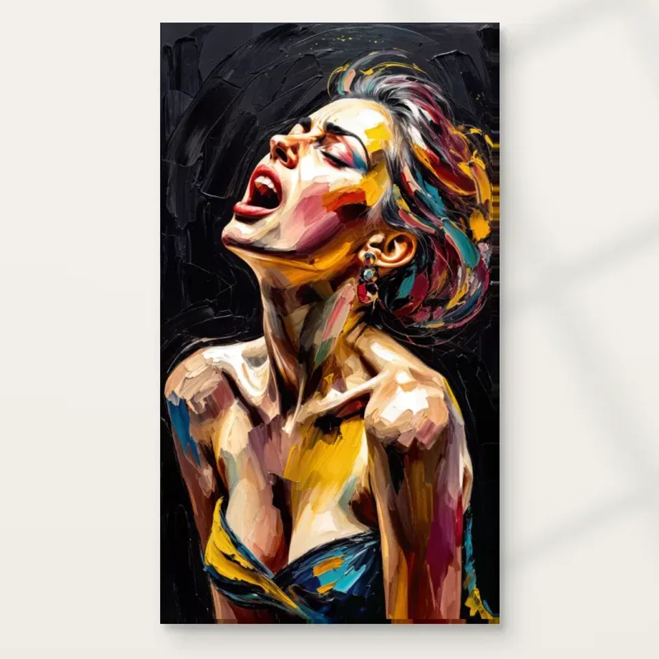
Place Woman with Open Mouth through considered sightlines, selected colour echoes and balanced evening light, allowing its expressive presence without turning a living or dining room into a venue.
Should the vocal gesture be a greeting or a chosen encounter?
Woman with Open Mouth can make a strong first impression through its bright facial treatment and action-like gesture. Decide whether you want that impression on entry or prefer a wall where looking is more deliberate. A view from a favourite chair can offer sustained attention, while a doorway may register the portrait mainly as colour against darkness. Both can work if they fit the room's use. Walk the actual route and sit in the usual places before choosing dimensions. The picture does not need the most prominent wall simply because it is expressive. A less central position may give a clearer, more comfortable encounter.
In a shared living room, consider how long each person will face the image. One seat may have a direct view while another sees only a passing angle. The household does not need to agree about an imagined song or emotion, but the portrait's prominence should be welcome. A side wall can preserve its force without making it unavoidable during every activity. Conversely, a main wall can be appropriate if everyone wants a concentrated figurative focus. Concrete sightline decisions are more useful than assuming a lively face will automatically make the room feel lively in the same way to everyone.
Can a dining room host the image without becoming a music set?
The product's related rooms include dining and living spaces. In a dining room, the portrait may offer a lively visual presence during conversation, but it does not require instruments, concert references or themed accessories. Ordinary furniture can support it. Look from each chair and consider whether the gesture feels engaging at that sustained distance. A wall seen only from one end of the table may work differently from a central position facing every seat. The useful relationship is between the image and the room's real social use, not between every object and the idea of a performer.
If the dining area connects directly to a kitchen, keep display conditions practical. Steam, splashes, grease and repeated chair movement matter more than a room label. A protected wall farther from preparation may offer a better view and simpler care than the most obvious empty patch. No finish should be assumed waterproof or immune to household residues. You can establish a connection through the sightline from the table without placing the print beside a hob or sink. The portrait's expressive action belongs in the image; the real room should remain comfortable and straightforward for meals, cleaning and ordinary movement.
Choose one colour connection instead of repeating every note
The multicoloured face offers many possible accents, but using all of them can make the room compete with the portrait. Begin with one note already present in a textile, book grouping or object. It need not match exactly. A related warmth, coolness or intensity may be enough. The print contains varied relationships rather than a set of flat swatches, so screen-based matching can be misleading. If the room is largely neutral, the artwork can remain the principal colour event without an echo at all. Position and scale can make it intentional on their own.
If you add an accent, keep it subordinate to the image's vivid facial area. Several equally bright objects directly below the print may pull attention away from the gesture. Test with existing belongings before purchasing new ones. This keeps the arrangement flexible and personal. A new cushion or moved lamp should not make the artwork feel disconnected if its place also depends on wall relationship and sightline. The aim is to support the complete portrait, including its dark field, rather than turn the room into a rainbow scheme derived from isolated fragments. Let one modest link do useful work and observe before adding another.
Give the dark field a steady base
The background contributes substantial tonal weight. A simple cabinet, sofa back or broad wall area can provide a stable relationship beneath or around it. If the room already contains a television or dark shelving, consider whether the print would compete along the same sightline. Separating strong rectangles can make each easier to enjoy. This is not a rule against art near technology; it is a practical attention question. The bright face deserves a setting where its contrast can be seen rather than becoming one more event beside an illuminated screen.
Include normal objects in the trial. A tall lamp, plant or speaker may obscure part of the portrait from seated positions even when it does not touch the wall. A sideboard that looks calm when empty may become busy in daily use. Choose a plan that tolerates those ordinary states. Moving one object may reveal the complete image more effectively than buying a larger print. A dark background does not have to disappear into a dark wall or be isolated against brilliant white. Test the actual relationship and keep the face, field and surrounding furniture readable as distinct parts of the room.
The picture does not need to compete with actual sound
A musical reading of the image does not determine where speakers or instruments should go. If the room is used for listening, choose the print's position through sightline and display conditions rather than assuming it belongs immediately above equipment. A speaker stack or instrument can be visually strong and may compete with the portrait's gesture. They can coexist if each has a clear role. You might prefer the image on a separate wall, where it can be looked at deliberately during a pause. There is no acoustic benefit to infer from the print or its depicted action.
The same restraint applies to mood. The work may feel expressive to you, but it should not be expected to energise a gathering or make every meal celebratory. Responses differ, and a vivid face can be welcome on some occasions and too insistent on others. Test the placement through ordinary use rather than a themed idea of the room. A comfortable view and an optional encounter can preserve the image's force while leaving people free to talk, read or listen without every activity being framed by an imagined performance. The room remains yours; the portrait supplies one particular visual voice within it.
Make shared reactions a placement question
People may read the open mouth and vivid marks differently. One person may immediately see singing, following the public description, while another notices colour and intensity first. Shared-room planning does not require a single interpretation. Ask instead whether the image's prominence is appropriate and where a longer view would be comfortable. A temporary size outline and the complete cover can make that discussion concrete. Compare two wall positions rather than debating whether the face is supposed to communicate one fixed emotion. This gives the household a practical decision it can actually make.
If the image feels too dominant opposite the main sofa, a side wall may retain a good view without making it the centre of every encounter. If it is intended as the main focus, simplify the immediate surroundings enough that the gesture remains clear. Avoid several other intense faces directly beside it unless that repetition is a deliberate collection choice. A little separation can distinguish this portrait from family photographs or quieter works. The goal is a hierarchy that allows each image to be seen, not a demand that every object and person in the room match the same expressive register.
Measure the whole portrait and its completed format
Mark an available size on the wall using a suitable removable method. Look from each intended seat and route, with furniture in normal positions. The open-mouth gesture may be the focal cue, but the full dark field and surrounding colour belong to the composition. Do not plan only around a cropped face. Check for conflicts with doors, switches, shelves and tall objects. A size that fits geometrically may still be uncomfortable at a close viewing distance. A larger option is not automatically the stronger choice; the useful dimensions preserve a complete view while leaving the room easy to use.
Read current presentation measurements. Rolled canvas separates selected artwork area, printed allowance and supplied flat size. Stretched canvas states the chosen front face and wrap separately. Framing a paper print adds outer dimensions that should be planned in advance. Consult a framer before relying on a tight wall gap, and do not substitute an old margin or gallery estimate. Existing room scenes are visualisations rather than measured installations. Use them to notice a relationship, such as clear space beside the picture, then translate that into your own wall and selected format. The final object should fit the actual room, not an imagined stage.
Check Woman with Open Mouth's current dimensions and formats
Keep the vivid face readable under evening light
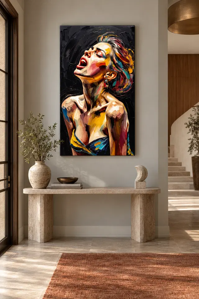
The dark background makes an evening lighting check worthwhile. Under weak or uneven illumination, the image may reduce to a few bright notes while subtler facial relationships become harder to see. Begin with normal lamps and assess from the actual seats. A small change in angle or position may help more than a spotlight. If choosing framed paper, consider reflections from windows and lamps. The goal is an even comfortable view of face and field, not a theatrical pool of light that exaggerates the performance association. The portrait already contains enough visual action without the room manufacturing more.
Avoid unnecessary direct sunlight, persistent damp and strong heat as general care considerations. Think about seasonal daylight and normal heating use, not only the planning day. The Canadian Conservation Institute's art-on-paper guidance is useful further reading for that format, but it does not certify this print or guarantee a lifespan. Follow instructions appropriate to the selected support and presentation. If the proposed wall has unusual conditions, discuss them with a competent framer or supplier. Optional finishing should not be expected to solve an unsuitable location or make the object waterproof. Sensible care planning keeps the expressive image available without exaggerated physical claims.
Select the support through a practical next step
Neptune Natural Matt Canvas 400 is specified as a 100 percent cotton, 400 gsm support with an irregular weave and natural warm base. Compatible photographic poster papers include Oyster 271 and Photo Lustre 310. Choose through the current product controls and decide what happens after delivery. A paper print or rolled canvas needs appropriate presentation; stretched canvas is offered ready to hang. Optional light, selective hand-finishing is separate from an ordinary print and does not recreate every visible mark as physical paint. The expressive surface is part of the image, not proof that the supplied object is an original painting.
Arrange framing where needed and plan fixings for the actual wall and object. Keep a safe unpacking area rather than leaving the print exposed in a busy passage. Quality in use includes accurate specification and suitable handling, not simply the most elaborate finish. Confirm format, dimensions, presentation and selected finish before ordering. Those clear details allow the image to remain open in interpretation. You can enjoy its vocal-looking gesture without naming a real performer or expecting unsupported durability. The material serves the way you want to display the portrait; it does not need to supply a concert history or guarantee a particular emotional response.
Let daily life remain quieter or more varied than the image
An occupied-room check can reveal a practical issue that an empty plan misses. A person seated below the portrait may obscure part of its approach view, or a chair pulled out at the dining table may bring someone too close for a comfortable complete view. Test those ordinary positions before fixing the location. Every angle need not be perfect, but the main intended encounter should work while the room is in use. This is more valuable than a wall that photographs well only when cleared. Give the portrait a place that tolerates people sitting, standing and changing activity without forcing them to preserve a decorative arrangement at the expense of comfort. Leave that practical freedom in the final plan.
Once the wall is planned, use the room normally before completing it with more accessories. Move chairs, open cupboards and switch on the usual lamps. If the portrait's proposed place only works when everything is unusually empty, revise the arrangement. A small object move or a clearer local boundary may be enough. The room does not need to become a venue, a musical tribute or a multicoloured set. Useful furniture and personal belongings can support a vivid portrait when the hierarchy is clear, leaving the face as one concentrated event rather than a demand on every surface.
Recheck shared views and selected dimensions, then leave tolerance for later changes. A new textile or shifted speaker should not make the whole wall fail. Stable relationships of scale, light and sightline are more durable than exact accessory matching. Woman with Open Mouth can remain an expressive visual presence in an ordinary living or dining room. You do not need to know the song, identify the singer or promise a mood. A comfortable encounter with the complete image and a well-understood presentation provide the practical foundation, allowing the portrait's suggestion of voice to coexist with the many real activities of the room.
Continue with this artwork
Find your next artwork
Four checks for placing the vivid portrait
Read more: Four checks for placing the vivid portraitRead less: Four checks for placing the vivid portrait
An open mouth portrait display puts a lively upward gesture into an ordinary room. You need enough space to see the chin and the upper area without making the rest of the space serve the picture. Start with a wall where the shape holds your attention and everyday movement still feels easy.
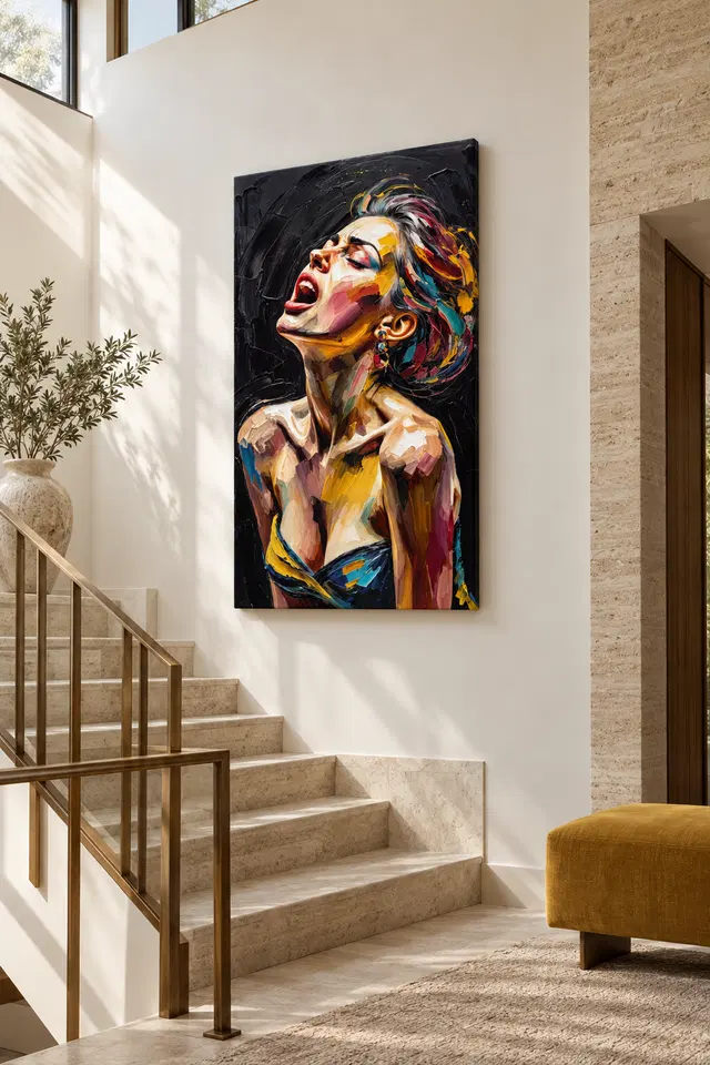
The console and staircase scenes above help with two different kinds of approach. Neither gives you a size or a fitting recommendation. Use four tests on the actual room: outline, approach, nearby colour and light. That sequence helps decide whether the artwork will still feel right when you use the room normally.
Open mouth portrait display test one: allow a tall outline to stay visible
Start by marking the outside dimensions of a presentation you might choose. Then stand back and compare the top of the proposed position with any panelling or trim. A tall outline can lose its effect when a shelf or doorway cuts across the view. However, a little space at the top may help.
Consider the console scene. The wide furniture gives the narrower image a visual base. However, your console might have a lamp or object that sits at another height. Before making any changes, test whether the top of that object hides the lower part of the proposed place as you pass.
If your wall has a narrow clear strip, try an outline that follows it without filling it. Therefore, you can still read the dark background as a separate region. Then compare a slightly wider nearby position at the same height. The portrait may look taller simply because you can see a clear edge.
Check the nearby corner in ordinary daylight if the wall changes direction close to the position. A shadow can give one side of the dark rectangle stronger contrast than the other. For example, you may see the head clearly without distinguishing the whole image from that corner. A little more space to the side can make the outline easier to see.
Check a second size for an open mouth portrait display
Compare the full display outline rather than treating the photographed art as a scale model. Leave any furniture where it normally stays. If the larger outline cuts across a rail or panel, test a smaller one from the same place. For example, the gesture might still hold the wall with less height than the styled picture suggests.
Before you buy wall art, use the ready-to-hang cost guide to note whether anything needs to happen before the display is ready. A frame you supply may affect the measurements. You can plan for that without guessing which parts come with the portrait.
Open mouth portrait display test two: see where it enters the room
The gesture can read differently from a doorway and from beside a seat. Start outside the room and look at the outline from your usual approach. Can you still see the raised face when the door stands open? Then check an ordinary seated position and see which details are likely to hold your eye there.
Select a landmark from the open mouth portrait study of tilt and colour. For example, use the edge near the chin or a cool patch in the hair. If only the widest coloured areas matter from the doorway, allow the doorway to be a quick view rather than expecting it to show the entire detail.
The staircase visualisation suggests a view from one side. If you are thinking about a landing, compare positions from a stable part of your own room. Do not treat the angle in a staged image as installation advice. More generally, make sure the proposed view does not depend on stopping in an inconvenient place.
If you pass the same wall in both directions, try each approach without changing the outline. The portrait looks towards one side of the image rather than directly out. Consequently, an angled view may put more emphasis on the face from one direction. Notice whether you prefer the order in which different features enter your view.
Let an open mouth portrait display work from an ordinary seat
Walk to the place where you read, eat or talk. See whether you like the image looking slightly off to one side rather than directly ahead. Because you might spend more time beside it than facing it, that matters as much as the first impression from the hall.
Our living room wall art selection lets you compare another composition from that same seat. Look at an image with a quieter centre. Then return to this portrait. If you miss the visible tilt and the colours around it, you know which traits to prioritise.
Open mouth portrait display test three: allow nearby colours to do less
In the console illustration, the pale wall sets the outline against a calm background. A warm floor covering can remain separate from the small bright passages around the face. Try the same idea without buying extra accessories. First keep your surroundings unchanged, then remove the most distracting small object and compare.
You do not need to repeat all the yellow, red and blue that appear in the artwork. In particular, a darker neighbour can make the boundary harder to see if it appears to join the ground. Try a small gap between them. Alternatively, keep only one warm thing within the immediate view and see what changes.
Revisit warm and cool colours in an open mouth portrait display
Test a view where you see the wall and some of your regular furniture together. If the forehead disappears into the brightest part of the room, see whether a shift along the wall gives it more definition. Sometimes a different position can change that relationship without altering your furnishings or the print size.
Before you buy artwork, record one colour contrast that matters to you. In the portrait, a warm patch by a cooler highlight may be more important than the fabric of your cushions. Then compare two positions while looking for that contrast. You can judge whether the artwork fits without creating a strict room palette.
Open mouth portrait display test four: evaluate light and the real surface
Try the proposed wall in daylight and under the lamp you normally use. A reflection might move across a small part of the artwork as you walk. In contrast, a warmer or cooler light can affect how you notice the colours in the whole scene. Check both rather than treating every difference as glare.
The Canadian Conservation Institute's guide to light exposure offers general context. It helps distinguish display conditions from how illumination affects an object over time. However, the bright staircase example does not show what exposure is suitable for this item. Base any practical decision on the selected material and the real space.
The Institute's guidance on the care of paintings is another place to consider display and handling questions. Use advice that matches the item you select rather than assuming the print is an original painting. Moreover, the room photographs cannot establish a particular mounting method or an ideal height.
Check the studio comparison of canvas and paper surfaces and the Woman with Open Mouth listing. If hand made wall art is what you searched for, ask which stage a chosen option actually refers to. Then compare the finish and confirmed dimensions with the position you tested, not the appearance of a painted mark.
Frequently asked questions
Where should I start an open mouth portrait display?
Begin with the viewpoint you use every day. Note which parts of the outline and tilted face will be visible from there. Then compare another spot rather than guessing from a staged room. A position that remains useful matters more than a dramatic first view.
Do I need a high ceiling to show the upward gesture?
Not necessarily. Mark the height of the presentation and compare it with the nearest fixed features. A clear margin above the image can help. However, it need not be large if the whole outline and face are already easy to see.
Will an open mouth portrait display work beside a staircase?
It can if the site offers good sightlines and a suitable place for the presentation. Check from a stable part of the room. In particular, use actual measurements rather than copying the visualisation. Arrange any practical installation according to the wall and item.
Should I position the portrait directly behind the main seat?
Consider the view from that seat and the usual route around it. The work may be easier to enjoy on a wall beside the seating instead. Alternatively, compare the same outline behind the seat. Decide what you will actually see during normal use.
Can I combine it with a large warm wall?
Yes, if the separate shape of the portrait remains clear. Take a look at the whole dark ground rather than trying to match one small colour on the face. Then test how you respond to the contrast at the distance you normally have.
Will a reflection change the way an open mouth portrait display reads?
Yes, it may obscure one area from a particular viewpoint. Move slightly to see whether the bright patch travels. Nevertheless, ask what surface and glazing the setup will have. The existing photograph does not show how all the available options behave.
Does the console have to be wider than the artwork?
No. It provides a possible relationship rather than a proportional rule. In your room, the console has a use apart from the picture. Therefore, check that your everyday objects do not cover a part you want to see as you enter.
Are the different colours evidence of a particular paint technique?
No. They help give the image movement and contrast, but the preview cannot verify tools or a physical process. Read the selected item's description if the material matters to you. If anything remains unclear, do not assume an appearance answers it.
Would it be better to add a second expressive picture?
Try the portrait on its own first. Then see what changes when a second image takes some attention from it. For instance, a simpler neighbour may make it easier to still see the upward line. The two do not have to tell the same story.
Should I use the daytime or evening view to choose?
Compare both if you use the room at both times. If you only pass the wall at one time of day, give that ordinary view more weight. Also, distinguish a reflection that only happens at one angle from general changes in the light.
What if the mock-up makes the artwork look larger than I expected?
Start again with the exact option on the listing. Check the whole proposed outline and compare it with the piece of wall you actually have. Then decide if the gesture still holds your attention. The pictured furniture is not a ruler.
When should I decide on the display finish?
Once you know the site and which image you want, check the available presentation. Compare the stated finish and size with your practical plan. However, do not decide on fittings or clearance until you know what the selected option does and does not supply.
Finish the open mouth portrait display with the view you will use
Choose the position where the outline still feels clear and the gesture draws you in. If it fits without taking away space or lighting you need, keep that position on the shortlist. It need not be where the portrayal would get the most attention from every possible angle.
Return to the listing for the actual measurements and presentation, then check the outline one final time. When those details suit your site, you can select the artwork for its particular gesture and colour without trying to recreate the staged room.