Looking closer
Wings, Profile and Swirling Blue: Choosing a Golden Figure
Explore the golden wings and quiet profile within an active blue field, deciding whether Golden Winged Figure interests you through its visual relationships rather than an assumed mythology.
Must the winged figure belong to a particular story?
Golden Winged Figure Abstract presents a humanoid presence with golden wings, a profile and a swirling blue-and-gold environment. Wings readily prompt associations with mythology, religion or fantasy, but the verified product information does not identify a named being or narrative. Begin with the visible relationship instead. A human-like profile gives recognition, while the wings extend that presence beyond an ordinary portrait. The surrounding field remains abstract enough that the figure is not anchored to a documented location. You can appreciate this combination without deciding which tradition it belongs to. Its openness is part of what distinguishes it from an illustration of an explicitly named character or event.
For selection, ask whether you need a fixed story. Someone seeking a particular religious image may require an identity that this work does not establish. Someone interested in the visual meeting of body, wing-like form and abstract movement may find that absence useful. It leaves room for looking before interpretation. You might notice the gold against blue, the profile's relative stillness or the way the wings change the figure's outline. Those are specific attractions that do not depend on invented provenance. A personal association can remain meaningful, provided it is understood as your response rather than a fact the print has promised.
Try describing the image without using angel, deity or any named mythological figure. If the description still interests you, the visual arrangement is doing substantial work. If nearly all the appeal depends on an identity you have supplied, compare a documented alternative before choosing. This is not a restriction on imagination. It is a way to distinguish an open image from a particular narrative purchase. The work can offer mystery without needing an unsupported explanation to make it seem complete.
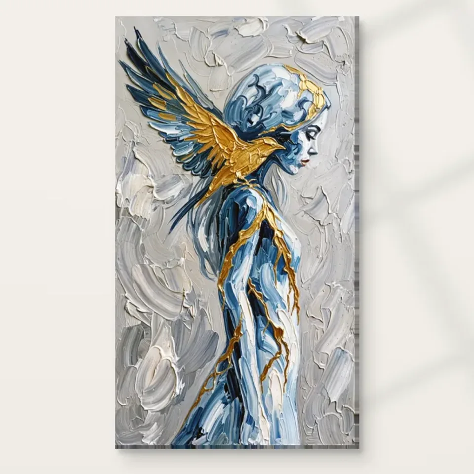
How does a quiet profile hold its place in a moving field?
The public description gives the profile a serene character, while the background is described as swirling and textured. Look at that contrast closely. The face may provide a relatively stable point within a surface that encourages the eye to move. Notice whether you return to the profile after following the surrounding directions. A small area of recognisable form can organise a much more active composition without dominating every passage. That relationship may be the work's most rewarding feature: stillness is not created by removing movement, but by giving it a point around which to circulate. The image can therefore feel composed and active at the same time.
Do not turn that reading into a claim about the figure's emotional state. Serene can describe an appearance or your response, not a verified inner experience. The profile does not establish meditation, spiritual fulfilment or a named psychological condition. If you enjoy contemplative imagery, consider whether the actual marks support that preference for you. A face that seems quiet in a thumbnail may become more intense when surrounded by the full textured field. Spend time with the cover rather than relying on one descriptive adjective. The whole relationship between face, wings and background is what will remain in the print you choose.
A useful comparison is a portrait with a direct gaze. That kind of image can address the viewer more explicitly, while a profile often directs attention within or across the composition. Ask whether you prefer that less frontal encounter. It may make the work feel available for contemplation without seeming to watch the room. This is a visual distinction, not a universal mood guarantee, and it can help explain why this particular figure appeals beyond its gold-and-blue palette.
The wings enlarge the figure's visual reach
A wing-like form can do more than identify an imagined being. It changes the figure's scale, silhouette and relationship with the surrounding space. Follow the wing areas as shapes before naming them. Do they spread the composition outward, lead your eye back towards the profile or merge with the swirling field? These observations reveal how the work is built. The humanoid presence may occupy one area, but the wings can make it feel more extensive. That expanded reach is a concrete reason the image may have a stronger visual presence than a similarly sized portrait focused only on a head.
Consider how much of your attraction comes from that expanded form. If you like the wings chiefly as a symbol, the image may serve one purpose in your collection. If you like the way they connect the recognisable figure to abstraction, it may serve another. Neither reason is inadequate, but distinguishing them makes the choice clearer. You may find that the most interesting passages are not the most clearly wing-like ones, but the areas where their shapes begin to join the background. That transition can sustain looking because the boundary between body and environment remains partly unsettled.
There is no need to invent actual flight, a destination or a moment of transformation. The wings can create visual extension without a literal action scene. Keeping the reading close to the image allows the composition to remain rich without becoming a synopsis of an unsupported story. Ask whether you want that openness in daily visual company. If you prefer a fully explained subject, a more explicit figurative work may be a better fit.
Gold and blue should be judged as a relationship
The palette brings warm gold-like colour into conversation with blue. Look at where each tone becomes most noticeable. A golden passage may seem luminous because a darker or cooler area supports it; a blue passage may feel deeper because a warm note interrupts it. The effect belongs to the arrangement, not to an isolated colour sample. View the complete image at a smaller scale and notice the broad distribution. Then return closer and see how local marks complicate the balance. This helps distinguish a composition you enjoy from a colour pairing that merely matches something you own.
Golden is a description of depicted colour, not proof of real gold leaf, metallic ink or a reflective physical finish. Likewise, the image's light-looking passages do not establish how the supplied material will respond to a spotlight. The current configuration governs support and any optional light, selective hand-finishing. You can value the luminous appearance without expecting an unlisted metallic effect. This distinction matters particularly with a winged subject, where evocative language can easily turn into exaggerated production claims. The visual contrast is already available in the image and does not need such claims to justify attention.
If you are selecting the work for its palette, test whether the profile and abstract field interest you as well. A gold-and-blue textile is not equivalent to a humanoid figure with wings. The human presence will remain after room accessories change. A lasting choice is clearer when colour supports your attraction to the complete image rather than replacing it. Ask what you would miss if the same colours appeared in a nonfigurative work. The answer can reveal whether recognition, symbolism or surface organisation is the main reason to choose this one.
Use texture to understand the image, not to invent the object
The textured treatment gives the swirling environment variation and apparent depth. Notice changes in direction, density and edge instead of treating texture as a single decorative effect. Some passages may gather the eye, while others let it travel. The figure may feel more settled where the surrounding marks become less certain. These are visual relationships that can be evaluated from the cover. A print can reproduce them without making every depicted layer physically raised. Keeping that distinction clear lets you appreciate the active surface without assuming that an original painted object or a complete reconstruction of its marks is being supplied.
Optional light, selective hand-finishing is a separate order choice where offered. It is not automatic because the image looks richly painted, and it should not be described as real impasto, waterproofing or a guarantee of lifespan. The ordinary print remains an image carried on the selected material. At this stage, decide whether the represented texture rewards your looking. Does it help unite wings and background, or make the figure harder to read than you prefer? More visual complexity is not inherently better. It is useful when it contributes to a relationship you want to revisit.
The existing room visualisations can show the image among domestic shapes, but they are not proof of installation, exact selected scale or included furnishings. After viewing them, return to the cover alone. This protects the selection from being carried by a staged chair, lamp or wall colour. The profile, wings and swirling field should remain compelling without that support. If they do, the work has a clearer basis for entering your collection, regardless of the final room arrangement.
Compare contemporary figures and abstract arrangements

Ask quality questions that the material specification can answer
The specified canvas is Neptune Natural Matt Canvas 400: 100 percent cotton, 400 gsm, with an irregular weave and natural warm base. Compatible photographic poster papers include Oyster 271 and Photo Lustre 310. These facts describe supports, not the source image's origin or a universal hierarchy of quality. Consider your intended presentation. Paper may suit separate framing, while rolled and stretched canvas involve different practical routes. The current product controls establish the actual combinations and dimensions. Read them rather than assuming the gallery's apparent format is the one you will receive.
Supplier further reading can clarify the canvas's stated characteristics, but it cannot certify the winged figure as a historic original or guarantee a particular room effect. Nor should a warm base be confused with real gold in the image. Quality becomes more concrete when you ask which support is selected, what dimensions arrive and whether an optional finish has actually been chosen. Those questions make the purchase precise while leaving interpretation open. The artwork can remain ambiguous without the order becoming ambiguous too. No claim of museum status, permanent unchanged colour or universal resistance to moisture is needed to make a clearly specified print worthwhile.
If you are uncertain between formats, resolve the presentation route before completing the order. A rolled print waiting for a frame and a ready-to-hang stretched canvas are not the same practical project. Your preference for the image should already be established through its composition. The material then serves that preference rather than being asked to manufacture authenticity or make the subject more mysterious. This keeps visual appreciation and practical specification usefully connected without confusing their roles.
A profile-first and a colour-first look reveal different priorities
Give the work two short, separate viewings. In the first, attend only to the recognisable profile and ask how quickly you return to it. In the second, follow the blue-and-gold field without trying to read a person. Then look again with both in mind. This is a practical way to discover whether the human presence and abstract arrangement support one another for you. It is not a test with a correct result. If the profile feels indispensable, you may be selecting a figurative work whose background remains unusually active. If the field is what holds you, the figure may function as one useful point within a wider colour experience. Either route can justify the choice. What matters is that you recognise which experience you want, rather than assuming a winged subject must be appreciated primarily through symbolism. The exercise also makes comparisons easier, because you can look for the same relationship in an alternative instead of merely matching blue and gold.
Choose the particular balance of recognition and openness
A final selection test is to state what this work adds that a different gold-and-blue image would not. You might value the profile's stillness amid swirling marks, the wings' extension of the figure or the uncertain boundary between humanoid form and abstract field. Those are specific visual reasons. A vague feeling that the picture is mystical may be a starting response, but it is worth identifying what produces it. Doing so helps distinguish sustained attraction from the novelty of an unusual subject. The work should offer something you want to look at after the first symbolic association has become familiar.
Compare it with a nonfigurative composition and with a clearly identified winged character. The first removes the human anchor; the second fixes a narrative this image leaves open. Notice which difference matters to you. Golden Winged Figure may suit someone who wants a recognisable presence without a prescribed story, and a luminous-looking palette without a promised metallic surface. It is reasonable to prefer either alternative. The purpose of comparison is to clarify your taste, not to argue that the most ambiguous choice is automatically the strongest.
Review the complete cover and the selected format, size and finish together before ordering. Make sure the profile, wings and background are all part of your attraction. You do not need to settle the figure's identity or invent an origin. A clear personal response to the composition and an accurate understanding of the supplied print are enough. That combination lets the image retain its openness while the purchase remains grounded, giving the golden figure room to be encountered through colour, form and movement rather than through unsupported claims.