Living with art
A Clear Setting for Wings, Blue and Gold in a Lived-In Room
Plan Golden Winged Figure through a clear silhouette, restrained warm accents and comfortable room use, keeping the wings readable without building a fantasy-themed interior around them.
Where can the wings retain their full visual reach?
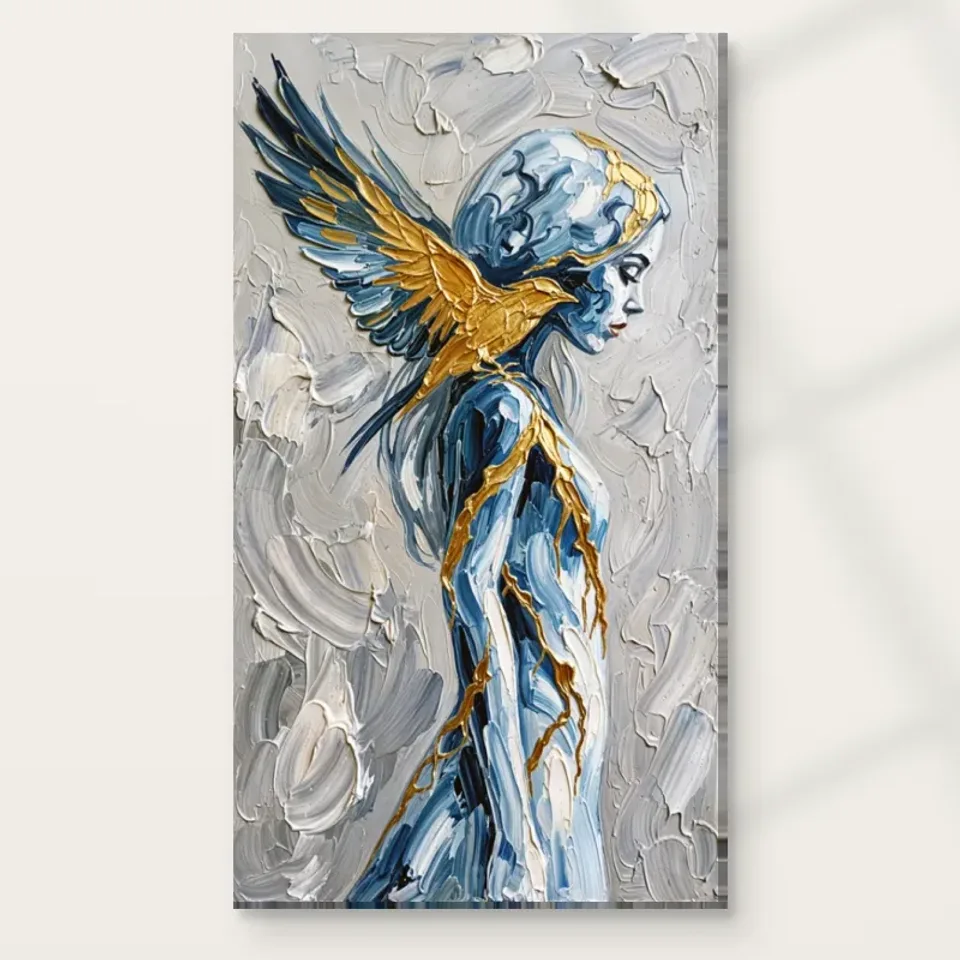
Golden Winged Figure needs to be considered as more than a profile. The wings extend the image's presence, and the swirling field participates in that extension. Begin by choosing a wall where the complete rectangle can be seen without a tall plant, shelf or lamp interrupting it from normal viewing positions. A wall that looks clear while standing may be partly obscured from a sofa or desk chair. Test those real views before selecting dimensions. The practical aim is to preserve the relationship between the quiet profile and the broader winged form, not merely to find a place where the face is visible.
A living-room wall can support a sustained encounter, while an entrance view may emphasise the broad blue-and-gold impression. Decide which matters most to you. If you want both, look for a wall visible on approach and from a comfortable seat. It need not be the largest wall. A smaller area with a clear sightline can serve the composition better than a broad surface seen only obliquely. Walk the ordinary route through the room with furniture in place and note where attention naturally pauses. The artwork should fit that pattern rather than requiring the household to behave as though the room were a gallery.
The existing room scenes are useful prompts, but they are visualisations rather than measurements or records of real installations. They cannot establish how your chosen size will relate to your furniture. Translate a useful relationship, such as open wall beside the image, into your own space. Keeping the full winged outline available is a more reliable starting point than copying the staged setting or choosing the largest option simply because the subject seems expansive.
How much gold belongs outside the picture?
The warm wing colour can connect with timber, a lamp fitting or a modest textile without requiring numerous gold-coloured accessories. Start with one existing relationship and see whether it is enough. A room already containing warm wood may need no new metallic object at all. The connection can be tonal rather than literal. This is helpful because the depicted gold is colour in the print, not a verified metallic surface. A reflective brass object and a printed golden passage will behave differently in light, and that difference can be attractive without pretending they are a matched material.
If you introduce an accent, keep it subordinate to the image's main warm areas. A large shiny object directly beneath the work may become the stronger focal point, particularly at night. View the arrangement under the lamps you normally use. The aim is to let the warm note support the wings, not turn the whole wall into a collection of competing highlights. Blue can be echoed quietly as well, but avoid automatically repeating both colours everywhere. The artwork already contains their relationship. The surrounding room can contribute steadier tones and useful materials while leaving the image as the concentrated colour event.
This restraint also makes the arrangement easier to change. If a cushion or lamp moves, the print should still belong through its position, scale and broad tonal relationship with the room. A complete matched scheme can feel brittle because every small replacement breaks the intended set. A clear wall relationship with one modest colour link is more forgiving, leaving space for ordinary possessions and later changes without rebuilding the whole interior around a winged subject.
Keep symbolism optional in a shared space
A winged humanoid figure may prompt religious, mythological or fantasy associations, but the product does not establish one named identity. In a shared room, it is useful to discuss the visible subject without requiring everyone to accept the same explanation. One person may respond to the profile, another to the blue-and-gold arrangement. They can share the space comfortably if the prominence and placement are considered. Ask whether the image is welcome as a main focal point or better as a more optional encounter on a side wall. Concrete questions about use are easier to resolve than a debate about what the wings must mean.
In a home office used for meetings or visitors, consider whether a strong symbolic-looking figure suits the room's role. That does not mean avoiding imaginative art. It means choosing it knowingly rather than assuming the palette makes it neutral. A wall visible when turning away from the desk may provide a personal viewing position without making the work the entire background to every interaction. If the room is also used for rest, test those views too. The artwork should not be promised to create calm, inspiration or productivity. Its practical contribution can simply be a clear place for an image whose profile, wings and moving field you enjoy.
Avoid surrounding it with objects added only to explain the subject. A fantasy-themed set may be a deliberate personal preference, but it is not required. Ordinary furniture can provide a strong context precisely because it leaves interpretation inside the image. The room can remain recognisably yours, with the wings acting as one unusual visual presence rather than a script for every furnishing and accessory.
Give the swirling field a steadier neighbour
The background already contains movement, so one broad quiet area nearby can make it easier to follow. A plain wall, evenly toned sofa or simple cabinet can supply that steadiness. Quiet does not have to mean white or empty. A deep even colour may be less visually busy than pale wallpaper with a sharp pattern. Assess the relationship from the main seat, where small details merge and larger contrasts become dominant. If the wall, rug and cushions all create swirling or highly directional patterns, the image may have less room to establish its own movement. Try simplifying one local element before changing the artwork plan.
A room can still be layered and personal. The useful distinction is between the main event in one sightline and supporting detail. If you have several pictures, give this one enough separation that the wings and surrounding field read as a complete arrangement. Closely packed images with similar blue-and-gold gestures may compete at the same scale. A different subject or quieter neighbour can provide a more interesting relationship than exact matching. Keep normal objects in place during the trial, because an arrangement that only works with every surface temporarily cleared is unlikely to remain satisfying in ordinary use.
Look for small practical adjustments. Moving a tall vase, shifting a lamp or removing one patterned cushion may be enough to reveal the composition more clearly. Subtraction is not a requirement to become minimalist. It is a way to see what the artwork actually needs. The figure's expanded form can remain the active element while the furniture supplies a stable base, allowing the wall to feel intentional without becoming a carefully staged display.

Measure the presentation rather than estimating from the wings
An expansive subject can encourage an oversized choice, but the physical print should be planned through actual measurements. Mark an available size on the wall with a method suitable for that surface, then sit and stand in the relevant positions. Can you see the complete composition comfortably? Does the outline feel squeezed by trim, switches or a doorway? Would the furniture hide part of the lower field? A larger object is not automatically more effective. The right size gives the profile and wing-like extension enough room at the distance you use, while preserving circulation and the room's other practical functions.
Use the current configurator to distinguish the chosen artwork area from the completed presentation. Rolled canvas states printed allowance and supplied flat dimensions separately. Stretched canvas uses the selected front face with wrap stated separately. A paper print gains outer dimensions if you arrange framing. Do not rely on an old margin or the apparent scale in a visualisation. If a frame is planned, settle the likely completed size before ordering for a tight wall. This preparation prevents a visually attractive idea from becoming an awkward installation once the actual object arrives.
Check ordinary movement too. A door, reclining chair or frequently opened cupboard can make a location unsuitable even if the rectangle fits while everything is closed. Leave clearance for the way the room is used. The wings can suggest expansion within the image; the print itself should not force furniture into inconvenient positions. A slightly less prominent wall that supports safe, comfortable use may be the stronger long-term choice.
Support the golden colour with comfortable light and a clear format
Do not try to make the depicted gold metallic by aiming a harsh light at it. Begin with the room's normal illumination and judge from the actual viewing positions. The blue field, profile and warm passages should remain readable together. A bright patch or reflection can interfere with that balance, especially in a framed paper presentation. Moving an existing lamp may be enough. Avoid unnecessary direct sunlight, persistent damp and strong heat as general display considerations. The Canadian Conservation Institute's basic painting-care guidance is useful further reading, but it does not certify this print or guarantee a lifespan. Follow the supplier's advice for the selected presentation.
Neptune Natural Matt Canvas 400 is specified as a 100 percent cotton, 400 gsm support with an irregular weave and natural warm base. Compatible poster papers include Oyster 271 and Photo Lustre 310. Choose the format alongside your practical next step: separate framing for a paper route, suitable presentation for rolled canvas or appropriate wall fixing for a ready-to-hang stretched option. Optional light, selective hand-finishing is separate from the ordinary print. It should not be assumed to recreate every brushstroke, supply real gold leaf or make the object waterproof. The material decision should clarify the order, not add an imagined effect.
Plan handling and installation before arrival. Use fixings appropriate to the actual object and wall construction, and arrange professional framing where needed. Keep a safe unpacking area rather than leaving the work in a busy passage. These ordinary choices allow the visual ambiguity to remain the interesting part of the project. The figure can be open to interpretation while the physical object has a straightforward, well-understood place in the room.
Centre the relationship, not necessarily the wall
A winged subject does not automatically need a ceremonially centred position. The useful centre may belong to the furniture grouping or viewing area rather than to the full wall. If a doorway occupies one side and a cabinet the other, measuring the plaster alone can produce an arrangement that feels misplaced during use. Stand at the main approach and identify the visual group you want the print to join. Then check from the relevant seat. A position can be slightly off the wall's geometric centre yet feel clear because it relates to the furniture and leaves useful space around the image.
Avoid using asymmetry as a decorative trick without testing it. The complete winged form still needs room, and a deliberate offset should not squeeze one side against trim or hide it behind a lamp. Try the outline in two positions before making a fixing decision. This small comparison can reveal a more natural arrangement without changing the chosen size. The goal is not to imitate the figure's symbolism through the room layout. It is to make an ordinary wall relationship support an unusual image, with the profile and wings available from the places where people actually look.

Leave ordinary life visible around the extraordinary form
Once the main placement is planned, resist completing it through a series of thematic purchases. Use the room normally and see whether anything is actually missing. If the work feels crowded, remove one nearby object or pattern. If it feels disconnected, try a small warm or blue-related note already present in your belongings. The artwork does not require a perfect staged setting to be meaningful. Books, comfortable furniture and personal possessions can coexist with it when the hierarchy is clear. The aim is a distinct place for the winged figure, not a room that pretends to be part of its abstract world.
Recheck the complete view from shared seats and ordinary routes. The profile should remain available, the wings should not disappear behind an object and the format should match the measured plan. Then allow the arrangement to tolerate small changes. A moved lamp or new textile should not require rebuilding the wall. Stable relationships of scale, position and light are more durable than a tightly coordinated collection of blue-and-gold accessories. They leave the room practical while the image retains its particular combination of stillness and movement.
Golden Winged Figure can be an imaginative presence in an everyday interior without promising a spiritual or emotional outcome. You can enjoy the visual reach of the wings and the quieter profile while leaving their identity open. A comfortable sightline, appropriate conditions and an accurately selected print provide the useful foundation. The rest remains personal: what you associate with the form, which colours you notice and how often the swirling field draws you back to the face.