Living with art
Placing Golden Masked Serenity Beyond a Gold-Themed Decorating Scheme
Consider this closed-eyed portrait in a real living room, bedroom or workspace through pattern density, warm colour, personal responses and the practical print specification.
Can closed eyes suit a bedroom without promising better sleep?
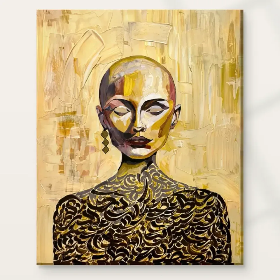
They can suit a bedroom as a visual choice, but neither closed eyes nor the word Serenity proves that a print improves sleep or produces a therapeutic effect. Golden Masked Serenity also contains strong dark shapes and an elaborate lower pattern, which some viewers may find quite active. Begin with your own response to the complete image rather than a general rule that closed-eyed portraits are always calming. In a bedroom, the relevant question is whether you want to encounter this particular combination of a paused face, warm colour planes and dense curves during the hours you use the room.
Consider the view from the bed as well as the view on entering. A portrait directly opposite a resting position offers a sustained presence, even without an outward gaze. A position near a dressing area or entrance creates a different, more occasional encounter. Either can be appropriate, but the choice should be intentional. Look at the image at a comfortable screen distance while thinking about that actual viewpoint, then use the selected physical dimensions to establish the likely wall area. Do not assume that a bedroom visualisation describes the scale or effect the print will have in your own space.
If the room is shared, compare responses before deciding on the most prominent wall. One person may find the rounded head and closed eyes restful while another first sees the sharp light-dark contrast. You do not need a single agreed interpretation, but you do need a location both can live with. A return wall or an entry view may be a better fit than the main sightline from the bed. The picture can contribute its character without being asked to fulfil a health claim or impose the same emotional response on everyone.
Consider other artwork choices for a personally comfortable bedroom
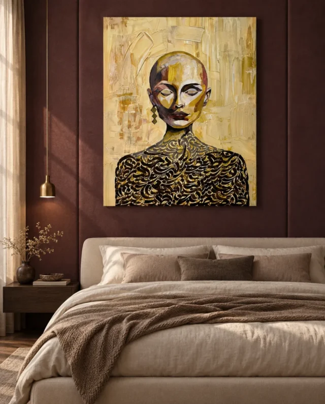
Warm colour is not the same as a reflective gold object
The portrait's golden appearance is reproduced within the artwork image. It should not be treated as a promise that the delivered print behaves like brass, gold leaf or a polished metal panel. This matters when relating it to existing furniture. A lamp with a reflective metallic finish changes as you move and as the light changes; a golden-looking passage in a print is an image of colour and light on the chosen support. They may sit together attractively, but an exact material match should not be assumed from a screen or a product title.
Instead, consider broader relationships of warmth and visual weight. Warm wood, a muted textile or a pale neutral wall can connect with the palette without imitating metal. Darker objects can answer the patterned lower figure, but placing too many together may make the arrangement feel concentrated in one area. The print already has a substantial dark foundation beneath the lighter face. You can use that fact to decide whether a heavy cabinet below is helpful or whether a lighter, simpler piece of furniture would provide more separation.
There is also no obligation to turn the whole room into a gold scheme. One strong warm image can be enough. If you already own metallic accessories, assess them in the complete view rather than adding more because the artwork's name suggests it. A change in the position of a lamp or vase may clarify the relationship more effectively than another purchase. The portrait can introduce warmth while retaining its distinct pattern and face, rather than becoming merely one coordinated item in a collection of similarly named finishes.
Let the curved lower pattern meet simpler forms
The lower portion of the image contains many closely spaced curves and dark interruptions. That gives it a different pace from the broader planes of the head. In a room, a simple nearby furniture outline can make this contrast easier to appreciate. A plain console, an unpatterned chair or a clear wall margin offers a visual interval without requiring a minimalist interior. You are not trying to remove all other interest. You are deciding whether the area immediately around the print helps the pattern read as part of the portrait rather than as one more indistinct decorative texture.
If the room already has patterned textiles, compare their scale and location with the image's curves. A large motif elsewhere may coexist more comfortably than an equally dense small pattern pressed close to the frame. The result depends on the actual view, not a rule banning combinations. Stand at the usual entrance and notice whether you can identify the portrait's head and lower shape clearly. Then move to the main seat. A group that looks coherent from one position may become more crowded from another because furniture and textile patterns overlap differently in the line of sight.
Try a reversible adjustment before making a permanent change. Move a patterned cushion, change the order of objects on a console or give the print a little more space from another picture. These small experiments can reveal whether the issue is the artwork itself or the immediate arrangement around it. The goal is not to preserve an empty stage forever. A useful place for the portrait should tolerate ordinary books, flowers and belongings while still allowing the contrast between the clear head and the more intricate lower field to remain visible.
Choose whether the portrait is an arrival or a companion
A picture seen on arrival performs a different role from one encountered beside a favourite seat. Near an entrance, Golden Masked Serenity may first register through its rounded head and warm field. Beside a chair, the smaller hanging accent and curving pattern can receive more attention. Identify which kind of encounter you want before choosing the most conspicuous wall. A prominent location is not automatically the most rewarding one, especially if it offers only a steep angle or a view interrupted by a door. A quieter position can allow a more complete experience of the actual image.
For a console arrangement, check the objects normally kept below. Keys, bags, lamps and decorative pieces may rise into the picture's lower view. Because the pattern is part of the portrait's character, repeatedly concealing it changes the encounter. This does not mean a console must stop being useful. It means the height, chosen print dimensions and everyday objects should be considered together. The styled room image may show a carefully cleared surface, whereas your own furniture may have a practical job that should not be sacrificed to keep the artwork visible.
If the work will be seen along a route, keep circulation and possible contact in mind. A framed object should not project into an awkward place where bags or shoulders regularly pass. Use suitable fixing methods for the real finished weight and wall construction, seeking competent advice when needed. The image's strong silhouette can support a passing view, but safe and ordinary use of the space remains more important than reproducing an apparently elegant position from a visualisation. Art can have a clear arrival role without making the entrance less practical.
Choose Golden Masked Serenity's actual size and presentation
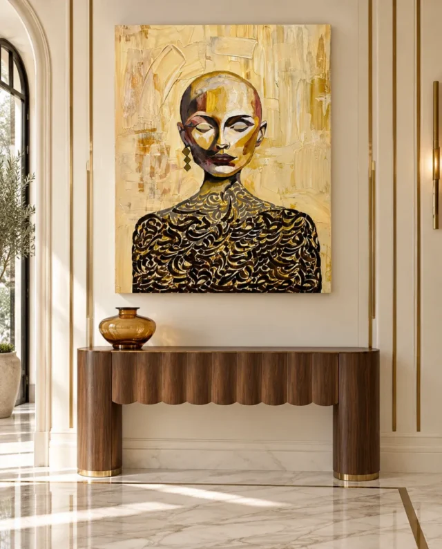
Will the pattern distract beside a working screen?
That depends on its position and on how you respond to the image. The closed eyes remove direct eye contact, but they do not make the rest of the portrait visually neutral. The dark curves and warm contrast may remain noticeable in peripheral vision. In a home office, try distinguishing the screen's reading area from the place where you look during a pause. A portrait on a side or return wall can offer a change of attention without sitting continuously against the edge of text you are trying to read. Another user may prefer a more immediate presence.
Think about how the room changes between focused work and conversation. A wall behind a visitor's chair may offer the print a clear role during a meeting while remaining outside the main concentration view. A wall behind your own seat may appear in video calls instead. Check that camera view if it matters to the room's use. You may discover that equipment crops the head or shows only part of the pattern. Knowing this is more useful than assuming a portrait that looks good in a furnished office scene will automatically perform the same function in your particular layout.
In a shared or commercial workspace, avoid claiming that the image universally communicates prestige, wellbeing or a specific spiritual message. The available information does not establish such effects or identities. Choose it because the actual image is appropriate to the people and activities of the space. One viewer may notice the closed eyes, another the calligraphic-looking curves. A straightforward description can welcome those responses without inventing an institutional or religious meaning. The artwork can be distinctive while the room's practical communication remains clear and separate.
Check the surface under ordinary light, not imagined shimmer
Observe the proposed wall at the times the room is normally used. The face's light and dark planes and the lower pattern both need comfortable visibility. A reflection can obscure part of that structure, particularly if a selected paper presentation or separate glazing introduces a reflective surface. Move between the relevant seats and standing positions when considering the light. You are checking actual viewing conditions, not trying to create a sparkling effect to match the word golden. The reproduced warm colour should not be expected to behave like a reflective metal finish.
Material choice affects the physical surface. A matt canvas and a photographic paper with pearl or lustre character are not identical, even when they carry the same artwork. If separate framing is involved, include its glazing and outer dimensions in your assessment. Keep direct sun, unsuitable heat and damp conditions in mind as part of appropriate care. The conservation reference below offers general guidance on display and care of paintings; it is not a certification of a specific print or a replacement for information about the actual selected support and presentation.
Avoid relying on a wall that is flattering only under one temporary arrangement of lamps. A room's lighting may change through the day and across seasons. If the print is difficult to see during the time you most want to enjoy it, another location may offer a better result than adding a dramatic light source. The image has its own varied surface appearance. A clear, comfortable view allows that to remain the focus without asking the surrounding room to perform a special effect every time someone wants to look at the portrait.
Treat room images as possibilities, not a scale promise
The existing visualisations show several possible furnished contexts for this portrait. They can help you ask a useful question about a console, bedroom wall or dining area, but they do not establish the exact scale on your wall. Measure the selected artwork dimensions and the complete outer size of any separately arranged frame or mount. The image's rounded head and broad shoulders can create a strong impression even when the surrounding room is generous. Do not let that apparent proportion replace the real measurements of the object you intend to order and display.
Also separate the print from the rest of the scene. Furniture, lighting, wall finishes and decorative objects pictured around it are illustrative rather than included in the order. Notice whether it is the artwork or the entire styled setting that first appealed to you. If the latter, identify one transferable relationship rather than attempting to recreate every detail. Perhaps the useful idea is simply a warm portrait above a clear horizontal surface. That can be assessed in your own home without assuming the same furniture, ceiling height or available natural light.
Return to the artwork alone before confirming the choice. Its closed-eyed face, divided colour planes and dense curves should remain interesting without the photographed or generated interior around them. This last check helps keep the product decision grounded. A visualisation can make a possibility easier to imagine, but it cannot guarantee your response to the work or the atmosphere of a room after delivery. The portrait's actual qualities provide a firmer basis for choosing it than a promise that the surrounding setting will arrive with it.
Finish with the specification, not the adjective
Once the place and role are clear, confirm the current material, artwork size, presentation and finish. Rolled and stretched canvas are different supplied forms, and a paper print may require separate framing. The visible paint-like ridges in the image do not establish raised paint on an unembellished version. Where optional selective hand-finishing is offered, check it as a selected process rather than an inference from colour or apparent texture. A clear description of the ordered variant is more useful at this stage than any general word such as golden, serene or luxurious.
Pass those details to anyone helping with mounting or installation. The final object's weight, outer dimensions and fixing requirements should be considered using the actual presentation and the wall, not estimated from a room scene. Keep the complete image in view if discussing any later preparation, so that the patterned shoulders and space around the head are not treated as incidental margins. The selected product options remain the authority for what Golden Ads supplies. Any additional framing or installation should build on that specification rather than silently changing the composition to fit an assumed measurement.
The resulting arrangement can be simple: a portrait you enjoy, in a place where its face and pattern can be seen comfortably, with a material and presentation you understand. It need not make a room uniformly golden or guarantee that every person feels calm. It can offer warmth, contrast and an unusual relationship between still features and active curves while ordinary life continues around it. That is a more durable role than an exaggerated atmosphere claim, and it leaves room for your response to the image to deepen or change over time.
Check the current support and finishing details
Continue with this artwork
Find your next artwork
Four checks for placing Golden Masked Serenity
Read more: Four checks for placing Golden Masked SerenityRead less: Four checks for placing Golden Masked Serenity
A Golden Masked Serenity wall display does not need a room full of yellow or gold. The face and layered curves can hold your view on their own. Check whether you want to see the face when entering the room or from a quieter spot within it. That decision can affect the position more than the colour of a lamp.
Two placing images offer different starting points. One shows the artwork above a pale bed on a brown wall. The other places it over a timber-looking console against a lighter surround. Use them to compare views and edges, not to calculate measurements or choose mounting hardware.
Golden Masked Serenity wall display check one: choose a view the room already offers
Start from your normal point of entry. Use a safe temporary outline in the place you are considering. Choose a small mark for the face and one below for the main area of curves. Then see whether both stay in view as you move to a place you normally pause.
In the bedroom illustration, the headboard offers a broad horizontal form. It does not tell you whether you would see the design from your own bed or from the doorway. If the useful view is beside the bed instead, weigh that alongside the first position. A close view is not always the most comfortable or practical one.
The guide to choosing artwork scale explains why the real view and the shape of the image deserve separate attention. Decide whether you need to recognise the expression or the larger division between light and dark. Use that choice when you compare different places.
Try a turning approach to the Golden Masked Serenity wall display
Walk the normal route into the hallway. A side view may bring the lower pattern to your attention before the face. Stop where the route widens and look again. If the artwork only reads well when you stand where people need to pass, choose a less awkward position.
Then check whether a bag or coat briefly blocks the area at busy times. Do not clear the hall just to get an ideal result from your test. Make the outline work with common use before choosing a spot that only looks good in a photograph.
Take another look as you come from the adjoining room. The pale outer field may be the first feature you recognise from that direction. If the face remains mostly hidden behind the doorway edge, make a note of the point where it appears. You can compare another position without making a guess about height.
Golden Masked Serenity wall display check two: choose a useful relationship with the surround
The console view has a soft pale wall and strips of darker furniture. The bedroom picture uses a stronger brown surround. On a light wall the outline may feel quiet while the dark garment becomes important. A darker wall may bring the pale outer field forward. Try one comparison instead of assuming that a matching wall is necessary.
Move a single small sample near the proposed outline. It could be a dark or warm colour already in the room. Then move it away and watch what happens to the picture boundary. If a quieter surround helps you see the face, leave the other furnishings as they are.
Give familiar furniture its own job
Do not move a bench, table or lamp out of daily use just to imitate the illustration. Notice where the furniture cuts across the bottom edge when viewed from the doorway. If necessary, shift the outline a little. See whether the larger shape then remains intact without taking the furniture out of use.
If there is other wall art nearby, check which piece you see first. The dark curves may be quite strong beside a small quiet image. Our wall art colour pairing guide gives another way to test the immediate colour relationship before painting any wall or adding a matching object.
If a curved drawer front or rounded vessel already sits nearby, compare the view before and after removing the portable item. A repeated curve can be useful without matching the gold tones. On the other hand, it may make the furniture as strong a feature as the dark lower pattern. The picture does not need every line in the room to join it.
Golden Masked Serenity wall display check three: compare how the light meets the face
Try the view during the time you normally use the room. Notice which light areas of the face stand out. Then try again under the light you already use at another hour. You may still see the outline even when the smallest bright marks are less apparent.
The Canadian Conservation Institute explains light as a cause of deterioration. Use its guidance for context, not as an assurance about the selected item. Check direct light and follow the care instructions for the particular format. A room mock-up is not a guide to safe long-term exposure.
Check the pale field separately from the details in Golden Masked Serenity wall display
Use the close guide to the face and its curves to identify one pale plane and one dark curl. Then imagine which one you can keep visible from your usual position. The overall boundary of the head may matter more than any hint of gold.
If a bright patch seems to move when you step to one side, compare it as a possible reflection. Do not confuse it with a fixed pale mark inside the image. Keep light that you need for reading or moving around. Then see whether an alternative wall or angle solves the problem.
Golden Masked Serenity wall display check four: verify the exact option dimensions
Measure the real available wall area. Check its height and width after accounting for a headboard, console or anything else that stays nearby. The Golden Masked Serenity product listing is the source for comparing the specific offer. Do not measure the art against the furniture in a photograph.
The National Gallery's glossary on frames explains how an edge can affect a picture's appearance. Ask about the outside dimensions if the chosen format includes a frame and the measurements are unclear. Before choosing a position above a bed, confirm suitable support and safe installation for the actual wall and item.
People who buy wall art may have separate costs or tasks before hanging it. Our comparison of ready-to-hang costs helps put those decisions next to the product choice. If the location depends on a delicate wall or uncertain fixing, use a different position or seek suitable installation advice.
Before you buy artwork with a particular finish in mind, check which format the selection supplies. Treat hand made wall art as a claim to clarify for that item. The visual curls and pale planes do not identify its physical relief. Ask for the specification you need to plan the display.
Keep the footprint separate from the decision to hang
Label any temporary outline with the measurements of the actual option. Then try the room with its normal furnishings in place. See which part of the image would first meet you at the door. If the view suggests a different position, alter the outline before considering anything permanent.
Look from the point where you would see the lower dark pattern most clearly. You may prefer a placement that encourages a closer look, rather than one that simply fills a larger patch of wall. Check the result once without holding the product page or the mock-up in front of you.
For a final comparison, note the clear area above the console rather than its furniture width. The edge of a lampshade or vase may rise into that area from one position. Make one temporary change while everything else stays in place. If the lower pattern becomes easier to see without affecting the room's normal use, save those measurements rather than trusting your memory of the trial.
Compare the upper outline as well. The head has pale space around it within the image. A high line of panelling near the outside edge can make that quiet area feel narrower. Check the outline from a second position before choosing whether that relationship suits you.
Frequently asked questions
Where should I start with a Golden Masked Serenity wall display?
Try the doorway first and then a view inside the room. Mark the face and the area of the curves within a full outline. See whether each remains visible with your normal furniture in place.
Does a Golden Masked Serenity wall display need matching gold accessories?
No. A quieter surround can give the pale background and dark pattern enough contrast. Try one movable item if you like a warm connection, then look without it. The design need not dictate the colours of everything nearby.
Can the picture work on a dark wall?
Yes, if you like the stronger outline between pale image and dark wall. Compare the lower edge as well as the brightest area. The dark garment inside the image can read differently against the new surround.
Does the bedroom image recommend hanging directly over a bed?
No. It is a styling illustration, not an installation recommendation. Use the chosen size, item weight, hardware and wall condition to decide what is suitable. If you are unsure, consider another location or seek suitable help.
What is useful about the console photograph?
It lets you compare a low horizontal object with a tall portrait. However, it does not establish the correct width or hanging height. Use the full measurements for the option and test against your own furniture.
Does a Golden Masked Serenity wall display require a special light?
No rule says it does. Compare daylight and ordinary evening light first. Then check whether the main outline stays readable. The work's care information is a better source for the actual material than an idealised room photo.
Can an edge disappear from one seat?
Yes. The viewing angle, furniture and surrounding light can all affect what you see. Try looking from a more useful viewpoint and adjust the temporary outline. A change of wall colour is not the only answer.
Should I measure the printed area or the whole item?
For a fit test, use the overall dimensions where the seller provides them. The printed area may not include the frame or another presentation edge. Check the chosen option rather than using a mock-up as a measurement.
Will the small curves still stand out from the doorway?
Some may merge into the larger dark area from farther away. Compare the cover in a smaller view. Decide whether the broader shapes offer enough from the doorway and keep the closer view for detail.
Do yellow highlights show how the supplied item reflects light?
No. They show the appearance of the design. The selected finish and light in your room affect how the delivered surface reads. Look up the option details and do not infer reflections from photographed marks alone.
Should I change the room to make the painting fit?
Try a different position or a measured change before replacing a useful item. Keep the normal view and furniture in the test. If the layout only works after several awkward changes, waiting can be the better choice.
When should I shortlist a different format?
Look again if the proposed size hides either the face or the lower pattern from the position you use. Compare the intended outside dimensions and the clear area. Then check whether another option gives you a more useful view.
Conclusion: separate the way it looks from how it fits
Look from the points you use, compare the neighbouring colours and check the light at ordinary times. Then test the real outside measurements. Choose a position and a format that keep the main shapes visible without asking the room to change its job.