Looking closer
Three Glasses, Gold and Blue: Reading a Celebration through Contrast
Look past the general idea of luxury to examine the three glasses, golden liquid, shard-like marks and blue-green field that give this print its particular rhythm.
What makes three glasses more than a decorative motif?
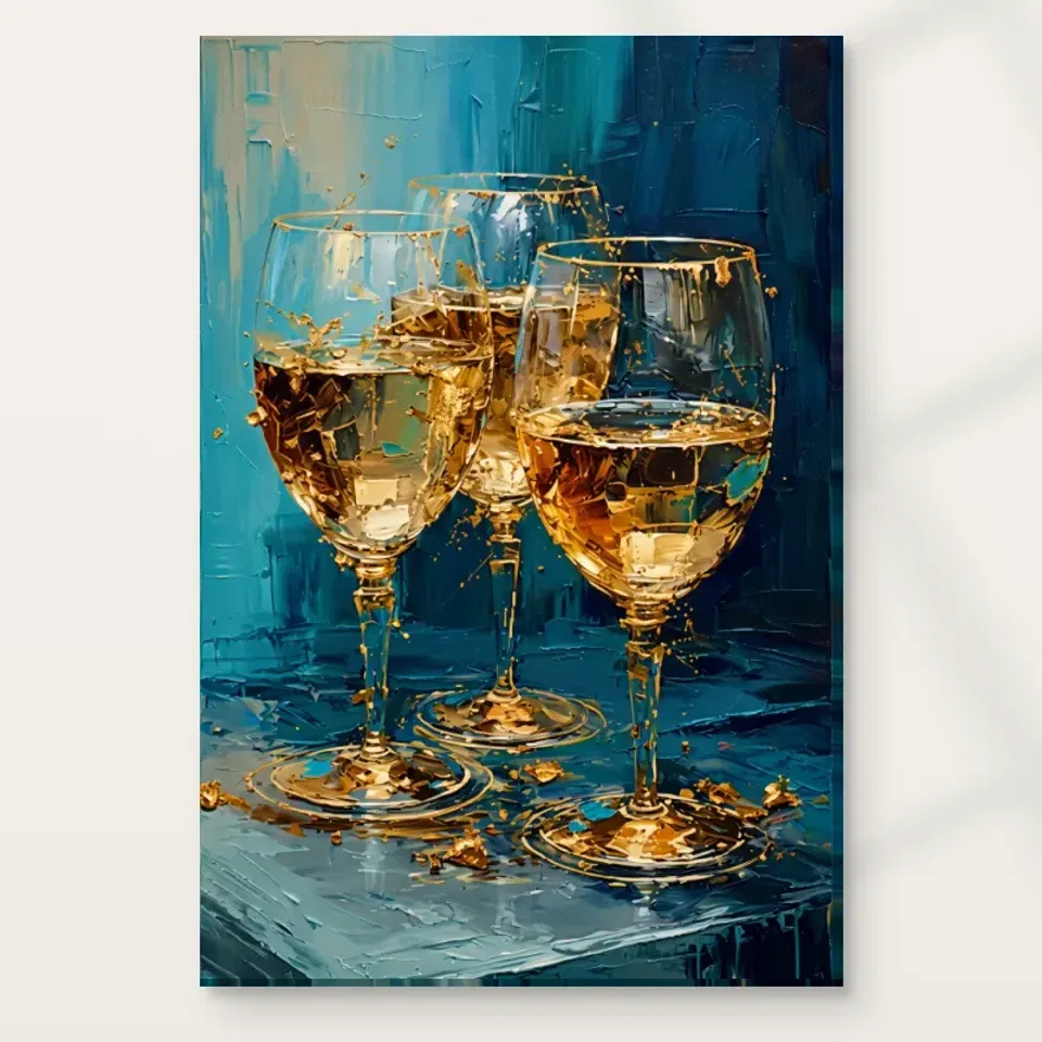
The title Gold and Blue Textures describes a palette, but the actual subject gives that palette a specific purpose. Three wine glasses contain golden liquid, surrounded by shard-like golden marks against a blue-green background. The glasses bring an identifiable, everyday object into an otherwise active field. They also introduce repetition. Rather than meeting one isolated object, we compare three related forms and notice their collective presence. That repeated subject can suggest an occasion without requiring us to identify the drink, the location or the people who might use the glasses. The image is open enough to hold a personal association with gathering, while remaining visually understandable as an arrangement of vessels and light.
Begin by looking at the group as one shape, then at each glass separately. Do the repeated forms create a steady rhythm, or does the surrounding activity make them feel less settled? This is a more useful question than simply deciding that glasses mean celebration. The answer concerns the way the picture has been organised. A viewer may appreciate the image as a still-life subject, a colour contrast or a reference to hospitality. You need not adopt all three readings. For selection, notice which interest remains when you have looked beyond the initial golden effect. If the repeated forms and their relationship to the background keep you engaged, the print offers more than a generic festive symbol.
Transparent objects need a visible surrounding world
Consider also the contrast between a vessel's outline and the space it contains. A glass is both an object and a boundary around liquid and background colour. That makes it a useful subject for an image interested in layers. You can follow the contour as a shape, then look through the suggested transparent area and find another passage of colour. This small shift in attention may be more rewarding than searching for a single dominant detail. It gives the familiar glass a visual complexity that belongs to this arrangement rather than to its social associations alone.
Glass is interesting to depict because it is not understood only through a solid local colour. Reflections, edges and the surrounding field help us recognise it. In this artwork, the smooth-looking reflections described on the glass surfaces contrast with the more textured background. That difference is worth noticing. The glasses can seem poised within a busy environment because their legible forms offer a different pace from the marks around them. Look at where a vessel appears clear and where it almost merges with surrounding colour. The image can ask the eye to move between object and background rather than treating them as completely separate layers. This exchange is part of the subject, not merely decoration behind it.
You do not need to evaluate the depiction as a technical demonstration of optics. Instead, consider the visual experience it creates. A highlight can suggest a hard reflective surface while a softer adjacent passage makes that highlight easier to notice. Golden liquid can provide an area of warmth within the glass, while the cooler field helps the vessel remain distinct. At some viewing distances, the objects may be read mainly as repeated bright forms; closer inspection may reveal a more complicated interplay of marks. This variation can be rewarding if you like still-life imagery that remains expressive rather than entirely descriptive. It also helps explain why both small and large product views are useful when deciding whether the work appeals to you.
Why does blue make the golden liquid feel brighter?
The blue-green background is an active participant in the artwork. Its cooler character makes the golden passages feel warmer by comparison. This does not require every blue to be dark or every gold-coloured mark to be light. The effect comes from relationships across the picture. Notice where warm areas are concentrated and where the cooler field provides a pause. A print described casually as gold art may actually depend heavily on the space given to blue. If you removed that resistance, the glasses and surrounding shards would have a different character. Their luminous suggestion is supported by a field that does not compete in exactly the same way.
When looking at the palette, avoid treating blue and gold as two paint samples to be extracted from the image. Both names cover a range of appearances within the composition. Some marks may look muted, others sharp; some passages may feel dense, others open. The interesting feature is how those differences work together. Try looking first at the cooler background alone, then returning to the glasses. You may find that the apparently supporting area is what gives the subject room to become clear. For a buyer, this is a useful check against selecting the print only for a fashionable colour pairing. Choose it if you enjoy the particular balance of warmth, coolness and density, not simply because the title names two colours you already own.
Shard-like marks introduce a different kind of movement
The source description calls attention to what appear to be shimmering golden shards around the glasses. That wording leaves room for their ambiguity. They may suggest fragments, flashes or energetic marks without needing to be identified as literal broken objects. Notice how their angular character differs from the recognisable vessels. Curved glass forms and smaller abrupt shapes can create a lively contrast. The surrounding marks prevent the still-life subject from feeling entirely static, while the glasses prevent the activity from becoming wholly abstract. This balance between an identifiable centre and a less settled field gives the image much of its visual interest. It is a specific relationship you can examine rather than a broad promise of opulence.
There is no need to infer a dramatic event from the shard-like appearance. The image does not require a story about a glass breaking or a particular celebration taking place. Such stories may occur to you, but they remain personal interpretations. Look instead at how the marks distribute attention. Do they draw the eye outward from the vessels, gather around them, or create a sense of movement across the whole picture? Your experience may change as you look. That change is valuable if you want a print that remains open to continued attention. If you prefer a quieter still life, the same activity may be a reason to compare alternatives. Neither response needs to be justified through an invented narrative.
Luxury is a response, not a certificate
Gold-coloured imagery often attracts the language of luxury, and the product copy uses a celebratory, opulent mood. You can understand that as a description of visual character without turning it into a material claim. The golden liquid and marks are colours within the printed image. They do not establish real gold leaf, metallic content or a precious finish on the supplied object. This distinction is especially important when viewing a luminous digital image. A convincing depiction of shimmer is still a depiction. Enjoy its warmth and contrast while judging the actual support and any selected finish from the current product information.
It is also reasonable to respond differently to the luxury association. One viewer may find the work festive, another elegant, another simply energetic. The glasses need not turn the room into a formal entertaining space. For visual selection, the strongest question is whether the image's richness feels inviting to you. If the golden effect initially attracts you but the active background feels too busy, take that hesitation seriously. If you enjoy the complexity of the blue-green field as much as the bright vessels, the appeal is likely more specific. The print should not be chosen to demonstrate status or guarantee a sophisticated atmosphere. A personal liking for the interplay of colour and form is a clearer and more durable reason.
Compare it as a still life and as an expressive field
A useful comparison does not need to end in a purchase of a second work. It can simply reveal what this one contributes. Place two product views side by side and ask which image has the clearer pause, which has more repeated forms and which feels more open around its subject. These are observations you can make without ranking the artists or inventing a technical explanation. If the glasses keep drawing you back, identify whether they offer stability or ceremony within the active field. That more precise preference will help you choose a size and setting later.
This artwork can be compared along two different routes. As a still life, it offers repeated glasses and a theme connected with gathering. As an Expressionist print, it offers an active background, strong colour contrasts and marks that do more than describe objects. Neither route needs to exclude the other. Consider which you would miss most if it were absent. If the glasses are essential to your enjoyment, compare other recognisable subjects as well as abstract colour arrangements. If the background is your main interest, look at how much structure the vessels provide and whether you would prefer an image with less explicit subject matter.
The existing Expressionist and Dining Room collections can help you make those distinctions. A room label is an editorial suggestion rather than evidence that a particular work must be installed there. A style label can open a comparison without defining a rigid technical category. Look for differences in density, repetition and the amount of recognisable imagery. If choosing a companion print, a second image with similar gold-coloured activity may either strengthen the theme or make both works compete. A quieter work could provide a useful pause. Judge the relationship from the full group rather than choosing a pair only because their titles share colour words. This keeps your selection tied to the actual visual experience.
What support suits your expectation of the image?
A print support contributes its own physical character, but it should not be mistaken for the depicted background. Neptune Natural Matt Canvas 400 is the verified canvas choice: a 400 gsm cotton canvas with a natural warm base and irregular weave. The compatible poster choices are Oyster 271 pearl or satin photographic paper and Photo Lustre 310 photographic paper. These are real material distinctions. None promises physical shard-like texture, actual liquid reflections or real metallic embellishment. If you are drawn to the image's apparent surface, make sure you still like it when understood as printed marks on the selected support. That is the clearest foundation for a satisfying order.
The manufacturer's Photo Lustre page provided as further reading concerns one available paper, not the history or identity of the artwork. Review the current materials guide alongside the product selections to understand presentation. A poster is supplied rolled and unframed; canvas can involve rolled or stretched choices with their own dimensions. Optional light selective hand-finishing, when selected, remains separate from the ordinary print. Do not infer it merely because the image appears textured. Think about the view you want to preserve: the overall warm-cool structure, the repeated glasses or the smaller surrounding marks. Then choose a material and presentation whose practical requirements you understand, rather than asking a finish to create an imagined physical effect from the picture.
Keep the final decision specific to these glasses
Take a moment to view the picture without imagining any furniture. This separates your response to the artwork from your attraction to a styled room. The glasses should remain interesting when they are not accompanied by a coordinated table or dramatic lamp. Then imagine a different setting, perhaps one with simpler materials than the visualisations show. If the warm vessels and cool background still feel appealing, the selection is less dependent on a particular display. That flexibility can be valuable as your room changes, because the image's own arrangement remains the reason you chose it.
Before choosing, return to the entire artwork and ask what makes this arrangement preferable to another gold-and-blue image. Perhaps it is the rhythm of three vessels, the contrast between smooth-looking glass and active background, or the way angular marks animate a familiar still-life subject. Naming that preference does not reduce the work to a formula. It helps you distinguish a sustained interest from a fleeting attraction to a colour combination. Look at the image again on another occasion and see whether the same relationship still appeals. You are not testing it against a universal standard, only giving your own response enough time to become clear.
A good final choice does not require believing that the print will make every meal festive or every reception room luxurious. Its role can be more modest and more particular: an image of repeated glasses, warm liquid and lively colour that you enjoy seeing. Use the product page to confirm the current size, support and finish, and use the collections to compare a quieter or more abstract alternative if needed. The source image can suggest celebration while leaving the imagined occasion open. If that combination of recognisable subject and expressive field continues to hold your attention, the work has offered a clear visual reason to become part of your home.
Continue with this artwork
Find your next artwork
Three ways to see the glasses and their surroundings
Read more: Three ways to see the glasses and their surroundingsRead less: Three ways to see the glasses and their surroundings
This gold and blue still life study starts with three glasses set at different positions. The brightest marks do not all sit in the bowls. Some appear around the bases or against the blue. However, the objects remain recognisable even where their edges break into warm fragments.
Try three ways to look at the artwork. Compare where the glasses touch the pictured surface, then trace apparent reflections, and finally look at the blue around the group. Each route highlights a different part of the composition. None requires identifying what the vessels contain or what event the scene might suggest.
Gold and blue still life study route one: compare the bases
Start with the front right glass. Notice the warm ring at its foot and the upright stem above. Then find the central base farther up the picture. That difference in height is a useful clue to the way the three objects occupy a surface. Their rims give a separate comparison.
Look at the glass on the left next. It stands far enough forward to let its rounded bowl interrupt part of the middle shape. Consequently, the rear glass can feel present without showing a continuous contour. Then drop your gaze back to the foot and see how the arrangement becomes easier to follow.
The National Gallery's glossary on still life offers context for looking at arranged objects. Here, the arrangement does not need to tell you who will use the glasses. Compare where their outlines cross, as well as the parts of the blue ground that remain open between the stems.
Also compare how much of the pictured surface remains visible between the two front feet. There is a small gap, but bright marks can seem to link the separate rings. Look at the gap without following those marks. The arrangement may appear more settled when you see how the objects stand. However, the paint-like highlights can make the same area feel much more active.
Change the starting point in the gold and blue still life study
Try beginning with the rear rim instead of the closest base. From there, you can see how two larger forms interrupt the view. Then check what tells you where the rear stem ends. The top and bottom will not necessarily lead you through the group in the same order.
If you prefer images of familiar objects in everyday spaces, compare the Golden Ads dining room wall art selection. Look for a different arrangement of shapes rather than just a similar subject. Then return to this piece. The three vessels can feel distinct even when only one base stands out first.
Gold and blue still life study route two: look at apparent reflections
Follow one of the bright curves around a bowl. It can seem almost continuous from across the image. At a closer scale, notice where the edge gives way to darker marks or picks up colour from nearby blue. The closer view therefore asks you to look at several fragments instead of a single polished line.
The National Gallery's glossary on composition is useful when you compare where these fragments gather. Near the right glass, bright areas recur down the stem and near the ground. Meanwhile, the rear glass leaves some passages quieter. Draw a loose path between the highlights that read together without counting every mark.
Look for a warm patch below the lip of a glass and a short warm patch close to the table edge. Their shapes differ. However, the repeat encourages you to notice the same colour in two different functions. One helps define a vessel. Another can suggest light or scattered shapes on the surface below.
Look for the darker cues in the gold and blue still life study
Bright marks can stand out on their own. Nevertheless, the darker areas of the bowls also help indicate depth. Compare a dark block in one front bowl with the blue close by. If the gold were equally bright throughout that part, it might be harder to see the curve as a form.
Try the same comparison at the rim. In particular, note when you find the line because of a pale gap rather than a bright streak. Looking for a missing part of the contour can be as useful as tracing an obvious edge. It can explain why the glasses feel visible without a continuous drawing.
Look above the rim for small flecks. Then see which flecks lead back to a bowl rather than away from it. A cluster at the left may ask for a quick glance, while a curve closer to the right may hold the eye longer. Consequently, you can compare their roles without deciding that each warm mark depicts the same object.
Gold and blue still life study route three: follow the blue planes
Start near the lighter blue section in the upper left. The background changes across the picture, becoming darker at the right. Then look at the lower plane beneath the stems. Some of its marks run diagonally rather than up and down. That shift helps you tell the wall-like area from the pictured table.
Our guide to large colour relationships in Fauvism offers another way to consider a boundary. Use the comparison to ask where contrast separates two regions. It does not identify the maker or historical movement of this print. You can follow a colour relationship here without claiming the two images use the same technique.
Trace the changing blue around the bowls. Sometimes it appears near a cooler outline, and elsewhere a large warm area covers it. As a result, the background gives the glasses different neighbours on the left and right. Try looking past the golden forms to see where the blue still carries your eye.
The front corner of the pictured table gives another comparison. Track its direction instead of looking for a highlight. Then return to the nearly upright strokes near the top. As you move between them, the blue can seem less like one flat colour. That distinction helps the group read as part of an arrangement with a ground beneath it.
Separate real surfaces from an impression in the gold and blue still life study
The studio's guide to marks and apparent relief distinguishes a picture of raised texture from a physical finish. A shining area in this image does not prove gold, foil or reflective material in the supplied print. Looking for hand made wall art? Verify which production steps or finishes the chosen option actually includes.
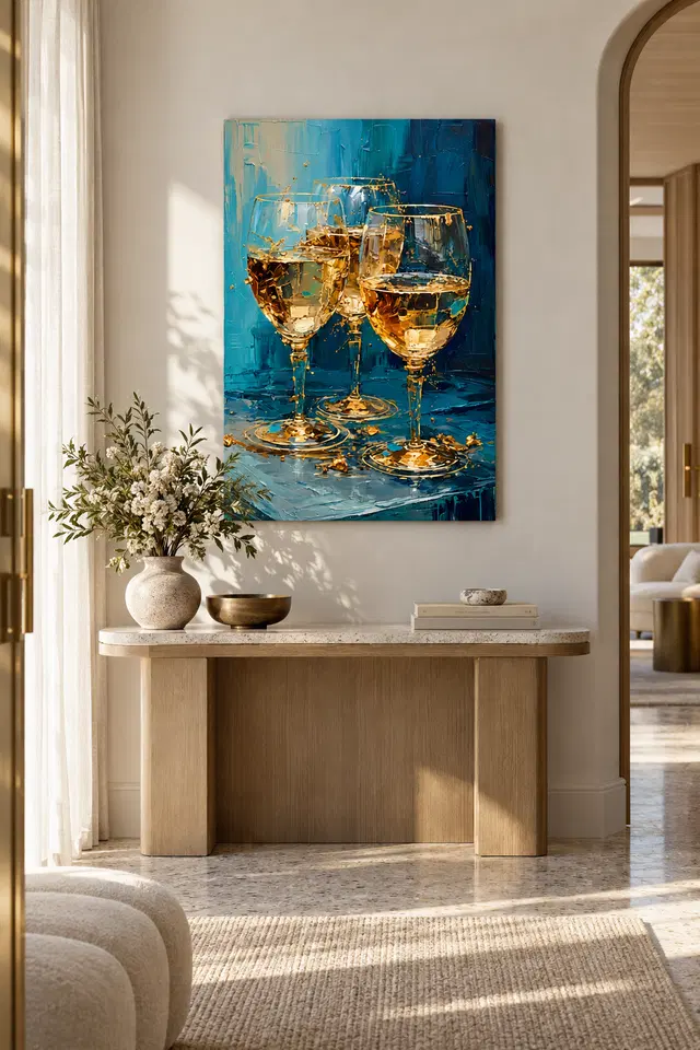
Before you buy wall art, compare the full image without the styled console. The surface and blue tones within the picture remain, while the pale wall and furniture disappear. Our companion guide to displaying the three-glass artwork considers that room question separately. Do not assume the illustrated dimensions apply to your choice.
Take the gold and blue still life study to the offered print
If you plan to buy artwork, open the Gold and Blue Textures product page. Check the available dimensions and presentation. Then compare them against the view you want, whether you care most about the three large shapes or about small breaks in the outlines. The product page describes the order, not a pictured drink.
If the detail already feels busy, try a whole view in a smaller preview and see what you still notice. Conversely, if you keep returning to the broken edges near a rim, think about how often you would approach the print. Those two situations give you different ways to make a useful choice.
Frequently asked questions
Where should a gold and blue still life study begin?
Try the base of the nearest glass rather than its rim. Then locate the other bases. This shows how the three forms sit in relation to one another. From there, you can follow the highlights upward and compare where the outlines overlap.
Are all three glasses shown from the same angle?
They share a setting, but their rims and lower parts occupy different positions in the picture. Compare a visible oval with one that another glass partly interrupts. You may notice different amounts of each vessel without assuming the scene is a measured arrangement.
Why follow the dark areas in a gold and blue still life study?
Not every boundary depends on a bright mark. Search inside a bowl for a darker shape next to a pale one. Then see whether the curve still reads from farther back. Tonal differences can help suggest a rounded form even when edges break up.
Does the picture tell me what is in the glasses?
No specific liquid needs to be identified for the visual comparison. You can see a warm-toned area and a boundary inside a vessel. However, neither colour nor the shape of a glass establishes a brand, drink or event outside the image.
Can bright marks on a still life work like lines?
Yes. When several small highlights align, you may follow a path between them without a continuous edge. For example, compare the broken marks on a rim with a broader shape at the base. They direct attention through different parts of the glass.
Does the gold and blue still life study imply gold leaf on the print?
No. Gold tones describe what you can see in the image. The composition does not establish the presence of metal or another coating. Use the stated material and finish for the selected option if you want to know how the item is made.
How do I see the ground without looking at the glasses?
Pick an open blue area and follow marks away from the nearest base. Then look at the change in direction nearer the bottom. That route can help you see how the pictured table remains legible independently of the objects on it.
Will the small highlights look the same from a doorway?
Not necessarily. The large contrast is easier to notice quickly, while closer views can reveal more breaks in the edges. Try to judge the size and position you have available. Then decide which part matters most in the actual setting.
What can I learn from the console illustration?
It gives a possible relationship between the picture and a lower horizontal surface. It is not proof of order size, mounting or material. Instead, use the isolated artwork to choose the image, then use measurements to decide whether a particular presentation fits your wall.
Is a dining room the only place for this subject?
No. A sitting area or another useful viewpoint may give you a good view of the glass shapes. Consider how often you see a proposed position. The artwork does not need the furniture beneath it to repeat the objects it depicts.
How does this compare with a quieter still life?
Choose another image with less contrast and compare how quickly you find its main objects. In this one, small warm details cross the larger blue field. However, you might prefer a more even arrangement if your normal viewing spot is already busy.
What details should I confirm before choosing a format?
Read the dimensions, surface and supplied presentation for that option. Then compare them with the wall you have. In particular, do not assume the appearance of a raised mark shows what you would receive. A product description and a picture answer separate questions.
End the gold and blue still life study with the contrast you noticed
Return to the three glasses without following a route deliberately. Which part comes forward now: the higher rear bowl, the bright edges or the darker blue? A short observation about that relationship can help you compare this image with a different still life.
When you are ready to choose, check the format that fits your actual view. Then select the artwork for the balance of warm fragments, cooler planes and recognisable forms, rather than trying to reproduce the styled room.