Living with art
Hosting around Gold and Blue Textures without Overdecorating the Table
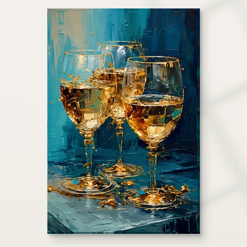
Plan this three-glass print for a dining room or reception area through seated views, adaptable table settings, evening light and clear distinctions between imagery and material.
Which kind of gathering should the room accommodate?
The three wine glasses in Gold and Blue Textures suggest gathering, but your dining room may serve far more than formal entertaining. It might hold weekday meals, homework, a laptop and occasional guests at the same table. Begin with those real uses. The print can add a sense of occasion without asking the room to remain permanently dressed for a celebration. If you like the image, consider whether its festive association feels welcome on an ordinary morning as well as during an evening meal. A work chosen for the everyday room is more likely to remain satisfying than one selected only for an imagined dinner party.
The subject may also matter in a shared reception area. Some homes and workplaces welcome images of wine glasses; others prefer not to use alcohol-related imagery in a common setting. This is a matter of context and personal preference, not a judgement about the picture's quality. Discuss it with the people who use the room if appropriate. You can admire the warm-cool colour relationship and still decide that another subject fits the setting better. If the glasses are welcome, let them supply a gentle reference to hospitality rather than making the room communicate a narrowly defined lifestyle or promise a particular social atmosphere.
Plan the view from the chair, not only the doorway
Include the view when the table is extended if you use an extending design for guests. A wall that relates neatly to the everyday table position may have a different relationship during a larger gathering. You do not need to centre the print perfectly in both situations. It is enough to know that the work remains visible and that no chair or serving route becomes awkward. Thinking through this variation is more useful than planning an idealised arrangement that ignores the room's most demanding real use. The artwork should accommodate gathering rather than requiring the furniture to remain fixed for its benefit.
Dining-room art is often chosen while standing in an empty room, but it will be seen repeatedly from chairs at different sides of the table. Sit in those positions before choosing a wall. A picture behind one guest may be directly in front of another; a print that looks central from the doorway may sit awkwardly behind a pendant fitting from the table. The three glasses should remain a coherent group rather than being divided by a visual obstruction. You do not need a perfect view from every seat, but it is worth knowing which view will be the most frequent and whether it feels comfortable.
Use an outline of the complete intended object and check it with chairs pulled out and the table in its normal position. Include the eventual frame if you are planning a poster. A sideboard arrangement can offer a useful relationship, but remember the objects that usually stand there. A tall vase or lamp can obscure the lower area of the image from a seated viewpoint. Leave room for the furniture to function during meals. The best location is not necessarily the largest blank wall; it is the wall that gives the artwork a clear presence while allowing people to sit, move and use the room without special adjustments.
How can the blue field steady a warm dining scheme?
A room with timber furniture, warm lighting and golden-toned accessories may already contain plenty of visual warmth. The print's blue-green field can provide a counterpoint rather than merely adding more gold. Consider the background as part of the decorating relationship. If you repeat only the golden passages in tableware and lighting, the work may be reduced to a warm accent and its cooler balance overlooked. An existing blue textile or cool wall could connect with that field, but no exact colour match is required. Contrast can be as useful as repetition, especially when you want the picture to remain distinct from the furniture around it.
Start with what you already own and test one connection at a time. A plain table surface may offer enough calm beneath the active image. A patterned cloth, many bright objects and a strong wall colour could create more activity than you want during meals. This does not mean everything must be neutral. It means deciding where the room's main colour interest should sit. If the artwork is the principal focus, allow some surrounding surfaces to be simpler. If the room already has a lively palette you enjoy, assess whether the print adds a clear relationship or simply another competing layer. Your actual view matters more than a rule about matching blue and gold.
Keep the table adaptable while the image stays in place
Storage matters here too. If the sideboard is where you set down dishes before serving, do not fill it permanently with objects chosen to echo the painting. Preserve a useful clear area. A room can communicate hospitality through how easily it works for people, not only through its imagery. The glasses on the wall can remain decorative while real glasses are stored safely and reached conveniently. This straightforward division keeps the artwork from becoming the reason everyday tasks are harder. It also allows a more relaxed display, because the room's practical order supports rather than competes with its celebratory note.
A wall print is relatively constant; a dining table changes several times a day. This difference can be useful. The artwork can provide a stable visual note while the table moves between practical and social roles. You do not need permanent decorative glasses beneath the painted glasses to explain the theme. In fact, literal repetition may make the room feel staged. Try leaving the table clear during ordinary use and notice whether the image already supplies enough character. For a meal, use the tableware and serving pieces you actually need, allowing the print to remain a background contribution rather than a demand for a coordinated display.
If you enjoy a centrepiece, keep sightlines and conversation in mind. A tall arrangement can interrupt both the view of the picture and the people across the table. A low, simple object may support the room more comfortably. The artwork's shard-like marks already create small-scale activity, so a quieter table setting can offer contrast. These are options to consider rather than etiquette rules. A lively household may prefer a more layered arrangement. The practical test is whether people can use the table easily and whether the print still reads as a complete image. A successful room should not require removing half the decoration every time someone wants to sit down.
Evening light should reveal, not imitate, the shimmer
Look at the wall with candles or other occasional table lighting only if those are already part of your routine. The image should not depend on an effect you rarely use. A print that becomes difficult to read under normal light may need a different location, not a more elaborate entertaining ritual. Equally, avoid assuming that a bright room is automatically better. Excessive contrast between a lit wall and the surrounding seating can feel distracting. Seek a comfortable balance that lets you see both people and artwork, allowing the picture's own suggestions of glass and light to remain within the image.
The image suggests reflective glass and golden light, but your room does not need a dramatic lighting scheme to reproduce that effect literally. Aim for a comfortable view of the print under the lighting you normally use. A pendant over the table may illuminate the meal well while leaving the wall comparatively dark. A side lamp or existing ambient light may help, but test the relationship before adding a fitting. The goal is to see the warm vessels and cool field clearly, not to create a theatrical spotlight that makes the rest of the room uncomfortable or draws attention away from the people at the table.
If the chosen presentation includes glazing, check reflections from several seats. A pendant or window may reflect across the glasses at one angle while seeming harmless from another. Canvas has a different surface, yet it should not be assumed to eliminate every lighting issue. The support, room and viewing angle all contribute. Domestic lighting can also change colour appearance, so avoid expecting a perfect match to a digital product view at every hour. If the work remains appealing under your normal evening conditions, that is a more useful result than achieving a brief ideal effect that requires every lamp and curtain to be positioned in one special way.
Give a reception area a welcome without a script
If the reception area has information signs, a clock or practical notices, consider their relationship to the print before installation. The three glasses are a recognisable subject, but they should not be confused with functional signage or used to direct people towards a service the room does not offer. Give the artwork an unmistakably decorative place with enough separation from instructions. In a home, the same principle can apply near a busy entrance: keys, post and everyday reminders need accessible space of their own. The picture can provide a visual welcome while the room's necessary information stays clear and easy to find.
In a reception area, the repeated glasses can suggest hospitality, but the print should not be asked to explain the whole purpose of the space. Visitors may be waiting, passing through or speaking with someone rather than studying art. Choose a wall where the broad colour arrangement is visible and where anyone who wishes can look more closely without obstructing movement. A low console or seating group can provide a relationship, but leave the circulation route clear. The image can offer a point of interest while the room remains legible and practical for people arriving with coats, bags or limited time.
Consider how formal the room already feels. The golden imagery may reinforce an elegant scheme, while the active blue-green field can prevent it from becoming too static. You might balance it with simple seating and a clear surface rather than adding many shiny objects. If the setting serves a varied audience, think about the subject as well as the colours before committing. A welcoming room does not need a universal symbol of luxury. It needs choices that suit its users. This artwork can be one such choice if the glasses and celebratory mood fit the context, but another subject may be equally appropriate where a quieter or less specific association is preferred.
Separate the golden image from the ordered finish
The print's gold-coloured marks are part of its imagery. They are not evidence of real gold leaf, metallic content or a universally applied embellishment. Likewise, the textured background does not guarantee physical impasto. Review the actual selected finish rather than treating the depicted surface as a manufacturing description. Light selective hand-finishing is optional and separate from an ordinary print. This matters when planning a room with metallic fittings or reflective tableware: the artwork may connect visually through colour, but it should not be expected to behave like a metal object under the same light. Let the image and the furnishings have different physical qualities.
The verified canvas support is Neptune Natural Matt Canvas 400, with 400 gsm cotton, a natural warm base and irregular weave. Compatible poster choices include Oyster 271 pearl or satin photographic paper and Photo Lustre 310 photographic paper. The manufacturer's canvas page linked below offers further reading about that material, not a promise about every display condition. Posters are rolled and unframed, while canvas presentation choices have their own practical requirements. Before ordering, check the selected artwork size and the stated margin or wrap details. A clear understanding of the actual object makes it easier to plan framing, wall clearance and installation without relying on the apparent richness of a digital image.
Let practical decisions protect an easy-going room
Choose a position away from routine splashes, direct heat and places where serving or cleaning is likely to knock the print. A dining theme does not make the object suitable for a kitchen splash zone. Use appropriate fixings for the wall construction and finished weight, and seek competent installation help if needed. If framing a poster, account for the external dimensions rather than only the image size. If selecting rolled canvas, make a clear plan for its later presentation. These details may be less glamorous than colour choices, but they allow the room to remain relaxed because the artwork does not introduce a new practical worry.
After installation, see how the image works during several ordinary meals before buying accessories around it. You may find that its three glasses and lively colour already provide enough emphasis. If the room feels busy, simplify nearby objects first. If the work feels detached, reconsider the spacing or lighting before assuming that more gold is needed. Return to the product page for exact options and the Dining Room collection for alternatives if you are still deciding. The most convincing setting is one where the print contributes warmth and interest while the table remains ready for real life. It can suggest an occasion without asking every day to become a performance of entertaining.
Continue with this artwork
Find your next artwork
Four checks for placing the three-glass artwork
Read more: Four checks for placing the three-glass artworkRead less: Four checks for placing the three-glass artwork
A gold and blue still life display can suggest a table without making the table below it part of the artwork. The three glasses already provide a group of warm highlights. Start with a view that gives those shapes room. Then see what the wall, furniture and ordinary light add.
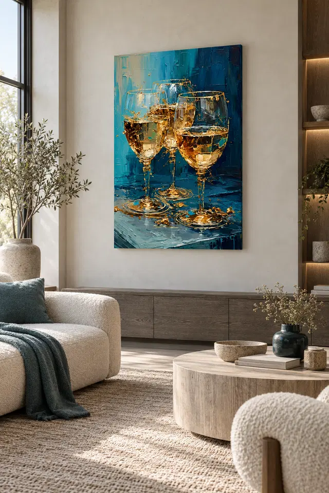
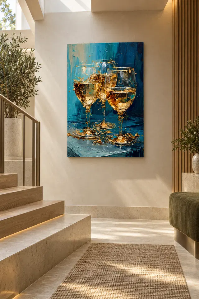
The two room examples above show a living area and a landing. Neither supplies dimensions or an installation recommendation. Try four checks in your own space: the horizontal edges below, the views you use, the neighbouring colours and the normal light. You can compare those things without setting a table just to match the picture.
Gold and blue still life display check one: separate the two table edges
The pictured glasses stand on a surface with a visible front edge. From farther back, that edge may nearly align with a console or table in the room. Try marking the intended outside size against the furniture you have. Then check whether a small gap lets you see the two surfaces separately.
Look from a place where you would normally sit. If the furniture below is busy, the gold areas at the base may not be easy to distinguish. Conversely, you might only notice that problem from the door. Compare both views before moving a lamp, plate or another thing people need to use.
The Gold and Blue still life study of the three glasses gives you a few features to test. For example, choose a foot at the bottom and an upper rim. If the lower detail is lost from one place, see whether a different wall will bring both into your normal view.
Try the outline in an adjoining area that has no table under it. This gives you a way to tell whether the blue field and upright stems hold your eye independently of the matching subject. In particular, check the lower corner of the image. If it stands out more there, you may prefer that site even when you host elsewhere.
Rehearse a second outline for a gold and blue still life display
Keep the surface below in its usual state when comparing sizes. Mark a larger or smaller outline around the same centre. A dark cupboard or shelf can affect a tall image very differently from a wide one. Therefore, a position that works for the apparent size in a room scene may not suit every order option.
Our comparison of the total cost of hanging a print helps identify what an extra frame or fitting would add. The exact outside dimensions can differ from the print area. Check the space you need to use before you buy wall art rather than guessing from the setting online.
Gold and blue still life display check two: compare how people enter and sit
Choose one seated view and one view along your ordinary route. The warmer details in the middle may be clearer from one, while the upper blue reads strongly from the other. Look at the artwork rather than the object used to mark its edge. You may prefer whichever view lets the group stay recognisable.
If a dining chair faces away from the proposed wall, do not judge it as though that person will always see the picture head on. Try a real seat or a path from the kitchen. The Golden Ads dining room wall art selection offers other arrangements for comparison from that same viewpoint.
The landing example uses a clear vertical section and a different approach from a room with chairs. If you are considering something similar, check the view from a safe level part of your room. In particular, do not assume a position near steps is suitable just because you can imagine it from the photograph.
If you use both sides of a table, test the seat farther from the wall as well. The picture may sit alongside one view and behind another. Then check whether that difference matters when guests use the room in the usual way. You might enjoy the most direct view from the entrance even if it is less visible from some chairs.
Use a quick view and a long view in a gold and blue still life display
First see which shape catches your eye as you walk past. Then sit in a place where you linger. If the smaller marks hold up only from the seat, that may be fine. Decide which view should carry the strongest impression instead of expecting each viewpoint to give you the same picture.
Try the shorter route with the door or seating in its ordinary position, especially if you move it when guests arrive. Then repeat once the room is quieter. The result helps you distinguish a one-off obstruction from a position that will make the main shapes hard to see most of the time.
Gold and blue still life display check three: quieten competing warm accents
The National Gallery's glossary on composition describes how parts of an artwork form an arrangement. Use that idea to distinguish what happens inside the frame from what surrounds it. A warm item nearby does not need to echo every rim or bright spot for the glasses to work as a group.
In the living room illustration, pale seats and blue accents leave the warm shapes to the artwork. Your dining area may have darker furniture or a patterned cloth instead. Start with those things in place. Then remove one bright object for a moment. See whether the glass bowls become easier to see.
Try the opposite comparison too. Place one modest warm object outside the outline, not right next to the part where the image is brightest. For instance, an everyday bowl might provide enough contrast without competing for attention. Put it back where it belongs if you prefer the artwork on its own.
Look at the blue near the margin before judging the warm accents. A wall section that repeats the darkest blue can change where you see the edge of the image. Compare that with a gap of clear wall colour. Consequently, you can decide whether the most useful change is adding a small accent or simply giving the outline more space.
Check a gold and blue still life display on an ordinary evening
When the room is not set for guests, look towards the picture again. If you still enjoy the relationship between the warm and blue areas, the scene may fit the space without additional decoration. That question matters more than whether the artwork and your serving pieces appear to be the same colour.
Gold and blue still life display check four: test real light and size
Look at the wall under your regular lamp as well as in daylight. A reflected spot may hide a rim when you sit down, even if the same area looks fine from the door. However, changing the lamp angle does not answer a question about the offered surface. Check the display position and material separately.
The Canadian Conservation Institute's introduction to light exposure explains why exposure matters over time. Use it as general context rather than a promise about this item. The studio comparison of canvas and paper surfaces also helps distinguish a finish from any glazing you might add.
Before you buy artwork, check the current Gold and Blue Textures product choices. Compare the physical size and finish with your test. If hand made wall art is what you searched for, clarify which step the description refers to. The warm appearance alone does not show metal, foil or a particular method.
Frequently asked questions
Where should a gold and blue still life display begin?
Start from the chair or doorway you use most. Compare a bright rim and the base of a glass in that view. Then check the outline against nearby furniture. You are looking for a position that suits the picture and the room.
Do I need a dining table below the artwork?
No. The living room and landing examples show different arrangements around the same piece. A quieter surface or clear wall may work too. For example, compare whether the glasses remain separate from another object below them rather than trying to repeat their setting.
Can I use a gold and blue still life display above a sideboard?
Yes, if the complete presentation fits and the everyday objects on the sideboard leave a clear view. Try the outline with those objects already in place. Then move only one item if it hides a detail you want to see from your seat.
Should I add gold-toned accessories?
No. The warm highlights already have their own role within the picture. Try the art next to what you use regularly. Nevertheless, if one small warm object helps balance the view, keep it where it works without turning the whole wall into a match.
How can I judge the artwork before buying a frame?
Mark the outside size of the print or presentation you are considering. Then add any separate surround you intend to use to a second outline. Compare the two before choosing. The size in a room picture does not verify which options include a frame.
Will a gold and blue still life display work beside open shelving?
It can if the arrangement remains easy to read from your usual position. A dark vertical shelf edge might compete with the blue shape at one side. However, a little more clear wall could help. Compare the two locations before deciding on the display.
Does soft light always make the brighter details easier to see?
No. The effect depends on the surface, the light and where you stand. Look separately for a moving reflection and for any change to the way you see colour. Then test a second spot if an everyday lamp causes a problem.
Is the artwork supposed to look like a particular drink?
Nothing about the display depends on identifying one. The scene shows golden areas within glass-like forms. For instance, you can enjoy the contrast against the blue without using the picture to decide what the glasses contain or how they might be used.
Should the lowest part align with the furniture top?
Not as a rule. Start with enough room to use your furniture as normal. Then compare how the pictured surface reads against the real one. If the two seem joined from a seat, a small change in position may separate them visually.
What if I see only the biggest glass from the doorway?
Decide how much that doorway view matters. Then check from your seat or from the opposite side. Perhaps the main glass gives you a useful first impression and the closer view reveals the others. You need not judge the site from one route alone.
Can a smaller format still work in a busy room?
Possibly. Mark its outline and see whether one or two important shapes remain clear. A smaller display might leave more open space beside nearby furnishings. However, verify the actual available options before planning the spot around an estimated size.
What should I confirm before hanging this artwork?
Check the selected dimensions and indicated presentation first. If you need a separate frame or fitting, confirm the appropriate details for your wall and item. The illustrated setting shows how a position might feel, not a method or guarantee for fitting.
Finish the gold and blue still life display with the view you use
Return to your preferred position and look from the place where you normally spend time. If you can pick out the warm group without needing to keep the table below bare or decorated, the picture of the glasses has its own space. That is a useful reason to keep the choice.
Verify the exact format before ordering. Then choose the view that lets the blue ground and golden marks stay distinct without making the rest of the room follow the artwork's palette.