Looking closer
A Profile Suggested by Swirls: Choosing Gilded Silhouette
Explore the black-and-gold field and fragmented profile suggested in Gilded Silhouette, distinguishing a shifting human association from a fixed portrait, metallic finish or physical paint claim.
A silhouette can be suggested without a clean outline
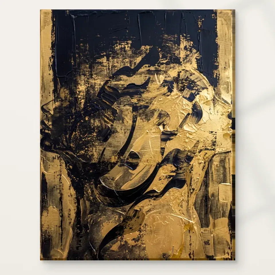
Gilded Silhouette Abstract uses black and gold tones in swirling, textured-looking patterns that suggest a fragmented human profile. The useful starting point is the word suggest. The verified description does not promise a sharply cut outline or a fully described face. Instead, recognition may arise from the relationship between marks. Look for the point at which an area becomes profile-like to you, then notice how it joins the surrounding field. The work can remain abstract while offering a human association. That threshold is more specific than a general description of an elegant black-and-gold picture, and it may be the reason the image invites repeated looking.
For selection, decide whether you enjoy a profile that is not entirely fixed. Someone wanting a clear likeness may prefer a more descriptive portrait. Someone wanting no recognisable subject at all may prefer a nonfigurative field. This work sits between those possibilities. It lets the eye find a human presence and then return to swirling marks that do not all belong to anatomy. You do not have to choose one reading permanently. The relationship between them can remain the main experience. A strong choice acknowledges that openness rather than mentally turning the image into either a precise face or a purely decorative pattern.
What does black contribute beyond a dark background?
Black can be an active part of the composition rather than empty space left around gold. Look at how dark areas separate, connect or interrupt the warmer marks. They may help a profile become legible, give the eye a resting point or create a sense of depth. The exact role is something to discover through looking, not assume from the palette. Try attending to the black passages first. Do they form a coherent arrangement without the gold being your main focus? Then let the warmer tones return to prominence and notice how the two change one another. This can reveal why the image feels concentrated rather than merely bright against dark.
If you are attracted to the print because black seems easy to coordinate, remember its visual weight. A dark field can make a work feel substantial even at a modest physical size. The gold-like notes may be smaller in area but stronger in immediate attention. Consider both quantities rather than selecting from a favourite warm fragment. A room or collection that welcomes a little gold may not necessarily want a large dark presence, and the reverse can also be true. The complete cover is the useful reference. The image's black areas should be part of what you value, not something ignored while imagining only the accent colour.
Gold names a colour relationship, not a material certificate
The warm notes can look luminous because of their contrast with black and because of variation within the marks. Golden or gilded language describes that visual character here; it does not establish real gold leaf, metallic ink or a reflective physical layer on the supplied print. Keep the image and material specification separate. You can enjoy the impression of light within a dark field without expecting an unlisted surface effect. This distinction is particularly important for a title that could otherwise invite assumptions about production. The current product controls determine support and any optional finish, while the cover supplies the relationship you are selecting visually.
Look at how the warm areas vary rather than treating them as one flat gold swatch. Some may carry more apparent brightness, others more density or connection to neighbouring marks. Those differences can keep the restricted palette active. A single sampled colour cannot represent the whole arrangement. If gold is the first attraction, ask what the swirling profile adds beyond a colour pairing. You may discover that the image matters because recognition seems to emerge through the warm passages and dark interruptions together. That is a more durable reason to choose it than matching a lamp or cushion, because it concerns the composition rather than an accessory that may later change.
How does a swirl become part of a face?
A curved or circling mark does not have to describe a facial feature to contribute to a profile. The eye can connect a few cues into a larger human form while other marks remain independent. Notice where that happens for you. Are you reading the whole field first and then finding a face, or finding a face and interpreting the field through it? Either route can be rewarding. The difference helps explain the image's abstract character. It is not simply a portrait with a patterned background. The suggested profile belongs to the same swirling treatment that can also be enjoyed without naming it.
Try looking away briefly and returning without searching for a particular feature. Recognition may arrive differently the second time. That variability does not require a hidden correct solution. It can be the work's repeatable experience. If you want the face to become fully settled and it does not, recognise that preference rather than forcing the image into a more literal role. If you enjoy the uncertain emergence, it may offer sustained curiosity. No named sitter, real person or artist identity is established by the verified public copy, and none is needed to discuss this visual exchange. The human association can remain suggestive while your reason for choosing it becomes precise.
Fragmentation can keep recognition from becoming a label
The profile is described as fragmented, which is useful to consider as an active quality rather than incomplete information. A fully resolved face can quickly become a label in the mind: a person, an expression, a likeness. A fragmented form may keep attention moving between parts and whole. You may repeatedly recognise enough to sense a human presence without settling all the boundaries. That can prevent the image from becoming exhausted after the subject is named. The useful question is whether you enjoy that ongoing process. Ambiguity is not automatically valuable; it becomes valuable when it gives you a way of looking you want to return to.
Avoid attaching a biography or fixed emotional state to the fragments. You might associate the image with memory, duality or change, but those are interpretations rather than established facts. The public description supports black-and-gold patterns suggesting a profile, not a documented account of a person. Keeping that limit clear can make the work more open in a shared collection. Another viewer may notice only movement and colour at first. They do not have to adopt your human reading immediately. A composition that allows several routes can be chosen for that quality without being advertised as universally meaningful or required to communicate one message to everyone.
Apparent depth belongs to the image before it belongs to the object
The source copy describes a thick, textured appearance and an almost dimensional feeling. For a print, those words should be read as visual description rather than proof that every mark is physically raised. Study what the apparent texture does. It may create dense passages, separate warm from dark areas or make the profile harder to distinguish from the field. These are concrete visual effects. A close view can be interesting, but return to the complete cover so the surface does not become detached from the composition. You are selecting a black-and-gold arrangement with a suggested human form, not merely an enlarged patch that looks like paint.
Optional light, selective hand-finishing is separate from an ordinary print and should be confirmed through the actual selection where offered. It is not a blanket promise of impasto, real gold leaf, waterproofing or a fixed lifespan. The image can remain rich without those claims. Quality questions become clearer when you separate the represented surface from the support carrying it. Ask whether the marks reward your attention, then ask which material and presentation fit your plan. The first concerns the image's success for you; the second concerns the supplied object. Neither requires an invented origin or a claim that the print is an original painting.
Compare the work with both a portrait and a nonfigurative field
A clear profile portrait offers a useful alternative because it fixes recognition more strongly. A nonfigurative black-and-gold work offers another because it removes the human anchor. Compare what you would miss in each. If you would miss the face-like emergence, the figurative suggestion is central. If you mainly want the palette and movement, the nonfigurative route may be equally appealing. This does not diminish Gilded Silhouette. It helps establish what makes it the right choice rather than simply one attractive option among many. A real comparison is more informative than lining up several similar titles and asking which sounds most evocative.
The abstract, contemporary and impressionist collection routes can help with browsing, but compare actual amount of dark tone, density of marks and degree of recognition. Your existing collection may already contain several fragmented faces or strong gold accents. This work can continue that interest deliberately, or it may repeat a role you do not need to add. If the collection is mostly open landscapes, the concentrated profile may create a welcome contrast. Name the contribution you want. That keeps selection grounded in relationships between images rather than a general belief that gold-looking art is automatically elegant or that an enigmatic face is automatically profound.
Use scale changes to understand, not to measure, the image
A smaller screen view can emphasise the broad black-and-gold arrangement, while a closer complete view can reveal the fragmented treatment. Alternate between them and notice whether both remain engaging. This is not an exact preview of a chosen physical size, but it can show how the composition works at different levels of attention. If the profile is meaningful only in one tiny crop, make sure you still want the full field. If the broad pattern is attractive but the face-like presence feels unwanted, recognise that too. The supplied print contains the whole relationship, not the part you mentally isolate during browsing.
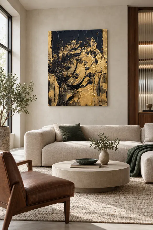
The current room gallery offers existing visualisations that can place the image among domestic forms. Use them to ask whether the work reads as a dark concentrated object or a more detailed profile from a room-like distance. They do not prove actual installation, selected scale or included furnishings. Return to the cover after viewing them. A stylish room can temporarily lend appeal to almost any image, and a dramatic crop can overstate texture. The complete artwork should remain compelling on its own. That final return helps ensure the selection is yours rather than a response to staging that will not accompany the print into your home.
Make material quality a question of stated choices
Neptune Natural Matt Canvas 400 is a specified 100 percent cotton canvas at 400 gsm, with a natural warm base and irregular weave. Compatible photographic poster papers include Oyster 271 and Photo Lustre 310. These facts describe supports, not the source image's provenance or a universal best format for black-and-gold art. Choose a presentation route that fits your plan. Paper may involve separate framing, while rolled canvas and stretched canvas have different next steps. The current configurator establishes the available combinations and dimensions, so read it rather than assuming the gallery's apparent presentation is the one you will receive.
Supplier further reading can clarify a stated material characteristic without certifying the image as a historic original or guaranteeing an exact screen match in every light. Optional hand-finishing remains light and selective when chosen. It does not turn printed gold colour into metallic leaf. A precise order makes clear which support, size and finish have been selected. That clarity is useful for an image whose recognition remains deliberately open. You can enjoy the profile's uncertainty while avoiding uncertainty about the object. The visual decision should already rest on the interplay of dark field, warm marks and fragmented human suggestion; the material serves that decision rather than supplying unsupported authenticity.
Read the actual supports and optional finishing specifications
Choose the particular emergence you want to keep seeing
A useful final sentence might be that you enjoy a human profile appearing through a swirling black-and-gold field without becoming completely fixed. That identifies the work's particular relationship. Saying only that it looks luxurious leaves most of the image unexamined. Ask whether you would still want it if its title did not include gilded or silhouette. The cover should provide enough interest through colour, movement and recognition. A title can guide attention, but it should not be asked to manufacture all the mystery or value. If the attraction remains clear without it, the selection has a stronger foundation.
Review the complete cover and current product choices together before ordering. Make sure you want the dark tonal weight as well as the gold-like accent, and the suggested profile as well as the swirling pattern. It is reasonable to prefer a clearer face or no face at all. The goal is an honest preference, not the most ambiguous purchase. If this particular emergence continues to draw you back, choose the support and presentation accurately and leave the identity open. A personal visual reason and a clear specification are enough to support the work, without invented artists, real-person claims or physical effects that have not been offered.
Continue with this artwork
Find your next artwork
Three ways to trace the profile and surrounding marks
Read more: Three ways to trace the profile and surrounding marksRead less: Three ways to trace the profile and surrounding marks
This Gilded Silhouette composition can suggest a face one moment and a collection of nearly black curves the next. Begin with the broad warm area on the right. Then look for a dark arc you can follow without deciding what it depicts. The artwork gives you several partial edges, not a single definite outline.
Use three routes: see where the profile appears, compare the large dark and warm regions, and test the role of the upright edges. Try each from the whole view before making a close inspection. It is fine to conclude that the pattern interests you more than any figure you can find.
Gilded Silhouette composition route one: let the profile appear
Look along the right edge of the large warm area. A projection near the middle and a few changes in direction below it can suggest a person facing right. However, the features do not sit inside a clean boundary. Paler marks and short dark ones cross the same area and can interrupt that reading.
Try finding the shape from lower down rather than starting at the upper right. Follow a broad dark curve in the lower middle and see where it brings you back towards the warm field. Because the line changes width, it can appear to belong to more than one shape when you follow it in the opposite direction.
Look for the short diagonal that cuts into the warm field near the upper middle. It seems to lean a different way from the curve below. Consequently, you can read the marks as separate sweeping motions even if you notice a face when they come together. Take turns looking at the narrow gap between them and the broad surfaces around it. The second view can make the suggestion of a face feel fleeting rather than fixed.
The National Gallery's glossary on composition provides a useful way to describe the arrangement. Ask where you supply a connection between marks rather than finding a complete line. For example, two separated dark areas might seem to meet if you look at the whole composition instead of a single patch.
Test an uncertain edge in the Gilded Silhouette composition
Cover a small part of the scene in your view, such as the outward point on the right. Does another part make you see a profile without it? Then uncover the complete image and try the same exercise near the bottom. These small tests help distinguish the feature that first suggested a figure from the ones you noticed afterwards.
Consider the Golden Ads abstract wall art selection if you want to compare how other pictures play with recognition. Choose an image without such an apparent projection. When you return to Gilded Silhouette, ask whether the uncertain shape is essential to your interest. Some viewers may want an abstract piece that offers no suggestion of a portrait.
Gilded Silhouette composition route two: compare the coloured areas
The top contains large blocks of deep blue-black. Elsewhere, darker material seems to break up into shorter, thinner marks against a warmer area. Follow that change down the left. Meanwhile, the lower right holds enough gold tone to become a separate centre of attention. The image does not reserve all its light for the suggested head.
Reduce the preview to a size where the smallest marks stop reading clearly. Note which border between warm and dark you still see. Afterwards, enlarge the view again and choose a detail on one side of that border. It may be a thin scratch-like line or a small patch of dots. Compare the roles of the detail and the larger shape.
The National Gallery's glossary on chiaroscuro introduces a broader way of thinking about light and shade. Apply it here as a question about contrast, not a list of materials. Why can the darker shapes feel as though they sit in front in one place, yet read as openings in another?
Try watching the warm shape emerge from the dark around the middle right. Then turn to the much thinner warm band at the left. The two areas share a general hue, but not their scale or direction. Therefore, you can compare what the colour does in each place without trying to locate one single source of light.
Look at the surface without guessing at the Gilded Silhouette composition process
The scraped or speckled passages can suggest a tool moving across a rough surface. However, the guide to apparent relief and light shows why the visible effect and the material in an order are separate questions. Even an edge that appears thick in a picture is not a measurement of a print's surface.
If you searched for hand made wall art, look for clear facts about the supplied item. In particular, do not infer metal leaf from a gold tone or original paint from a sequence of marks. If available, an optional finishing description refers to the option you select. It does not establish who made the original image or how.
Gilded Silhouette composition route three: test both upright bands
Look at the narrow warm areas to either side of the large dark top. They appear inside the image, not outside it. Notice how much stronger their upright movement is compared with the low curved stroke. If you follow an edge downwards, activity in the central area soon makes it harder to think of the side as a simple frame.
Now concentrate on the right side below the outward projection. Its warm upper band leads into a more varied lower passage. Meanwhile, the left margin meets darker shapes sooner. The comparison tells you why a figure can seem to move sideways even though two vertical elements help steady the picture.
The sofa illustration above gives this upright shape a pale background. However, it also adds a window, upholstery and furniture that are not part of the image. Take a look at the room guide for Gilded Silhouette if you would like to compare positions. Then return to the complete artwork without the sofa.
Decide what matters most in the Gilded Silhouette composition
Before you buy wall art, write down one contrast that remained after you looked away. It may be the left edge against the dark or the broad hook-like curve under the warmer shape. In contrast, if all you remember is the palette, compare another work with similar colours and less movement. The difference may lead to a better choice.
Read our guide to canvas and paper surfaces when you want to think about texture or reflections. Appreciating the marks here does not bind you to a particular format. Instead, let the chosen presentation answer a separate question about how you plan to display and view the piece.
Take the Gilded Silhouette composition back to the actual listing
The Gilded Silhouette artwork listing shows the piece and current buying choices. If you want to buy artwork for a specific wall, compare the measurements you can use with the available option. Do not take the apparent scale of the visualisation as evidence. Stay with the exact details of the selection.
If you are undecided between the idea of a face and the surrounding dark curves, you can keep both. The picture leaves the relationship unresolved. Moreover, that is a useful quality to notice if you want art that rewards an occasional second glance rather than giving you the same outline at once.
Frequently asked questions
Where should a Gilded Silhouette composition reading start?
Try the point at the right of the warm field. See whether it suggests a profile before you label the rest. Then start again with one of the darker arcs. The effect can change when a broad stroke rather than an outline catches your eye first.
Can I see a profile without seeing a complete face?
Yes. Several marks can suggest the direction of a head without separating every feature. For example, a point and the curve below it can be enough at first. Other marks may add a different interpretation once you look at the full picture.
Why does the dark part seem to move in the Gilded Silhouette composition?
Look at the change from long patches at the top to arcs and broken strokes lower down. Dark tones repeat, but in different shapes. As a result, one area may feel steady while another leads you around the warmer parts.
Are the warm upright marks a physical frame?
No physical frame follows from an edge inside the image. These warm areas form part of the view itself. If your plan includes an actual frame, verify what the selected offer includes. Use the outside dimensions for a space check.
Can a reduced preview make the profile easier to spot?
It can make small details less prominent, which may leave a few larger shapes clearer. However, it can also hide a mark you were using to recognise the form. Try the smaller view to see what survives rather than assuming it is always better.
Does the Gilded Silhouette composition show real gold leaf?
Gold-coloured passages do not establish which material the print contains. A bright colour and a metallic finish are different observations. In particular, check the stated specification for any material you consider essential instead of reading it into the picture or title.
Which feature works well for a closer view?
Look at the speckled transition between dark and warm near the left of centre. Then compare it with the more definite curve below. You may enjoy the difference between their edges even if you see neither as part of a figure.
How can I compare two other pieces of wall art with this one?
Pick a picture with related colours and a second with related curves. Consider them in separate comparisons. That way, you can tell whether the palette or the arrangement makes the bigger difference to you. Matching both at once gives you less information.
Does the room image show how shiny the artwork is?
No. It gives one impression of a picture in a styled space. Nevertheless, you can use it to think about where a wall might catch the light. Check the actual material and any glazing independently of that visual effect.
Can I use the art mainly for its pattern?
Yes. Try following the changes in width of the two biggest dark curves. They can hold your interest without needing to represent anything specific. Then compare the quieter upright marks. How they steady the pattern may matter more to you than recognising the profile.
Why is the same warm hue less obvious in some places?
Some areas contain smaller marks or sit immediately beside dark. Others spread farther without a strong interruption. Therefore, compare where the colour appears and what surrounds it. Small differences in location can make the same broad family of colour feel quite different.
When should I check the print presentation?
Once you know you like the image, confirm the current size and finish options. Then compare them with your room. A look at the artwork helps you decide what to choose; it does not tell you which dimensions or presentation you will receive.
Finish the Gilded Silhouette composition by following your own route
Return to the complete work and see which opening still interests you. It may be the suggested profile, the dark curve below or the warm edge that brings your eye back around. The fact that more than one route holds up is a reason to keep this work on the shortlist.
If you want that movement on your wall, check the exact format and size you can use. Compare the width of the complete display and the distance from which you will usually see it. Then choose for the form you want to live with rather than a promise the picture does not make.