Living with art
A Dark Field, a Warm Accent: Living with Gilded Silhouette
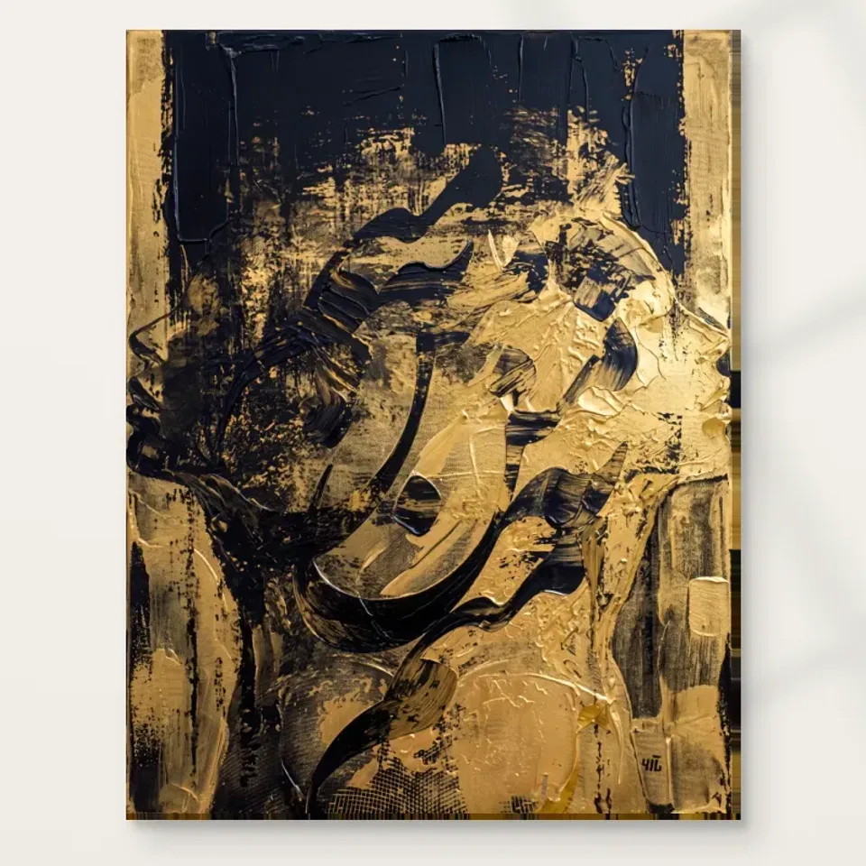
Plan Gilded Silhouette through tonal balance, clear views and restrained warm connections, allowing its fragmented profile to remain visible without building a black-and-gold theme around it.
Where should the dark field carry its visual weight?
Gilded Silhouette can be visually substantial because black occupies an important role alongside the warm marks. Begin by considering where that weight belongs in the room. A clear wall above steady furniture may give it a coherent base. A position beside several other dark rectangles may make it compete or merge. Walk through the room and look from the main seats, not only straight at the proposed wall. The image's presence depends on its neighbours and the viewing distance as well as physical size. A modest print can feel strong in a close view, while a larger one can feel comfortable where the room offers space.
Decide whether the first encounter should be the broad black-and-gold pattern or a more sustained look at the profile. A living-room chair can support the latter; a passing route may emphasise the former. Neither is inherently better, but the choice should be intentional. The print does not need the largest wall to be important. A smaller surface with a clear view may serve it better than a prominent wall repeatedly obscured by a door or plant. Start with real use and let the artwork's placement follow, rather than asking the household to preserve a staged sightline at the expense of ordinary movement.
Does the gold need a metallic echo?
The gold-like colour can connect with warm timber, a soft textile or one lamp fitting without requiring shiny accessories. The depicted gold is not a verified metallic surface, so a reflective object will behave differently under room light. That difference can be attractive, but it should not be treated as an exact material match. Begin with one existing warm relationship and see whether it is enough. A dark cabinet and a little natural warmth may already establish a coherent setting. Adding several gold-coloured objects directly below the print can compete with its warmer passages rather than make them clearer.
Check the arrangement in evening light. A small reflective object may become the strongest highlight when a lamp is on, drawing attention away from the image's more subtle variations. Move one item temporarily and observe the change. This is not a rule against metal or decorative objects. It is a practical hierarchy test. Let the print remain the concentrated black-and-gold event if that is the role you want. The room can support it with quieter materials, leaving enough difference between object and image that the profile's emergence is not lost within a repeated colour theme.
Keep a readable boundary against the wall
A dark wall may make the print feel integrated, while a lighter wall may make its rectangle more distinct. Test the relationship with the complete cover and actual wall samples if you plan a change. Do not choose paint solely from a warm fragment. The substantial black field matters too. A deep wall is not automatically more sophisticated, and a pale one is not automatically safer. The useful question is whether the full image remains clear from the intended view. If it seems absorbed, more breathing room or a steadier furniture base may help before you consider repainting.
Consider neighbouring objects in the same sightline. A television, dark shelving or several black frames can create competing areas of similar weight. Separating them onto different views may be more effective than forcing a perfect balance side by side. The artwork can then be enjoyed deliberately rather than acting as a background to a brighter screen. Include normal belongings in the test. A wall that looks clear when a sideboard is empty may become fragmented by books, lamps and speakers after installation. Choose a plan that tolerates those ordinary states instead of requiring every practical object to disappear.
A bedroom placement should make the profile optional
The product's related rooms include the bedroom, but that does not determine your response to a fragmented face near the bed. Test the view from the sleeping position, doorway and dressing area. Some people welcome an abstract human suggestion in a private room; others prefer a less figurative image. A side wall can offer an optional encounter if a direct view feels too insistent. The work should not be promised to create calm because its palette is restricted or its profile is indirect. The practical question is whether you enjoy the combination of dark field, warm marks and partial recognition during the times you use the space.
Bedside lamps and tall objects can change the view considerably. Check for reflections if choosing framed paper, and for uneven illumination with any presentation. A dark image may lose subtle distinctions under weak light, while a harsh patch can overemphasise one warm area. Small adjustments to lamp position can help more than adding decorative gold objects. If the placement still feels too strong, another wall may be a better answer than trying to soften every surrounding textile. The artwork's presence should be wanted in that room, not made acceptable through a promise that accessories will guarantee a particular mood.
Give a home-office view a separate role from the screen
In a home office, a side wall visible when turning away from work can give the image a distinct role. Its shifting profile offers a different kind of attention from clear task information, but it should not be expected to improve productivity or concentration. A useful placement lets you choose to look. Directly behind a monitor, the print may remain mostly hidden or visually divided by equipment. Check the room while it is in normal working use, with cables, papers and lamps present. The artwork does not need to conceal the office's function. It needs enough separation that its black-and-gold field reads as one composition.
If the room is shared or used for guests, test those uses too. A folding bed, moved chair or opened cupboard may alter the practical clearance. A less dramatic wall can be better if it remains visible and safe through those changes. The same principle applies in a living room: choose a view that works during reading, conversation or television use, rather than only when everything is arranged for a photograph. A fragmented profile can remain open in meaning while the room plan stays concrete, giving both the image and the people using the space room to operate without constant negotiation.
Avoid a second swirling field immediately around the image
The artwork already contains dense, circling-looking movement. Similar patterns in wallpaper, curtains or several nearby objects may compete at the same scale. Give it one steadier neighbour: an even wall, broad furniture surface or quieter textile. Calm does not mean blank or colourless. A rich but uniform tone can be visually steadier than a pale sharp pattern. Judge from the main seat, where fine detail merges and broad relationships dominate. If everything in the local view seems equally active, simplify one element before assuming the print needs to be smaller or the room needs to become entirely minimal.
A layered interior can still work well. The useful aim is a hierarchy, with one main event per sightline and supporting elements around it. Try removing a nearby high-contrast object temporarily. If the profile becomes easier to find, the subtraction has helped. If not, restore it and test another relationship. Keep personal possessions that matter to you, but do not require all of them to sit directly beneath this print. The image's own pattern can carry a great deal of interest. Let the surrounding arrangement contribute comfort and steadiness rather than trying to repeat every mark and warm accent in another material.
Measure the complete presentation and its practical clearance
Mark an available size on the wall using a surface-safe method, then look from the normal seats and routes. The profile is suggested within a full field, so plan the entire rectangle rather than a crop around the face-like area. Check whether furniture, plants or lamps would obscure it. Consider door swings and chair movement as well. A size that fits geometrically may still be inconvenient in use. There is no universal ratio that makes black-and-gold art elegant. The useful dimensions are the ones that support a comfortable complete view while leaving the room easy to navigate.
Use current presentation measurements. Rolled canvas distinguishes selected artwork area, printed allowance and supplied flat size. Stretched canvas gives the chosen front face with wrap stated separately. A paper print gains outer dimensions when framed. Discuss a framing plan before relying on a tight gap, and do not substitute an old margin or estimate from a visualisation. Existing room scenes are illustrative rather than proof of selected scale, real installation or included furniture. Borrow a useful relationship from them, such as clear wall beside the print, then translate it into your own measurements and normal household use.
Check Gilded Silhouette's current dimensions and presentation
Light the dark and warm passages together
Begin with the room's ordinary light and assess whether the black field retains variation and the warm marks remain connected to it. A harsh beam can make one passage dominate, while weak uneven light can reduce the image to a dark rectangle and a few bright notes. Check from the actual viewing positions. A lamp shift may be enough. If choosing framed paper, consider window and lamp reflections. Do not try to make the printed gold metallic through lighting. The supplied image has not promised that effect, and comfortable even visibility is more useful than a theatrical highlight.
Avoid unnecessary direct sun, persistent damp and strong heat as general display considerations. Seasonal daylight and normal heating use may change the wall's conditions. The Canadian Conservation Institute's art-on-paper guidance provides useful further reading for that presentation route, but it does not certify this print or guarantee its lifespan. Follow instructions relevant to the actual support. If the proposed wall has unusual conditions, discuss them with a competent framer or supplier. Optional finishing should not be expected to solve an unsuitable environment or make the object waterproof. Sensible care planning keeps the composition available without exaggerated promises.
Choose support and finish before installation details
Neptune Natural Matt Canvas 400 is specified as a 100 percent cotton, 400 gsm support with a natural warm base and irregular weave. Compatible photographic poster papers include Oyster 271 and Photo Lustre 310. Select the format through the current product controls and connect it to the next practical step. A paper print or rolled canvas needs suitable presentation after delivery; stretched canvas is offered ready to hang. Optional light, selective hand-finishing is separate from the ordinary print. It should not be described as real gold leaf, complete physical brushwork or a guarantee of permanent unchanged appearance.
Arrange any professional framing in advance and plan fixings for the actual object and wall construction. Keep a safe unpacking area, rather than leaving the work in a busy passage while deciding what to do. Quality in daily use includes accurate specification and appropriate handling, not merely choosing the most elaborate finish. The image should already be wanted for its black-and-gold field and suggested profile. The material then serves your presentation plan. A clear order makes it possible for the image to remain uncertain without making the object uncertain, which is a useful balance for an abstract work with a strongly evocative title.
Keep the home open to change around the profile
One useful final trial is to view the wall with the room occupied. A person seated below the print can alter its approach view, while a chair moved back may change clearance. You do not need every angle to be perfect, but the main intended encounter should still work when people are present. This is especially relevant to a dark field whose boundary may merge with clothing or furniture from an oblique route. If the view becomes unclear, test a small position change before assuming a larger size is required. The aim is not a display that succeeds only when the room is empty. It is a place where the full black-and-gold composition remains available during ordinary life, with a comfortable distance for anyone who chooses to look longer.
After planning the wall, use the room normally before buying more decoration. If the print feels crowded, remove one nearby object or pattern. If it feels disconnected, test a modest warm or dark link already present in your belongings. The room does not need a complete black-and-gold set to explain the image. A clear place, comfortable view and a few quiet relationships can be enough. Let books, useful furniture and personal possessions remain visible where they belong, while the artwork carries the concentrated swirling field in its own area.
Recheck shared views and the selected presentation dimensions before ordering, then leave tolerance for small changes after installation. A new textile or moved lamp should not make the whole arrangement fail. Stable relationships of scale, sightline and light are more durable than exact accessory matching. Gilded Silhouette can remain a fragmented human suggestion in a practical room without a fixed story or promised mood. You can enjoy the way the profile appears through black and gold while the home continues to accommodate ordinary life, allowing the image's openness and the room's usefulness to coexist.
Continue with this artwork
Find your next artwork
Four checks for placing Gilded Silhouette
Read more: Four checks for placing Gilded SilhouetteRead less: Four checks for placing Gilded Silhouette
A Gilded Silhouette wall display does not need another gold object beside it. The upright picture brings its own contrast between a deep blue-black area and a warmer field. First find a wall where you can read the curve between them. Then see whether the neighbouring furniture supports or interrupts that view.
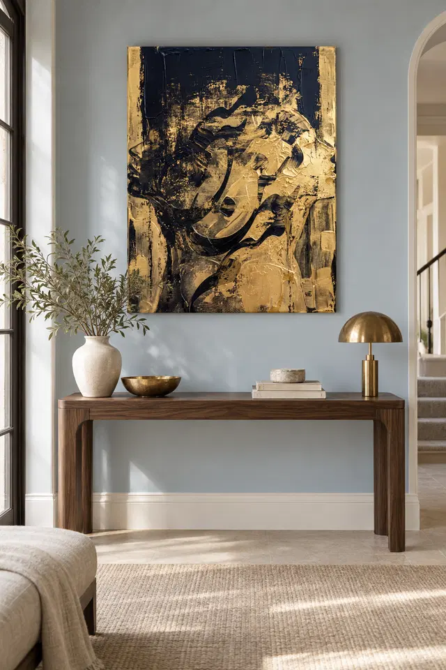
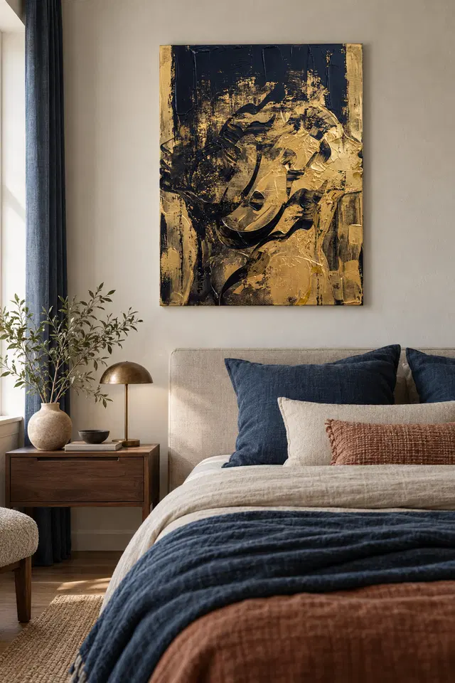
The console and bedroom visualisations above show two ways of furnishing around the artwork, not two specifications. Four tests can help you compare your own options. Look at the wall and border, your usual viewpoint, the light across the surface and the eventual presentation. Keep only the comparisons that work in the room you actually use.
Gilded Silhouette wall display test one: separate the edge from the wall
Mark a temporary outline where you could place the print. Then look at the wall from two steps back. On a paler surface, the dark top may make the outline particularly clear. On a darker one, you may first see the warm strips. Neither result is automatically better. Compare how each responds to the wall around it.
Look closely at where the artwork ends and the furniture begins. The console scene uses a wide top and a slim upright picture. However, a shelf or tall bowl can sometimes seem to run into the lower part of an image. Leave that object in place for the first test, then remove it to see how much the effect changes.
If you already have darker wood or a dark wall panel, try the edge in two positions beside it. Because the work contains both upright shapes and a large curve, it need not echo the nearest vertical exactly. Instead, see whether a clear space between the two lets the curved part have more room.
Before you buy wall art, note the other things the chosen part of the room must do. A console might have to hold keys and a lamp. A bedroom wall might need space around a headboard. Consequently, the display that works is the one that leaves those ordinary functions in place.
Gilded Silhouette wall display test two: check the chair and the doorway
Choose one view you see for a long time, such as from a chair or bed, and one you usually pass. Mark which feature you want to be able to recognise from both. For example, you might prefer to see the half-suggested face from the chair but only the large curve when entering.
Use the composition guide to the picture's curved and upright marks to select a landmark before you start. Then look from the chair without changing where it sits. A feature that is prominent in a zoomed picture may be quieter at that distance. Decide whether the larger shapes make up for it.
Test a Gilded Silhouette wall display against furniture you already use
In the bedroom view, the pillows repeat some dark colour while the headboard remains light. However, a throw and pillows may move between morning and night. Try the position when the room looks ordinary. As a result, you can judge the artwork independently of a particular arrangement that you may not keep.
For a second comparison, use our bedroom wall art selection to find a piece with a more even field. Keep the intended wall and viewing position constant. If you still prefer the contrast of the gold-toned shape and deep surrounding area, the preference comes from the picture rather than a change of setting.
An open door may let you see the lower curve before the darker top comes into view. Stand in the room with the door at the angle where it normally rests. Then try a different side of the wall. You may prefer the artwork to appear gradually, especially if a central position makes it too prominent in a room you use to rest.
Gilded Silhouette wall display test three: inspect side light and reflections
Look from your usual position when the window lights the wall. Then return after sunset with the lamps you generally use. A patch of strong light may sit on one side, while a reflection from glazing may move when you change your view. Therefore, note whether the issue is the position of the light, the surface, or both.
The Canadian Conservation Institute's guide to light exposure explains why longer exposure matters apart from a short glare problem. Treat it as general advice, not a statement about the life of this item. Keep direct sunlight and the expected handling of the selected material separate from a purely decorative choice.
If the bright area appears to alter the colour, check the darker region as well. For example, a reflection may make it harder to see the arc against the gold tone. However, the gold tone itself does not mean the print contains a reflective metal. Ask what the actual printed surface and any additional glazing involve.
Note where the shadow from a lamp shade or shelf falls. It may add an apparent horizontal division even though the picture has a largely upright format. Move the light before deciding the image looks too dark. Nevertheless, if the position is useful for reading or another task, try a second wall rather than giving up light you need.
Let the surface decide how to light a Gilded Silhouette wall display
Our guide to canvas or paper helps distinguish the surface from the way you present it. A detail that looks crisp under a photographed light may read differently in your room. Before you buy artwork, compare the finish and the viewing angle rather than assuming the console's lamp is suitable.
The Institute's basic care guidance for paintings offers useful questions about handling and display. Nevertheless, choose advice for the item you are actually buying. Do not treat the image or the museum guidance as evidence that this print uses the same materials as an original painting.
Gilded Silhouette wall display test four: confirm the intended presentation
Check the current Gilded Silhouette artwork options after you have picked a likely place. Determine which measurement applies to the print, and whether additional items would affect the outside outline. A room illustration makes a shape easier to imagine. However, it cannot tell you what the particular offer includes.
If you arrived by searching for hand made wall art, check which process the selected listing describes. Printing, presentation and any optional hand finish answer different questions. In particular, the gold-toned artwork is not evidence of real gold or a frame. Decide which product facts you need before adjusting furniture or planning any fixing.
Use the guide to the total cost of ready-to-hang artwork to record steps you may need after ordering. Then return to your marked outline. Would the position still fit after accounting for any frame you plan to add? If not, compare a different size or move the position rather than guessing.
Compare a second size for a Gilded Silhouette wall display
Start a second outline from the same centre instead of copying the corner of the first. As a result, you see which parts of the room each would overlap. Then look again from your usual position. If the smaller space leaves the central arc easy to notice, it may fit the room better than the larger one.
If neither outline works, wait before choosing the largest available option. Check the vertical space between the furniture and the next permanent feature. For instance, a high window can leave less usable area than you first expect. A narrow adjacent site may give you a clearer view.
Frequently asked questions
Do I need a gold lamp for a Gilded Silhouette wall display?
No. The room example presents one possible accent. Try removing a bright object from beside the wall and see whether the warm part of the image still stands out. The artwork can carry that contrast itself without a matching finish nearby.
Will the artwork work above a dark console?
It may. Test the lower edge of the proposed position against objects that already sit on the console. For example, leave room for a tall item that does not move often. That is more useful than assuming a clear console in an illustration.
Is the light wall in the bedroom example essential?
No. Compare your own walls from the place you usually sit or stand. A warmer or darker background can change how clearly you see the outside edge. However, you do not need to repaint simply because an example uses a pale setting.
How do I judge a Gilded Silhouette wall display from the doorway?
Check whether the place reveals enough of the outline and large dark curve when you first enter. Then try a more direct view. Because an angled glance can hide part of an upright image, choose according to how often each view occurs.
Does the work need a patterned rug underneath?
No. If there is already a patterned rug, compare how easily you can notice the image without moving it. Alternatively, shift one smaller object first. The choice is about how many things demand attention, not whether the floor and art share a style.
What if daylight hits only the left side?
Look at the left and right sections separately from your normal position. If a bright patch interferes with one detail, see whether another location reduces it. Also, assess ongoing exposure separately from a temporary reflection or a choice about room colour.
Can a Gilded Silhouette wall display still work without a clear face?
Yes. The broad bands and curved dark edges can provide plenty of visual interest. Try focusing on them first in a smaller image. If they remain engaging, you need not place the work somewhere that makes every suggested feature easy to read.
Would a bigger version give me a more accurate view?
A larger print may make some marks easier to see at a similar distance. However, that does not account for your wall and light or guarantee a particular effect. Compare the available sizes and choose the one that works within the whole setting.
Is the gold tone a guide to material?
No. The photograph shows colour and apparent texture. It does not confirm metal leaf, foil or another substance. If a physical finish matters, check the wording for that selection. Then consider its effect separately from the overall colour you see in the image.
What if I want a wide artwork instead?
Keep the normal furniture and compare an actual wide option with the same wall. Consider whether its main feature will still be clear. In contrast, Gilded Silhouette gives you a tall edge and a large lower curve; those features do not transfer automatically.
Can I use either mock-up to estimate the frame clearance?
Use them to decide what needs measuring, not to estimate an actual gap. The console, bed and furnishings are not given with a scale. Instead, measure the usable opening and compare the full outside dimensions of the setup you are considering.
When should I settle on a final position?
First confirm the chosen order and the presentation it includes. Then compare the marked position with the complete outline. If a frame or fitting would change your available space, keep the position open until you can check that point for the actual item.
Finish the Gilded Silhouette wall display with the quieter setup
Choose the site where a clear edge, usable space and ordinary light give you the view you want. If you can enjoy the change between the large warm area and the darker curve, the arrangement is already doing what it needs to do. It does not require an extra gold detail.
Return to the listing and choose only a presentation that fits the measurements you checked. Then enjoy the image for the qualities already inside it. A position that lets the shape emerge naturally can matter more than faithfully recreating either of the styled rooms.