Looking closer
A Figure Made of Movement: Reading Dynamic Brushstrokes in Hues
Explore the blues, oranges and whites that form a moving-looking figure in Dynamic Brushstrokes in Hues, separating visual direction from an invented performance, identity or physical paint claim.
When does a group of marks become a figure?
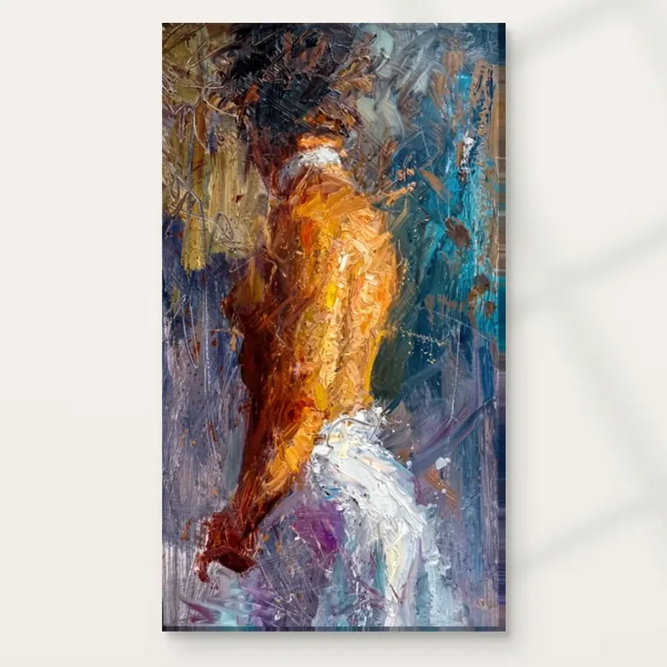
Dynamic Brushstrokes in Hues Abstract presents a figure through an active mixture of blues, oranges and whites. Begin by noticing the point at which the marks become recognisable as a body. You may register the figure immediately, or first encounter colour and movement before a human form emerges. Both routes are part of the image's interest. The subject is not separate from the brush-like treatment; it is made through that treatment. This gives the work a useful double character. You can look at it as a figure in motion and as a composition of changing colour, density and direction without needing to choose one reading as the only correct one.
For selection, ask how much recognition you want. A more descriptive figurative work may offer a stable body and a clear action. A purely abstract image may leave the forms entirely unnamed. This print sits between those positions, giving the eye a human anchor while keeping the surrounding field active. If you enjoy that threshold, it can provide sustained looking rather than a single resolved view. If you are frustrated by partial definition, a clearer figure may suit you better. The choice should be based on your preferred experience, not on an assumption that ambiguity is automatically more sophisticated or that recognisability makes abstract art easier.
Try looking at the complete cover briefly, then looking away and recalling the broad arrangement. Do you remember a pose, a colour relationship or a sweep of marks? Return and see whether another element becomes stronger. This simple comparison can reveal what actually attracts you. It is not a test of visual expertise. It helps distinguish a composition you want to revisit from an image whose title supplies most of the idea of movement. The figure should be allowed to remain partly open, but your own attraction can become more specific as you notice which relationships persist.
What gives the image its movement if the print itself is still?
Movement in a still image is an arrangement of visual cues, not a physical event occurring on the wall. Here those cues include expressive strokes, changing directions and the suggestion of a dynamic figure. Follow the main paths across the cover without naming the action. Notice whether the marks appear to converge, spread, bend or interrupt one another. Then return to the figure and see how it participates in those paths. This can show why the image feels active without requiring an account of a specific performance. The movement may belong as much to the surface's organisation as to the body you recognise within it.
Avoid calling the figure a particular dancer, athlete or real person unless the product information actually establishes that identity. The verified description supports a figure in motion, not a documented event or named role. You can imagine possibilities privately, but the print does not depend on one being true. This openness can be useful if you want figurative energy without a fixed narrative. It allows the work to remain connected to bodily movement while also being read through colour and gesture. A viewer who wants a known performance or identifiable activity should recognise that this picture offers a different kind of engagement.
A useful selection question is whether the implied motion remains interesting after you already know the figure is there. Surprise can attract attention once; a coherent network of directions can reward repeated looking. Follow a different route on the second viewing and see whether the composition still brings you back to a satisfying whole. If the image feels lively but directionless in a way you do not enjoy, take that reaction seriously. You are choosing a still object whose movement will be experienced through looking, so the particular paths it offers matter more than a general promise of energy.
Blue, orange and white have different jobs to do
The palette combines cool-looking blues, warmer oranges and pale passages. Rather than treating this as a ready-made colour scheme, identify what each area does within the image. A warm note may bring a form forward or mark a point of concentration. A blue passage may provide a broader field or a contrasting direction. White can create an opening, a highlight or an interruption, depending on its placement. These functions matter more than a general statement that contrasting colours are exciting. The work's specific distribution determines whether the palette feels balanced, restless, concentrated or dispersed. Look at the whole cover before selecting a favourite patch.
Reduce the image briefly and notice which colour mass dominates. Then return to the larger view and observe how local marks complicate that broad balance. This can prevent a common selection error: buying a richly organised work because one orange detail matches an object you already own. The complete image includes much more than that detail. If the blues and whites do not interest you, the matching accent may not be enough. Conversely, you may find that the palette works because no single colour remains isolated. The figure can emerge through their interaction rather than through a fixed outline filled with colour.
The depicted colours do not establish particular pigments or the source work's physical medium. Nor do they guarantee how every screen, print support and room light will render them. The current product specification governs the supplied object. At the visual-selection stage, use the palette to understand the composition rather than to make unsupported production claims. A clear reason might be that you enjoy the way warm and cool areas make the body both recognisable and unstable. That is more specific, and more useful over time, than simply saying that the colours are vibrant.
View Dynamic Brushstrokes in Hues and the current print choices
Texture can give an abstract body weight without a literal outline
The textured appearance contributes to the figure's visual weight. A dense passage can seem substantial even where the edge is unclear, while a more open passage can make a form appear to loosen or disperse. Notice those changes around the body. They may help you recognise movement without a continuous contour. This is a particular advantage of expressive figurative abstraction: the figure can be sensed through pressure, direction and density rather than described feature by feature. If that kind of construction interests you, spend time with the transitions. The most rewarding area may be where the body stops being certain and the marks become more independent.
Separate that represented texture from the physical surface being ordered. A print can reproduce thick-looking brushwork without supplying raised paint at every mark. Optional light, selective hand-finishing is a distinct choice where offered, not a blanket property of all configurations or a recreation of an original impasto surface. No claim of waterproofing, a fixed lifespan or certified provenance follows from a textured image. Those limits do not diminish the visual effect. They simply keep the purchase accurate. You can enjoy the impression of depth while selecting a clearly described paper or canvas support that suits your presentation plan.
When judging quality, ask how the surface appearance supports the image rather than assuming more apparent thickness is always better. Does it clarify the movement, make colour transitions interesting or obscure the figure more than you want? The answer can guide your choice among works. An active texture is not automatically a virtue for every viewer or room. It becomes valuable when it contributes to a relationship you want to keep looking at, such as a body emerging from marks that also seem to pull beyond it.
Compare it with a static figure and with pure abstraction
Two genuine alternatives can clarify the work's role. Beside a more static figurative portrait, Dynamic Brushstrokes may feel less concerned with identity and more with bodily direction. Beside a nonfigurative composition in similar colours, its human anchor becomes more important. Ask which difference you would miss if you chose the alternative. You may discover that you want movement without a narrative, or that you enjoy colour more when a figure gives it a point of reference. These are specific preferences. They are more useful than deciding that one image looks more artistic or dramatic. A thoughtful selection identifies the kind of attention you want, not a hierarchy of styles.
The abstract, contemporary and expressionist categories can help you browse, but they do not make every work within them interchangeable. Compare actual quantities of pale space, the clarity of the body and the direction of the strongest marks. Consider your existing collection too. If most of your pictures are tightly focused faces, this work may introduce a broader bodily presence. If they already rely on sweeping blue-and-orange gestures, it may continue an interest or repeat a visual role you have enough of. Repetition can be deliberate, but it should be recognised. A new subject title does not necessarily mean a new experience.
Return after a short break and look again without reading the title. Does the figure remain engaging, and does the palette still make sense as a whole? The title can guide attention, but the image should not need it to create every sense of movement. If the composition continues to reward you through changing readings, it may be a strong candidate. If you find yourself only trying to identify the action, consider whether a more descriptive work would provide greater satisfaction. There is no obligation to choose ambiguity when clarity is what you actually prefer.
Quality becomes concrete through support and presentation choices
The specified canvas is Neptune Natural Matt Canvas 400, a 100 percent cotton support weighing 400 gsm, with a natural warm base and irregular weave. Compatible poster options include Oyster 271 pearl or satin photographic paper and Photo Lustre 310 photographic paper. These are useful material facts, not a universal ranking of which format is best for energetic abstract art. Your framing plan, handling and preferred presentation matter. Read the available configuration rather than inferring the order from the room gallery. A rolled option and a stretched option are different practical routes even though they carry the same image.
Optional light, selective hand-finishing remains separate from the ordinary print. Its presence should be confirmed through the selected control, not assumed because the image contains expressive marks. Supplier further reading can explain a stated support specification, but it cannot establish the figure's identity or the source artwork's history. It also should not be used to promise an exact screen match, museum status or a guaranteed lifespan. A well-understood order is clear about material, dimensions and finish. The picture can remain open in interpretation while the physical object is described precisely enough for you to plan its next step.
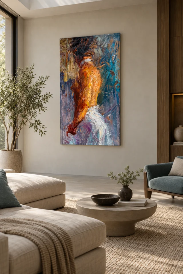
Existing room visualisations are useful for considering how the image's broad colour and motion-like treatment behave among furniture. They do not document an actual installation, prove scale or include the pictured objects in the purchase. After viewing them, return to the complete cover and the actual product controls. Make sure the blue, orange, white and recognisable body all remain part of what you want, rather than allowing a staged room or an enlarged fragment to carry the decision. That final return keeps image selection separate from later room styling.
Read the actual support and finishing information
Choose a repeatable way of looking, not a promised room effect
One final check is to notice whether the pale passages matter to your response as much as the brighter colour. If they provide necessary pauses or breaks in the moving field, you are selecting a complete arrangement rather than only its most saturated notes.
A useful final reason for choosing this work might be that it lets a figure emerge through a network of coloured directions, or that its warm and cool passages make movement visible without fixing one action. Those reasons concern the image. A promise that it will energise everyone entering a room is less reliable because responses differ. You can enjoy an active composition without claiming a measurable effect on mood or behaviour. Ask whether you want to revisit its particular balance of body and marks during ordinary days, not only whether it feels exciting in a first preview. Sustained curiosity is a stronger selection signal than intensity alone.
Dynamic Brushstrokes in Hues can suit someone who wants figurative recognition within a lively abstract field. It is not a fully explained action scene, and it is not an entirely nonfigurative colour arrangement. That in-between relationship is the point to assess. Review the complete image, then select the current size, support and finish that fit your practical plan. You do not need to identify the figure or decide what movement it must represent. You do need a clear sense of why the visual relationship interests you. That clarity allows the interpretation to remain open without making the purchase vague.
It is reasonable to admire the work and choose a quieter alternative. A collection is not improved simply by accumulating the strongest contrasts or most active surfaces. It becomes more personal when each addition contributes a kind of looking you actually want. If this figure's shifting emergence continues to draw you back, the image may have earned that place. If not, the comparison has still helped you understand your preferences more accurately, which is a useful outcome in its own right.