Living with art
Give a Moving-Looking Figure a Stable Place in the Room
Plan Dynamic Brushstrokes in Hues around clear approaches, a steady furniture base and restrained blue-orange connections, with practical checks for reception use, lighting and the chosen print format.
Should this active figure be the first thing a visitor sees?
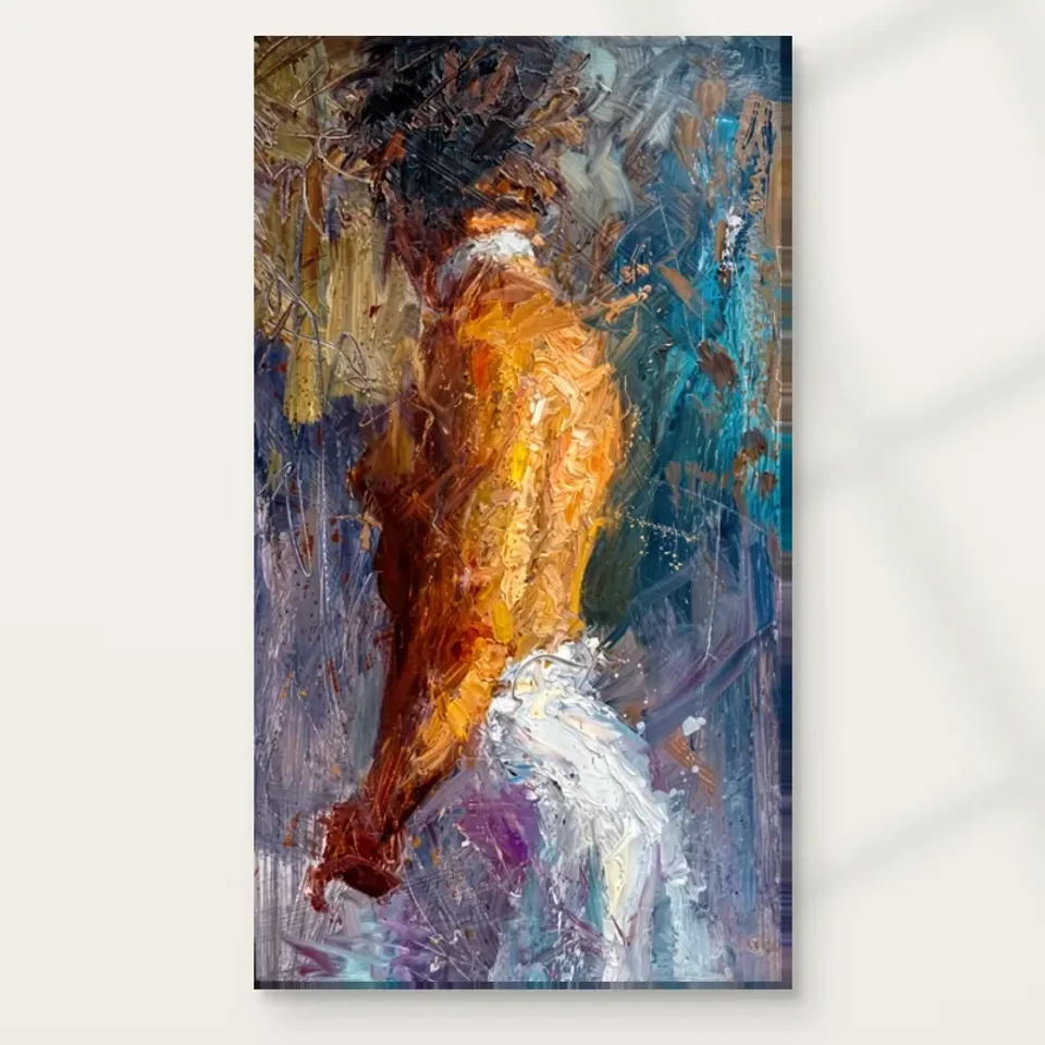
Dynamic Brushstrokes in Hues can register quickly through its blues, oranges, whites and moving-looking body. In a reception or entrance view, that may provide a memorable point of attention. Before choosing the first wall a visitor sees, decide whether that is the encounter you want. The image is visually active and partly figurative, not a neutral field of colour. Some rooms welcome that immediate complexity; others need a quieter arrival before a more deliberate view. Walk the actual approach and imagine the complete composition. Do not assume that a strong first impression is automatically the best use of a work you also want people to look at more closely.
A reception seat creates a different encounter from a passing doorway. Someone waiting may spend a long time opposite the picture, so check the view from that position as well as from the entrance. Is there enough distance to see the whole image comfortably? Does the figure remain legible, or would furniture interrupt it? Can a visitor look without leaning or turning awkwardly? These practical questions determine whether the work is available as an image rather than merely as a bright background. A slightly less prominent wall may provide a better sustained view and still contribute to the room's overall character.
Keep the response personal and proportionate. The print can offer visual movement without being promised to energise customers, improve waiting experiences or change behaviour. What you can plan is a clear approach and comfortable sightline. Let the artwork's effect remain something viewers discover for themselves, while the room arrangement makes that discovery easy rather than compulsory or obstructed.
Compare artworks for a reception and waiting view
How much blue and orange should leave the artwork?
The palette offers several possible links to the room, but begin with one rather than repeating all of them. If there is already a blue textile or painted element, that may be enough. If warm timber contributes an orange-related tone, you may not need an orange accessory at all. The connection can be broad and material rather than an exact hue match. The print contains varied colour relationships, not a pair of flat swatches. Trying to copy both dominant colours across cushions, lamps and objects can make the room feel more planned around the image than is necessary. Start with what you own and observe the complete field from the main viewing position.
If the room is mostly neutral, the artwork can remain the principal colour event. It does not have to be echoed to look intentional. Scale, position and a clear wall can establish its place. If you choose an accent, keep it modest enough that the eye returns to the figure rather than travelling between several equally bright objects. Warm and cool areas already interact within the print; the surrounding room does not need to recreate that entire interaction. A quieter tonal support can be more effective than a matching set. This also keeps the arrangement flexible if furniture or textiles change later.
Check colours under the room's usual light before making permanent changes. A blue that seems compatible on screen may appear different beside the actual wall and lamps, and timber tones can become stronger in evening light. Use reversible adjustments first. A small change in object position may solve a relationship more simply than repainting a wall or purchasing several new accessories to satisfy a palette derived from a digital preview.
A stable base can make the movement easier to read
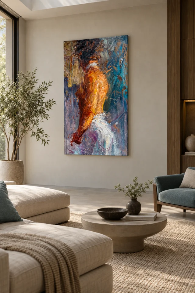
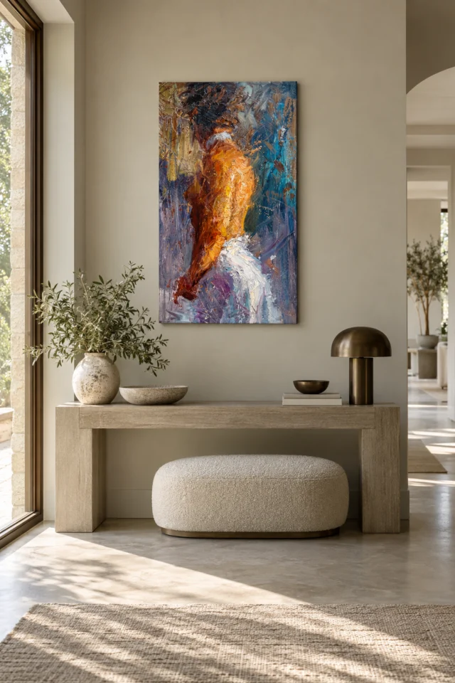
Because the image's marks are active, a broad steady piece of furniture beneath it can provide a useful contrast. A simple sofa back, cabinet or bench may help the work read as one intentional event. This does not require rigid symmetry or a particular furniture style. The important relationship is between an active field above and a calmer shape below. Stand at the main view and assess whether the furniture offers that steadiness or breaks into many competing details. A crowded open shelf may be less helpful than a quieter surface, even if both are the same width. The composition needs a clear local context more than a perfectly matched design.
Keep normal objects in place during the trial. A console that usually holds books, a speaker and a lamp should not be evaluated as if it will remain empty. Tall objects can obscure parts of the figure from seated angles, while small bright ornaments may compete with the orange passages. Move one item at a time and observe what changes. The aim is not to erase the room's life. It is to distinguish the main image from supporting elements. A practical arrangement tolerates ordinary use without requiring a daily reset to a staged photograph.
If the room already contains strong patterns, give this work one quieter neighbour rather than trying to quieten everything. A plain wall area or evenly toned textile may be enough. Different kinds of activity can coexist when they occupy distinct roles. Let the print carry directional movement in its immediate zone, while another part of the room can carry books, patterned textiles or personal objects without all demanding equal attention along the same sightline.
Measure for the whole figure and its surrounding field
Use a wall-safe outline in a size offered by the current product controls. View it from the entrance, the main seats and any reception waiting position. The complete rectangle matters because the figure emerges through the surrounding marks; planning only around a small recognisable body area can underestimate the composition. Check whether furniture, plants or lamps would hide parts of the field. Also consider whether a nearby door or shelf would make the image feel squeezed. There is no universal size that guarantees a dynamic work will succeed. The right dimensions serve your intended view and leave the room easy to use, rather than simply occupying the maximum wall area.
Account for the completed presentation. A frame around a paper print adds outer dimensions. Rolled canvas distinguishes the selected artwork area from its printed allowance and supplied flat size. Stretched canvas uses the chosen front face with wrap stated separately. Read those current figures rather than relying on an old margin or apparent scale in the gallery. If you plan professional framing, discuss the likely completed size before committing to a tight position. This preparation prevents the installation from becoming a compromise after delivery, when the object no longer fits the wall relationship that first attracted you.
The existing room visualisations can suggest broad relationships, such as a clear area around the print or a steady furniture base. They are not evidence of a real installation, precise selected scale or included objects. Translate the useful relationship into your own measurements. A moving-looking figure can remain visually open while its physical placement is carefully defined, and that distinction makes the project easier to manage.
Choose Dynamic Brushstrokes' current size and presentation
Separate the artwork's attention from screens and busy tasks
In a living room, consider whether the print and television compete along the same sightline. Both can contain strong colour and apparent movement, even though only one is a screen. A separate wall may allow each to be enjoyed more clearly than a side-by-side arrangement. This is not a rule against art near technology. It is a question about how many equally strong destinations the eye is asked to follow. If the room's main use is conversation or reading, the image may work well facing a chair. If viewing is mostly from an angle, test whether the figure and broad palette still read comfortably.
In a multiuse room, account for changes of activity. A space that serves as a lounge, workspace and guest area should not require the artwork to solve every function. Choose a wall that remains visible without obstructing storage, opening furniture or practical equipment. The image can be a chosen pause rather than a constant background to concentration. Do not expect it to improve productivity or guarantee a mood. Its value can simply be that you enjoy the shift from task-related objects to a figure made through colour and marks. That is a sufficient reason to give it a clear place.
Shared use also means shared reactions. One person may notice the body immediately, while another sees mostly colour and direction. They need not agree on a narrative. Discuss the prominence and view instead: how close the main seats are, whether the first impression is welcome and which nearby objects can move. Concrete placement decisions are more productive than insisting that everyone interpret the figure's motion in the same way.
Choose lighting and support without manufacturing extra drama
The image already has strong visual activity, so begin with even, comfortable light. Check the proposed wall under normal daytime and evening conditions. Would a lamp create a bright patch across the pale areas, or would a window reflection interfere with a framed paper presentation? Moving an existing light may help more than adding a narrow spotlight. The goal is to see the blues, oranges, whites and figure together, not to make one passage artificially dominant. Judge from the actual seats and approach route rather than from beside the wall. A dramatic installation photograph is less useful than a view that remains comfortable during ordinary use.
Avoid unnecessary direct sunlight, strong heat and persistent damp as general care considerations. The Canadian Conservation Institute's basic painting-care guidance can help you think about display and handling, but it is not certification of this print's construction or a promise of longevity. Follow the supplier's instructions for the exact presentation. Neptune Natural Matt Canvas 400 is specified as a 100 percent cotton, 400 gsm support, while compatible photographic poster papers include Oyster 271 and Photo Lustre 310. Their actual surface characteristics and your presentation plan matter more than an assumption that one format always makes abstract art more dramatic.
Optional light, selective hand-finishing is a separate choice from an ordinary print. It does not mean every visible textured mark becomes raised paint or that the object is waterproof. Rolled formats need a suitable finishing or framing plan; stretched canvas is offered ready to hang. Confirm those details before planning fixings, and use hardware appropriate to the actual wall and supplied object. Clear practical decisions allow the visual movement to remain the interesting uncertainty, rather than leaving the installation dependent on improvised handling or unsupported expectations.
Preserve a view when people and furniture move
A reception arrangement should be tested with people in the chairs, not only with empty furniture. A seated visitor may obscure the lower image from the entrance, while another chair may bring someone closer to the wall than the plan suggests. In a living room, a recliner or moved footstool can change the practical distance. Observe those ordinary movements before fixing the final position. The figure's activity belongs in the image; the real room should remain easy to navigate. If a location repeatedly creates contact risk or blocks the complete view, a quieter wall may be more useful than a highly prominent but fragile arrangement. You should not have to forbid normal furniture use to protect the composition. Leave enough clearance for the actual household or visitor routine, and choose a location that remains legible when the room is occupied. This keeps the print available as an artwork rather than a display that only works during a carefully prepared photograph.
Let the room stay useful while the figure stays open
After planning the wall, use the space normally before buying more decoration. Move chairs, open cupboards, switch on the evening lamps and look from the places people actually occupy. If the print's proposed position only works when the room is unusually empty, revise the arrangement. A small move, a quieter nearby object or a different lamp angle may be enough. Do not assume the solution is another blue or orange accessory. The artwork already supplies a concentrated colour relationship. The room can support it through clarity and comfortable use rather than through repeated motifs or a complete scheme built around one image.
A durable arrangement leaves some tolerance for change. A new book stack or shifted chair should not immediately obscure the body or make the wall feel incoherent. Establish the print through a stable relationship with the wall and furniture, then keep small accents optional. Recheck the actual dimensions, selected finish and presentation before ordering. Once those are clear, allow the figure to remain partly unresolved. The room does not need to explain its motion or tell visitors which action they should see. It simply needs to offer a clear place to look.
Dynamic Brushstrokes in Hues can be the active element within a practical interior. The surrounding room may be steadier, quieter and full of ordinary life. That contrast can be more effective than making every object equally energetic. A comfortable sustained view, sensible display conditions and an accurately selected format provide the useful foundation. The rest can remain personal: how you read the moving-looking figure, which colour you notice first and whether the image's changing emergence continues to reward your attention over time.