Looking closer
A Gaze Between Blue, Yellow and Dripping Marks
Explore the woman's gaze, contrasting blue-and-yellow treatment and drip-like movement of this expressionist portrait, choosing the complete image without inventing identity or physical paint properties.
What holds attention first: the gaze or the colour?
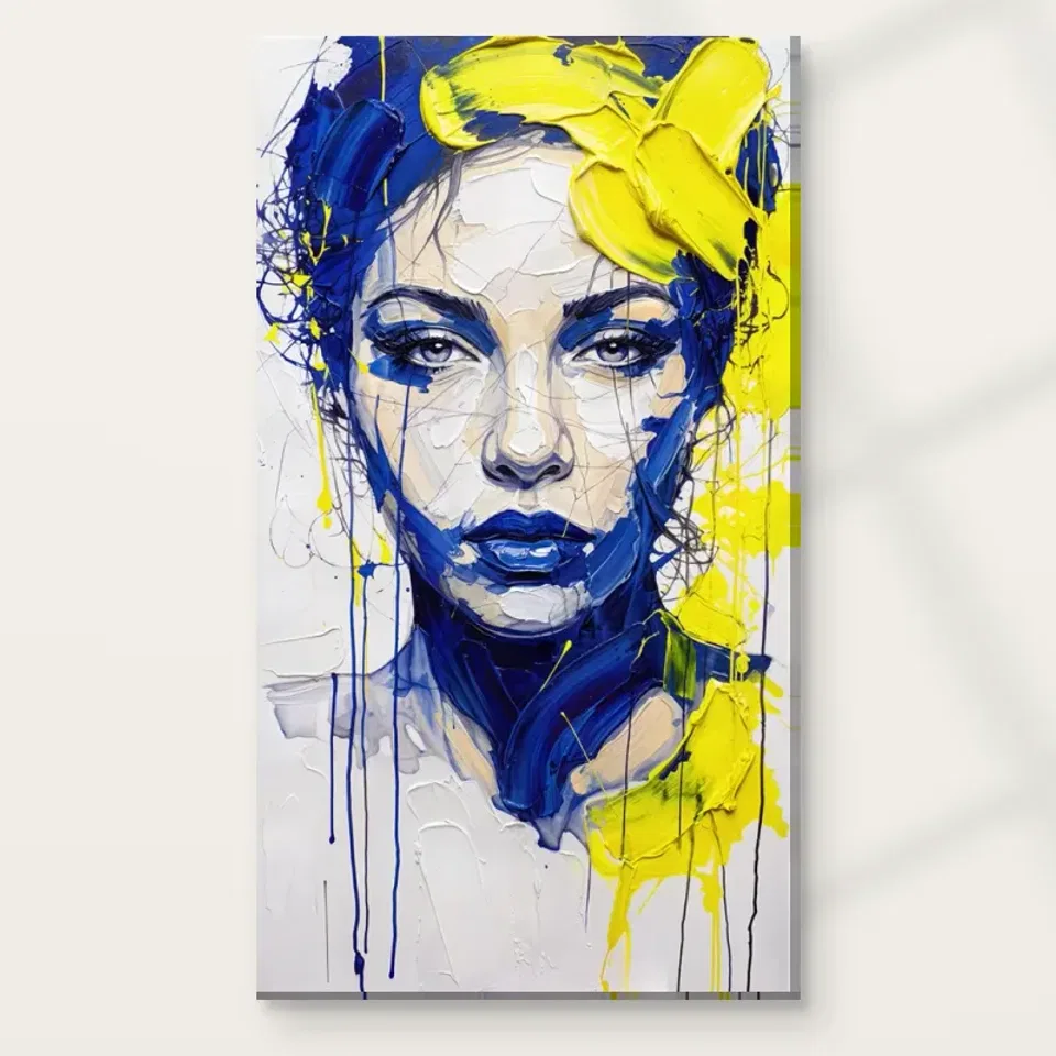
Blue and Yellow Textures Expressionist presents a woman's face through bold blue-and-yellow marks and a strong gaze. Begin by noticing which element reaches you first. You may recognise the face immediately, or encounter the colour contrast before the human presence becomes clear. Those routes can reinforce one another. A gaze gives the field a point of recognition, while the colour treatment makes that recognition less straightforward than a naturalistic portrait. The image's particular appeal lies in their relationship. It should not be reduced to a face with an unusual palette or to an abstract colour field that happens to contain eyes.
For selection, ask whether both parts interest you. If the colours are the only attraction, compare a nonfigurative work in a related range. If the face is the main attraction, consider whether the expressive treatment strengthens or complicates it in a way you enjoy. The complete print will include both. A small preview can make the colours dominant, while a close crop can make the gaze seem like the whole subject. Return to the full cover before deciding. The useful choice is a composition you want as it is, not one you mentally edit to keep only its most convenient element.
Blue and yellow have structural work to do
The palette is vivid, but vividness alone does not explain how the image works. Look at where blues and yellows meet, separate or interrupt one another. A brighter passage may define part of the face or pull attention across a boundary. A deeper blue may give weight, contrast or continuity. The exact functions are things to discover through looking rather than assume from a general colour rule. View the cover at a smaller size to register the broad distribution, then return closer to see how local marks complicate it. The face is formed through those relationships, not simply filled with two colours after its outline is fixed.
If you are selecting the print for a room palette, avoid extracting one blue and one yellow as though they represented the whole picture. The image contains variation, a human presence and drip-like movement. Those qualities remain even if the room's accessories change. A lasting selection can begin with colour but should extend to the way colour constructs the subject. Ask what you would miss if the same hues appeared in a simpler geometric composition. The answer may reveal whether the gaze, texture or unstable boundary is central to your attraction. That is more specific than saying the colours are bold, and more useful when comparing alternatives.
How do the drips alter a portrait's sense of time?
The verified description identifies dripping-paint effects, which introduce a different direction from the more deliberate-looking brush marks. A drip-like form can suggest something continuing beyond a controlled edge, even though the print itself is still. Notice how those vertical-looking cues affect your route through the face and field. Do they extend attention away from a feature, interrupt a boundary or add a sense of release? You do not need to reconstruct a painting process to appreciate their visual role. The image can imply movement through the appearance of drips without documenting when, how or with which actual materials a source work was made.
That distinction matters because an expressive appearance can tempt viewers to invent studio events. The public copy supports a visual description, not a verified sequence of physical paint application. You can say that the drip-like treatment gives the image movement for you. You should not claim an authenticated technique, particular paint brand or original surface from that observation alone. At the selection stage, the useful question is whether the drips contribute to a face you want to keep looking at. If they feel like a distracting addition, a more contained portrait may suit you better. If they make the gaze and colour field less settled in an engaging way, they may be central to the choice.
A strong gaze does not identify a real person
The portrait's intensity may make the subject feel very present, but presence is not identity. The verified public information does not name a real woman, artist or historical figure. There is no need to assign one. Look at the gaze as a visual relationship between image and viewer. It can concentrate attention, resist a quick glance or make the colour feel more personal. These are effects you can discuss without inventing a biography. The work can be selected as an expressive face whose individual identity remains unspecified, which is a different kind of purchase from an authenticated portrait of a named person.
Keep emotional description proportionate too. You may experience determination, tension or curiosity, but those remain readings rather than facts about a real subject's inner state. A strong gaze need not be translated into one fixed feeling. This openness can make the image engaging in a shared collection, where viewers notice different things. If a documented identity or precise emotional narrative is essential to your purpose, choose a work where that information is established. Blue and Yellow Textures offers colour, gaze and surface activity as its verified basis. Those elements can sustain a thoughtful response without borrowing significance from an external person's life.
The face and surface can exchange importance
A useful way to look is to let the face become clear, then attend to the marks until they begin to feel independent again. The image may shift between a person and a network of coloured directions. That exchange is characteristic of the experience offered here. You do not have to decide that one reading is the real subject and the other merely decoration. The face gives recognition; the surface keeps recognition active. If you enjoy that movement between whole and parts, the work may reward repeated looking after the initial blue-and-yellow impact is familiar.
If you prefer a stable outline, the same exchange may feel frustrating. That is legitimate selection evidence. Ambiguity is not a requirement for serious art appreciation, and a clearer portrait can be equally rewarding. Ask whether you are curious about the shifting boundary or only trying to correct it. The answer can distinguish a work you admire from one you want in daily surroundings. You do not need to solve the image. You need to know whether its particular degree of partial definition is a kind of visual company you welcome, alongside the directness of the gaze and the force of the palette.
Texture is visible information, not an automatic raised surface
The source copy describes thick-looking layers and rich texture. In a print, these should be understood as represented qualities unless the actual selected finish states something separate. A depicted stroke does not automatically become physical paint, and a drip-like mark is not a loose material that will continue moving. Study the texture for its role in the composition. Does density give the face weight? Do changes in direction keep the gaze from becoming too isolated? Does the surface reward a closer view while remaining coherent as a whole? Those are useful visual questions that do not depend on exaggerated object claims.
Optional light, selective hand-finishing is separate from an ordinary print and should not be assumed to recreate every mark. No original-impasto, waterproof, museum-certified or lifetime claim follows from the image's painted appearance. Keeping those limits clear leaves the work's visual interest intact. It also makes quality questions more practical. First decide whether the represented texture contributes to an image you want. Then decide which support and presentation fit your display plan. The image can be expressive and materially suggestive while the supplied object remains plainly described. That clarity is preferable to expecting a print to carry physical properties inferred from an enlarged screen detail.
Compare directness as well as colour intensity
A nonfigurative blue-and-yellow work and a quieter portrait make useful alternatives. Against the first, the gaze becomes the major difference. Against the second, the expressive surface and strong contrast become more important. Ask what you would miss in each. You may want colour with a human anchor, or a face whose treatment refuses a fully naturalistic reading. You may instead discover that one element is more forceful than you want. These comparisons clarify preference without ranking the boldest image as automatically best. A collection benefits from the kinds of looking you actually enjoy, not simply from accumulating intense works.
The contemporary and expressionist routes can help locate alternatives, but compare actual amount of dark tone, strength of gaze and degree of mark activity. A different title can conceal a very similar visual role, while two portraits in the same category may feel substantially different. Consider what this one would add to your existing images. It could introduce a direct human presence among open landscapes, or repeat an interest in close faces. Either may be intentional. Naming the contribution helps prevent a colour match or a dramatic first reaction from carrying the whole decision without regard to the collection you are building.
Use the whole cover to check the first impression
Return to a complete view after inspecting any detail. The full image contains the gaze, drips, tonal masses and colour transitions together. A crop may make it seem more abstract or more conventionally portrait-like than it is. Alternate a smaller complete view with a closer one and see whether both remain engaging. This is not an exact preview of a chosen physical size, but it can reveal how the composition works at different levels of attention. Make sure the part that first attracted you belongs to a whole you also want, rather than mentally excluding inconvenient marks or an insistent human presence.
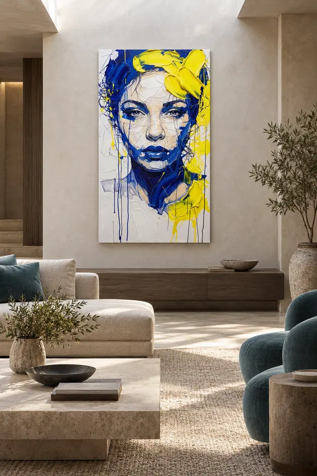
The existing room visualisations can suggest context but do not prove actual installation, selected scale or included objects. A staged room may soften the portrait's force; a close crop may exaggerate it. Return to the artwork alone before deciding. If the face, colour and drip-like treatment remain compelling without furnishings, the selection has a stronger basis. If the room scene is doing most of the persuasive work, compare alternatives. The image has to travel into your setting without the staged furniture, lighting or wall colour, so its own relationships should remain the main reason for the purchase.
Ask material questions that lead to clear choices
Neptune Natural Matt Canvas 400 is specified as a 100 percent cotton support at 400 gsm, with an irregular weave and natural warm base. Compatible photographic poster papers include Oyster 271 and Photo Lustre 310. These facts clarify possible supports, not an artist's identity or a universal best format for vivid portraits. Choose alongside your intended presentation. Paper may involve separate framing, while rolled and stretched canvas have different practical next steps. The current configurator supplies the actual available combination, dimensions and optional finish. It should remain the authority rather than the image's apparent thickness or a room scene's scale.
Supplier further reading can explain a support's stated surface character without guaranteeing an exact screen match under every light or a fixed lifespan. Optional hand-finishing remains light and selective when chosen. It does not turn all depicted layers into physical paint. A precise order makes clear which material, size and presentation will arrive. That clarity is useful for a visually intense work: you can leave the face's expression and identity open while understanding the object. The quality decision should serve an image you already value, not be asked to make it an original painting or supply a provenance claim that the verified copy does not establish.
Choose the gaze and the field together
One last viewing exercise is to attend to the quieter transitions between the strongest blue and yellow passages. If those areas help the face remain coherent, they are part of the attraction too. A bold image is not made only from its loudest notes. Recognising the supporting passages can make your selection more complete and prevent the most saturated fragments from carrying expectations that the whole composition does not share.
A final reason might be that you enjoy a direct-looking face made through blue-and-yellow marks that also retain their own movement, or that the drips extend the portrait beyond a settled outline. Those are specific visual relationships. They are more durable than a general wish for something bold. Ask whether the composition continues to interest you after the colour contrast is familiar. If the answer depends on an invented identity or a story outside the image, recognise that as your contribution rather than a product fact. The work has enough visible material to be chosen without those additions.
Review the complete cover and current print options before ordering. Make sure you want the human presence as well as the palette, and the active surface as well as the gaze. It is reasonable to admire the image and choose something less direct for daily use. If this particular relationship keeps drawing you back, select the support and finish accurately and leave the identity open. A clear personal attraction and a well-understood presentation are enough to support the purchase. The face can remain intense without being named, and the texture can remain visually rich without being promoted as physical paint on every supplied variant.
Continue with this artwork
Find your next artwork
Three ways to see the face and falling marks
Read more: Three ways to see the face and falling marksRead less: Three ways to see the face and falling marks
This blue and yellow portrait composition gives you a direct gaze inside an uneven field of colour. The eyes hold steady near the pale centre. However, the blue around the mouth and jaw points down, while yellow spreads around the upper and lower right. The artwork does not make everything move in the same direction.
Use three routes to see what holds the picture together. Start with the eyes, follow an area of colour, then look at the thin lines that fall towards the lower edge. Each route works at a different scale. Try one from the whole image before testing a closer view of the marks.
Blue and yellow portrait composition route one: find the gaze
Start by looking between the eyes. The two dark rims suggest a fairly level line across the lighter face. Look next for the pale nose and the mouth. Their arrangement remains clear even when other marks interrupt the edges. Consequently, the person can seem to face you directly without a continuous border.
The National Gallery's glossary on composition gives a name to the relationships among parts of a picture. Here, notice where the two upper features offer stability. Then compare the much less even path from the lips towards the lower right. The relationship between those directions is easier to see than to explain with a single mood.
Look a little below the eyes and find the small changes in grey on the nose and cheeks. These changes do not always have the strong boundaries you see around the lips. Nevertheless, they can show where the face turns or appears to change plane. Try reducing the preview and notice which boundaries remain.
Look back at the brighter part of the cheek without starting at the eye. For example, a light patch has several neighbours of similar brightness, while a nearby dark curve has a much clearer edge. Bring both back into view. This gives you two different cues for reading a face rather than making all its features rely on strong contrast.
Test a pale passage in the blue and yellow portrait composition
Look just above the nearer parts of the brow. Several faint strokes cross the forehead. Try to follow one without leaving the pale region. Then compare it with a bolder blue mark at the edge. That small move asks you to read the centre as an area with its own marks, not a blank piece between bright surroundings.
Cover one eye temporarily in the preview. Then do the same with the other eye. The portrait may still address you directly, but the nearby outlines and colours will pull your attention differently. In particular, compare the light space beside each eye before deciding whether the pair has the same visual weight on both sides.
Blue and yellow portrait composition route two: read the broad colour
Follow the blue from the upper left towards the side of the face. It is not one uninterrupted stripe. A dark outline and shorter marks repeatedly interrupt it. Elsewhere, at the neck, a wider blue curve directs the eye to the lower right. This gives the same colour a different job near the bottom.
Then start at the yellow near the upper edge. Its broadest areas are not evenly balanced around the centre. In contrast to the dark curve below the mouth, the upper yellow crosses the edge of the suggested hair. Look at the lower right as well. See whether the second yellow area brings you back towards the face.
The National Gallery's glossary on colour helps distinguish the appearance of colour from other qualities of an object. For this picture, use the contrast to compare boundaries. A yellow area can separate a form very clearly from dark blue without telling you what pigments or tools were used to create it.
Compare the lower blue area with the smaller dark form of the lips. They differ in scale but lie close enough to suggest a route down the image. However, a pale chin gives you a place to stop between them. Try following that interruption rather than treating every dark area as part of the same shape.
Compare the blue and yellow portrait composition with a different colour study
Our Fauvism colour guide compares ways a bright area can divide an image or link parts of it. This portrait is not evidence of a historical school. However, you can use the same viewing question. Does a blue patch give the face a stronger edge, or direct your gaze along another path?
Before you buy wall art, compare the piece with a work that uses one large area of colour and fewer breaks. The Golden Ads Expressionist wall art selection gives you others to consider. Some people enjoy a direct gaze with a quieter surround. Others may prefer the colour to stay active at the edges.
Blue and yellow portrait composition route three: follow the narrow marks down
Look beneath the face at the long blue lines. On the left, several begin close together and extend into the pale area. Their fine edges make a different impression from the blue near the jaw. Compare where a line ends with where the next one continues. They need not stop at the same level.
On the opposite side, look for thinner marks near the yellow and darker boundaries. The longer paths help you notice the height of the image. In addition, smaller loops around the hair invite a closer, more local view. Try to switch between those two distances rather than treating all the lines as one kind of detail.
Notice where one straight-looking mark crosses a broader, softer edge close to the pale side. It can bring attention outside the face. Then follow it back in the other direction. As a result, the narrow mark may seem less like an addition beneath the picture and more like a route joining areas with different amounts of activity.
Our guide to apparent relief in an image explains why a mark can look raised without identifying the surface of the print. The drip-like appearance here does not establish how a particular option was made. If you searched for hand made wall art, verify the production and finishing details you actually need before deciding.
Find what survives from a distance in the blue and yellow portrait composition
Try the whole image at a scale where you can still see the dark lip shape but not the smallest falling lines. Then alternate with a closer view. Which change seems more important to you? The strongest contrast may stay clear from a doorway, even when the shorter marks need a nearer position.
The sofa scene above supplies one possible background for the tall image. It does not show the exact size of an order. Our blue and yellow portrait placement guide considers the position and view separately. Compare that room with the isolated image before you buy artwork for where you will normally sit.
Take the blue and yellow portrait composition back to the listing
Check the Blue and Yellow Textures product page to see the actual artwork and available choices. Use it for dimensions and presentation rather than trying to measure the picture from a room visualisation. If you want a particular finish, read its current description. The strokes you see are not sufficient evidence of it.
If the eyes and broad colours matter more to you than the thin lines, judge the whole view first. Conversely, if the falling marks are what make this picture distinctive, consider whether you will often approach it closely. Those questions give you different reasons to consider the same artwork.
Frequently asked questions
Where should a blue and yellow portrait composition reading start?
Try the line between the eyes. Then look at the area above it and the dark curve below. Because the face stays readable while the boundaries change, you can separate the direct gaze from the surrounding action before choosing another route.
Do the two eyes play the same visual role?
They form a pair, but each sits against a slightly different set of touches. Compare the colour and spacing around them. In particular, one outline may direct your eye towards a stronger edge. That difference does not establish what the figure is thinking.
Where does blue lead in the blue and yellow portrait composition?
It can carry you from the upper edge towards the face or from the dark lips down towards the neck. These are not the same route. Try tracing the dark edges without expecting all the blue to work as a single border.
Is the bright yellow the only place to begin?
No. A pale area or the form of the lips might catch your eye first. However, following the yellow can reveal how light-looking shapes near the top and lower right relate. Try it after looking at the gaze and see what changes.
What happens if the thin lines disappear in a smaller view?
The larger areas can still read as a face and a contrast of colours. Then, when you enlarge the image, look for one line you missed near the lower edge. You learn which parts work from afar and which make a closer view worthwhile.
Does the blue and yellow portrait composition show real raised paint?
It shows areas with a convincing appearance of thickness. However, the preview does not establish the material or surface of a particular order. Use the actual option details, especially if you want a specific finish rather than just that look.
Can the pale face count as an active colour area?
Yes. Compare its faint strokes with the dark eyes and mouth. It gives those features space to remain distinct. In contrast, if the whole centre matched the darkest region, the smaller boundaries would not read in the same way.
Does the portrait identify a person or tell a story?
This article does not identify the sitter. You can describe the direction of the gaze and the position of the head without naming anyone. Likewise, a convincing pose does not establish any event or a particular emotion outside the picture.
Should I study it next to another blue and yellow artwork?
That can help if the colours alone first attracted you. Compare where each picture places its broadest blue and brightest yellow. Then ask whether the face, thin marks or overall shape keeps you interested after you notice the shared palette.
Can I see the arrangement in a staged room image?
Yes, but treat the room as a separate composition. In the sofa picture, the furnishings and pale wall affect where you look. Compare the isolated artwork before carrying the decision over to the scale and colour of your own room.
What should I check if I want to see the lower details?
First note how far away you usually sit or stand. Then check the available sizes and the actual wall opening. A detail that matters to you may benefit from a closer viewing position rather than an assumption about what the photo shows.
When should I choose a print surface?
After deciding what interests you about the image, compare the surfaces currently offered for that choice. Then check the presentation and where you plan to see the print. The same image may suit more than one plan for an actual room.
Finish the blue and yellow portrait composition with the route you remember
Review the whole image without trying to find all the parts again. If you still see the eyes, one broad shape or a falling line first, you know which part matters on a second visit. That makes it easier to compare this portrait with other wall art.
When you have a place in mind, check the offered size and finish rather than relying on the comparison views. Choose the work if the relationship of its colours and gaze still holds from the distance you usually use.