Living with art
An Intimate Equine Image in an Everyday Room
Place Equine Gaze with a practical balance of dark tones, small red echoes and comfortable sightlines, without turning the room into an equestrian display or assuming every variant has a hand finish.
Where do you want the horse and woman to meet your view?
Equine Gaze is a close encounter, so placement should begin with the kind of attention you want to give it. In a living room, a wall facing a favourite chair may allow the eye and face to be considered deliberately. In a home office, a side wall can offer a different focus when you turn away from the screen. A position directly behind a monitor may leave the work mostly unseen during ordinary use. Walk through the room and sit where you normally spend time before choosing the wall. The most prominent location is not always the most useful one, particularly for an intimate image that can feel strong at close range.
Consider shared views as well. Someone seated opposite the print may experience its closeness differently from a person who sees it only while entering. Ask whether the full composition feels comfortable from those sustained positions. You do not need agreement about what the human-animal relationship means, but the household should understand the subject and its prominence. A side wall can preserve a clear encounter without making the image unavoidable from every seat. Conversely, a main wall may be right if the room is intended to have a strong figurative focus. Let actual use guide the choice rather than a rule that equine art belongs in a study or that a dramatic print must dominate the lounge.
How many red echoes are enough around the bridle accents?
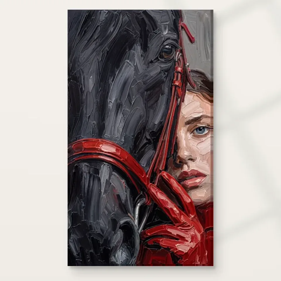
The red bridle and gloves offer an obvious cue for the room, but a small echo is usually a better starting point than a complete red scheme. Look at what you already own: one textile, a book grouping or a modest object may provide the connection. It does not need to match the printed red exactly. The image contains varied tones and a large dark field, so a single screen-sampled colour cannot represent the whole work. Keep any supporting accent quieter or smaller than the red areas in the picture if you want the artwork to remain the main event. You can observe the arrangement before deciding whether another connection is needed.
If red is already extensive in the room, consider reducing one nearby accent during the trial. The print may supply enough additional colour that a previously balanced arrangement becomes more crowded. This does not mean red is unsuitable; it means quantity and placement matter. A bright chair far across the room behaves differently from several small red objects directly below the image. View the whole field from the main seat. The aim is a coherent relationship, not a display that repeatedly points at the same colour. Let the horse and woman remain the reason for looking, with the accents helping the composition rather than turning it into a palette chart for the furnishings.
Let broad dark forms support rather than swallow the image
Black and grey give the print substantial tonal weight. A dark cabinet or chair can connect with that weight, but the artwork should still have a readable boundary. Against a dark wall it may feel more integrated; against a pale wall it may become a more distinct object. Test both possibilities through actual samples and the complete image if you are considering paint. Do not choose from the red detail alone. The overall field will have a greater effect on the room than one small accent. A quiet wall can give the eye and face room to register without requiring a high-contrast black-and-white interior around them.
If the room contains a television, large black shelving or other dark rectangles, consider separate sightlines. The print may be easier to enjoy on another wall than immediately beside a competing screen. You do not need to remove technology or practical furniture to make room for art. A clear hierarchy can come from location. Likewise, a plain sofa or cabinet front can provide a stable base while a nearby busy pattern may compete with the textured treatment. Evaluate the actual arrangement during use, including lamps, books and the objects that normally occupy surfaces. A wall that works only when everything below it is temporarily removed may need a more forgiving plan.
Keep personal equestrian objects from becoming a crowded set
If horses are part of your life, the room may already contain photographs, trophies, books or practical references. Those objects can coexist with Equine Gaze, but they do not all need to gather around it. A concentrated display may make the print read as one item in a themed collection rather than as a distinct visual encounter. Decide which role you want. One meaningful object nearby can create a personal link, while several equally prominent pieces may compete with the horse's eye and the woman's face. The artwork's figurative closeness deserves enough separation that it can be seen on its own terms as well as through your equestrian interest.
For someone without riding connections, there is no need to add them artificially. Natural materials, useful furniture and a clear wall can support the image without saddlery motifs or stable-style decoration. The subject's appeal can lie in closeness, observation and dark tonal structure rather than a lifestyle theme. This makes the placement more adaptable if the room changes use. A print chosen for its composition should remain welcome even if a bookcase moves or a personal collection is rearranged. Keep the connection genuine and proportionate, allowing the room's own history to remain visible instead of building a staged identity around the image.
Measure for the complete close encounter
Use a wall-safe outline in an available size and test it from the intended seats. Because the image is already close, a very large presentation in a small room may feel more insistent than expected. A smaller version may still have considerable presence because of its dark field and recognisable eye. There is no universal correct size. Ask whether you can see the whole composition comfortably and whether furniture would hide part of the relationship. A tall plant, lamp or shelf can obscure a lower passage from seated angles even if the wall looks clear while standing. Plan the full image, not a crop around the horse's eye.
Read the current dimensions for the selected format. Rolled canvas includes printed allowances and a supplied flat size that differ from the chosen artwork area. Stretched canvas states its front-face size with wrap separately. A frame added to paper changes the completed outer dimensions. If you intend professional framing, establish that plan before relying on a narrow wall gap. Do not infer a size from the existing room gallery or substitute an obsolete margin measurement. The goal is to preserve the woman, horse and red accents as one encounter, carried by an object that fits the room without squeezing against trim, furniture or frequently used controls.
Choose Equine Gaze's actual dimensions and selected finish
Use the office for a chosen pause, not a promised benefit
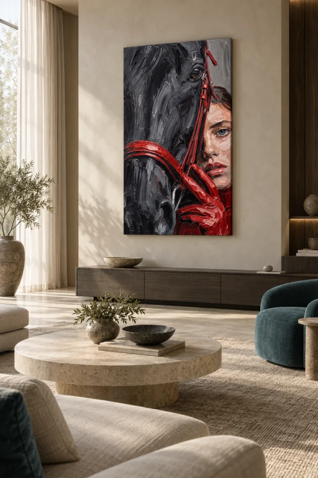
The home office is an editorially suitable setting, but the print should not be expected to improve productivity or create a guaranteed emotional effect. Its practical value can be simpler: an image you enjoy looking at when turning away from work. A side wall visible from a comfortable chair or the room's entrance can create that separate destination. Check the view while the desk is in its normal state, with screens, cables and papers present. The artwork does not need to hide the office's function. It needs a clear area where the close subjects are not visually cut apart by equipment or buried among other images.
If the room doubles as a guest room or shared workspace, test those uses too. A position that works from the desk may become awkward when a bed is opened or another person uses the room. The existing visualisations can suggest domestic contexts, but they do not prove exact scale, real installation history or a particular mood. Translate a useful relationship, such as breathing room around the image, rather than copying the entire scene. This keeps the result personal and practical. The print can remain a concentrated equine encounter while the room continues to accommodate work, visitors and ordinary changes without being locked into a single themed arrangement.
Give the eye and face even, comfortable illumination
The darker palette deserves a lighting check before installation. Under weak or uneven light, the red accents may register while subtler grey relationships become harder to see. Start with your normal lamps and view the proposed wall from the actual chair and doorway. Would a bright patch cross one subject while leaving the other less visible? Would a reflection obscure the focal area in a framed presentation? Moving an existing lamp may be more effective than adding a strong spotlight. The aim is to reveal the composition evenly, not to exaggerate its drama. The close encounter already supplies enough visual intensity without theatrical lighting.
Avoid unnecessary direct sunlight, strong heat sources and persistent damp. Consider normal heating use and seasonal daylight rather than only the conditions on the planning day. These are general care considerations, not guarantees that another location eliminates every risk. If choosing paper, discuss framing and the intended display conditions with a competent framer. The Canadian Conservation Institute offers basic art-on-paper care information that can help identify sensible questions, but it does not certify this product or establish a lifespan. Follow advice specific to the actual selected support and presentation. Good lighting and suitable placement should make the work easy to see while avoiding avoidable stress on the object.
Select the real finish before planning installation
The title includes Hand Finished, but your current configuration determines the order. An ordinary print and optional light, selective hand-finishing are separate selections. The latter is not a promise that every visible textured stroke becomes raised paint. Neptune Natural Matt Canvas 400 is specified as a 400 gsm, 100 percent cotton support; compatible photographic poster papers include Oyster 271 and Photo Lustre 310. Choose the format alongside your presentation plan. Rolled canvas and an unframed rolled poster need suitable finishing or framing after delivery, while stretched canvas is offered ready to hang. None should be treated as waterproof because an applied finish sounds protective.
Arrange the next practical step in advance. If using a framer, discuss the chosen material, completed outer size and proposed wall. If hanging a stretched object, select fixings appropriate to the actual piece and wall construction. Keep a safe area for unpacking and do not leave the print exposed in a busy passage while deciding what to do. These preparations are part of quality in everyday use: accurate specification and appropriate handling matter as much as an appealing image. Once they are settled, the close subjects can remain the focus. The installation does not need to recreate an equestrian setting or imply an original painting's physical structure to support a print you genuinely enjoy.
Make clearance work during ordinary furniture movement
Check the proposed position while chairs are moved, a desk is adjusted or a cabinet door is opened. An intimate image can encourage a close look, but that does not require placing it where people will regularly touch or brush the surface. Leave practical clearance for the room's real activities. If a work chair backs towards the wall, a different position may be safer than trying to fix the chair permanently in an inconvenient place. If a console collects bags, allow for that use rather than assuming it will remain empty. These checks are especially useful in a home office that changes between concentrated work and family use. The picture's relationship with furniture should tolerate modest changes. A slightly less dramatic wall can be the better choice if it keeps the whole encounter visible and the supplied object away from repeated contact. The aim is an arrangement you can maintain naturally, not a daily negotiation between protecting the print and using the room.
Let the room keep its own identity around the encounter
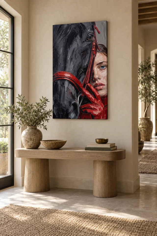
A finished arrangement should not require every object to explain the horse or repeat the red. Keep one or two intentional relationships, a clear complete view and enough surrounding steadiness to read the subjects. Then use the room normally. If the wall feels crowded, remove one nearby object before purchasing something new. If it feels disconnected, test a modest tonal link already present in your belongings. A room can accommodate books, family photographs and practical equipment while giving this artwork a distinct place. The goal is a hierarchy of attention rather than an artificially empty display or a complete themed interior.
Equine Gaze can offer an intimate human-animal presence without telling you exactly what that relationship means. Your room plan can remain much more definite: a measured presentation, appropriate light and a sightline that suits daily use. Recheck the actual format and selected finish before ordering, then allow for small adjustments after installation. The horse's eye and woman's face should remain available together, while the rest of the room continues to reflect your own life. That balance respects the image's closeness without asking it to dominate every activity or serve as proof of an equestrian identity. A clear place for a compelling encounter is enough.
Continue with this artwork
Find your next artwork
Choose the sightline and balance the dark field
Read more: Choose the sightline and balance the dark fieldRead less: Choose the sightline and balance the dark field
An Equine Gaze wall display brings two close presences into a room. A woman's face and a horse share one narrow space. That intimacy is the print's strength. It is also the reason placement deserves more thought than usual. A strong image at close range can reward daily looking. In the wrong position it can just as easily tire it.
The five tests here move from the broadest decision to the smallest. They cover where the encounter is seen and how red echoes behave. They also cover how the dark field sits, how the full size is measured and how light and care are planned. None of them requires specialist knowledge. All of them ask you to judge the actual room rather than an imagined one. Taken together, however, they turn an attractive picture into a considered placement.
Equine Gaze wall display: choose the sightline first
Begin with the kind of attention you want to give the picture. A wall facing a favourite chair invites deliberate looking. The horse's eye and the woman's face can be considered at leisure there. A side wall in a home office offers something different. It gives a separate focus when you turn away from a screen. A position directly behind a monitor has the opposite problem. The print stays mostly unseen during ordinary use, which wastes the closeness that makes it worth owning.
Walk through the room and sit where you normally spend time. Do this before committing to any wall. The most prominent location is not automatically the most useful one. An intimate image can feel insistent at close range. Think about shared views as well. Someone seated opposite the print experiences it differently from a person who only passes the doorway.
Test the seated view and the passing view
A first glimpse and a long evening look ask different things of the same image. From the doorway you may register two dark forms and a flash of red. From the chair, the relationship between eye and face becomes the main event. Both experiences are legitimate. Neither should surprise you after hanging.
Mark the intended outline with a method safe for your wall surface. Then live with the empty shape for a day or two. Notice how often your gaze actually lands there. Perhaps the spot collects more attention than you expected. In that case a quieter wall may serve this encounter better. The rehearsal costs nothing. Moreover, it prevents the most common error: choosing a wall for its emptiness rather than for the view it truly receives.
Equine Gaze wall display: let one red echo be enough
The red bridle and gloves offer an obvious styling cue. Even so, a single echo usually serves better than a complete red scheme. Look at what you already own first. One textile may provide the connection. A small grouping of books or a modest object can do the same. No new purchase is required at all.
The echo does not need to match the printed red precisely. The image holds varied tones and a large dark field. No screen-sampled colour can represent the whole work. Keep any supporting accent quieter than the red passages in the picture. Keep it smaller as well. The artwork should remain the main event in its own area.
Where red already fills much of the room, take one nearby accent away for a week. The print may supply enough colour on its own. As a result, a previously balanced arrangement can start to feel crowded once it arrives. View the whole field from your main seat and judge honestly. The aim is coherence, not a display that keeps pointing at one colour.
Equine Gaze wall display: balance the dark field
Black and grey give the image considerable tonal weight. A dark cabinet or chair may answer that weight directly. The print still needs a readable boundary around it, though. Against a dark wall the work may feel integrated. Against a pale wall it becomes a more distinct object. Test both directions with actual samples before choosing paint. Judge the complete cover rather than the red detail alone.
A television or large black shelving deserves a moment's thought. The picture may be easier to enjoy on another wall, away from a competing dark rectangle. You do not need to remove technology to make space for art, however. A clear hierarchy can come simply from location. A plain sofa or cabinet front, for instance, can give the encounter a steady base.
Keep equestrian objects proportionate
Horses may already be part of your life. In that case the room may hold photographs, books or practical references. Those objects can coexist with this print. They need not cluster around the print, either. A tightly grouped arrangement can flatten the artwork into one item in a themed collection. One meaningful object nearby creates a personal link. Several equally prominent pieces compete with the horse's eye.
A household without riding connections needs no equestrian references at all. Natural materials and useful furniture support the image well enough. So does a clear wall. The subject's appeal lies in closeness and tonal structure. A print chosen for its composition should remain welcome even when the room's use changes later.
Equine Gaze wall display: measure the full encounter
Mark an available size on the wall and test it from the intended seats. The image is already close, so scale behaves unusually here. A very large presentation in a small room can feel more insistent than expected. A smaller version still carries presence through the dark ground and the readable eye. No single size is universally right. Instead, there is only the size your room and viewing distance can hold comfortably.
Plan for the complete encounter, not a crop around the horse's eye. A tall plant, a lamp or a shelving unit may hide a lower passage when seen from a chair. The wall may look perfectly clear while standing. The home office artwork selection is worth browsing if the planned room doubles as a workspace. Sightlines there must survive desks, screens and cables in their normal state.
Read the current dimensions for your selected format with care. Rolled canvas includes printed allowances and a supplied flat size. Both differ from the chosen artwork area. Stretched canvas states its front face with the wrap listed separately. The National Gallery's frame glossary shows how a border changes the way a picture meets its wall. A framed paper print will grow beyond the sheet you ordered.
Equine Gaze wall display: plan light and care together
The darker palette deserves a lighting check before installation. Under weak illumination the red accents may register while subtler grey relationships disappear. Start with your normal lamps. View the proposed wall from the actual chair and doorway, at the hour you use the room most. Moving an existing lamp often achieves more than a strong spotlight. The aim, after all, is to reveal the composition evenly, not to exaggerate its drama. Meanwhile, check whether a bright patch crosses one subject while the other sits in shadow.
Keep the print away from unnecessary direct sunlight, strong heat and persistent damp. The Canadian Conservation Institute's notes on caring for art on paper set out how light, humidity and handling affect paper works. They also underline that light damage cannot be reversed. Treat that guidance as general background. The supplier's instructions for your exact format remain the practical reference. Therefore, note the display conditions first and discuss framing with a competent framer where paper is involved.
Equine Gaze wall display: order what the room can hold
The title includes Hand Finished, but your configuration determines the order. An ordinary print and the optional light, selective finish remain separate choices. The product-page evidence guide shows how to keep stated materials distinct from the image's suggestions. Nothing here makes the print hand made wall art by default. Confirm the actual finish control before paying.
When you buy wall art for a specific wall, the honest sequence is measure first and order second. If you buy artwork only after checking the outline, the light and the stated supports, the print materials guide becomes a practical reference rather than homework. Neptune Natural Matt Canvas 400 is the specified cotton canvas at 400 gsm. Oyster 271 and Photo Lustre 310 are the compatible poster papers.
Wall art of this intensity works best when the room around it stays calm. Artwork should carry the complexity so your furnishings do not have to. Finally, allow the room to keep its own identity. Books, photographs and practical equipment can stay, provided the encounter keeps a clear zone. For the image itself, the Equine Gaze composition guide studies what the picture shows. This guide has tested where and how it can live.
Frequently asked questions
Which five tests does an Equine Gaze wall display use?
Where the encounter is seen, and how red echoes behave. Then how the dark field sits, how the full size is measured and how light and care are planned. Run all five before ordering.
Is a prominent wall always the best choice?
No. An intimate image can feel insistent at close range. A side wall with a comfortable seated view often serves better than the most prominent position.
How many red accents should the room repeat?
One echo is usually enough. A single textile or small object can connect with the bridle and gloves. Several red pieces would compete with the composition's own structure.
Does the dark palette suit a small room?
It can, provided the size stays proportionate. A smaller print still carries presence through its dark field. An oversized one may feel insistent where viewing distance is short.
Does the Hand Finished title mean it is hand made wall art?
No. The optional finish is light and selective where offered. Not every variant includes it. The order controls, not the title, settle that question.
Can I hang it in a home office?
Yes, and the setting suits the image. Choose a side wall that offers a deliberate pause away from the screen. Check the view with the desk in its normal working state.
What lighting does the dark field need?
Even, moderate light. Check the wall from your actual seat at the hour you use the room most. Move an existing lamp before considering any dedicated picture light.
Is direct sunlight ever acceptable?
Avoid it where you can. Conservation guidance for works on paper stresses that light damage accumulates. Once it occurs, it cannot be reversed.
Should riding trophies or photographs sit beside it?
Keep them proportionate. One meaningful object can create a personal link. A gathered cluster turns the print into one item in a themed display rather than a distinct encounter.
How do I measure for the full encounter?
Mark an available size on the wall and test it from seated and standing positions. Check that plants, lamps and shelves do not obscure the lower passages from where you actually sit.
Do the supplied dimensions equal the image size?
Not always. Rolled canvas includes stated printed allowances. Stretched canvas lists its wrap separately. A framed paper print grows beyond the sheet. Read the format's own figures.
What is the final check before ordering?
Confirm the support, the dimensions, the presentation and any optional finish. Then look at the measured outline once more at your usual hour. If the encounter still holds its place, the plan is sound.
Conclusion: give the encounter a clear wall
An Equine Gaze wall display succeeds when the practical decisions are definite and the image stays open. Choose the sightline, restrain the red and balance the dark field. Measure the full size and plan the light. Then see Equine Gaze with Red Accents on its product page and weigh the stated support, dimensions and finish against your prepared wall.