Living with art
A Mountain View for an Ordinary Room: Placing Textured Mountain Crest
Use the crest's restrained palette and open landscape character in a living room or reception space, with a measured plan for furniture, materials and everyday viewing.
Do you want a view to approach or a landscape to live beside?
Textured Mountain Crest can play a quiet role in a room, but quiet does not have to mean unnoticed. Begin by deciding how you would like to encounter it. A smaller presentation near a reading chair may invite closer inspection of the depicted marks. A more substantial placement on a clear wall may offer the broad terrain from across the room. These are different relationships with the same image. Neither is automatically more suitable for a mountain subject. The useful choice depends on whether you want a place to pause deliberately or a landscape that remains in your wider field of view during ordinary activity.
Walk through the room and sit in the positions you actually use. Notice whether the proposed wall is seen directly, at an angle or only while moving between spaces. The crest's overall shape may read well from farther away, while its subtler colour variations need more attentive looking. You do not need every detail to be visible from every seat. You do need a clear idea of which encounter matters most. This prevents a common mismatch: choosing a print for close-up texture and then installing it where no one can comfortably approach it, or choosing a broad colour field and crowding it with nearby objects.
Do not begin with a promise that mountain art will make the room relaxing. You may find the image restful, but that is your response rather than a guaranteed property. A room's noise, light, furniture and daily demands will still matter. The print can contribute a landscape interest within that larger environment. If you like it during a normal busy day as well as in a quiet moment, it is more likely to feel at home. Let the placement support a real habit of looking rather than an idealised picture of how the room ought to feel.
What should the ridge relate to in your furniture layout?
The mountain crest offers a strong internal boundary, so consider how it sits in relation to the larger lines of your furniture. Above a sofa or sideboard, the print can form a concentrated landscape area without having to fill the full width below it. A long piece of furniture does not automatically require the largest available image. Conversely, a very small work placed high above a substantial sofa may feel detached. Use an outline of the finished object to judge the relationship. Include any planned frame, and look from your regular seat rather than relying solely on a straight-on standing view.
Think about the space above and beside the image. A nearby curtain edge, tall cabinet or doorway can alter how the landscape reads within the room. The artwork's own open passages may be easier to appreciate if the immediate wall is not crowded. This does not require a blank room. It means giving the picture a clear territory. If a tall lamp overlaps the proposed area from a seated viewpoint, try shifting the lamp or print before reducing the size. Often the issue is the relationship among objects, not the artwork's dimensions alone. A small practical change can make the whole arrangement more legible.
Remember that the room visualisations are not measured plans. They can show a possible context, but the apparent scale of the landscape in a scene is not proof of the size you should order. Your wall, furniture and selected presentation decide that. Check door swings, cupboard access and cleaning clearance as part of the trial. A mountain image may suggest spaciousness, yet the installed object still occupies real wall area. A successful arrangement respects both experiences: the imaginative space within the landscape and the practical space around the print in your home.
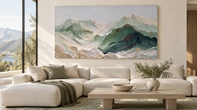
Use earthy connections without building a lodge theme
The muted landscape can connect with timber, wool-like textures, stone-coloured surfaces and other familiar materials, but those connections do not require a themed interior. You do not need rustic furniture or mountain-related ornaments to make the image belong. Begin with the existing room and identify one or two relationships you already like. A wooden table may answer the earthy palette; a plain fabric may offer a softer counterpoint to the rugged-looking marks. The artwork can sit comfortably in a contemporary setting precisely because its subject and surrounding furniture do not have to be literal matches.
Avoid repeating every apparent texture. If the print contains a busy suggestion of rough terrain, many strongly patterned or heavily textured neighbours may make the room feel more dense than intended. A simple wall and a relatively quiet textile can allow the image's surface to remain interesting. On the other hand, a room with very smooth materials may welcome the visual variation. The point is to compare pace and scale of texture rather than deciding that natural subject matter must be surrounded by natural-looking objects. Visual contrast can be just as coherent as repetition when it is chosen deliberately.
Colour can connect across the room rather than clustering immediately around the artwork. An existing earthy cushion or a muted ceramic object on another surface may be enough. Keep any paint decision grounded in physical samples and the room's real light, not a colour sampled from a screen. The image's palette may appear different at different times, so a perfect digital match is not a reliable decorating target. If the print works with the wall you already have, there is no need to repaint solely to prove that the arrangement is coordinated.
A reception space needs clarity as well as atmosphere
In a reception area, a landscape can provide a point of interest without demanding personal disclosure or a fixed story. People can notice the terrain while waiting or passing through, and those who wish can look more closely. Choose a wall with a clear view from the seating or arrival route. Avoid placing the print where someone would need to stand in a doorway to inspect it. The room's practical purpose comes first. The artwork can contribute an open landscape association while signs, storage and circulation remain easy to understand. A welcoming arrangement should work for people who are not there to study art.
Consider the broader view from the entrance. If there are already several strong focal points, the mountain print may need a quieter supporting role rather than another prominent position. If the room feels visually empty, it may become a clear anchor. Neither role is inferior. The selected size and spacing should reflect the amount of attention you want the work to receive. A reception room can contain art without turning every wall into a gallery. One landscape with sufficient breathing room may be more effective than a crowded group added simply to fill available surfaces.
The source copy describes a tranquil mood, but do not treat that as an established response for every visitor. Some people may see ruggedness, others softness or memory of travel. The image can accommodate those differences without requiring an explanation. This is part of its usefulness in a shared setting. Keep any accompanying description factual and modest rather than inventing a location or a therapeutic effect. The landscape can be offered as something to look at, with its terrain and colour providing interest while the room continues to serve its ordinary reception function.
Check subtle colour under the light you actually use
A restrained palette can be sensitive to its surroundings. In strong daylight, subtle changes may be easy to notice; in a dim corner, the same passages may gather into a flatter impression. Before finalising the wall, check it during the hours when the room is used. You do not need specialised lighting to enjoy the print, but you do need enough comfortable light for the landscape's relationships to remain visible. A lamp positioned for reading may not illuminate the wall evenly. Notice this before assuming that the image itself lacks contrast or that a larger size will solve the issue.
If framing a poster behind glazing, check reflected windows and lamps from the usual viewing positions. A reflection that appears only from one chair can still matter if that is your favourite seat. Canvas has a different surface, but it is not a reason to ignore light or environmental conditions. Avoid direct heat, routine splashes and other avoidable exposure when choosing a wall. The general care resource linked below is further reading, not a guarantee for this product. The actual support, presentation and room conditions should guide specific decisions about display and handling.
Do not try to force the domestic lighting to imitate a landscape atmosphere. The picture can suggest weather and terrain without the room becoming a scenic installation. A comfortable, stable setting is usually more practical than a dramatic effect that only works with every curtain and lamp in one position. If you enjoy the print under your normal conditions, the arrangement has a useful foundation. If the proposed wall is consistently too dark or visually obstructed, consider another location before adding equipment or changing the whole room around one image.
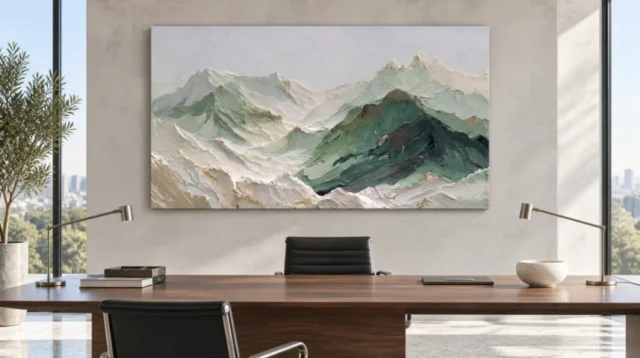
Choose canvas or paper through the finished object's needs
The image's depicted texture does not decide the support for you. Neptune Natural Matt Canvas 400 is the verified canvas option, a 400 gsm cotton material with a natural warm base and irregular weave. Compatible paper choices include Oyster 271 pearl or satin photographic paper and Photo Lustre 310 photographic paper. Review these as actual supports with different presentation requirements. A poster is supplied rolled and unframed, so plan its later framing. Rolled canvas also needs an appropriate presentation plan. Stretched canvas is offered ready to hang. The most suitable route is the one that fits your practical intentions as well as your visual preference.
Check the exact current dimensions before making a framing or wall decision. Rolled canvas distinguishes selected artwork size, printed allowance and final supplied flat size. Stretched canvas states the chosen front face and printed wrap separately. A frame can change the total outer dimensions of a poster presentation. Do not rely on an old margin example or on the apparent size in a room scene. Write down the measurements that apply to your actual selection and use them in the temporary wall outline. This small step can prevent an object arriving that fits the image you imagined but not the physical arrangement you planned.
Optional light selective hand-finishing is separate from an ordinary print, and a textured-looking mountain does not guarantee raised paint. No visual effect in the source image should be converted into a claim of physical impasto, geological material or archival lifetime. If a particular surface quality matters to you, confirm what is offered before ordering. Otherwise, let the printed image do its visual work without asking the support to become the mountain it depicts. Understanding the object clearly leaves more room to enjoy the landscape for its colour, ridge and suggestive marks.
Keep the room open to change around one steady view
After installation, give the arrangement time before adding more landscape references. The mountain print may already provide all the natural imagery the room needs. Notice whether the wall feels balanced during ordinary use, with books, cups and other practical items present. A display that only works when every surface is empty may be difficult to maintain. The artwork can hold a steady place while the room remains active. If the surrounding area feels busy, try simplifying nearby objects first. If the work feels disconnected, reconsider spacing and sightlines before assuming that matching accessories are missing.
As furniture or textiles change, return to the image's broad relationships rather than trying to preserve an exact original scheme. Its muted palette may connect with more than one setting, and its landscape subject does not require all neighbouring objects to be natural or rustic. This flexibility is part of a personal home. A print can remain meaningful through its own visual interest while the practical room evolves. You are not obliged to keep a sofa, paint colour or lamp indefinitely because it appeared to suit the artwork at the moment of purchase.
The most useful final test is simple: can you see the crest comfortably, do you understand the physical presentation, and do you continue to enjoy the image at the hours you use the room? If so, the placement has a sound basis. The product page provides current choices, and the Living Room or Reception collections can help compare alternatives. Let Textured Mountain Crest be one landscape view within your home, not a promise that the whole environment will become permanently serene. Its quiet terrain can contribute to daily life while leaving room for the room, and its occupants, to keep changing.
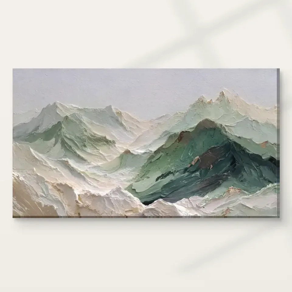
Continue with this artwork
Find your next artwork
Compare sightlines above a sofa and behind a desk
Read more: Compare sightlines above a sofa and behind a deskRead less: Compare sightlines above a sofa and behind a desk
Mountain Crest print placement starts with what interrupts the view. The wide green ridge in Textured Mountain Crest draws attention to the right. However, the much paler areas need space around them to stay readable. Compare the supplied living room and office scenes, then look at the places from which you will actually see the print.
The useful question is not how closely you can copy either room. Ask how the work sits near your own furniture, what daylight reaches the wall and how much of the image you can see from a chair. A room illustration can help you decide what to measure. It cannot supply your measurements.
Mountain Crest print placement above a pale sofa
In the living room example, the pale sectional sets out a long line beneath the mountain image. The large window is to one side. Consequently, your eye can compare the breadth of the print with the uninterrupted part of the wall, rather than treating the entire room as available space. Look at the small gap between the top of the sofa and the lower edge of the image.
Start with the width of your own sofa back, not the total width of a corner arrangement. Mark the part that actually sits below the proposed print. Then check whether a raised arm, a tall cushion or a lamp occupies one end. A position that looks centred when the whole sofa is empty may feel different with the things you use each day.
Our living room wall art collection lets you compare this broad composition with other arrangements. However, check each from the seat or doorway that matters to you. An image that spans more of the wall does not automatically become the easier one to see when you are sitting close to it.
Try two heights before choosing Mountain Crest print placement
Use a lightweight paper outline of the size you are considering. Start low enough to see its relation to the back of the sofa. Next, move the outline slightly higher and step back towards the room entrance. Notice which height gives the pale strip at the bottom of the picture a clearer edge.
Keep the test tied to your room rather than to a universal hanging rule. If you usually see the wall from an angle, move sideways instead of always standing straight in front of it. Then compare the apparent gap above the furniture with the usable wall width. You may find that a little more free wall on one side matters more than moving everything upwards.
Mountain Crest print placement behind an office desk
The office illustration shows the picture on a plain wall between tall windows. A wide desktop and low dark chair sit in front of it. The desktop makes a second horizontal line. However, the chair and desk objects do not fill the wall area. That separation helps the landscape remain recognisable behind the furniture.
In a working room, open a space for the view before choosing the size. Sit in a normal spot facing the wall and note what the screen, lamps or storage already cover. Then ask someone else to look from the side where a visitor would sit. Therefore, a useful mounting position may differ from the one that looks best on the central axis of a photo.
The separate reception wall art selection offers more examples for spaces where several people use the same wall. If a picture is visible from an entrance as well as from a chair, compare both angles. The darker right-hand ridge may be clear from one spot while the pale sweep becomes more noticeable from another.
Treat the areas beside the print differently from the area below it
In the living room, furniture follows the wall but a window sits to one side. In the office, glass breaks up both sides. Therefore, the uninterrupted area above the furniture is more useful than an overall room width. Compare that band with the outside measurements of the version you might order.
If only one end of the wall allows extra space, see how the green ridge reads when the image sits farther from that side. A shift in placement need not be obvious to everyone. However, from an everyday viewing position it can keep a window edge, lamp shade or shelf from crowding the outline.
Let daylight inform Mountain Crest print placement
The bright glazing in both illustrations offers a useful question rather than a lighting recommendation. Does sunlight fall directly on the wall at the times you use the room? Check on more than one occasion if you can. Then consider whether a nearby wall or position would make it easier to see the distinction between light ridges and the palest sky.
The Canadian Conservation Institute's guidance on light explains why the intensity and duration of exposure matter. The guide to lighting artwork with less damage applies that distinction to planning a display. However, check the instructions for the particular print you choose before drawing conclusions about its care.
Compare a plain edge and a framed edge in the same place
A border changes the amount of wall around the artwork. The National Gallery's short account of frames explains the importance of the surround to looking at an image. Use two outlines if you are comparing different presentations. Then check the outer measurements so that a proposed edge does not run into a fitting or piece of furniture.
If the illustrated edge appeals to you, compare it with what the seller actually includes. A display image does not tell you which parts you receive. Therefore, confirm the print material, whether the product needs mounting and what the finished size refers to. Those practical details matter more than copying the exact furniture in the illustration.
Try Mountain Crest print placement with the room in use
Leave normal objects where they sit for a day before you compare the outline again. In the office, for example, a laptop lid and an adjustable light can change the line in front of the picture. A low sofa may likewise acquire extra cushions. Then note whether your chosen edge is still easy to follow. This gives the proposed placement a fairer test than an empty room.
Test the sightline again before you buy wall art
Use the Mountain Crest composition guide to choose a detail you want to recognise. Then mark where it would sit inside your outline. For example, you might check the dark ridge against the line of a screen or the back of a chair. Move the outline sideways before assuming that only a larger print will make the difference.
Before you buy artwork, see the current Textured Mountain Crest presentations. Choose a version whose dimensions fit the wall you have measured. However, do not infer the finish from a room image. Good placement leaves you room to see the image and enough space to use the room as you normally do.
Frequently asked questions
Does Mountain Crest print placement require a large living room?
No. Start with the uninterrupted wall you can actually see. A smaller print can fit comfortably if a chair or lamp does not hide a large part of it. Meanwhile, a long wall does not force you to use its full width. Choose a size you can look at comfortably from normal positions.
What width should I measure above a corner sofa?
Measure the part of the back that is directly below the proposed space. Then mark the ends of the wall area that is actually free. A cushion or floor lamp may matter as much as a sofa arm. However, use the product's finished width rather than the width suggested by a room illustration.
Can the picture work behind a working desk with a monitor?
Yes, if the monitor leaves the part you want to see unobstructed. Check from the chair opposite as well as from an entrance. Then use the paper outline to compare two locations. A slightly different position might reveal more of the dark slope without moving the desk or adding another item to the wall.
Should the print go exactly between two windows?
Not just because the room photo does. Compare the remaining wall width and the light that reaches it throughout your normal day. If the distinction between sky and pale ridges becomes hard to see there, test a position with a quieter surround. The first priority is how the composition reads in that spot.
Will direct sun help the mountains stand out?
It can change the appearance of the print, but brighter is not necessarily better. Light can create distracting reflections or make a pale area harder to distinguish. Therefore, use indirect light when you can and consider the care requirements for the finish. Compare whether a nearby viewing position helps you see more clearly.
Is the picture in the office a guide to the size I receive?
No. The illustration shows a possible room relationship, not a measured installation in your home. Consult the real product choices and record the selected dimensions. If another component extends outside the print, allow space for its finished edge. Then compare those measurements with the wall rather than the desk in the photo.
Can I place this artwork on a green wall?
Yes. Compare it with the green you actually have rather than assuming all greens match. A dark green wall may quiet the border near the ridge. However, pale areas can still stand out strongly. Try holding a reference image against the selected wall colour in the light you normally use.
Is Mountain Crest print placement the same for a rolled and stretched version?
The viewing questions are similar, but the orderable presentation changes what you need to measure or arrange before hanging. Check what each choice includes. Where a later frame or installation affects the outside edge, measure that completed size. Do not assume the two versions take up the same space after mounting.
Does the room view show whether a print is hand made wall art?
No. It shows the image in a setting. Confirm what is printed, what offers a hand-applied finish and what the particular version includes. Those facts concern production rather than interior styling. A photographed brush-like mark or textured fold cannot verify the method by which your print will be finished.
Can an adjacent lamp crowd the print even if it does not touch the outline?
Yes. A lamp may sit partly in front of it from an oblique seat or while approaching from the side. Check the view at eye level from both directions. Consequently, it can be useful to move the paper outline a little before deciding that you must move the lamp itself.
How should I plan for a room the whole household uses?
Ask people to compare the wall from their ordinary positions. One may see the print on entering, while another has a seat with a closer view. Then look for a placement that works reasonably from both positions. There is no need to make every small mark equally visible to everyone.
What should I check just before choosing a size?
Check the free width, the nearest object in front of the wall and a source of direct light. Then mark the finished dimensions and stand in your usual viewing place. If an edge looks cramped, compare another position or size. Keep the actual presentation and material with your measurements.
Conclusion: choose the spot with the clearest useful view
Mountain Crest print placement works best when you account for the real room as well as the picture. Compare what the sofa or desk leaves visible. Notice when the window changes that view, then use the actual outside dimensions to place your outline. A convincing room illustration gives you ideas, not a setting you have to recreate.
If the dark ridge and pale foreground remain easy to see near your everyday furniture, choose a verified presentation that fits. Confirm its finish and mounting requirements before ordering. Then the artwork can keep the broad, open view that made you want to display it.